Original Xbox Design Team Critiques PlayStation 4

roseofbattle

News Room Contributor
Apr 18, 2011
2,306
0
0
Original Xbox Design Team Critiques PlayStation 4

Teague calls the PS4 beautiful and notes the improvements on the DualShock 4 but says the two are not cohesive.

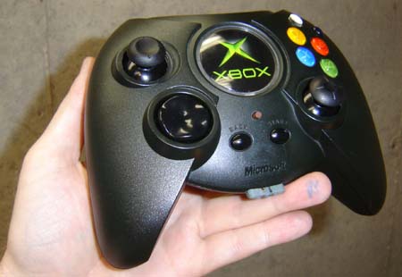
Design consultancy company Teague worked on the original Xbox and its controller, both of which have changed tremendously since 2001. PlayStation has changed quite a bit, too, and Teague has been around to see the transition. The company offers its review of the PS4, calling it a "beautiful console and a much improved controller, but it's almost as if these two components were designed discretely, and they never combined to create a truly cohesive system," the company told Fast Company.

Teague notes the slim look of the PS4 is similar to the well-received PS2 slim model. However, the company noted it did not like the angular body of the PS4 in conjunction with other devices: "On its own we liked the effect-it adds visual interest and energy to the form-but is that really the best choice for a box that will likely live side-by-side with the rectangular boxes that fill most of our living rooms?"

The company had lots of praise for Sony's new controller. It's "solid, not light and toy-like like the previous generation" with the joysticks spread further apart. One Teague designer disliked the touchpad and said it resembled a "flip-up door," but overall the team said the controller both looked and felt good.

Teague ended its review with a critique of how the console and controller do not appear cohesive because the PS4 uses square grid-like patterns while the controller uses circles. The controller is also more gray than black while the console is black-on-black. Creative director David Wykes said of the loss of the controller's iconic look, "It looks like a piece of clay that's been worked with too much."

Do you find Teague's assessment fair?

Source: Fast Company [http://www.fastcodesign.com/3021802/innovation-by-design/the-design-studio-behind-xbox-reviews-the-playstation-4]


Permalink
 

FinalDream

[Insert Witty Remark Here]
Apr 6, 2010
1,402
0
0
The original Xbox design was horrendous. These people shouldn't be critics of anything in design. But fair play, they achieved a cohesive design by having a huge brick for a system and controller.
 

omega 616

Elite Member
May 1, 2009
5,883
1
43
How you sound like a pretentious douche? You say ""On its own we liked the effect-it adds visual interest and energy to the form" ... what the fuck does that even mean? How does it's design add energy? Visual interest I can kind of get behind but I don't get visual interest from it really.

Like I can look at the Liver building in Liverpool and think "wow, that's a great looking building" and then look at the building 4 along and think "god damn, that's ugly!" but with the PS4, it's just a weird shape and has different finishes ... although that blue pulse thingy sure is purdy!
 

Eiv

New member
Oct 17, 2008
376
0
0
He's correct from a design perspective. Unless your a designer, it most likely wont matter, or you wont understand his critique. The 2 have separate form factors. On they're own, they are both nice pieces of design, together they don't match. Its not a criticism of prettiness, just cohesiveness.
 

Bug MuIdoon

New member
Mar 28, 2013
285
0
0
Have to admit they're spot on about the controller, It looks like a cheap, tacky rubber boomerang now. I think the actual system looks decent enough. Simple and discreet, and that blue light adds a nice little touch. I also have to admit that they're spot on in saying the two don't go together at all. In my opinion there's no coherence between the 2 designs.

At the end of the day though, even if you want them to look nice, it should still boil down to function > form.
 

Battenberg

Browncoat
Aug 16, 2012
550
0
0
Haven't people gotten bored of discussing what the console looks like yet? It's not like it makes any odds to the customers (unless they had brought out something so hideous that it was detrimental to your eyes in some way). Not to mention he ignores the ergonomics of this design which, at least from the looks of it, are excellent, particularly the changes to the controller.
 

Xeorm

New member
Apr 13, 2010
361
0
0
Sure, I'll go with that. The controller and the console don't really match each other aside from having roughly similar consoles.

Which is great, why would you want them to match? I like my controllers round and my console rectangular.
 

luvd1

New member
Jan 25, 2010
736
0
0
They should match? Hmm, that explains why you designed the travesty that was the orgianal controller. I loved the orginal xbox but that controller was the size of a house and felt like it. Chuck it out the window in frustration and knock over a bus.
 

Covarr

PS Thanks
May 29, 2009
1,559
0
0
I think the most important question here is "So?" The DualShock 4 doesn't need to look good next to the system, since ideally it should be in players' hands.

P.S. Thanks
 

kailus13

Soon
Mar 3, 2013
4,568
0
0
If you don't think a box looks good next to other boxes, why did you make your console a rectangular box?

I don't think anyone buys a console to look at it anyway.
 

wooty

Vi Britannia
Aug 1, 2009
4,252
0
0
All I can picture is a room full of berets and neckerchiefs looking at a black box.

Screw the case, the innards and the data on the disks are the important things in a console.
 

the doom cannon

New member
Jun 28, 2012
434
0
0
Wow so much hate going around here. The company gave a critique on design. Their arguments are sound from a design perspective. Also, this is 2013, not 2001. A lot can change in 12 years. But I guess people only see what they want to see.
 

CriticalMiss

New member
Jan 18, 2013
2,024
0
0
Teague ended its review with a critique of how the console and controller do not appear cohesive because the PS4 uses square grid-like patterns while the controller uses circles
Doesn't the Xbone have a generally square design? And I don't remember the controller being square too, although given the number of changes the console has gone through since it was announced maybe it is. Plus the Xbone is hardly a ground breaking piece of product design that challenges preconceptions about a synergistic user experience in a day-to-day configuration. It's a black box. Although I don't have a degree in being-paid-to-much-to-make-something-slightly-different-than-the-previous-something so what do I know?
 

Vigormortis

New member
Nov 21, 2007
4,531
0
0
Holy hell. With all the angry responses to this critique you'd think the people over at Teague were calling everyone's mother ugly and fat.

It's a critique, people. A critique from a design perspective. They're not insulting you, they're analyzing the design of the hardware.

And, in that regard, I actually found their critique quite fair. I agreed with many of their points. Not all, mind you, but many.

I even agree with their final conclusion. That while the controller and console aren't aesthetically cohesive, they are nonetheless both exquisite designs. I'd even go so far as to say that they are two of the best looking designs in console and controller history.

So good, in fact, that I've been finding myself almost wanting a Playstation 4. This after I'd sworn off this coming generation of consoles.

josemlopes said:
In what universe do they live on where they werent the guys behind this?
You mean the controller that was just as much loved as it was reviled?

Many of the people I knew quite liked that controller. Myself included. It felt far more comfortable in our hands than the later redesign.

I still consider that controller one of my all-time favorites.
 

Baresark

New member
Dec 19, 2010
3,908
0
0
They designed a horrid controller and the system itself was not aesthetically pleasing. I don't care one bit for their assessment. Also, all that matters is functionality, and the XBox controller was lacking in function because of it's terrible button layout.
 

PrimePowerOn

New member
Nov 30, 2009
45
0
0
What they said was extremely fair. The console and controller look like the only theme that ties them together is "dark" (not even black) and possibly "simple geometric shapes".

However, on note for the circular controller, human hands aren't exactly square. From what I've heard the new DualShock 4 is a delight ergonomically. I'll worry about whether or not they look good together when we have to retire the thing to a plinth in the "Hall of Forgotten Consoles"

Controllers are to use. Consoles are for views.

This cheap rhyme brought to you with apologies.
 

weirdee

Swamp Weather Balloon Gas
Apr 11, 2011
2,634
0
0
from a friend: "people who live in glass houses..."

me: "...shouldn't own an xbox, because that thing's gonna go right through the floor."
 

Covarr

PS Thanks
May 29, 2009
1,559
0
0
PrimePowerOn said:
From what I've heard the new DualShock 4 is a delight ergonomically.
You heard correctly. IMO it's not quite as comfortable as the 360 controller, but it's still a huge improvement over the DualShock 3, and the D-Pad is still leagues above what the 360 has on offer.

P.S. Thanks