Halo Concept Artist Releases Nifty Halo 3 Concept Art

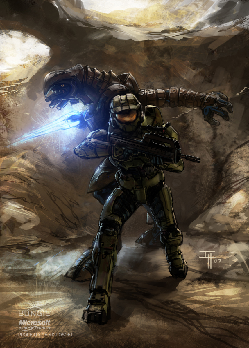
Before there was Halo 3, there was the Halo 3 concept art.
I've made no secret of the fact that I'm a huge sucker for concept art as a general rule of thumb. I love seeing how the cool worlds of gaming and the characters that inhabit them came into being. I also have made no secret of the fact that I'm a pretty big fan of Bungie's Halo franchise. So I think it's completely understandable that I find the Halo 3 pieces being posted on the blog of artist Isaac Hannaford [http://www.isaachannaford.com/] pretty darn sweet.
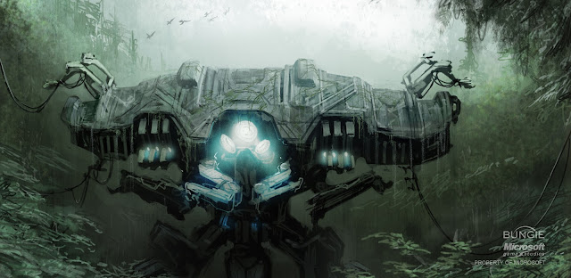
Now, many of these pieces aren't "concept art" as we think of it: By the time Halo 3 rolled around, everybody already knew what the Master Chief, Cortana and the Covenant looked like. There is some exploratory concept work regarding the game's environments (and now I'm having flashbacks to "Cortana," a strong contender for the worst level in the entire Halo series), but for the most part it's just cool sketches and action shots of the game's cast. Some of them were intended for use on the game's manual or tie-in novels and comic books, but for some reason or another never made the cut.
I'm a pretty big fan of the picture you see here to the right, which was one of the early concepts for the Halo 3 manual cover, says Hannaford. As he says, the sketch does an excellent job at putting the Master Chief's superhuman size into context - just look at how he's towering over all of those regular UNSC marines. That's what happens when you stick a seven-foot super soldier into power armor, I guess.
If you're a fan of the Halo series, like videogame concept art, or just enjoy looking at pretty pictures, you can check out all of Isaac Hannaford's Halo 3 concept art via the "Halo 3" tag [http://www.isaachannaford.com/search/label/%22Halo%203%22] on his blog. It's some seriously cool stuff.
Even if "Cortana" was a horrible level. Sorry, I'm still not over it yet.
(Isaac Hannaford [http://www.isaachannaford.com/])
Permalink


