New Skyrim DLC? That was the first thing that sprung to mind...dragongit said:

Are there any examples of good American box art?
- Thread starter dragongit
- Start date
Honestly, I'd say the example you've given is one where the American Box art beats the Japanese. That Japanese one is just a complete mess.
The European one is way better than both though.
As for an example of my own, I choose that one where they made Kirby look really angry, because at least that made me chuckle.
Edit: Wait, I have a semi serious one.
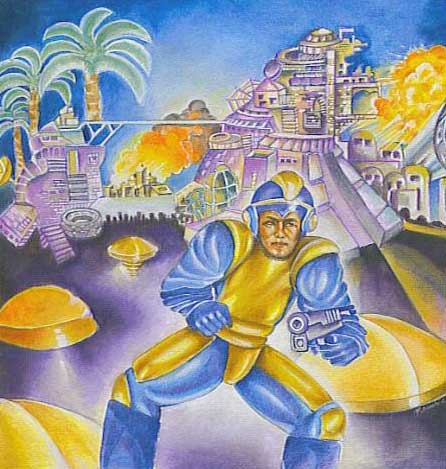
The Box art for the side-scrolling spaceship shooter, where you never leave your ship or see another human, Phalanx, advertised inexplicably with a bearded banjo player

I love its attempt to baffle buyers into curious purchases.
The European one is way better than both though.
As for an example of my own, I choose that one where they made Kirby look really angry, because at least that made me chuckle.
Edit: Wait, I have a semi serious one.
The Box art for the side-scrolling spaceship shooter, where you never leave your ship or see another human, Phalanx, advertised inexplicably with a bearded banjo player
I love its attempt to baffle buyers into curious purchases.
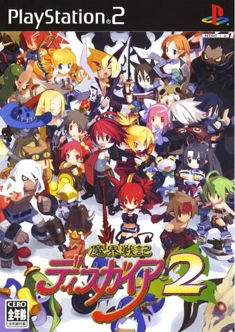
It's weird really, it seems to be almost the opposite with Disgaea 1.MasterMasamune said:A trend I've seen with Japanese box art for RPGs compared to American box art is that Japanese art tends to focus on the group and American art tends to focus on the self. This tends to result in the Japanese box looking like a cluttered, ugly mess since it tries too hard to show every major character in the game, and the American box being dull, dark, and washed over, not at all conveying the actual tone of the game. A perfect example of this is the Disgaea series. Here's the box art for Disgaea 3.
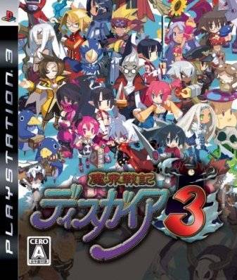
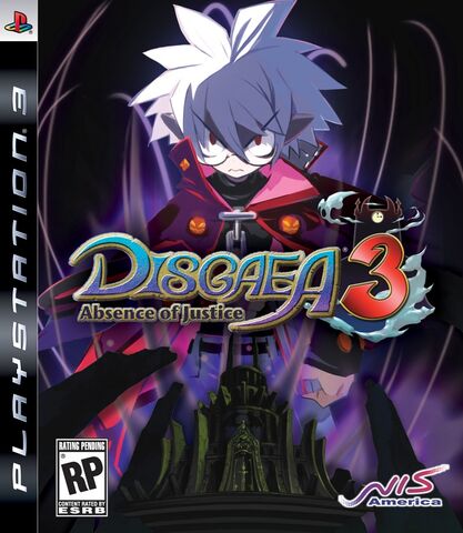
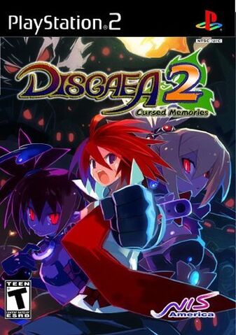
The Japanese box art shows almost all of the main characters alongside some of the generic classes, while the American box art (which was also used for the European release) only shows Mao, the main character. The Japanese art is noticably brighter, and the American art is darker. Cultural differences and such.

From what I've seen on the Disgaea wiki, this is also the limited edition cover for the JP version.
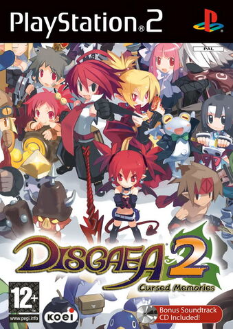
Except the other cover in question is from Europe:
So there are exceptions to this rule.
The European box art can go either way, it seems. For 1 and 3, it uses the same "main character and little else" formula that the American box art uses now, but for 2, it's a scaled down version of the Japanese box art.scorptatious said:It's weird really, it seems to be almost the opposite with Disgaea 1.MasterMasamune said:A trend I've seen with Japanese box art for RPGs compared to American box art is that Japanese art tends to focus on the group and American art tends to focus on the self. This tends to result in the Japanese box looking like a cluttered, ugly mess since it tries too hard to show every major character in the game, and the American box being dull, dark, and washed over, not at all conveying the actual tone of the game. A perfect example of this is the Disgaea series. Here's the box art for Disgaea 3.
The Japanese box art shows almost all of the main characters alongside some of the generic classes, while the American box art (which was also used for the European release) only shows Mao, the main character. The Japanese art is noticably brighter, and the American art is darker. Cultural differences and such.
From what I've seen on the Disgaea wiki, this is also the limited edition cover for the JP version.
Except the other cover in question is from Europe:
So there are exceptions to this rule.
I don't know what the European box art for Disgaea 4 is, however.
I'll agree with this, but I'm just so lazy that I can't type it for myself.Caiphus said:What do you know? Art is subjective.
Europe > US > Japan for me in this case.
Bear in mind that this is a Japanese game. It may be different for games made in Europe or America.
In their defense: As an MMORPG these are not necessarily fully formed characters but examples of classes you can choose from and representation of the standard party you might encounter playing the game. Having unidentifiable archetypes that fail to convey the mixture of martial and mystic would be a bad thing in this scenario because it would inform you less about the game.DoPo said:Also if the good guys didn't look like 100% of the good guy groups. Seriously, I mean, they probably don't want to put too many characters, however, they could have tried - I can see the warrior and the wizard, I'm pretty sure the guy in front should be a priest and the one to the right...well, OK, looks like a bard more than a thief, but it's still The Most Generic Band Of Heroes®©?. I mean, you could at least put the silhouettes of a larger band of people - you don't need to be able to distinguish each of them but I don't think any of the people from the Japanese cover look like the ones on the Eurapean version. Well, maybe the chick at 11 o'clock seems a bit like that bard figure but whatever.
[hr]
Ico or Fatal Frame might be a better example of bad NA boxes.
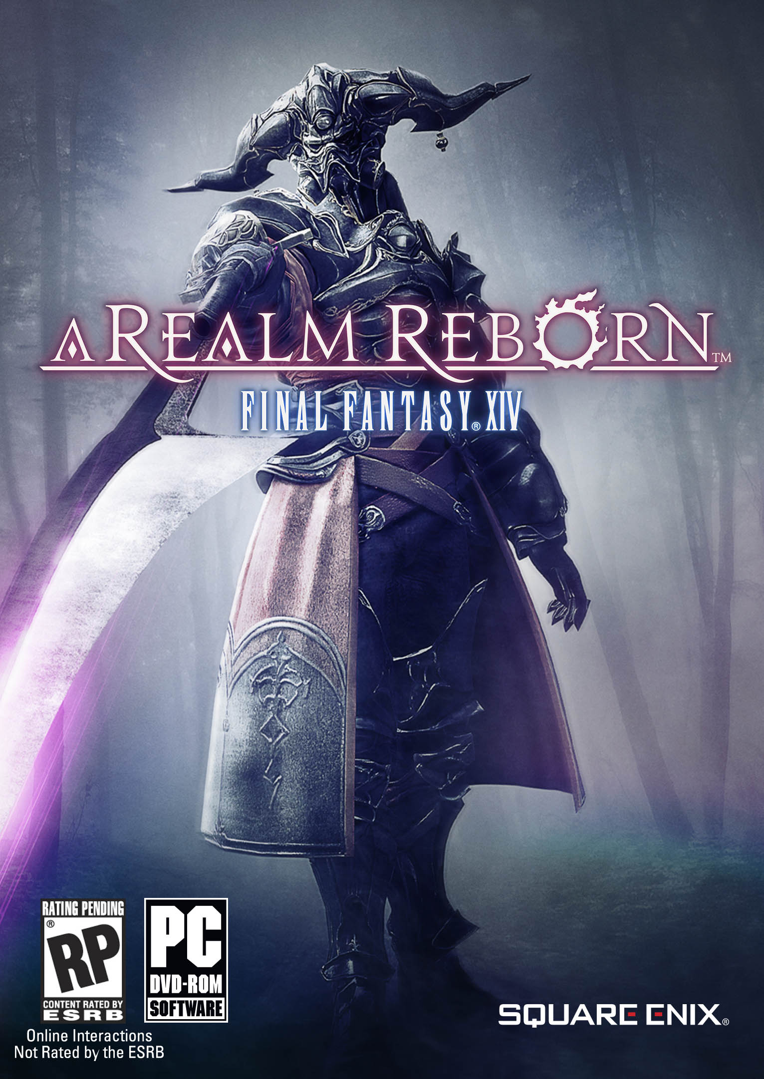
In regards to FFXIV ARR though I have to side with Europe on this one but will say the Japanese is better than the NA.
If the FFXIV logo was not already a group of random adventurers all banded together I would like the Japanese art more but they've redundantly used the same message twice instead of giving more information and the logo style clashes with the more descriptive character art in my opinion. Worse though is that the NA art has excluded the game's logo altogether.
Some of my favorite NA box art would include Guild Wars 2, Dragon Age: Origins, The Elder Scrolls V: Skyrim(Collector's Edition), Deus Ex: Human Revolution (Augmented Edition), Mirror's Edge, .Hack//Infection, Fatal Frame 2: Crimson Butterfly (PS2), Fatal Frame 3: The Tormented(PS2), and Folklore (Though in all fairness the Japanese art for Folksoul is more unique if not necessarily better).
There is likely more but those are the physical boxes I have on hand.
Soooo, yes there is good NA box art in my opinion but it is not the majority. My opinion also means very little because NA box art is localized for mass appeal and there are people that prefer it as art is largely subjective.
The Japanese covers I've seen in this thread, including the OP example, are way too cluttered. What in the holy hell is going on in those illustrations? Sure, the American habit of "lone armed badass looking murder ready" gets stale, but at least you generally know what you're looking at.
So to answer the original question; literally any American box art that doesn't the Japanese thing of having every random class and character on the cover is , in a relative sense, "good". Though I do like the EU box art in the OP the best of the three.
So to answer the original question; literally any American box art that doesn't the Japanese thing of having every random class and character on the cover is , in a relative sense, "good". Though I do like the EU box art in the OP the best of the three.
Well OP is looking for good American boxart, so that's why...Da Orky Man said:No-one brought up ICO yet?

Eh, still seems like the US version is trying to go for the "what looks cool and would sell more" approach again.
Look at what each cover is trying to convey.
Japanese: The background seems to be filled with people travelling around the cover, I'm guessing that was to signify a "world", just as it is a MMORPG.

Plus the large amount of people on the very front of the cover signifies a unity or a shared hero's journey. I suppose that does make sense for the game since "everyone can be the hero" and since this kind of teamwork vibe is very present in JRPGs.
Europe: A much cleaner cover if you ask me. It displays a few heros (though still signifying the message of teamwork) as small and insignificant compared to the goliath sized "evil" figure that looks down upon them. The fact that they only appear within the shadow of the figure suggests restraint meaning the heroes must break free from the figures rule. Pretty much displaying the whole purpose of the game and player.
American: This cover does not really bear much symbolism, just simply the bad guy pointing a sword. You COULD argue that this may come off as threatening, challenging the viewer. However seeing as this seems almost traditional with American covers, I'd say that it's just another case of "awesome guy (with awesome weapon) looking cool" syndrome.
Not that this really determines any of them as bad or good, though personally I prefer the European and maybe the Japanese if they removed the faded people in the background. Those figures make the entire piece a tad too busy.
Look at what each cover is trying to convey.
Japanese: The background seems to be filled with people travelling around the cover, I'm guessing that was to signify a "world", just as it is a MMORPG.
Plus the large amount of people on the very front of the cover signifies a unity or a shared hero's journey. I suppose that does make sense for the game since "everyone can be the hero" and since this kind of teamwork vibe is very present in JRPGs.
Europe: A much cleaner cover if you ask me. It displays a few heros (though still signifying the message of teamwork) as small and insignificant compared to the goliath sized "evil" figure that looks down upon them. The fact that they only appear within the shadow of the figure suggests restraint meaning the heroes must break free from the figures rule. Pretty much displaying the whole purpose of the game and player.
American: This cover does not really bear much symbolism, just simply the bad guy pointing a sword. You COULD argue that this may come off as threatening, challenging the viewer. However seeing as this seems almost traditional with American covers, I'd say that it's just another case of "awesome guy (with awesome weapon) looking cool" syndrome.
Not that this really determines any of them as bad or good, though personally I prefer the European and maybe the Japanese if they removed the faded people in the background. Those figures make the entire piece a tad too busy.
The Plunk said:HAHA! Is that picture supposed to represent multi-culturalism? I'm pretty sure everyone in that picture is at least 1/2 white!TheFinalFantasyWolf said:
So is the cast of every Final Fantasy. BOOM!
Captcha: "finger licking good"
.....I suppose the game could be.
I like the American box art in the op's example. I'm not sure whether it or the european artwork is better. Japanese is the worst. The only time I have like japanese bax arts like that(ALL THE CHARACTERS) is Fire Emblem: Awakening

Not really "more," just "more to it." The Japanese cover for FFXIV is encapsulating the game's scope and MMO atmosphere--a world full of lush characters, colors, and textures just waiting to be explored. The European box art is also showing off the depth of the world and hinting at epic adventures to be had, but with what appears to be a villain, suggesting a challenge to be met. But the American box art...you've got one threatening villain in front of a shrouded forest...and that's it. It speaks nothing of the scope or breadth or lushness of the world, and is almost devoid of all color except for that little bit on the lettering and the blade. The other covers did a lot to suggest that FFXIV is a BIG game with lots to do. The American box art seems to be advertising a much smaller game.Elijin said:So More = better?
Actually, pretty much all Final Fantasy characters are made to look Asian. It can be hard to tell, just as it's hard to tell in anime, but in truth they are simply idealized Asians.TheFinalFantasyWolf said:So is the cast of every Final Fantasy. BOOM!
I'm a sucker for illustrated box art.
As such the Japanese one is more appealing to me.
However this might not be true for every individual.
Some will say that the American box art is the best while the Japanese one is the worst.
I will say however that American box art lately has lacked a sort of...life into it.
It's not that they use high end CGI models...it's just how they utilize it.
Nothing about American box art really stands out. It's just generic character pose.
There is no situational story behind it.
Which is strange because in the 90's box art while cheesy tended to have more life in them.
Whether it be a warrior fighting a Minotaur, or a Barbarian about to put the sword in the head of a beast- there was at least some sort of situation there that you can headcanon what happened and how.
Now...more or less it's passable.
Here are some American Box art I do like:
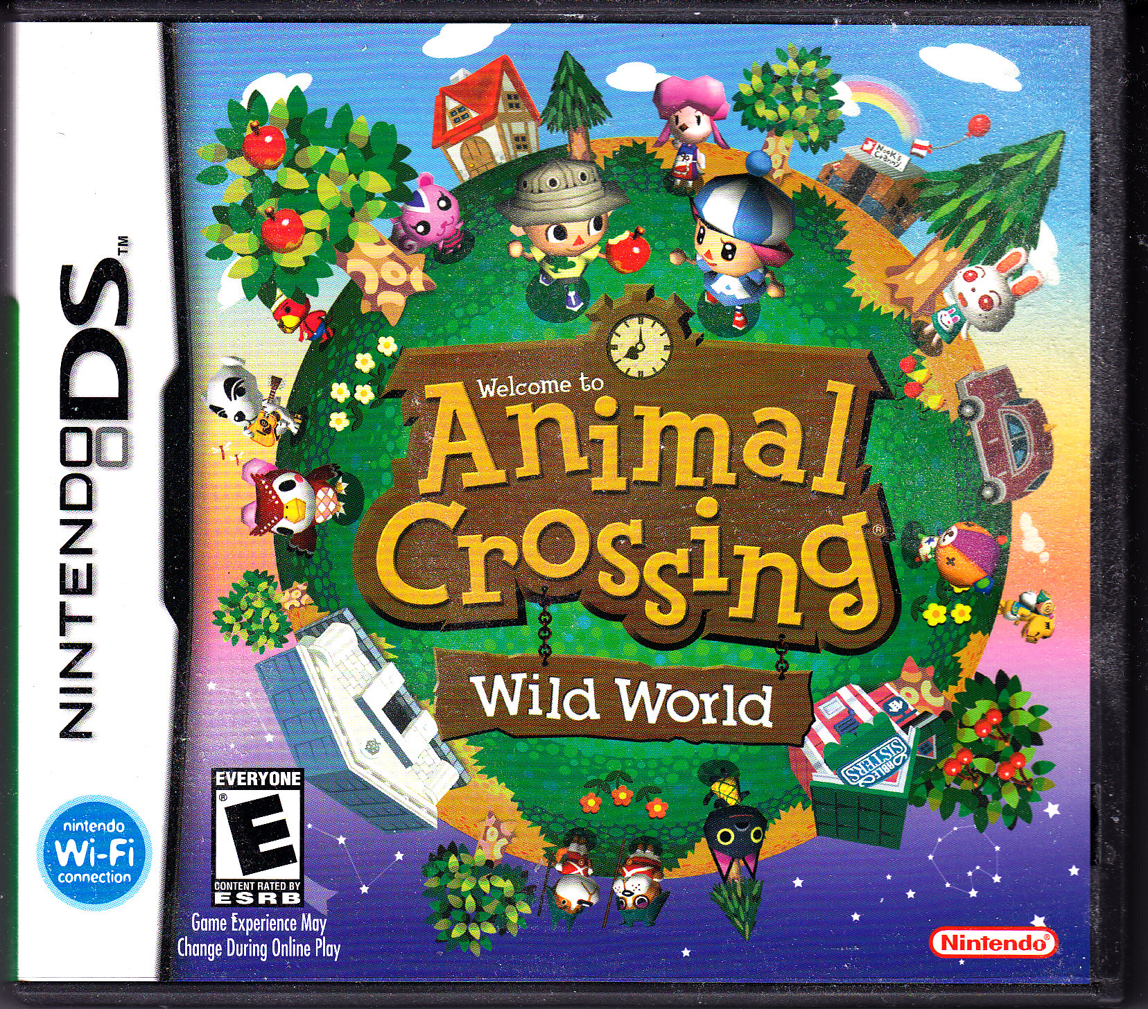


This one is personally my most favorite box art cover right now.
This one is personally my most favorite box art cover right now.