
ARTISTS!! Opinions needed
- Thread starter Denny Crane
- Start date
You're pretty good. Maybe work a little more on gradual shading. The light and dark areas are really good but maybe a little more grey so it isn't such a sharp contrast. But over all you're very talented, well done. Just FYI the Escapist has a Creative group that is pretty active you may want to join.
Could you please be so kind as to provide a link to this group.Rylot said:You're pretty good. Maybe work a little more on gradual shading. The light and dark areas are really good but maybe a little more grey so it isn't such a sharp contrast. But over all you're very talented, well done. Just FYI the Escapist has a Creative group that is pretty active you may want to join.
I'm not sure if you cropped it that way for the sake of our viewing in a zoomed in manner or its the actual piece to me the last two are too zoomed in but thats my personal issue nothing wrong artistically about it other then that they're very good. You could also place them on deviant art or others and if you're so inclined for future prints allow them to be sold via that site or on Etsy.
Here you go:Denny Crane said:Could you please be so kind as to provide a link to this group.Rylot said:You're pretty good. Maybe work a little more on gradual shading. The light and dark areas are really good but maybe a little more grey so it isn't such a sharp contrast. But over all you're very talented, well done. Just FYI the Escapist has a Creative group that is pretty active you may want to join.
http://www.escapistmagazine.com/groups/view/Escape-Artists
- Feb 7, 2011
- 7,960
- 2,329
- 118
- Country
- 'Merica
- Gender
- 3 children in a trench coat
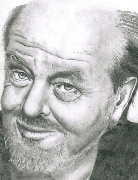
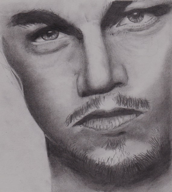
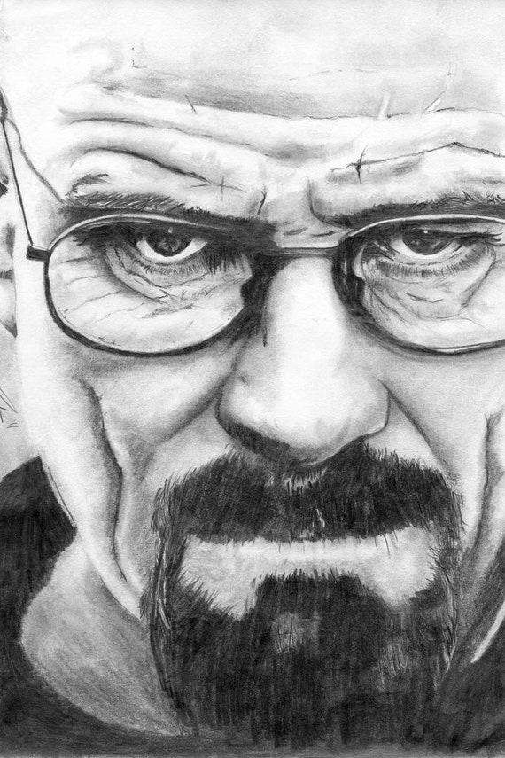
The last one is zoomed in like that because it's a copy of a promotional image from Breaking Bad, which is also really closely zoomed in on Bryan Cranston's face. In fact, I know the top and bottom picture are both copies of photographs, and I'm guessing the second one is as well, though that's not one I'm familiar with.white_wolf said:I'm not sure if you cropped it that way for the sake of our viewing in a zoomed in manner or its the actual piece to me the last two are too zoomed in but thats my personal issue nothing wrong artistically about it other then that they're very good. You could also place them on deviant art or others and if you're so inclined for future prints allow them to be sold via that site or on Etsy.
Anyway, my interpretation as a non-artist is that they're good, but they aren't something that you should really be showing to people as your own work, because it really isn't your work, you've essentially just copied another picture without adding any of your own style to it. As far as being copies of photographs and an attempt to show realism they are very good, but I don't think they express your artistic talent well, and are therefore difficult to critique. Really hope that doesn't come off like an insult, because I really don't mean it to be.
Looking good! ") Very, very good.
Very, very good.
The only recommendation I'd make is to try shading along with the contours rather than against them. In the second picture, it looks like the lips are shaded horizontally and the nose is shaded vertically. Traditional art techniques would suggest doing the opposite. For example, shade the upper lip from the top to the bottom, following the curves of a real lip. Start light and darken the strokes where the lips come together, but ALWAYS keep the direction of your strokes consistent. Doing this, you shouldn't need to draw a harsh line between the lips because the shading will separate them for you.
This heightens the realism of your drawings by re-creating the natural shadow patterns you'd see in the 3D world. It's a really simple technique that can boost all of your work to the next level, whether you're attempting photorealism or more individualized styles.
Very, very good.The only recommendation I'd make is to try shading along with the contours rather than against them. In the second picture, it looks like the lips are shaded horizontally and the nose is shaded vertically. Traditional art techniques would suggest doing the opposite. For example, shade the upper lip from the top to the bottom, following the curves of a real lip. Start light and darken the strokes where the lips come together, but ALWAYS keep the direction of your strokes consistent. Doing this, you shouldn't need to draw a harsh line between the lips because the shading will separate them for you.
This heightens the realism of your drawings by re-creating the natural shadow patterns you'd see in the 3D world. It's a really simple technique that can boost all of your work to the next level, whether you're attempting photorealism or more individualized styles.
Very good, I like the first one the most, it has good contrast, but I think it could be pushed even more. Just in little areas (like in the beard and hair) to really accent it. Very nice texture there by the way and good job on the wrinkles (in both the first and the third).Denny Crane said:snip
The second looks a little too grey for me, it might just have been the photograph though and the lighting, and I second TenFootBunny on the lip shading suggestion.
On the third, I really like high contrast drawings more than grey, give me harsh highlights and dark shadows over midtones any day. That being said, you almost have a little too much contrast, you're loosing the hair texture in the beard that looked so good in the first drawing.
Also The Escapist Creative Society [http://www.escapistmagazine.com/groups/view/The-Escapist-Creative-Society] is another pretty active user group with a lot of artists in it.
Tidy work, man, good on ya.
That said, I'm not sure what you specifically wanted people to comment on. I assume it's a physical illustration, scanned.. Pencils and thumbs / erasers to shade, but with the quality of 1:1 stylus + HD monitor interfaces and material modelling illustration software, it's not impossible for this sort of thing to be made digitally anymore (still takes a long bloody time, but undo functions help). What's your media / technique / dimensions?
The first is the strongest, technically. The gradient of shading in it confers a greater depth and vitality to the subject than the other two. It looks like you communicated the properties of light, beyond making a good illustration. Nicholson's a good subject, but the photo and picture work really well too... The right eye is a great focal point that sets up a well working balanced asymmetry and neat 'rule of thirds' / phi ratio with the rest of his face. It's a really tight piece.
The other two communicate the subject; the line work is fine, but they don't have the depth you got on Nicholson. They feel more 2D than the first. Part of that's just the source material, part is the scope of contrast and shading. The second one is probably the weakest, in that it's the least vivid, the angle and crop are kinda strange leave out interesting detail in favor of dead space. If you tell me the answer, I'll start seeing it as who it is, but I don't know if you were drawing Dicaprio or Aaron Paul.
Cranston's well done. A little more fine detail / visual info and definition would help it pop. Here's a timelapse illustration that might give you some ideas:
Your Nicholson is perfect and I wouldn't change a thing. It's fine to do overall 'darker' and more 'desaturated black and white' stuff like the second - paul/dicaprio, but actually going even darker with ink helps carve a 'deeper' impression, with that range of opacity.
For what it's worth, I'm not an artist, so take this as constructive criticism from a layman, but I do like your stuff. Keep it up.
While I understand your point, one of the best ways to practice real life sketching is to use a Photograph. This means your "model" is holding their pose perfectly, for free. This is what is known as a "study" or a focus on a particular technique, with an available reference for measuring your success. If artistic integrity, or plagiarism is a concern, include Artist and Title in your own work. EG "Leonardo DiCaprio Sexy Sot" by A. Photographer.- A sketch by A. Artist.Dirty Hipsters said:The last one is zoomed in like that because it's a copy of a promotional image from Breaking Bad, which is also really closely zoomed in on Bryan Cranston's face. In fact, I know the top and bottom picture are both copies of photographs, and I'm guessing the second one is as well, though that's not one I'm familiar with.white_wolf said:I'm not sure if you cropped it that way for the sake of our viewing in a zoomed in manner or its the actual piece to me the last two are too zoomed in but thats my personal issue nothing wrong artistically about it other then that they're very good. You could also place them on deviant art or others and if you're so inclined for future prints allow them to be sold via that site or on Etsy.
Anyway, my interpretation as a non-artist is that they're good, but they aren't something that you should really be showing to people as your own work, because it really isn't your work, you've essentially just copied another picture without adding any of your own style to it. As far as being copies of photographs and an attempt to show realism they are very good, but I don't think they express your artistic talent well, and are therefore difficult to critique. Really hope that doesn't come off like an insult, because I really don't mean it to be.
From a technical standpoint, excellent work. As has been mentioned, a slightly more gradual shift in lighting would be the diffenece in a more Photograph like quality. The hard distinction between shades comes off as slightly anime, and works better with colours than black and white. Try some smudging through the borders of the shadowed zones.
Damned fine job though.
- Feb 7, 2011
- 7,960
- 2,329
- 118
- Country
- 'Merica
- Gender
- 3 children in a trench coat
I realize all of this, and the point of my post wasn't "ooooh plagiarized" or anything of the sort. The point was that this is essentially just practice. They're sketches without actual artistic merit since all they are is practice of one's technique. It's like a programmer practicing programming by coding their own version of tetris. Sure, it's kind of cool and if you do it correctly you feel good about it, but at the end of the day if you show it to other people all they're going to say is "it's tetris, woopty doo."SilverStuddedSquirre said:While I understand your point, one of the best ways to practice real life sketching is to use a Photograph. This means your "model" is holding their pose perfectly, for free. This is what is known as a "study" or a focus on a particular technique, with an available reference for measuring your success. If artistic integrity, or plagiarism is a concern, include Artist and Title in your own work. EG "Leonardo DiCaprio Sexy Sot" by A. Photographer.- A sketch by A. Artist.Dirty Hipsters said:The last one is zoomed in like that because it's a copy of a promotional image from Breaking Bad, which is also really closely zoomed in on Bryan Cranston's face. In fact, I know the top and bottom picture are both copies of photographs, and I'm guessing the second one is as well, though that's not one I'm familiar with.white_wolf said:I'm not sure if you cropped it that way for the sake of our viewing in a zoomed in manner or its the actual piece to me the last two are too zoomed in but thats my personal issue nothing wrong artistically about it other then that they're very good. You could also place them on deviant art or others and if you're so inclined for future prints allow them to be sold via that site or on Etsy.
Anyway, my interpretation as a non-artist is that they're good, but they aren't something that you should really be showing to people as your own work, because it really isn't your work, you've essentially just copied another picture without adding any of your own style to it. As far as being copies of photographs and an attempt to show realism they are very good, but I don't think they express your artistic talent well, and are therefore difficult to critique. Really hope that doesn't come off like an insult, because I really don't mean it to be.
There's no point in showing your practice sketches to people for critique. If you want critique on something it's better to show them something original and unique, which will show your mastery of a particular technique much better than a recreation of a photograph would.
Hmm a lot to think about.
Thanks guys.
Most of my work is up here.
https://www.etsy.com/au/shop/vandenHoorn
Thanks guys.
Most of my work is up here.
https://www.etsy.com/au/shop/vandenHoorn