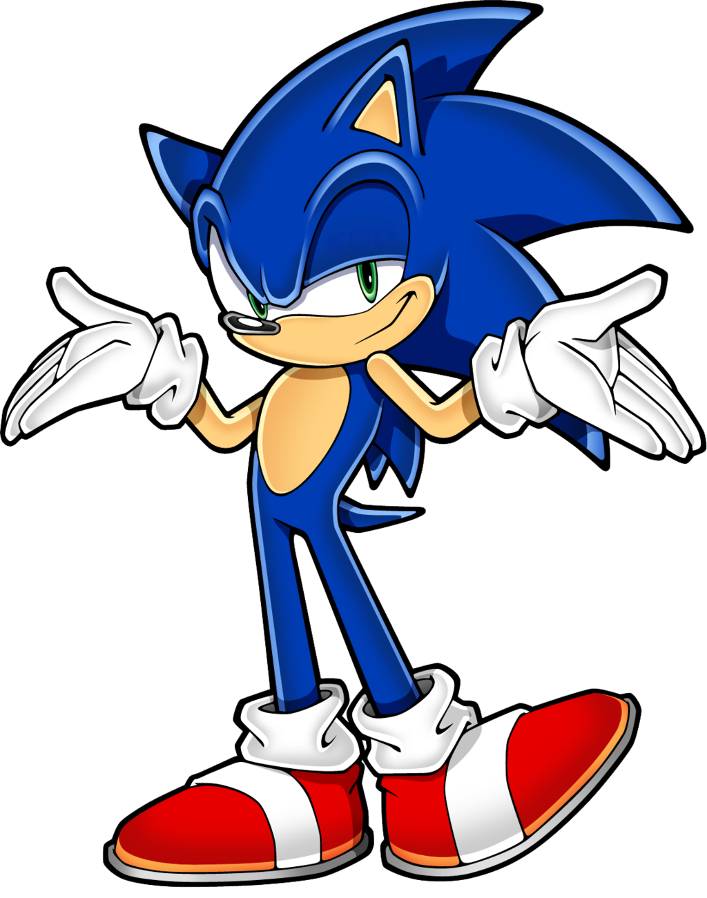
The problem here is that those re-imagined Sonic pics think Sonic was supposed to have 2 distinct eye balls. There wasn't enough emphasis here on the bounce pads.
Check Out These Rejected Sonic Boom Sonic And Eggman Redesigns
- Thread starter Steven Bogos
- Start date
They'd be fine as a cartoon but they're a huge departure of what made sonic recognizable.Story said:Not gonna lie, I was never into Sonic's esthetic so I really dig some of these.
The superfluous bandages are soo 90s that I like them in the new design though
I'd prefer some of those designs if only because Sonic would finally have two separate eyes rather than one, gross, large eye with two pupils...
You either need to get your eyes checked, or you linked the wrong image, because every Sonic on that collage you posted has the exact same design.Snotnarok said:But Sonic since his concept on a napkin to Sonic Generations has changed a lot.
That was my thought as well, but I just went back and looked, and it looks like he changed his shoes a few times.WhiteTigerShiro said:You either need to get your eyes checked, or you linked the wrong image, because every Sonic on that collage you posted has the exact same design.Snotnarok said:But Sonic since his concept on a napkin to Sonic Generations has changed a lot.
Yeah, a few of 'em. Notably they're all the ones where he has those goggles and a snowboard, so they're all probably from that Mario & Sonic Winter Olympics game (whatever it was called). Otherwise the rest are the same red shoes with a white stripe and yellow buckle, with a couple of them having a slightly different shape to the shoes.Signa said:That was my thought as well, but I just went back and looked, and it looks like he changed his shoes a few times.WhiteTigerShiro said:You either need to get your eyes checked, or you linked the wrong image, because every Sonic on that collage you posted has the exact same design.Snotnarok said:But Sonic since his concept on a napkin to Sonic Generations has changed a lot.
Still though, I'm hoping that when he said Sonic "has changed a lot", he was referring to more than just his shoes. That would just smack of Smithers yelling "But she's got a new hat!"
Edit: And I'll note that I'm not saying that he's wrong, as I haven't paid enough attention to Sonic as a franchise to really know if he's ever had any major changes to his character design. I was just pointing out that the image used as evidence wasn't exactly convincing. I'll also note that I don't have any problem with them changing Sonic's look; just that the way that the characters look in Sonic Boom is (IMO, granted) terrible. By all means they can experiment (and some of those rejected images would have been rather interesting to see), but I still reserve the right to decide if the new design is better or worse than what they had before.
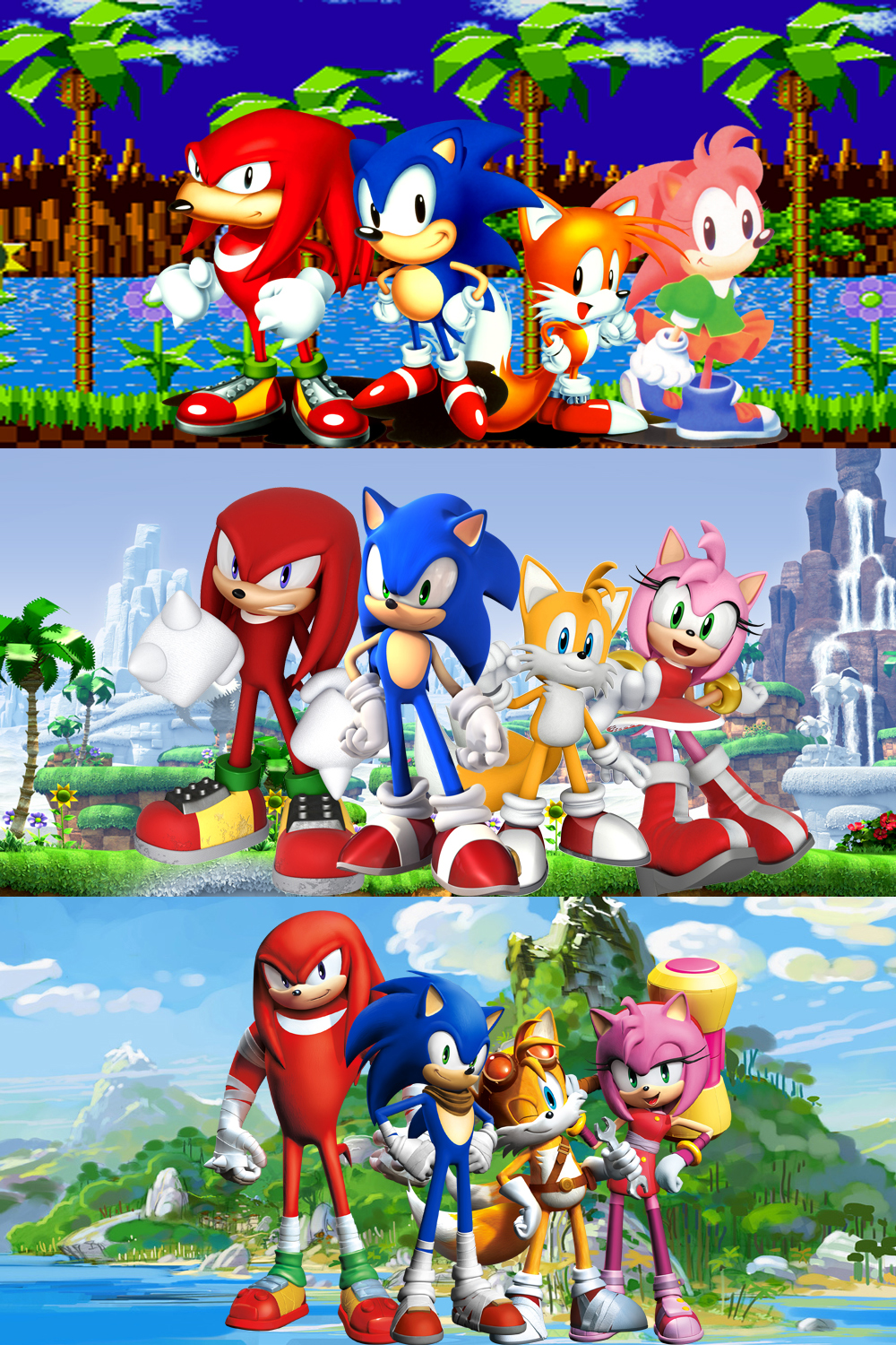
So black eyes to green eyes, short to tall, round to thin, mouth positioning, different shoes, shades, taller again, longer spines, even longer spines, shorter spines, then made shorter with thicker limbs, different rendering styles, is the exact same design?WhiteTigerShiro said:You either need to get your eyes checked, or you linked the wrong image, because every Sonic on that collage you posted has the exact same design.Snotnarok said:But Sonic since his concept on a napkin to Sonic Generations has changed a lot.
This guy looks identical

to this?

Whatever you think then.

Edit:
Sonic nor his friends have ever seen a redesign till Sonic Boom. Fact:

Identical? No. Same design? Yes. Different style does not mean different design.Snotnarok said:So black eyes to green eyes, short to tall, round to thin, mouth positioning, different shoes, shades, taller again, longer spines, even longer spines, shorter spines, then made shorter with thicker limbs, different rendering styles, is the exact same design?WhiteTigerShiro said:You either need to get your eyes checked, or you linked the wrong image, because every Sonic on that collage you posted has the exact same design.Snotnarok said:But Sonic since his concept on a napkin to Sonic Generations has changed a lot.
This guy looks identical
(( Image Snipped ))
to this?
(( Image Snipped ))
Whatever you think then.
WhiteTigerShiro said:Identical? No. Same design? Yes. Different style does not mean different design.Snotnarok said:So black eyes to green eyes, short to tall, round to thin, mouth positioning, different shoes, shades, taller again, longer spines, even longer spines, shorter spines, then made shorter with thicker limbs, different rendering styles, is the exact same design?WhiteTigerShiro said:You either need to get your eyes checked, or you linked the wrong image, because every Sonic on that collage you posted has the exact same design.Snotnarok said:But Sonic since his concept on a napkin to Sonic Generations has changed a lot.
This guy looks identical
(( Image Snipped ))
to this?
(( Image Snipped ))
Whatever you think then.
Longer legs, longer thicker spines, big green eyes, mouth has been in the middle or on the side from game to game, smaller & thinner belly, bigger head, bigger hands, that's not a change in just art style, that's a change in proportions & design, the rendering in adventure with shines and stuff, that's style.
With the new design the biggest thing to note is Sonics arms are blue, other than that he has bed head, wraps and a scarf. That's like saying him posing in Santa outfits is a drastic change of design.

Well whatever, art's subjective so like I said, think whatcha want. I don't really think it's something that needs debating but I think the redesign people are overreacting, especially since SEGA came out and admitted this is a side thing and isn't part of the series. So I don't think we'll see Sonic Team making a game like this.
I'm fairly convinced that Sonic has survived this long solely based on his design. Why would you change the one great thing about him?
Eh, not really. There
I'd also say his appearance in game has changed less than in his cartoon drawings, for example he's always had longer legs and a smaller torso in the actual games.

Eh, not really. There
It's all just tweaks here and there dude. I'm not saying they look identical, but the only dramatic alteration I see is his torso, the rest is stuff that most people wouldn't even pick up on if you didn't compare them side by side and point it out. For example I didn't notice his eye color.Snotnarok said:So black eyes to green eyes, short to tall, round to thin, mouth positioning, different shoes, shades, taller again, longer spines, even longer spines, shorter spines, then made shorter with thicker limbs, different rendering styles, is the exact same design?WhiteTigerShiro said:You either need to get your eyes checked, or you linked the wrong image, because every Sonic on that collage you posted has the exact same design.Snotnarok said:But Sonic since his concept on a napkin to Sonic Generations has changed a lot.
This guy looks identical

to this?

Whatever you think then.
I'd also say his appearance in game has changed less than in his cartoon drawings, for example he's always had longer legs and a smaller torso in the actual games.

I have a bias dislike for Sonic (Something about his design makes me want to punch him) but some of these look pretty good. I might've been more interested in Sonic if he looked like that last pic.
Not digging those Eggman designs, though.
Not digging those Eggman designs, though.
Johnny Novgorod said:Eggman's redesign would've rendered his nickname moot.
It wont! Just have him say egg puns.
Really wish they would have gone with the eggman redesign. After seeing the game and the show, I can safely say the more this abomination distanced itself from the original, the better.

