- Sep 8, 2014
- 1,109
- 64
- 53
- Country
- Canada
- Gender
- Male
Martin and I performed a Canadian mind meld, thus leading to the creation of this review. If you want to blame anyone for this, blame his stroke-ridden mind. That being said, this will be a series of reviews going over cover art for video games, both good and bad, as I have done a single art course at the university I go to, which I got an A in, thus making me highly qualified to write this, though Martin’s influence upon my mind also helps in creating my informed critique. Unlike Martin, I don’t believe in numbers as they are but an illusion of a feeble mind, thus there will be no number score for these reviews, instead I will outright tell you if something is good or bad, as I doubt most people can determine quality if it came and shit on their front door. Lets do this:
These are all masterpieces:

I know I said it was bad earlier in a comment of a different review, but that was referring to the art of the original game, a generic anime group of jackasses, a gathering one can observe in countless weeb games. No, the true artistry of this work is due to what it is selling. Most games try to sell you an experience, hiding their capitalistic desires. This, however, does not apply here. This is the true capitalistic dream, with no hiding of intention. You pick this up and you know you are buying a game. You see the product, thus there is no illusion of intent from Konami, to make money. This bold approach of treating the customer base with true honesty is one to admire as this is a masterpiece to the power of capitalism.

Rarely do we, as gamers, see such boldness in box art. The industry knows its market, and thus who they need to appeal to, which they do so consistently. Thus, we should applaud this attempt to reach out to the redneck portion of the population, to bring in fresh blood into enjoying this medium. A trustworthy man greets the observer, along with his trusty banjo, letting the redneck population know that they are welcomed here. We see a description of the game to the side, to let the traditional audience of video games know what to expect. It is a bold choice, as words are known to scare rednecks, but the man with the banjo is to reassure them that all will be ok, as nothing with a banjo can ever hurt them. This bold masterpiece attempted to build a bridge between two worlds.

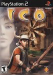
The USA gives no regards in the artistic merits of the other, weaker, countries of the world. Thus, this masterpiece was crafted by disregarding the intent of the original creators and blazing their version of who this game should be purchased. We see our young protagonist with a stick in hand, nervous yet determined, ready to deal with the struggles that will come to face him. A mysterious woman observes him, leading to a potential mystery that the player might have to overcome. This lets us know that there is an adventure ahead of, yet what the adventure will have in store of us is still unknown. One of the biggest mistakes one can do is put enemies on the cover, as it ruins potential surprises in the future. The mystery and intrigue is visible to even the most unobservant, thus making this masterpiece approachable to all.
Now we move onto visual rejects, the bottom of the barrel when it comes to box art. Theses terrible box covers could have been improved if the designer had working eyes and a semblance of skill. Alas, they do not, so thus we shall begin with this written execution of mistakes.

The American version fixed the mistakes of this inferior original version. The first issue I have with this is that it helped create the hand-holding fascination that weebs have, as we see some characters hand-in-hand, going somewhere. For that fact alone should condemn this travesty to the darkest pits of hell, but alas, the mistakes continue. They are running of to nowhere in particular, thus failing to show that this game would have any form of focus. The architecture on display does not make sense, with a ladder going nowhere useful. This is a rookie mistake many artists make, failing to apply logic to their creation. I am glad that the American version improved upon this illogical, weeb-creating mistake.

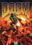
They came close to making something manageable, yet all the small mistakes destroy any hope of this reaching the lofty level of acceptable. What is this armor? People rightly criticize bikini armor on women, yet this man showing off is abs while the legions of hell chase him gets a pass? I say no! To the right we see a demon missing a shot with his fireball at pretty much point-blank range. If this is the quality of mook that Hell employees, then there should be no challenge (which the bad armor design also emphasizes). The demon to the bottom left is looking to the viewer, trying to give a cheeky grin, implying that he got this, yet the illusion of strength fails due to the other elements observed within the piece. And thus, the name is the final disappointment. Doom implies a sense of difficulty, but I see none among these cockeyed demons and ab-showing protagonist. This cover desperately wants to come off as badass, but fails, like a typical 8th grader, who was probably the designer of this visual mistake.

Its first mistake is that it spits in the face of my beliefs. Numbers aren’t real, and this game claims that they are. Once upon a time, I thought it said Vii, but just capitalized all of it like a jackass, but then I was informed that it was a number, which are the devil’s tools. But let us move on to the other artistic mistakes made here. For a game advertising multiple discs, there is a lot of empty white space on this cover. It tells us that nothing is happening, as if there was something important for us to know going into the game, they would’ve shown it. All this white space tells me that this game has nothing in it. Now we move onto what little is there. I blurry image of a tower, indicating to the tower is launching off into space for some reason. We also see a skinny-ass failure standing back onto the viewer, with a sword so large that he really should be falling backwards, unless the sword is made of paper mache, in which case he is just a weak ass poser. So, this art tells us that we will be playing a game featuring a loser while nothing happens. Why would you want to tell your potential customers something like this unless you are a talentless hack?
I think the mind meld is wearing off... PEPSI PEPSI, I AM PEPSI, YOU ARE PEPSI! That was odd, I think I got part of his stroke there. More reviews will come out in the future.
These are all masterpieces:

I know I said it was bad earlier in a comment of a different review, but that was referring to the art of the original game, a generic anime group of jackasses, a gathering one can observe in countless weeb games. No, the true artistry of this work is due to what it is selling. Most games try to sell you an experience, hiding their capitalistic desires. This, however, does not apply here. This is the true capitalistic dream, with no hiding of intention. You pick this up and you know you are buying a game. You see the product, thus there is no illusion of intent from Konami, to make money. This bold approach of treating the customer base with true honesty is one to admire as this is a masterpiece to the power of capitalism.

Rarely do we, as gamers, see such boldness in box art. The industry knows its market, and thus who they need to appeal to, which they do so consistently. Thus, we should applaud this attempt to reach out to the redneck portion of the population, to bring in fresh blood into enjoying this medium. A trustworthy man greets the observer, along with his trusty banjo, letting the redneck population know that they are welcomed here. We see a description of the game to the side, to let the traditional audience of video games know what to expect. It is a bold choice, as words are known to scare rednecks, but the man with the banjo is to reassure them that all will be ok, as nothing with a banjo can ever hurt them. This bold masterpiece attempted to build a bridge between two worlds.

The USA gives no regards in the artistic merits of the other, weaker, countries of the world. Thus, this masterpiece was crafted by disregarding the intent of the original creators and blazing their version of who this game should be purchased. We see our young protagonist with a stick in hand, nervous yet determined, ready to deal with the struggles that will come to face him. A mysterious woman observes him, leading to a potential mystery that the player might have to overcome. This lets us know that there is an adventure ahead of, yet what the adventure will have in store of us is still unknown. One of the biggest mistakes one can do is put enemies on the cover, as it ruins potential surprises in the future. The mystery and intrigue is visible to even the most unobservant, thus making this masterpiece approachable to all.
Now we move onto visual rejects, the bottom of the barrel when it comes to box art. Theses terrible box covers could have been improved if the designer had working eyes and a semblance of skill. Alas, they do not, so thus we shall begin with this written execution of mistakes.

The American version fixed the mistakes of this inferior original version. The first issue I have with this is that it helped create the hand-holding fascination that weebs have, as we see some characters hand-in-hand, going somewhere. For that fact alone should condemn this travesty to the darkest pits of hell, but alas, the mistakes continue. They are running of to nowhere in particular, thus failing to show that this game would have any form of focus. The architecture on display does not make sense, with a ladder going nowhere useful. This is a rookie mistake many artists make, failing to apply logic to their creation. I am glad that the American version improved upon this illogical, weeb-creating mistake.

They came close to making something manageable, yet all the small mistakes destroy any hope of this reaching the lofty level of acceptable. What is this armor? People rightly criticize bikini armor on women, yet this man showing off is abs while the legions of hell chase him gets a pass? I say no! To the right we see a demon missing a shot with his fireball at pretty much point-blank range. If this is the quality of mook that Hell employees, then there should be no challenge (which the bad armor design also emphasizes). The demon to the bottom left is looking to the viewer, trying to give a cheeky grin, implying that he got this, yet the illusion of strength fails due to the other elements observed within the piece. And thus, the name is the final disappointment. Doom implies a sense of difficulty, but I see none among these cockeyed demons and ab-showing protagonist. This cover desperately wants to come off as badass, but fails, like a typical 8th grader, who was probably the designer of this visual mistake.

Its first mistake is that it spits in the face of my beliefs. Numbers aren’t real, and this game claims that they are. Once upon a time, I thought it said Vii, but just capitalized all of it like a jackass, but then I was informed that it was a number, which are the devil’s tools. But let us move on to the other artistic mistakes made here. For a game advertising multiple discs, there is a lot of empty white space on this cover. It tells us that nothing is happening, as if there was something important for us to know going into the game, they would’ve shown it. All this white space tells me that this game has nothing in it. Now we move onto what little is there. I blurry image of a tower, indicating to the tower is launching off into space for some reason. We also see a skinny-ass failure standing back onto the viewer, with a sword so large that he really should be falling backwards, unless the sword is made of paper mache, in which case he is just a weak ass poser. So, this art tells us that we will be playing a game featuring a loser while nothing happens. Why would you want to tell your potential customers something like this unless you are a talentless hack?
I think the mind meld is wearing off... PEPSI PEPSI, I AM PEPSI, YOU ARE PEPSI! That was odd, I think I got part of his stroke there. More reviews will come out in the future.
Last edited:
