maninahat said:
I was looking over fantasy maps, as any healthy adult human might, and noticed how every bloody one follows one of two trends:
Basically a) is for your Redwalls and your Eragons and whatever. TVtropes calls it a "Left justified map", where there is a big sea on the left and the rest is a big land mass with the good bits on the west and the deserts, exotic stuff and bad guys in the East. b) Borrows heavily from reality, in that you have the snowy bit up north, the temperate bit in the middle, and (err) the deserts, exotic stuff and bad guys again in the East. In games its a step worse in that these land masses immediately switch from one biome to another without any concession to realistic geography or climate. Writers aren't geographers or cartographers, they are guys who need a bad thing looming off in the distance, away from their calm, green, ersatz European medieval setting, and as a result, fantasy maps tend to fall into obvious categories.
There's a few things you're overlooking. Although it is true that fantasy map makers tend to not be professional cartographers versed in proper map theory, they also don't tend to be writers. They're artists, either making their own project or, more likely, taking a commission for a writer's project. As such, artists tend to follow the common rules of art as applied to the particular criteria of the specific project. "Left-justified" maps, for instance, are not just popular because Lord of the Rings sets a famous precedent (although of course precedent is an important factor, as it is in all things, as success tends to follow success). And its not just because of some Euro-centric worldview with snide overtones of racism. It follows artistic theory in the way humans are most likely to first read a piece of art: left to right reading cultures' eyes will begin in the top left corner, and move diagonally to the bottom right, with an eventual neutral resting spot just above center. As such, the left side of the work, particularly the upper part, should not be the most visually busy part of the map, as it will push too much at the reader too fast. As such, important metadata, such as a title, is often placed at the top left, to introduce the map, with the rest of the map unfolding from there (although this rule is very open to bending, as per the needs of the map, you can find the title anywhere along the margins on the top or the left; you'll still very rarely see it on the right, especially the bottom right). Titles and such display best with an ocean for a backdrop, to emphasize the title.
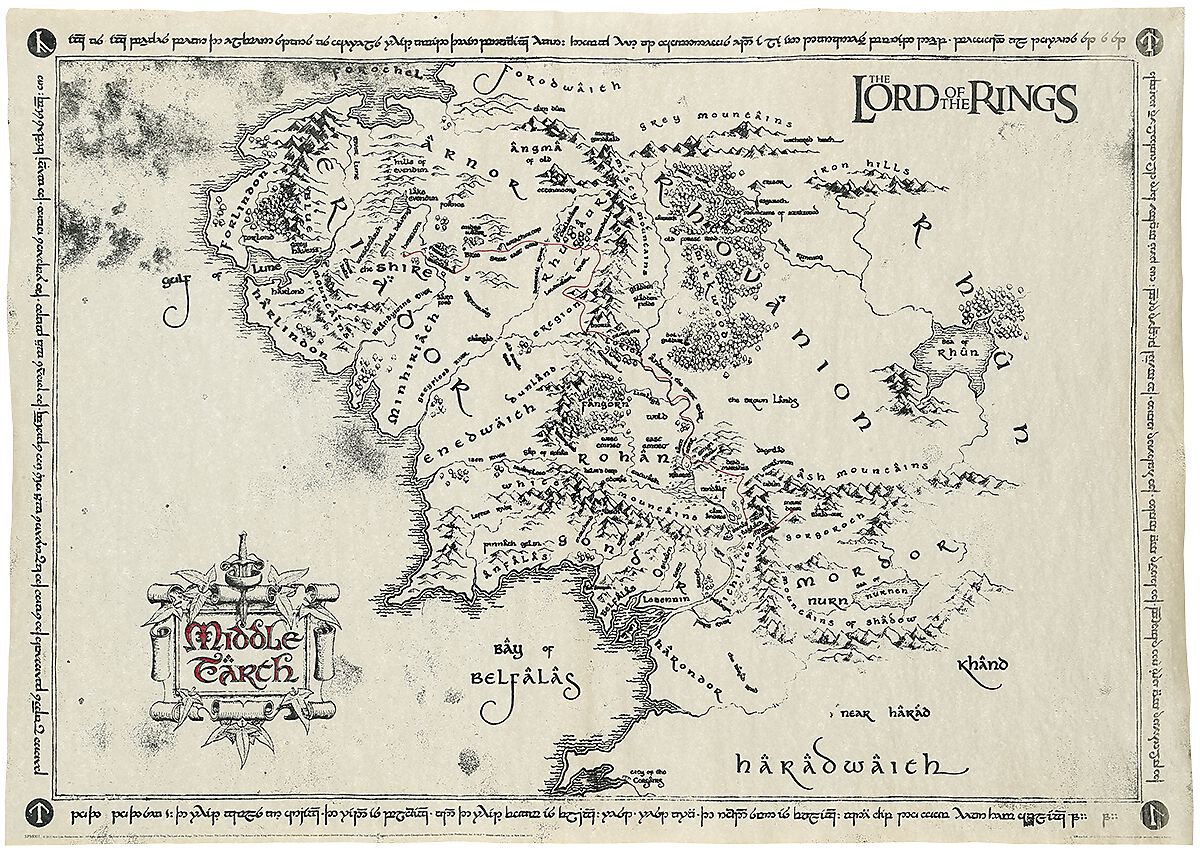
This is also why the "good guys" tend to be in the middle or west/north, and the "bad guys" the east/south. Because that fulfills dramatic convention as a piece of narrative art best; introduce the world at the beginning of where people will read first, then show them the people/places they're supposed to care about second, then introduce the conflict last. It's simply artistic design. The Middle-Earth design is pretty much the epitome of this, as the way a reader will first read a map will follow Frodo's journey from beginning to end whilst feeling very natural; it is very much a thing of brilliance.
As for "faux-realistic" maps, yes, artists are not geographers. They are extremely unlikely to be able to articulate what makes a "realistic" map for a general reference guide. Indeed, going back to Lord of the Rings, the area where Mirkwood is should probably be as dry as Tibet, what with the mountain ranges blocking sea winds. This is why, when the job is to provide a map meant to be an
accurate general reference, rather than a straight story telling tool, it is far simpler to rip something off of real world geography. We're all so familiar with our world's map that even though few of us can articulate what real geography is, we do have an instinct for it. If you try to make a map from scratch with no knowledge of geography, it is gonna feel very fake very quick, like... just about all overworlds in every JRPG, at least the ones I've played. Or even the Lord of the Rings map, with its Mordor that's a box of mountain ranges with an inland sea that flows
away from the ocean. If you simply take bits and pieces of real world geography, you'll end up cobbling something together that at least maintains a degree of verisimilitude, and naturally, media from the West is going to follow a Western perspective of geography if that's what they're instinctively familiar with. Major inspirations from the US and Europe.
So that's what it comes down to: people unfamiliar with the scientific principles of a subject asked to portray that subject are going to fall back onto the tools that they
are familiar with, and over enough iterations there will very naturally be similar patterns in the outcome because everybody is filtering their inputs through the same pattern called "rules of art".
Maps that don't follow these rules tend to either be a) a move away from how geography is presented contemporary (either taking cues from some form of map from history, or going full hog on making a map a piece of art rather than as any useful tool), or b) a fucking mess, to a lesser or greater degree. Most fantasy maps are not brilliant pieces of narrative design. They muddle their message through not following rules on how the reader will read the map, or there'll be extraneous detail that creates distraction, or they won't follow "figures and grounds" theory wherein important features are emphasized whilst background features are de-emphasized, etc. The map may still
function in the end, but lots of people are gonna skip over it as not being informative enough, quickly enough. Not even my precious Middle Earth map is immune to this criticism; Tolkien's original publications muddle the map too much with large print region names that distract from smaller labels that are actually much more relevant to the story.
maninahat said:
Because a map traditionally isn't just functional. Historically they reflect the society that made them, the limitations of their knowledge, and the failures of their measuring tools which is often why countries are way out of proportion and there is an unusual art style employed to emphasise things of cultural significance, like this Medieval map of the world [http://lisadeam.com/medieval-maps/] (for reference, Jerusalem is in the middle, England in the North West, and a few bible locations for good measure). That map isn't attempting to accurately represent the World, it is a religious tool used by priests.
That is a misrepresentation of historical intentions. Of course maps were meant to be functional. Reading historical maps for the perspective of their creators and users like an art piece is an inherently modernist perspective. It took months or years and lots of expensive ink and expertise to make those overly complex things, and they looked like ass. There wasn't even a point to them being decorative, given that they still relied on the reader having basic literacy, not a guarantee even amongst nobility for a long, long time.
Just because there was no science to maps doesn't mean that they weren't meant to be functional. Absolute geographic relationships are of course impossible to expect from most historical maps. But that doesn't mean that there was no value in displaying
relative relationships. If Anglemesh is the first town along the road going out of the north of Jerusalem, a map with a road going to the north of Jerusalem with Anglemesh being the first town along it is quite good enough for finding Anglemesh from Jerusalem, or for having an idea that Anglemesh is north of Jerusalem when you get a letter in from the Crusades saying that they're in Anglemesh. Even for the classic less detailed T-O maps, it showed the relative position of the known continents with Jerusalem at their crossroads, a great visualization aid.
maninahat said:
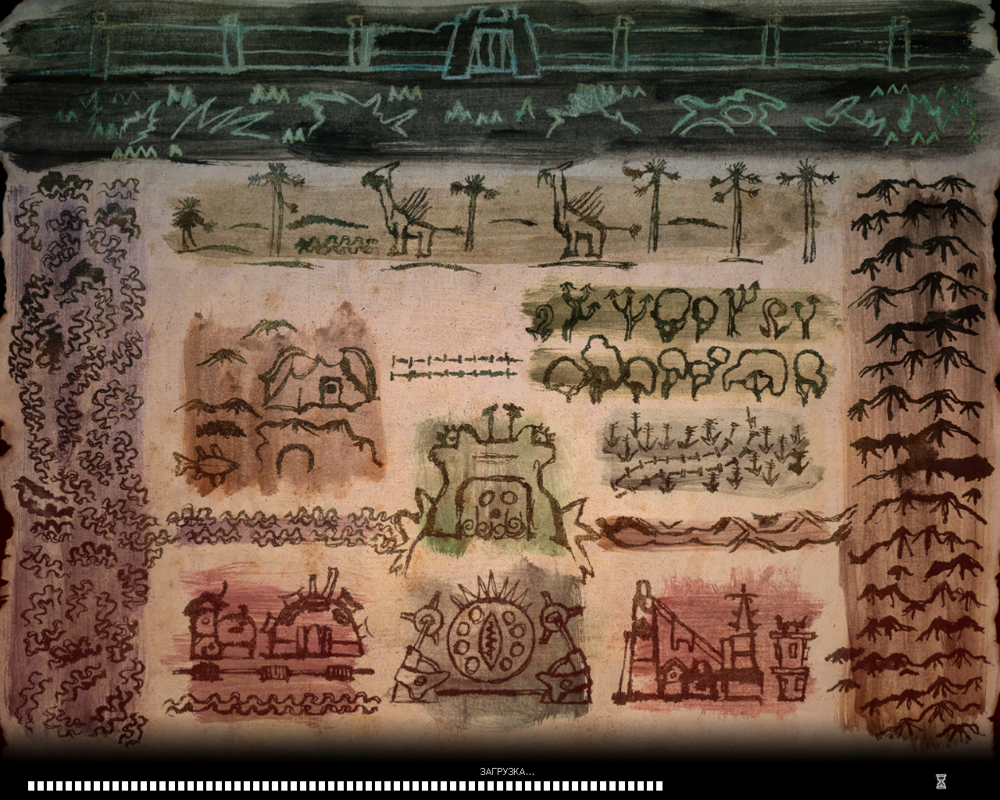
They recognise this in Xenoclash. The whole thing looks like a crude cave painting and is deliberately abstracted to show the sections of the game world that are important. It makes no effort to actually capture what the fantasy setting's contours would actually look like, instead it fills itself in as you go through the game, indicating thematically important locations. thus it communicates a lot better for sake of story, whilst avoiding making an overly familiar looking map.
I'm certain that I've seen an ancient real world map that that fantasy map almost certainly rips off. Can't find it for the life of me, though. It was made from pictograms; I'm pretty sure it was Mesopotamian, but Google searches for "ancient Mesopotamian maps" are only going to find a bunch of contemporary maps depicting the bounds of Mesopotamia. It was a rectangle, with a line of mountains down one side, a line of a river down the other, and a line of forest... maybe along the top, but maybe also by the river, I can't recall. The items in the center were depicted in mostly equal sized rectangles. I have a hard time believing that Xenoclash wasn't directly inspired by it, only replacing the pictograms with a faux-historical Japanese drawing style.
It's true what they say, that great art steals.