Go Gordon Ramsay on my Art (Possibly going to get mature)

Saulkar

Regular Member
Legacy
Aug 25, 2010
3,142
2
13
Country
Canuckistan
Sooooo... I have been trying to get feedback on my latest 3D work but I am getting nothing despite consistent updates on VFX websites. For this reason I came to the website that will shrivel up and die if it does not criticise something into dust but that is no fun.

It needs something moar, some... pizazz! That is why I am asking the Escapist to imitate Gordon Ramsay while voicing genuine critiques! I am creating something for a short film that will be watched by... maybe a few hundred people but you are an audience too and thus are likely to have tastes, likes, dislikes and OH FOR CRYING OUT LOUD!

I am just tired of people I know endlessly congratulating my work that seems to be pure magic to them but at the same time seems to be uninteresting enough or just passable that the people with superior skill seem to take a glance at and then say nothing.

Well not anymore!

Tell it to me straight Escapist with an angry British accent!


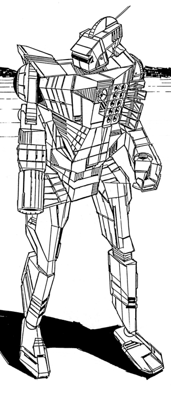
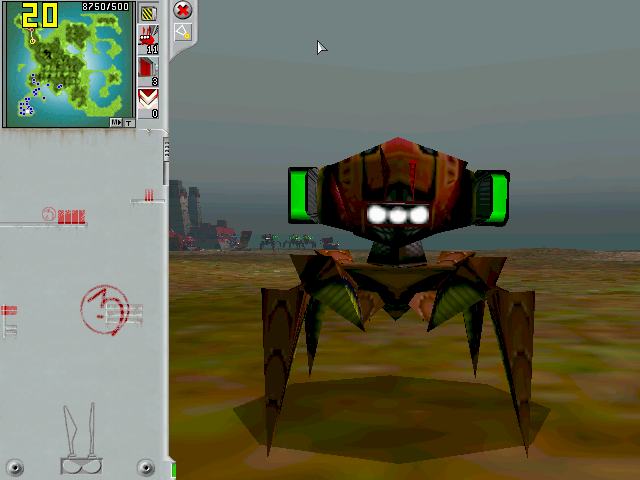
I am trying to update this 5 year old work:
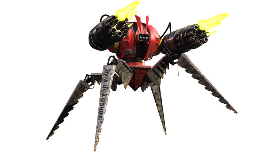
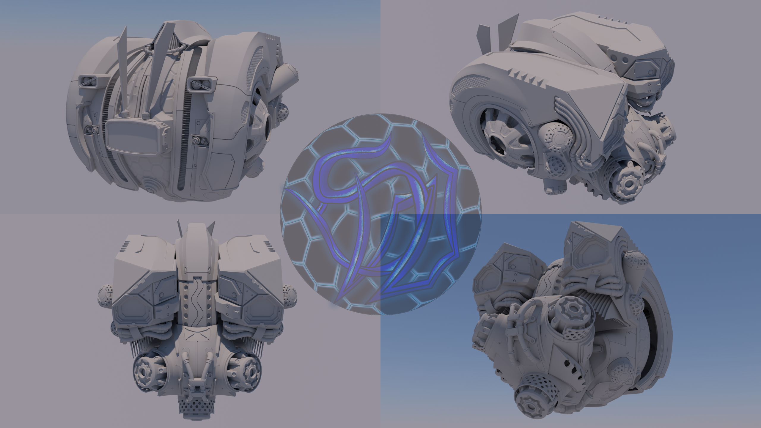

Into this:


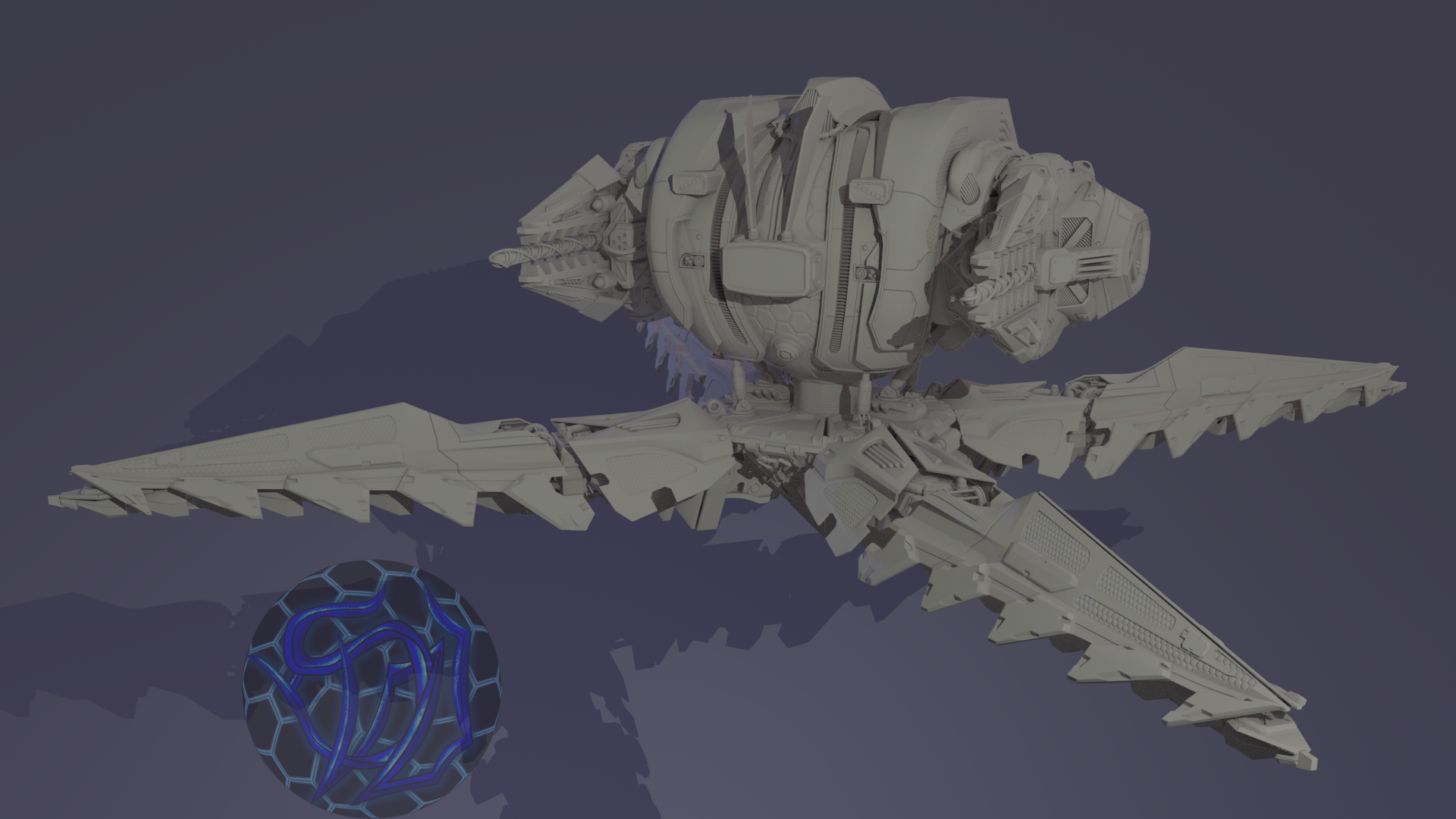
With a texture designed to imply that this 120 year old sarcastic fucker crashed into the ground at Mach 4 during a botched drop!
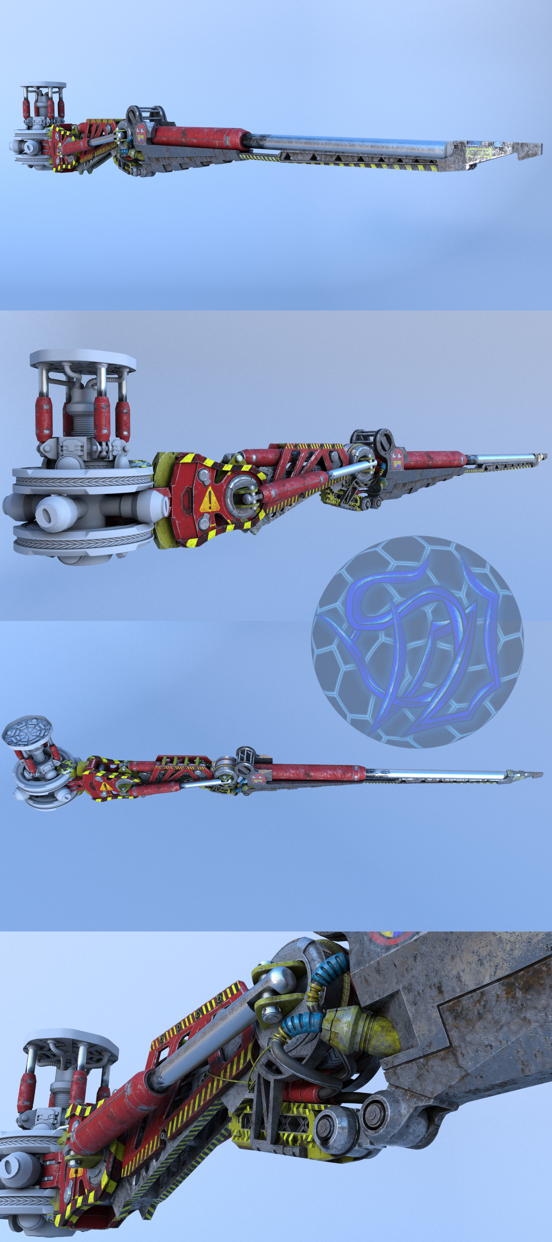
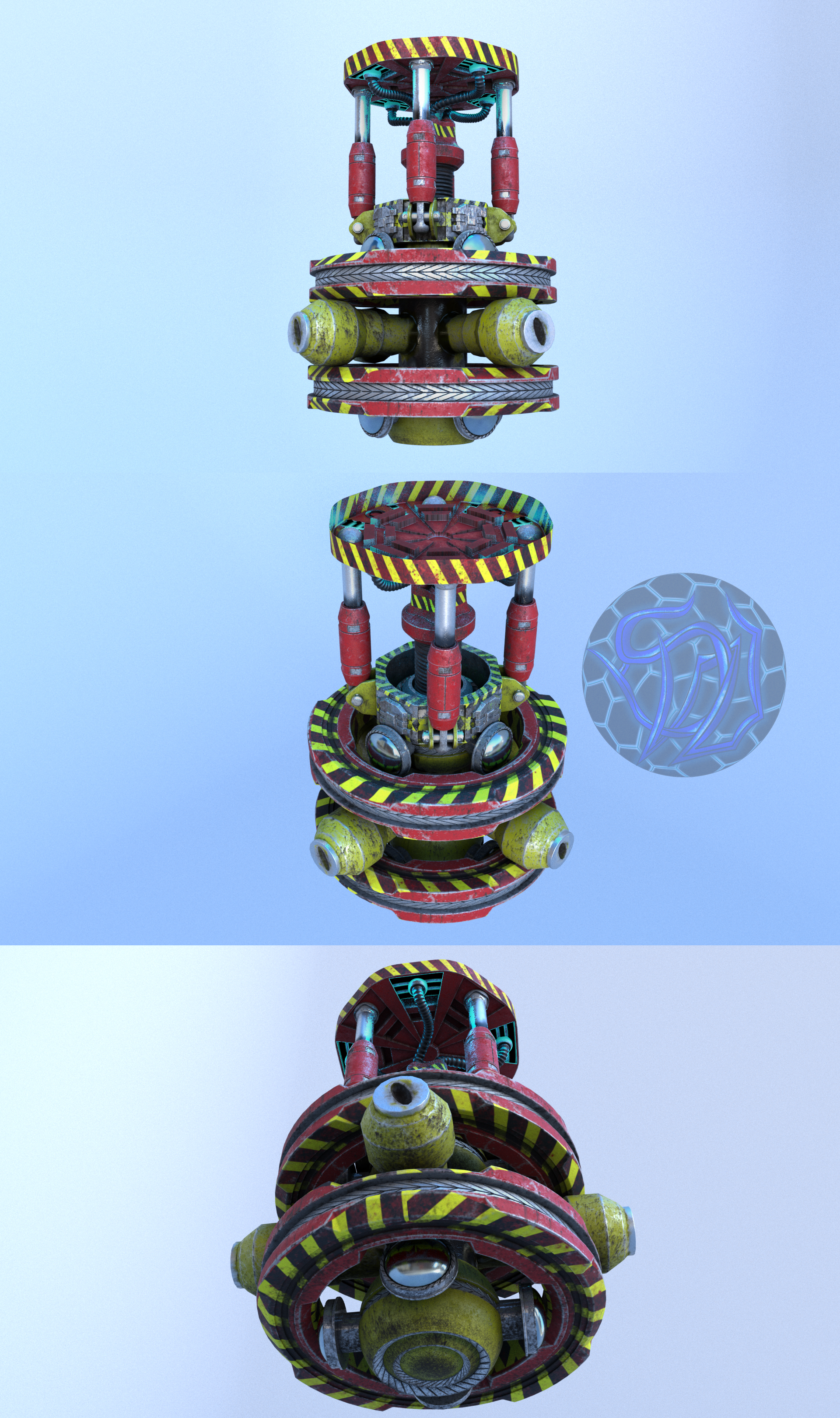
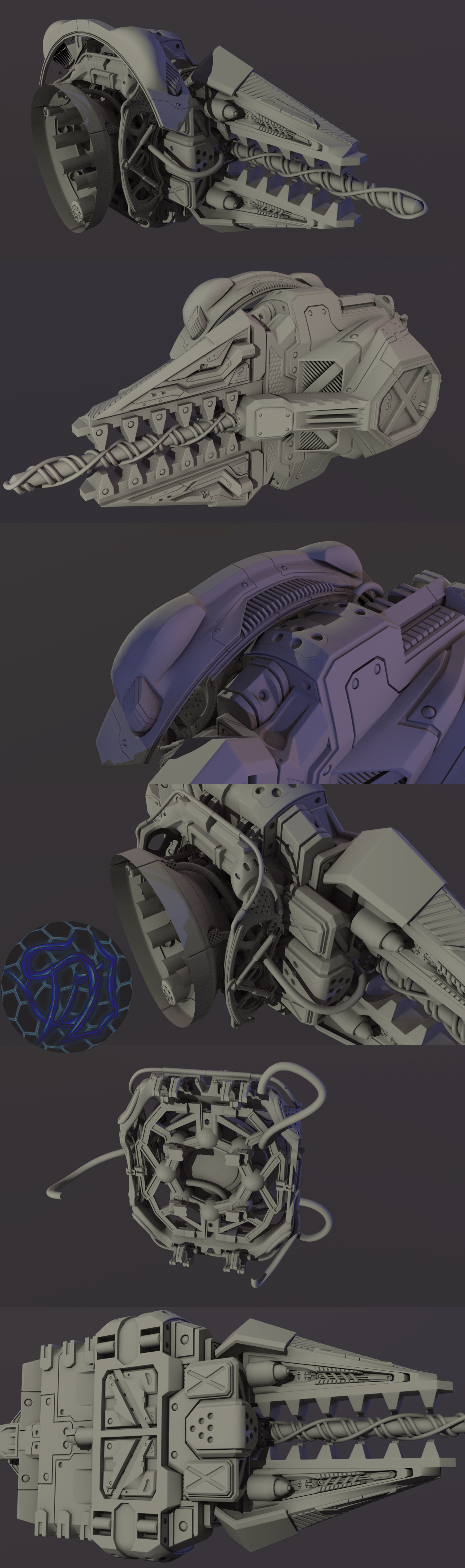


Unleash your inner angry Brit BUT remember that you still need to be meaningful with what you say.

For Example: Are you a fucking moron?!I hate robots! vs You fucking wanker. Those scorch marks defy the laws of physics! If it were energy blasts then they would blah, blah, blah, or would blah, blah, blah, if it were projectile impacts!

I am going to bed now but I hope to see something both meaningful and funny by the time I get back this afternoon.
 

Silentpony_v1legacy

Alleged Feather-Rustler
Jun 5, 2013
6,760
0
0

Your artwork is so phallic the Japanese are going to put a little tiny black box at the tip to hide them from sight!
 

Aerosteam

Get out while you still can
Sep 22, 2011
4,267
0
0
Are you actually shitting in my eyelids with this? What the fuck is that? Is that one of those meme faces kids nowadays drool over and laugh at like a hyena with brain damage? Cut that out like it's a tumour-infested insect that swam up your dick hole.

If you want a user group that's specifically for posting creative stuff and get feedback, here it is you donkey shit.
 

Wintermute_v1legacy

New member
Mar 16, 2012
1,829
0
0
Reading the title I was just about ready to say your drawings, as is often the case when people decide to show their art on internet forums, are complete shit.

I'm not a funny person, but anyway, it just looks dull, like something you would see on the cover of a shitty "how to 3D" book from the mid 90s.

Get rid of the excessive "police line do not cross" texture, it's everywhere and it's distracting. The smiley face too. The "!" sign is ok. The blue "honeycomb" texture is too clean and clashing with the rest of the industrial looking robot/spaceship/weapon thing. I'd get rid of that too, not only the texture but I'd remodel the thing to make those parts "hollow" making the robot/spaceship/weapon thing more "dynamic" looking. I'd also change the color to yellow but that's more personal taste than anything.

TLDR: start over.
 

Saulkar

Regular Member
Legacy
Aug 25, 2010
3,142
2
13
Country
Canuckistan
Silentpony said:

Your artwork is so phallic the Japanese are going to put a little tiny black box at the tip to hide them from sight!
I am being dead serious when I say I cannot see it.

Aerosteam said:
Are you actually shitting in my eyelids with this? What the fuck is that? Is that one of those meme faces kids nowadays drool over and laugh at like a hyena with brain damage? Cut that out like it's a tumour-infested insect that swam up your dick hole.
[/link].
He does, actually, the robot. He has no idea what it means, he just really likes it before replacing it with something completely different two hours later. He gives the impression of being straight faced serious yet is the one to pull the first prank.


Wintermute said:
Reading the title I was just about ready to say your drawings, as is often the case when people decide to show their art on internet forums, are complete shit.

I'm not a funny person, but anyway, it just looks dull, like something you would see on the cover of a shitty "how to 3D" book from the mid 90s.
What would you do differently? I am not being condescending, language is so stupid that I even have to say that, if you had the actual skill, what would you do to it?


Wintermute said:
Get rid of the excessive "police line do not cross" texture, it's everywhere and it's distracting. The smiley face too. The "!" sign is ok.
The reaper chassis is actually based upon futuristic construction and terraforming equipment and follows a similar paint scheme. I am merely following something that was actually established in the lore of the Game (but never explored) that this was based off of. The character himself would paint a giant bulls-eye across his body in retaliation to your comment... that is definitely something I should do.

Wintermute said:
The blue "honeycomb" texture is too clean and clashing with the rest of the industrial looking robot/spaceship/weapon thing. I'd get rid of that too, not only the texture but I'd remodel the thing to make those parts "hollow" making the robot/spaceship/weapon thing more "dynamic" looking. I'd also change the color to yellow but that's more personal taste than anything.

TLDR: start over.
Hmm, never thought of making them hollow but they are shield emitters (and would have distortion effects around them in the final pass) so they would be slightly more clean than the rest. You will notice that in closeups that they are not really clean.

http://orig15.deviantart.net/264e/f/2016/205/0/c/wraith_reaper_lower_body_texture_shots_by_shadow_whisperer-dab6an0.jpg

They actually have a lot of dirt on them that is extremely visible when they stop glowing.

What I got from this. He is a memetastic and gaudy Japanese phallic symbol with no style. Any one else got anything.

P.S. I might seem like I am simply dismissing what other people have to say but I am not. I am merely explaining my though process and since I am only 50% done (you are looking at literal hundreds, plural, of hours of work. I cannot simply restart it) and will take what people say into consideration as I continue on my way.

Where are the angry Brits?!
 

Thaluikhain

Elite Member
Legacy
Jan 16, 2010
18,681
3,591
118
For me, the proportions look wrong, too top heavy and the guns are really oversized compared to the body (where do they keep the ammo anyway).

Also, lots of exposed machinery...is this military, or someone who'd stuck some guns on some other robot?
 

baconsarnie

New member
Jan 8, 2011
423
0
0
What's with the swirly dildo thing in your ... plasma cannons (i guess?)
It's too fancy, if the fire comes out of the dildo itself then why does it extend beyond the outer bit?
If the fire comes out around it then why the uneven swirly bits?
Each piece has to DO something

You have shock absorbers on the inner column (allowing free rotation while still being useful, fine) but then you have more between the torso and hips making rotation of the upper half impossible with the pivots you have.
 

default

New member
Apr 25, 2009
1,287
0
0
The main thing that jumps out at me is that it's all way too busy. It's a clusterfuck to the eyes. Clean up and simplify your design. Greebles and shit all over is fine if you do it right, but I just can't even discern an overall silhouette or shape from this, something that's very important for ship and vehicle design. Your work here has panels and angles all over the place. The red is okay. The shade could use some work, but the hazard marks just don't look good. They're cheesy and detract from the overall design.

But yeah, way too busy. Hope this helped.
 

Saulkar

Regular Member
Legacy
Aug 25, 2010
3,142
2
13
Country
Canuckistan
Thaluikhain said:
For me, the proportions look wrong, too top heavy and the guns are really oversized compared to the body (where do they keep the ammo anyway).

Also, lots of exposed machinery...is this military, or someone who'd stuck some guns on some other robot?
I can understand all that. The exposed machinery is due to its original design being that of a construction vehicle. It would be like throwing armoured plates on a front-hoe's arm. Though, on the other hand, the mech is 5 meters tall and 7 Tonnes but most of the weight is concentrated in the legs. The guns do not run on ammo, they are plasma cannons whose capacitors are fed from the reactor on the back... OH! I forgot to include pictures of the engines!


As you can see, a newer Wraith Reaper looks much more streamlined and balanced as it was built from the ground up to be a war machine.


It is literally comparing an armoured bulldozer with a tank turret to a Bond car.

baconsarnie said:
What's with the swirly dildo thing in your ... plasma cannons (i guess?)
It's too fancy, if the fire comes out of the dildo itself then why does it extend beyond the outer bit?
If the fire comes out around it then why the uneven swirly bits?
Each piece has to DO something
They guide and form the plasma stream. The tongs briefly clamp down on the tong dong which starts the process. As they slowly release the plasma visibly swirls into a vortex along the wires while energy is fed from the teeth of the tongs before being launched like a corkscrew lightning bolt!

baconsarnie said:
You have shock absorbers on the inner column (allowing free rotation while still being useful, fine) but then you have more between the torso and hips making rotation of the upper half impossible with the pivots you have.
The sphere underneath the armour freely pivots in a cup that the shock absorbers are connected to. The armour can also freely pivot across the sphere. If you are implying that this is a poor design then you are right. This guy can but struggles to twist his whole upper torso 360 degrees due to an auxiliary reactor too large for him in order to power his weapons. He was built by other machines that at the time could only iterate, not innovate. He looks ancient next to newer designs. Almost as if Mad Max bandits had a budget.

Digi7 said:
The main thing that jumps out at me is that it's all way too busy. It's a clusterfuck to the eyes. Clean up and simplify your design. Greebles and shit all over is fine if you do it right, but I just can't even discern an overall silhouette or shape from this, something that's very important for ship and vehicle design. Your work here has panels and angles all over the place. The red is okay. The shade could use some work, but the hazard marks just don't look good. They're cheesy and detract from the overall design.

But yeah, way too busy. Hope this helped.
Thanks for the heads up. I will admit the hazards have gotten very dense, mostly because I can only paint on a few dozen pieces at a time given the fact that I keep running out of VRAM when texture painting so it ends up looking good by itself but noisy when combined with all the other textures. I will probably cull a bunch of them but silly, cheezy decals are staying. Those are part of his personality! The other thing I tried to do, and forgot to mention, is that I deliberately designed him to have the already bulky aesthetic of a construction vehicle with armour haphazzardly thrown on top in order to exacerbate it. He looks fat next to other reapers and needs a diet.


From all this I gathered that function is poorly conveyed, he looks top heavy which while intentional has left him looking silly, and the decals are too dense. Also need to work on density of details.
 

Quazimofo

New member
Aug 30, 2010
1,370
0
0
I don't see "combat drop gone wrong" in that paint job. It just looks like wear and tear from a long slog over bad terrain/ slightly corrosive atmosphere. I'd expect some very dramatic scratches/dents/deformation or at the very least swathes of paint scraped off on whatever parts would have hit the ground directly.

Also, as much as I love the attention to detail, I agree with the poster above me in that it is a little much. The legs seem fine but the weapons don't have a very clear silhouette. The eye flows from one detail to the next trying to take it all in, but I don't really see where one part ends and the next begins. I'm just halfway across the mech when I look up and I don't know what I was just looking at.

I really dig that bit on top of the "shoulder" where it connects though. It looks not unlike something one might see on a Covenant Vehicle in Halo. If that's not what you're going for though then it might warrant another try.
 

Saulkar

Regular Member
Legacy
Aug 25, 2010
3,142
2
13
Country
Canuckistan
Quazimofo said:
I don't see "combat drop gone wrong" in that paint job. It just looks like wear and tear from a long slog over bad terrain/ slightly corrosive atmosphere. I'd expect some very dramatic scratches/dents/deformation or at the very least swathes of paint scraped off on whatever parts would have hit the ground directly.

Also, as much as I love the attention to detail, I agree with the poster above me in that it is a little much. The legs seem fine but the weapons don't have a very clear silhouette. The eye flows from one detail to the next trying to take it all in, but I don't really see where one part ends and the next begins. I'm just halfway across the mech when I look up and I don't know what I was just looking at.

I really dig that bit on top of the "shoulder" where it connects though. It looks not unlike something one might see on a Covenant Vehicle in Halo. If that's not what you're going for though then it might warrant another try.
Skimping a lil on the angry Brit bit but I agree with much of what you say. I have always had a terrible aesthetic creativity which has often been a stick in the mud when it comes to designing things and probably why I dig big ugly industrial things most. I often get very sporadic input which often leaves me floundering when trying to improve.

On the other hand, most of the damage from the drop will be on his ass (pointy bit between his legs) and shoulders as he smashed through several floors of a structure facing up before it collapsed on him. All of the dirt and leaking oil is a result of that. I exaggerated the speed at which he slammed into it though. He can survive an impact at terminal velocity which is what happened. How much that is for a seven tonne, five meter tall mech with deployable armoured fins on his legs is beyond my ability to math.

There's a bathroom on the right
 

default

New member
Apr 25, 2009
1,287
0
0
Saulkar said:
Skimping a lil on the angry Brit bit but I agree with much of what you say. I have always had a terrible aesthetic creativity which has often been a stick in the mud when it comes to designing things and probably why I dig big ugly industrial things most. I often get very sporadic input which often leaves me floundering when trying to improve.
This here I think is your main problem, friend. I think you need to perhaps take a course on design or at least do some research.
I see above you say you've spent literally hundreds of hours on this, and to be honest it shows in the worst way. It's far too overdesigned. It's messy, and clunky, and frankly quite unappealing. I know the feeling of lacking input, it's such an invaluable resource which can be hard to come by unless you're in school. And it can be very difficult to understand the fine line between complex and overdesigned.


Here, let me give you some examples of walker designs that I think really work, and I'll walk you through why.


The combine strider from Half Life 2. Elegant, eerie, alien, simple. It has an extremely unique silhouette. It's design by omission, focusing on a single flowing shape. Greebles and details are minimal but enough to make it feel real. It is instantly recognisable, readable and memorable.


A little closer to your ballpark, the dreadnought from Warhammer. Notice how it's complex but it still retains an appealing overall shape and sense of proportion. It looks tough. The panels are mostly flat, with the heavy technical detail confined to the joints for contrast. I'd definitely look carefully at the space marine Warhammer stuff for the kind of style you're going for.


Again similar, the Protoss Immortal from Starcraft. See how the top has a flowing overall shape with a strong silhouette. It's detailed but there are plenty of flat spaces so it remains readable (especially at the size it will appear onscreen).


In regards to big ugly industrial stuff, that's totally fine to focus on. But the rules of design are just as important.


The Millennium Falcon is as industrial and junky as they come. There's a ton of greebling and detail on this thing but it's still readable and appealing. Most of this is careful management of lines (see how they all flow from the centre?), but it's also because they're subtle and inobtrusive while retaining that sense of texture and weight.


Start looking at some of your favourite designs and thinking about why they look good and how you can incorporate that into your own work. Start doing smaller, simpler and more numerous projects to practice your principles of design. Get yourself a sketchpad and start tinkering around. Simplify, simplify and then simplify again. Tear out everything that does not need to be there. I think the main reason you feel like a lot of people just pass right over your work is because, from what I can see here, it's just overwhelming. The eyes and brain are just not invited to take it in. But you clearly have a ton of technical skill. You just need to work on the art and aesthetics side :)

Sorry for lack of angry brit, just don't have it in me. Even this is harsher than I usually speak. Hope some of this helps point you in the right direction.
 

Sonmi

Renowned Latin Lover
Jan 30, 2009
579
0
0
Ya fokin wanka! What the hell is wrong with you?! Have you seen that chassis, those legs? This is not how a proper fokin mech operates, for fok's sake man! Those pamby-ass legs need some kind of foot to ensure stability, that's design 101, fuck!

Let's take a look at the fokin disaster you call texture work now... it's all over the place! Most of the metal is rusted, but some of the "chromier" parts look so clear they look right out of a cartoon! It looks like fokin plastic! Who the fok ever taught you to do textures? It's all a goddam mess! DO IT ALL OVER AGAIN.

No wait, actually. Come back here, I'm not done yet. That's not a proper colour scheme for a robot, it looks like some nitwit gorged himself on fokin raspberries and hurled all over a metallic piece of shit!


Wait, is that a fokin MEME I see plastered on the one of those pictures?! ...I'm done. Get out. GET OUT OF MY KITCHEN!
 

Worgen

Follower of the Glorious Sun Butt.
Legacy
Apr 1, 2009
14,493
3,443
118
Gender
Whatever, just wash your hands.
Uhh... it looks like something from a sonic the hedgehog game, one of the 3d ones.
 

Saulkar

Regular Member
Legacy
Aug 25, 2010
3,142
2
13
Country
Canuckistan
Worgen said:
Uhh... it looks like something from a sonic the hedgehog game, one of the 3d ones.
U Fockin Wot Mate?! I will lay you out with me fists, I swear on me feckin mom!

I kid, I kid, your comment though is the first one that actually made me laugh.

Digi7 said:
I am sorry you took all that time to tell me everything I already knew but cannot put into practice. I am stuck with like some natural art block that forcibly simplifies my creativity.

If I was told to just go nuts with a pencil and paper what I would feel inexplicably limited to create would be this:


vs this:
despite the fact that I can draw the latter just fine in another pose.

Everything in my mind is flattened and at 90 degrees, the least interesting shapes. I was told by someone who at one point was critiquing me over Teamspeak before he became to busy to continue doing so that going out and drawing from real life would boost my creativity and spacial awareness. After a year I can say it has had absolutely no effect.
 

sky14kemea

Deus Ex-Mod
Jun 26, 2008
12,760
0
0
I'll be honest, I have no idea what the fuck I'm looking at here.

As someone with 0 experience with 3D modelling, I don't know if that's supposed to be good or not.

"But I'll agree with the other donkey's in this thread. That honeycomb logo thing looks like some 12 year old's DeviantArt account decided to eat a tube of blue playdoh and shit it out all over their mothers "contemporary art" plate set."/ramsey.

The lines are wonky and the colour shading(?) doesn't make sense with the overall shape of the... Letters?
 

Dirty Hipsters

This is how we praise the sun!
Legacy
Feb 7, 2011
7,931
2,295
118
Country
'Merica
Gender
3 children in a trench coat
For something that's supposed to be designed for mining/terraforming the legs are too skinny and the design is too damn top heavy.

Look at construction equipment, it tends to be much heavier toward the bottom for the purposes of stability. Construction equipment needs to be able to lift heavy things, and with how heavy this thing is if it tried to lift anything it would tip over.

And good fucking luck figuring out how to get it to walk through muddy or swampy terrain, the thin pointy legs would sink into the ground making it almost impossible to move.

Do the plasma cannons have recoil when they fire? If they do that's another reason for the design to have a larger heavier base instead. You need a lot of stability to prevent your big gun from tipping over when it shoots.

This thing looks like it would be really easy for some Ewoks with logs to sabotage.