Google's new logo: Good, bad, or ugly?

IceForce

Is this memes?
Legacy
Dec 11, 2012
2,384
16
13
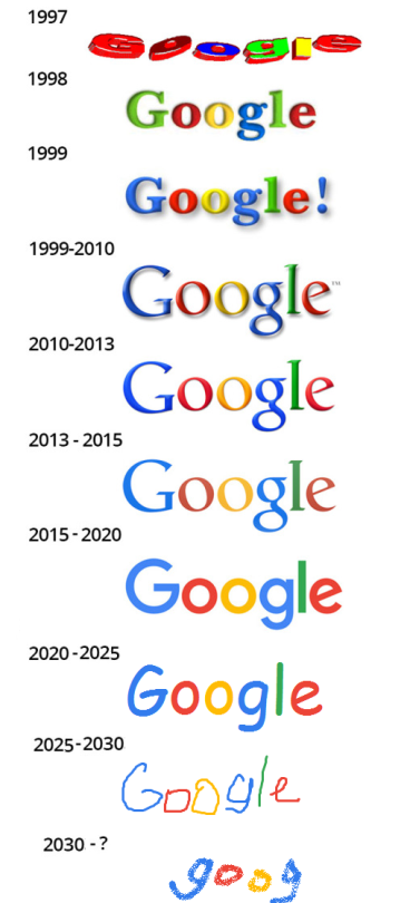
If you haven't noticed it the last few days, Google has unveiled a new logo that they've rolled out across all Google services.

Old logo:


New logo:


Thoughts? I think they've definitely made it look more baby-ish, if that's the look they were going for.
 

Dizchu

...brutal
Sep 23, 2014
1,277
0
0
Well, you've missed out the intermediate logo which (in my opinion) displayed the best aspects of both designs.

The previous one has a great typeface, the new one has a great colour scheme. I think losing the serifs was a bad idea, I honestly thought that the new logo was one of the alternate logos they use for a day to mark a certain occasion, it was so out of place.

I mean come on, the lowercase "g" in the logo is so recognisable it has been used by Google as an icon itself.
 

Thaluikhain

Elite Member
Legacy
Jan 16, 2010
18,723
3,603
118
A San Serif font is designed to be read on a screen, as a opposed to being printed. So, I guess they think they won't be printing the google logo as much as reading it on the screen so much.
 

Zombie_Fish

Opiner of Mottos
Mar 20, 2009
4,584
0
0
I'm not fond of the lighter colours used in the logo, but otherwise I don't mind it. I'm less fond of the multi-coloured G that they have as their mini-logo though; to me that's too cluttered to work as a favicon:
 

Queen Michael

has read 4,010 manga books
Jun 9, 2009
10,400
0
0
I like it. The lighter colors give it a softer feeling. The sans-serif font makes it feel more "computery" for lack of a better term. The old font felt a bit like it belonged on one of those old angelfire websites.
 

1981

New member
May 28, 2015
217
0
0
I think it's much better than the old one. That bevel is a bit 1990's. "Look ma! I can do Photoshop!"
 

Rewdalf

Usually Sacrastic
Jan 6, 2010
769
0
0
☐ Good
☑ Bad
☑ Ugly

You can't just follow up the old logo with the new one.
If I had seen the new one without ever knowing what the old one looked like, I probably would have liked it.
New one just looks so dry...
 

Hero in a half shell

It's not easy being green
Dec 30, 2009
4,286
0
0
I think it's a bit too basic, but I'll probably get used to it and not even notice by the end of the month. Whether good or bad, if something is familiar enough you stop really judging it and just accept whatever is presented to you, I think this is a logo that we'll all see so often it doesn't necessarily have to be good, just recognizable.
 

Worgen

Follower of the Glorious Sun Butt.
Legacy
Apr 1, 2009
14,533
3,478
118
Gender
Whatever, just wash your hands.
I don't like this weird flatness thing that everyone is going for now. Window's has been doing that lately too. Just this weird flat thing.
 

crimson5pheonix

It took 6 months to read my title.
Legacy
Jun 6, 2008
36,182
3,394
118
I feel like I might be tainted after getting on their phone service. All the stuff they send with the bright pastels make their stuff look like toys. I feel like the logo looks less "professional" as well.
 
Sep 13, 2009
1,589
0
0
Zombie_Fish said:
I'm not fond of the lighter colours used in the logo, but otherwise I don't mind it. I'm less fond of the multi-coloured G that they have as their mini-logo though; to me that's too cluttered to work as a favicon: [/QUOTE]

Agreed with this. I think the logo looks fine, it's an acceptable "modernization" of the logo.

But the icon looks ugly as hell, the color bands are given a somewhat arbitrary length, as well, I can barely distinguish between the blue and the green on the bottom, unless I look closer. If they have to change anything, I hope they change that
 

Scarim Coral

Jumped the ship
Legacy
Oct 29, 2010
18,157
2
3
Country
UK
I'm not fond of it at the moment but hey it could had been worse. Anyone remember the first logo when it was released?


Man the very first logo remind me of the 56k era and those safari(?) website layout sellers (the ones that everybody used when making their own fan sites).
 

Aerosteam

Get out while you still can
Sep 22, 2011
4,267
0
0
I don't like it. Too simple and will never be as recognisable as the previous logo.
 

kazall

New member
Aug 31, 2015
10
0
0
Kinda one of those "is what it is" things. I mean the funnier aspect might be the fact that they spent what I'm sure is tens of thousands of dollars and ended up with a relatively similar logo
 

Ambitiousmould

Why does it say I'm premium now?
Apr 22, 2012
447
0
0
I like it. The fact that the previous had shading always irritated me a bit. The new sharper edges and flat colours have a simple elegance, and suit well the modern internet age.

By the way, this is me practising talking shit for my second year of my graphic design course at uni.
 

Ekit

New member
Oct 19, 2009
1,183
0
0
I quite like it. It isn't the most amazing logo I've ever seen, but it's nice and safe. Which is all you can really expect from such a huge Corporation as Google
 

Smooth Operator

New member
Oct 5, 2010
8,162
0
0
Well Google always had that distinct engineers styling, as in "I have no idea how to make shit pretty so I'll flip through fonts and colors until something looks not shit"... it's what I do anyway.

I do however have to applaud the balls on the paid designer who walked into the bosses office and told him this is what he has spent all his days working on and somehow convinced him it's much better then what they had before. Bravo sir bravo, too bad we don't have emperor's around any more because you sure could sell some stylish new clothes.