
Judging By The Cover: Judging Mega Man
- Thread starter Yahtzee Croshaw
- Start date
Recommended Videos
Yup, looks fine to me, too.
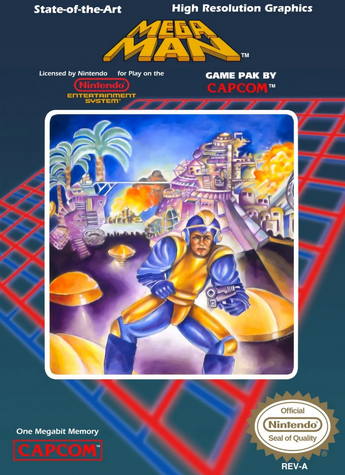
I never noticed the bits on the american box art before: "State of the art, high resolution graphics." It was a nintendo, which is not much better than an etch-a-sketch crossed with a litebrite.
I think my favorite of all the covers now is going to be the japanese one where everyone looks like a collapsing human pyramid.
I want to say "best in a while" but it feels like I say that every couple of videos. So great work as usual.
Eeyup. I think he's onto another winner.Johnny Novgorod said:I want to say "best in a while" but it feels like I say that every couple of videos. So great work as usual.
even though that cover is as painful, to look at, as a fist up your arse!LenticularHomicide said:What I got from this is that "Looks fine to me" == No arse fisting. Sounds legit.
Anyway... Yeah... Great work as always.
I was waiting for the US boxart for Mega Man, and I was not disappointed. I expected him to go to town on that one, but the only advantage that one has is "Nobody is looking up Mega Man's butt."
I've never seen the European box art before. I must say that I though it looked okay.
Sure, they betrayed the original artist's vision by trying to make it more mature, but within that framework they managed to capture what I imagine the game would look like if a more mature looking design what was they were going for.
Aside from Megaman himself, since he just looked like some kid.
Sure, they betrayed the original artist's vision by trying to make it more mature, but within that framework they managed to capture what I imagine the game would look like if a more mature looking design what was they were going for.
Aside from Megaman himself, since he just looked like some kid.
So, I'm the first one to note the irony in a character named "Rock Man" being the Anti-Rocky? Get it? Because he (probably) eats thunder and craps lightning...
... I'll show myself out...
... I'll show myself out...
Way to set up and then subvert our expectations with the European box art, although admittedly one of the reasons it worked so well was because I (and presumably many other here) didn't even know there was different box art for the European version, let along seen it. I'm actually quite surprised at how not-shit it is (everyone actually looks like what they're supposed to, a point the NA box art's "retard in a yellow leotard holding a laser pistol" missed like a champ), proving once again that even when PAL box art isn't as good as the original Japanese art, it's still leagues ahead of what American marketing companies think their audiences will like.
http://s3.amazonaws.com/kym-assets/photos/images/original/000/158/723/spongebob-dat-ass.png?1312623581
If Mega Man was of universal legal age then...
*ahem* I had no idea the US cover was better than the EU cover... Really adds a new perspective to my "worse covers" viewpoint... 
If Mega Man was of universal legal age then...
http://img.memecdn.com/dat-ass_o_202648.jpg
I never forgot the Composition of the American Art ... All the classical form and function of a game screaming "HEY this is like an Arcade game!". My little 9 year old brain being completely unable to understand the proper Foreshortening & perspective and also too A.D.D. riddled & zapped up on sugar constantly to even be capable of focusing on more than 1 character at a time in whatever scene was there... soooo much nostalgia and yet...
What a &@%#ing atrocity
What a &@%#ing atrocity
why not the US boxart??? that one was WAAAAAAAY worse! almost ridiculously terrible!
also, that EU cover was partially responsible for the western MegaMan 10 cover which is pure 80s goodness! SO FREAKING METAL! a bit cheezy but who cares? look how badass ProtoMan looks!

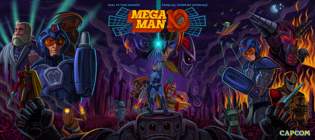
also, that EU cover was partially responsible for the western MegaMan 10 cover which is pure 80s goodness! SO FREAKING METAL! a bit cheezy but who cares? look how badass ProtoMan looks!