
Mass Effect 3 Cover Art - Improvement?
- Thread starter Steampunk Viking
- Start date
Recommended Videos
Ehh, I don't understand why they have such a hard time making a half decent cover. It's not as awful as the last one, but it's still lackluster.
You've got the universe as a setting. Give it some more thought. I also find it exceptionally disappointing when the main character on the cover is one that is completely customizable.
You've got the universe as a setting. Give it some more thought. I also find it exceptionally disappointing when the main character on the cover is one that is completely customizable.
Not that I think a cover will reflect on a game in any regard (after all Sega Saturn games are dime a dozen crappy Americanized covers and their games are fantastic). However I think they're trying to push that FPS 'lone hero' walking at the camera looking tough routine.
Which is a bit deceiving considering you play as a squad through the entire game, but you know whatever works. I'm sure the better cover is part of the cost on the Special edition
*waits for someone to quote him and tell him he's wrong and the cover is the same, but metal, thus feeling like an idiot*
Give me the option to get the female Shep version instead, and I'd say we have a winner. Certainly better than Mass Effect 2's, but it doesn't convey the RPG-ness (?) of the series. Mass Effect's cover did. You look at this one and think, "Oooh, action game. Big explosions. Should be fun."lacktheknack said:Here it is to anyone who hasn't seen it.
<img width=300>http://images.wikia.com/masseffect/images/b/be/ME3_Cover_Art.png
Still not as good as the first Mass Effect, but better than Mass Effect 2.
I'm pondering on why they decided to show the default male Shepard for the cover art. Plus he looks more bored in that pose... why not have an army behind him with Reapers and Alliance ships duking it out above him? It's a all out war after all.lacktheknack said:Here it is to anyone who hasn't seen it.
<img width=300>http://images.wikia.com/masseffect/images/b/be/ME3_Cover_Art.png
Still not as good as the first Mass Effect, but better than Mass Effect 2.
lol is that the CE? cause if so me and you are gonna be looking at the same thing.Zhukov said:You might want to change that to "cover art". People are going to think you are talking about the gameplay cover system.
Anyway...
ME1's cover was poorly designed, mediocre at best. Overly crowded. Looked like the result of a graphic design student's first photoshop assignment.
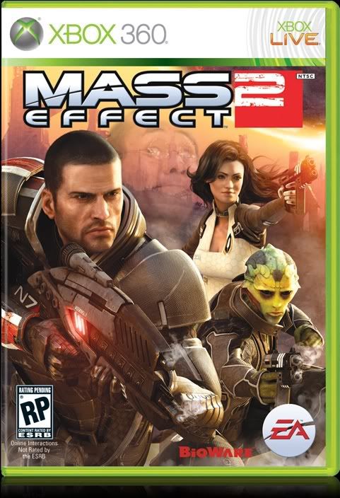
ME2's cover was, yeah...crap. Ohh look, people with guns. Boring and generic with bad composition to boot.
ME3's cover is at least a little better composed, but is still crap. Ohh look, a soldier guy.
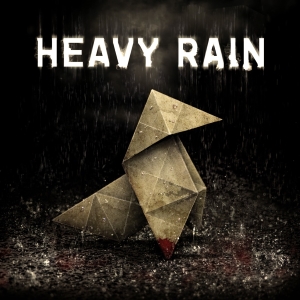
Luckily, I wont have to look at it. My copy of ME3 is going to look like this:
OT: really your going to complan about cover art? Even yatzee doesnt single out cover art if he can help it.
Didn't expect the confusion! But changed just to avoid it in the future.Zhukov said:You might want to change that to "cover art". People are going to think you are talking about the gameplay cover system.
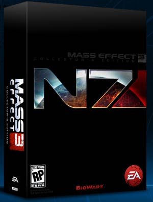
It is better than the ME2 cover but still ugly and no where near as good as the ME1 cover. The collector?s edition box art is much much better tho.
Not that it really matters at the end of the day tho if this was a new franchise to me that would not be a cover that would encourage me to look at the game.
Not that it really matters at the end of the day tho if this was a new franchise to me that would not be a cover that would encourage me to look at the game.

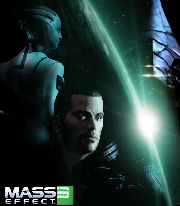
For those looking for the femshep version of the ME3 cover. It's the wallpaper version of the cover, but who can complain?
in god's name stop yelling!DeanoTheGod said:That is a pretty petty point... Also don't forget the covers often change in different regions due to the demographic there! The biggest differences in a cover I can think of are the final fantasy games! The EU games all have awesome but incredibly simple covers, plain white with just the logo!
I tried looking the cover up to see what you mean, but just found loads of different ones.. They all looked pretty generic though! (Apart from the one with Sheppard sillouetted, that was pretty good!)
Edit: Looks like I was looking at people speculations! (Damn some people are good at photoshop, and appear to have no lives!)
Looks like this one is the same all out! Dunno, incomparison I like it more than the other 2... Reminds me of all the other game covers at the moment! It could be added to that infamous mash-up image that was going round in sept/oct time!
op: wouldnt care less about cover art
Mass Effect 1 was a generic Star Wars rip-off cover, but it was well done.
Mass Effect 2 had a terrible cover but it did the job, you could recognise Shepard so yeah.
Mass Effect 3 cover looks like the advertisement for "Action Man!! Space Edition!!"
Mass Effect 2 had a terrible cover but it did the job, you could recognise Shepard so yeah.
Mass Effect 3 cover looks like the advertisement for "Action Man!! Space Edition!!"
Yeah, I have that as my desktop wallpaper... Femshep admittedly does make the cover look better than Manshep.wintercoat said:
For those looking for the femshep version of the ME3 cover. It's the wallpaper version of the cover, but who can complain?
Sorry but... I couldn't help but notice this, and I found it bloody hilarious.Zen Toombs said:Well, a side by side comparison may be in order.


I am a massive fanboy of the series, but in my opinion, the first game's cover is not very good at all. Decent, but way too cluttered. The second game's cover is absolutely terrible and generic, but who cares, we finally got to play Commander Shepard again! But the third game's cover actually looks alright (once again not great, but better than the others). It has much of the same effect as the first cover without the awkwardness and crowding.
But, all in all, I'm not totally certain why we're having this discussion. The fans would buy it even if the cover just had a jellyfish on it[1], so in the end it doesn't really matter.
[1] Just to be clear, not the image of a jellyfish, a life one.
That stings.

Anyways, I'm not a big fan of the ME3 cover to be honest... what is shepard standing on? Is he floating in space? It's hard to comprehend.
Yay FemShep!!!!!wintercoat said:
For those looking for the femshep version of the ME3 cover. It's the wallpaper version of the cover, but who can complain?
I disagree, at least with the assertion that having stuff is bad.Zhukov said:Too crowded. It's like they wanted to fit every single thing on there. Default Shepard, Garrus, Ashley, Saren, Vigil, bunch o' Geth, Normandy, Sovereign, random ships, two planets. Too much.Vault101 said:really? I liked ME1's cover...had a real "classic space opera" feelZhukov said:ME1's cover was poorly designed, mediocre at best.
Plus, the composition is bad. Rather than looking like one image, it looks like the photoshoped bastard-child of about ten different images.
The best visual designs are simple and striking with a clear focal point. ME1's cover is the exact opposite.
They were clearly going for :

Compared to:

Anyway. IMO
ME2's art is the worst
ME3's is next
ME1's is next
ME2 Collectors eddition is THE BEST THING EVER!

Both Sheploo and Femshep are on the tin case in the Collector's Edition.fangclaw said:i thought ME3 was going to use a female shepard for the cover.
The cover art is simply horrible. This is supposed to be an epic Space Opera, not another iteration of Call of Duty.
Take that generic version of Shephard off of there, keep the backdrop of planet Earth, and add a Reaper looming over the horizon. Not particularly original, but way better than what's currently passing as the cover art.
Shit, the game has better fan-made covers out there than this.

Take that generic version of Shephard off of there, keep the backdrop of planet Earth, and add a Reaper looming over the horizon. Not particularly original, but way better than what's currently passing as the cover art.
Shit, the game has better fan-made covers out there than this.