
Poll: Comic Sans: what do you think of it.
- Thread starter Lev The Red
- Start date
Recommended Videos

I don't have a problem with Comic Sans, but I hope they ban that red color that gets used for pretty much every single teenage sex comedy's title.
You know the color I'm talkin' about. The lettering also makes it look like it's stamped on the cover. Usually stamped in just the right place to cover up the one interesting thing in the entirety of the god-awful movies--breasts.
You know the color I'm talkin' about. The lettering also makes it look like it's stamped on the cover. Usually stamped in just the right place to cover up the one interesting thing in the entirety of the god-awful movies--breasts.

Not to mention that letter heading is totally fucked.RAKtheUndead said:There is almost never an excuse for using Comic Sans. If you don't know what the story of Comic Sans is, I'll inform you that it was designed by Vincent Connare in 1994 in an attempt to make a better typeface for interface purposes, specifically speech bubbles, than the Times New Roman that was used by Microsoft until then. Unfortunately, it's infected the world since by being included in the standard font list in Windows 95.
Comic Sans is a detestable typeface. Despite being ostensibly based on the lettering of such graphic novels as Watchmen, the typeface has none of the style of these hand-drawn letters and instead is infested with inconsistency. It is a disgrace to the world of typography. Connare might have later made up for some of his sins with Trebuchet, which isn't terrible, but his most (in)famous is still free to roam around, destroying any semblance of good typographical design in its disciples.
There is only one positive thing which can be said for it: At least it's better than Papyrus. There is almost never an excuse for using Comic Sans; there is absolutely never an excuse for using Papyrus. In all other respects, Comic Sans should be considered a blight on the typographic universe. I think I'll stick to my Avenir and my Adobe Garamond, and if I ever feel like conveying a feeling of irreverence, I'll choose a rounded Helvetica or something.
I leave you with this, an ostensibly serious political letter that I received recently:

Comic Sans and Bradley Hand: If these two typefaces being used for what is supposed to be a serious political letter is any representation of Gay Mitchell's campaign, making him the President would be a joke - and not a particularly funny one.
I used to use Comic Sans, or Comic Snazz as I call it, when I was an accountant in meetings because it used to fucked with peoples heads, that and any items of interest were highlighted in bright pink.
I can't say I like the font. It was designed for comics, and sure it looks alright there, but when it's used in a serious context it just looks weird and out of place. I was in an airport a few days ago and they were using Comic Sans for those signs that tell you not bring bombs and such on the plane, which was very strange looking. In summary, I wish people would stop using it, but nowhere near enough to actually do anything to convince them not to.
I'm a typographer, meaning my life is based around the intricacies of type that most people take for granted. And I'll tell you Comic Sans is a terrible font. It's one of the worst, up there with Papyrus and Hobo. I understand that most people don't care in the least and often don't even see the issues, but for those with any education in type design, Comic Sans is painful. Not even actual comics use it.TestECull said:I think anyone who gets that pissy over a font has no business with any sort of power. Over anything.
I get pissy over Comic Sans so that you don't have to.
/martyr

It serves one purpose, writing in Comic Books.
Outside of that I just think it is an ugly and over used type face that is not suited for reading in long documents. (And trust me I have seen that too)
I am not against the font, and I have never understood the "omg this font is Soooo much prettier than that font" mindset. To me most fonts are all nice and good But know when to use which honestly.
*thinks everyone should know how to read webdings.
Outside of that I just think it is an ugly and over used type face that is not suited for reading in long documents. (And trust me I have seen that too)
I am not against the font, and I have never understood the "omg this font is Soooo much prettier than that font" mindset. To me most fonts are all nice and good
But know when to use which honestly.*thinks everyone should know how to read webdings.

Ban a font? No, that's dumb, and I think maybe those people need to find a new purpose in life. At least you can read Comic Sans without any problems, unlike some other fonts out there.
Anyway, if there's one font I don't really enjoy, it's Times New Roman. I don't know why... I just don't like it. Give me Arial instead please.
Also, as long as we're sharing comics about font, might as well toss this xkcd into the mix:
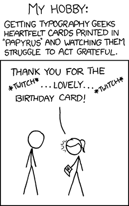 [http://xkcd.com/590/]
Anyway, if there's one font I don't really enjoy, it's Times New Roman. I don't know why... I just don't like it. Give me Arial instead please.
Also, as long as we're sharing comics about font, might as well toss this xkcd into the mix:

I just don't like Helvetica for some reason. I can't really explain it.RAKtheUndead said:You do realise that Arial is considered to be a cast-off copy of Helvetica, and that Helvetica predates Arial by something like thirty years? I mean, I'm not even all that big a fan of Helvetica, but if you're going to say that Arial should be the only sans-serif typeface, it demonstrates a distinct disregard for the chronology of typeface design. If everybody thought that way, the Germans would still be using Fraktur.Lukeje said:Come on. All you need is Computer Modern (or Times New Roman when this is not available) as a serif font, and Arial as a sans-serif font. Any other fonts are basically redundant.

As a web graphic design student, I don't think I need to tell anyone that I really hate Comics Sans (though I suppose I just did.)
A while back, I found this site: Why You Hate Comic Sans [http://www.kadavy.net/blog/posts/why-you-hate-comic-sans/] which gives a detailed explanation about the problems with Comic Sans, and why people have grown to hate it. I recommend checking out the site if you want a better understanding of the whole matter.
A while back, I found this site: Why You Hate Comic Sans [http://www.kadavy.net/blog/posts/why-you-hate-comic-sans/] which gives a detailed explanation about the problems with Comic Sans, and why people have grown to hate it. I recommend checking out the site if you want a better understanding of the whole matter.


Like most things, it has a purpose. It works well in comics, and conveys a sense of frivolity. The problem is that, while using different fonts would make something better, learning about typography is not exactly a priority. Its often times a bad thing, but its a small bad thing, and I wouldn't make a big deal out of it unless the font is being used by people in a serious or professional setting where they should know better.
Actually, I can bring this around to games. Comic Sans is like a realistic, grey-brown shooter. When presented with it sparingly, it can be very effective and has its place in the world. When it is absolutely everywhere, it makes connoisseurs of the art cringe and overreact with anger and hate.
I may be biased because I picked fonts in Middle/high school based on what took up more space, and let me reach x pages faster. I think I used a lot of Arial?
Actually, I can bring this around to games. Comic Sans is like a realistic, grey-brown shooter. When presented with it sparingly, it can be very effective and has its place in the world. When it is absolutely everywhere, it makes connoisseurs of the art cringe and overreact with anger and hate.
I may be biased because I picked fonts in Middle/high school based on what took up more space, and let me reach x pages faster. I think I used a lot of Arial?





Geez, people. Just read the stuff and get on with your life. The meaning is in the words, not how they look.
I like Times New Roman better because it is easier to read. However, it is too formal most sites.
I don't find it offensive. It's just too relaxed for things that need to appear smart and too boring for when you want an interesting font. Also, yes, it's over-used. Although nothing can be worse than the use of Papyrus. Really Prince of Persia movie? Really? You spent all that money on making a CGI Jake Gyllenhaal do flips and you couldn't be bothered to find a better font? You too Thief: Deadly Shadows, shit AND you assault my eyes with Papyrus EVERYWHERE. *begins to froth with rage*