
Tryzon's Nostalgic Gaming Trips
Box Art #2
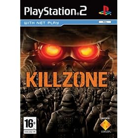
With this being the eve of the very long-awaited sequel, I felt it was appropriate to look at the cover of this, Sony?s previous (and failed, don?t forget failed) attempt to get us all to love shooting the Helghast.
This is yet another picture which has a mostly muted colour palette, only to suddenly have something bright jump at you. In this case, it?s a pair of evil orange goggle-eyes, the impractical trademark of the Helghast grunt trooper. Being both British and a lover of jokes only other Brits will comprehend, I looked at this box and instantly thought ?you?ve been tangoed?. While that may have been a better name, it sadly (if understandably) lost to Killzone, which I always thought was stupid until I learned that a ?kill zone? is military jargon for a place where you are more likely to find a pot of gold than NOT get shot to bits by AK-47s. This made me realise that the name makes some sort of sense, but not much more. And yes, in my way, I have once again gone off track.
In any case, having the clearest things on display be the game?s title and the soul-sucking circles is a cunning tactic, which the US cover also attempted, in a competent but inferior effort.

Seeing as the Helghast are the face of Killzone, and far more memorable than any of the so-called ?good guys?, it makes sense that the trusty pal cover ignores the existence of the heroes completely, instead giving all attention to the much more deserving cannon-fodder. The US almost does this, but you can see the awesome foursome fighting on the left. They are awfully puny, though.
Getting back on track, you can see that the reams of ready and willing troops all stand to attention, with their backs facing the audience. This creates an enigma, which inspires wonder, and maybe a bit of foreboding. Of course, the looming masked face that takes up the other half of the cover basically destroys all that, but there you go.
As I mentioned, the title and giant lamps are the only coloured things to be seen, which is very similar to the actual game?s palette of grey against grey that is only broken by the darting lights strapped to every foe?s head. It?s the Sam Fisher directive: ensure sneaking is impossible due to large bulbs on headgear.
Again, I?m a big fan of only showing the Helghast, as you will come to recognise them very well in the game. Orange is also a rare colour in general human society (don?t ask me why: it beats blue any day), and so having a large pair of blobs of the colour is likely to stand out among the rest of the spectrum displayed on a shop?s shelf.
Finally, the box just looks nice to own, and is a fine addition to a weird cover art shrine or something, if you have one. It?ll blend in next to all the Crash Bandicoot titles you have, seeing as you?re probably an orange fetishist. You weird person, you.
Box Art #2
With this being the eve of the very long-awaited sequel, I felt it was appropriate to look at the cover of this, Sony?s previous (and failed, don?t forget failed) attempt to get us all to love shooting the Helghast.
This is yet another picture which has a mostly muted colour palette, only to suddenly have something bright jump at you. In this case, it?s a pair of evil orange goggle-eyes, the impractical trademark of the Helghast grunt trooper. Being both British and a lover of jokes only other Brits will comprehend, I looked at this box and instantly thought ?you?ve been tangoed?. While that may have been a better name, it sadly (if understandably) lost to Killzone, which I always thought was stupid until I learned that a ?kill zone? is military jargon for a place where you are more likely to find a pot of gold than NOT get shot to bits by AK-47s. This made me realise that the name makes some sort of sense, but not much more. And yes, in my way, I have once again gone off track.
In any case, having the clearest things on display be the game?s title and the soul-sucking circles is a cunning tactic, which the US cover also attempted, in a competent but inferior effort.
Seeing as the Helghast are the face of Killzone, and far more memorable than any of the so-called ?good guys?, it makes sense that the trusty pal cover ignores the existence of the heroes completely, instead giving all attention to the much more deserving cannon-fodder. The US almost does this, but you can see the awesome foursome fighting on the left. They are awfully puny, though.
Getting back on track, you can see that the reams of ready and willing troops all stand to attention, with their backs facing the audience. This creates an enigma, which inspires wonder, and maybe a bit of foreboding. Of course, the looming masked face that takes up the other half of the cover basically destroys all that, but there you go.
As I mentioned, the title and giant lamps are the only coloured things to be seen, which is very similar to the actual game?s palette of grey against grey that is only broken by the darting lights strapped to every foe?s head. It?s the Sam Fisher directive: ensure sneaking is impossible due to large bulbs on headgear.
Again, I?m a big fan of only showing the Helghast, as you will come to recognise them very well in the game. Orange is also a rare colour in general human society (don?t ask me why: it beats blue any day), and so having a large pair of blobs of the colour is likely to stand out among the rest of the spectrum displayed on a shop?s shelf.
Finally, the box just looks nice to own, and is a fine addition to a weird cover art shrine or something, if you have one. It?ll blend in next to all the Crash Bandicoot titles you have, seeing as you?re probably an orange fetishist. You weird person, you.
