I was inspired by the recent article on Left 4 Dead's awesome box art to create my own box art thread of sorts. Good box art equals better sales especially on new IPs.
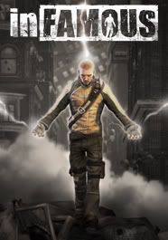
Prototype and Infamous are new IPs. With the similar sells. My question to you is which one do you think will sell better based on their box art. After adjusting for differences in installed user bases. (Prototype is multiplatform.)
[img Infamous]http://scrawlfx.com/wp-content/uploads/2009/03/infamous-box-art-reveal-560x643.jpg[/img]
Yellow on black/dark grey is striking. The logo is cool. The sell is you're an angry guy with lightning powers. It gets the point across. Little clutter. Your eye is drawn right to the badass on the box. Simple and effective. I like it, but why is it inFAMOUS? Our hero is kind of generic looking isn't he? It's not a classic. There is no single iconic image that defines it. No zombie claw, or triforce symbol, lancer, or whatever. The yellow jacket is cool but I doubt it has much to do with the actual gameplay.
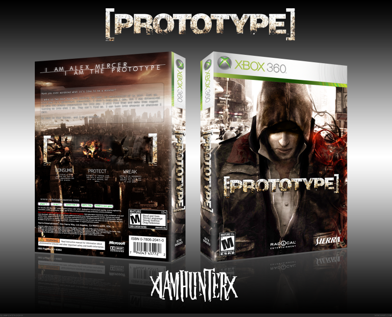
[img prototype]http://www.ebgames.com/common/images/lbox/270132brp.jpg[/img]
I couldn't find a bigger image maybe because it's not a final image, which is good because this, I don't think is very good. The main character is in the background? Are we selling the badass hero with a blade for his arm or the title of the game? White logo on a white background? The only color is in the arm which effectively draws your eye to the blade which is the important image, but that arm doesn't look very menacing to me or even like a weapon. More of an infected arm. He looks like he's praying. It's decidedly not badass. Red, white and black aren't bad colors even if they are a little boring. And I don't have to say and it but, Assassins Creed much?
Based on the boxes alone my money is on Infamous to sell relatively better. Do you guys agree?
Prototype and Infamous are new IPs. With the similar sells. My question to you is which one do you think will sell better based on their box art. After adjusting for differences in installed user bases. (Prototype is multiplatform.)
[img Infamous]http://scrawlfx.com/wp-content/uploads/2009/03/infamous-box-art-reveal-560x643.jpg[/img]
Yellow on black/dark grey is striking. The logo is cool. The sell is you're an angry guy with lightning powers. It gets the point across. Little clutter. Your eye is drawn right to the badass on the box. Simple and effective. I like it, but why is it inFAMOUS? Our hero is kind of generic looking isn't he? It's not a classic. There is no single iconic image that defines it. No zombie claw, or triforce symbol, lancer, or whatever. The yellow jacket is cool but I doubt it has much to do with the actual gameplay.
[img prototype]http://www.ebgames.com/common/images/lbox/270132brp.jpg[/img]
I couldn't find a bigger image maybe because it's not a final image, which is good because this, I don't think is very good. The main character is in the background? Are we selling the badass hero with a blade for his arm or the title of the game? White logo on a white background? The only color is in the arm which effectively draws your eye to the blade which is the important image, but that arm doesn't look very menacing to me or even like a weapon. More of an infected arm. He looks like he's praying. It's decidedly not badass. Red, white and black aren't bad colors even if they are a little boring. And I don't have to say and it but, Assassins Creed much?
[img creed]http://www.psu.com/media/articles/assassins_creed_box1.jpg[/img]
Based on the boxes alone my money is on Infamous to sell relatively better. Do you guys agree?