
So most of us have probably heard about the FPS coming out for the Wii named The Conduit. Now putting aside my criticisms of the actual game, I have to ask this question. Am I the only one who thinks this box art looks absolutely stupid?
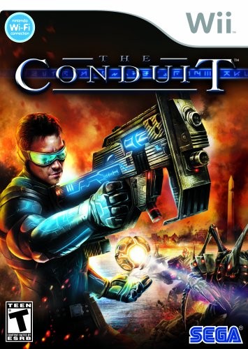
I'd say it's on par with the old Megaman box art when it comes to making the main character look stupid.
I'd say it's on par with the old Megaman box art when it comes to making the main character look stupid.
