Colours are complicated. I've been agonising about them a lot recently so I'm just going to spill my thoughts here. Not really making a point, just musing.
Grey and brown can be beautiful, somber and atmospheric or it can just be dull, boring and ugly. A lot of it depends on the depth of tone and subtle colours the art directors end up using in the palette. A lot of it also depends on tone. Tone of the story, gameplay, etc.
Sometimes a completely washed out, sepia tone brown palette is just a good choice for atmosphere. I feel like if you choose to use a palette like that your work requires other things to make it still be visually interesting though. Interesting designs, animations, effects, etc. It requires very careful use of contrast and light and shade if things are going to be at all distinct from another.
Here's a couple of examples. These are what I consider to be effective uses of a broadly 'grey and brown' colour scheme, mostly because they indulge some colour depth.
A couple of regular mid-gameplay screenshot from Bloodborne. I notice a lot of people saying Bloodborne is nothing but grey, but I really love the colours in this game. Beautiful, washed out, iridescent pastels of all sorts of tones. It is grey overall, but there's more to it than that and it ends up feeling beautifully atmospheric and otherworldly.
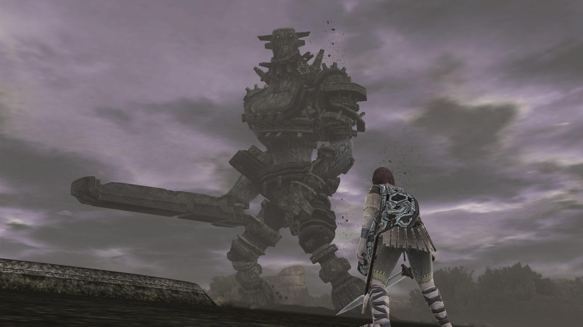
Shadow of the Colossus. This is another washed out, desaturated game but you don't hear that as a complaint as often. The reason is that it fits with the overall aesthetic and incorporates many different, chalky, natural tones. There's also this constant misty, dreamy quality to the visuals.
I see a lot of people desperate for more colours, and that's really understandable. I really love super colourful designs myself and the desaturated grey and brown palette has become waaaay overused. But overuse of saturated colours can sometimes negatively affect the overall visual tone of a piece of work. They don't necessarily fit or look good everywhere, just as grey and brown has a place and a purpose of its own. For example the work of H.R Giger would not have the incredible qualities it does if not for the ethereal hyper contrast of rich greys, whites and blacks with extremely subtle tinges of pink, blue and tan.
Just as Adventure Time or Bastion would not work nearly as well visually without their cascade of beautiful rich colours.
Blah blah, wanky waffley art shit. Hope someone enjoyed reading it at least.