The Official Screenshot Thread
- Thread starter Chimpzy
- Start date
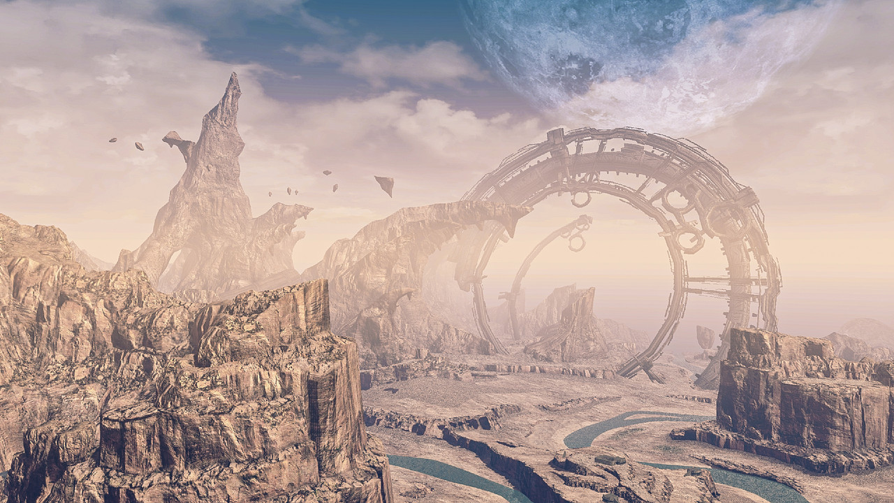
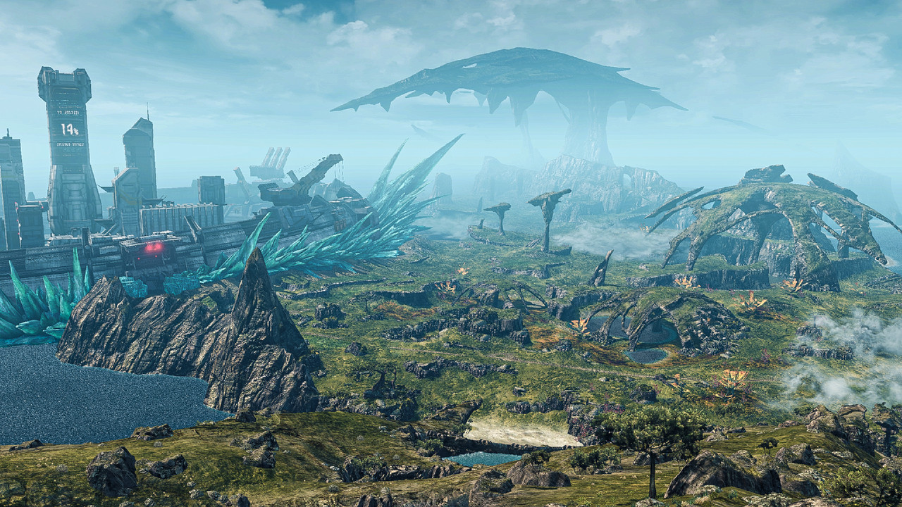
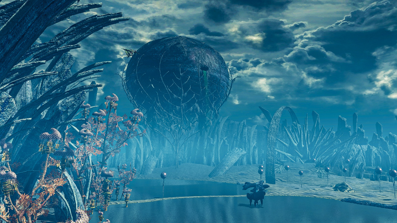
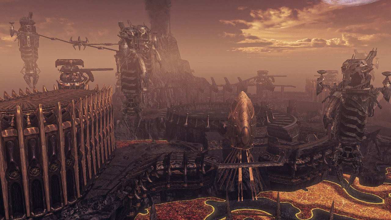
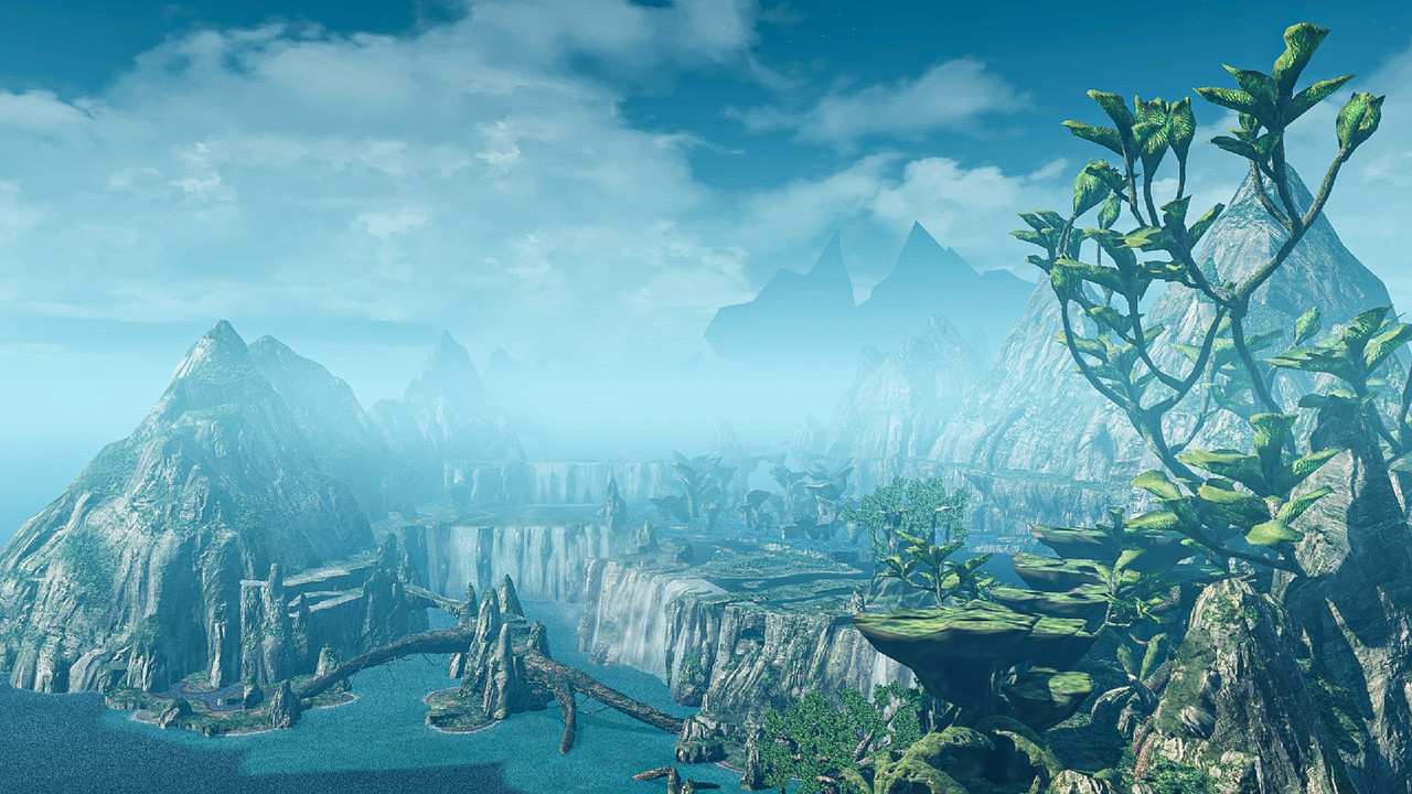
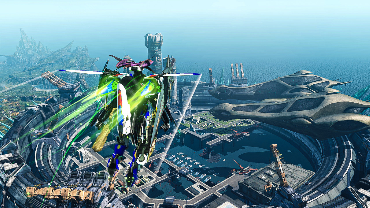
Last Xenoblade X shots
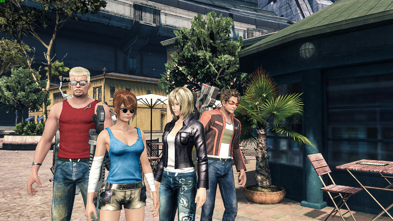
So this game lets you use any armor piece as a cosmetic, but unfortunately, most options are either too busy, too boring or too obnoxiously fan-servicey. Much like the characters themselves really. The solution? Make everyone do a shitty cosplay of other, more interesting game characters. By all means, take a guess.
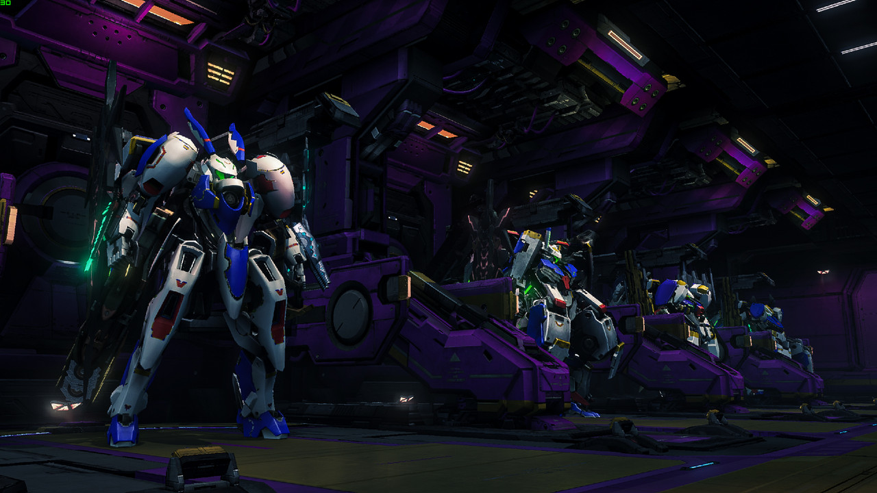
My skell hangar. Apparently the mech designs are from the guy who did Gundam 00, so it's only appropriate they also cosplay in Gundam colors.
So this game lets you use any armor piece as a cosmetic, but unfortunately, most options are either too busy, too boring or too obnoxiously fan-servicey. Much like the characters themselves really. The solution? Make everyone do a shitty cosplay of other, more interesting game characters. By all means, take a guess.

My skell hangar. Apparently the mech designs are from the guy who did Gundam 00, so it's only appropriate they also cosplay in Gundam colors.

Last edited:
Nuke Dukem, Lara Crapt, Aya Boring, and Fukiv Aino.The solution? Make everyone do a shitty cosplay of other, more interesting game characters. By all means, take a guess.
First three are right.Nuke Dukem, Lara Crapt, Aya Boring, and Fukiv Aino.
- Apr 1, 2009
- 15,083
- 3,943
- 118
- Gender
- Whatever, just wash your hands.
Travis Touchdown.First three are right.
- Apr 1, 2009
- 15,083
- 3,943
- 118
- Gender
- Whatever, just wash your hands.
Ghost of Tsushima is a meticulously crafted world with wonderfully impressive attention to natural beauty. It's all too easy to become immersed. That is until I came across this oversight...

What is this anti-scientific befuddlement, sucker punch? Smoke ignoring physics like some errant pervert ghost?? It's not even trying!
But I suppose you've earnt enough tolerance and forgiveness for providing this moment to ease my decaying cynical heart...


What is this anti-scientific befuddlement, sucker punch? Smoke ignoring physics like some errant pervert ghost?? It's not even trying!
But I suppose you've earnt enough tolerance and forgiveness for providing this moment to ease my decaying cynical heart...

- Apr 1, 2009
- 15,083
- 3,943
- 118
- Gender
- Whatever, just wash your hands.
Hmm, based on these I think I like the top right best, with top left second.Some shots from the OG and HD versions of Wind Waker. Both emulated, but at different settings. Everything default to the left. With improved resolution, anti-aliasing, texture filtering and whatnot on the right. Which looks best?


Top right is better of the two for definite. But the bottom two am struggling to find much difference on. Am only viewing through a phone currently though, so maybe that's not helping, I dunno. The seagull changed places, but I expect that sort of deviancy that from those cheeky bastards anyway.Some shots from the OG and HD versions of Wind Waker. Both emulated, but at different settings. Everything default to the left. With improved resolution, anti-aliasing, texture filtering and whatnot on the right. Which looks best?


Hmm, based on these I think I like the top right best, with top left second.
I'll break it down. Top left is basically Gamecube Windwaker. Top right is the same but rendered at 4K and a fuckton of texture filtering and like 4x supersampling anti-aliasing (which is complete overkill, but looks ultra sharp in motion), then downsampled to 1080p. Bottom left is Windwaker HD at default Wii U settings, bottom right the same but rendering at 4K with some minor other improvements, then downsampled to 1080p.Top right is better of the two for definite. But the bottom two am struggling to find much difference on. Am only viewing through a phone currently though, so maybe that's not helping, I dunno. The seagull changed places, but I expect that sort of deviancy that from those cheeky bastards anyway.
And yeah, I also think top right is best too. The original art style looks amazing when you throw some modern gpu power at it. So vibrant and crisp. The HD remake might have more advanced graphical features, but imo they kind of subtract from the overall look, and that you can't fix by bumping the resolution.
Last edited:
- Apr 1, 2009
- 15,083
- 3,943
- 118
- Gender
- Whatever, just wash your hands.
I think the top right is also the crispest image, for the hd remakes it seems like they added a light fog effect that washes out some of the color for distances. While that might be more realistic, I like the crisp image better.And yeah, I also think top right is best too. The original art style looks amazing when you throw some modern gpu power at it. So vibrant and crisp. The HD remake might have more advanced graphical features, but imo they kind of subtract from the overall look, and that you can't fix by bumping the resolution.
Yeah, they added a bunch of stuff like bloom lighting, ambient occlusion, realtime shadows and what looks like a smidge of depth of field. They also changed how character models are shaded. It's most noticeable on Link's head. It makes models look more like plastic figurines of the 2d toons.I think the top right is also the crispest image, for the hd remakes it seems like they added a light fog effect that washes out some of the color for distances. While that might be more realistic, I like the crisp image better.
- Apr 1, 2009
- 15,083
- 3,943
- 118
- Gender
- Whatever, just wash your hands.

