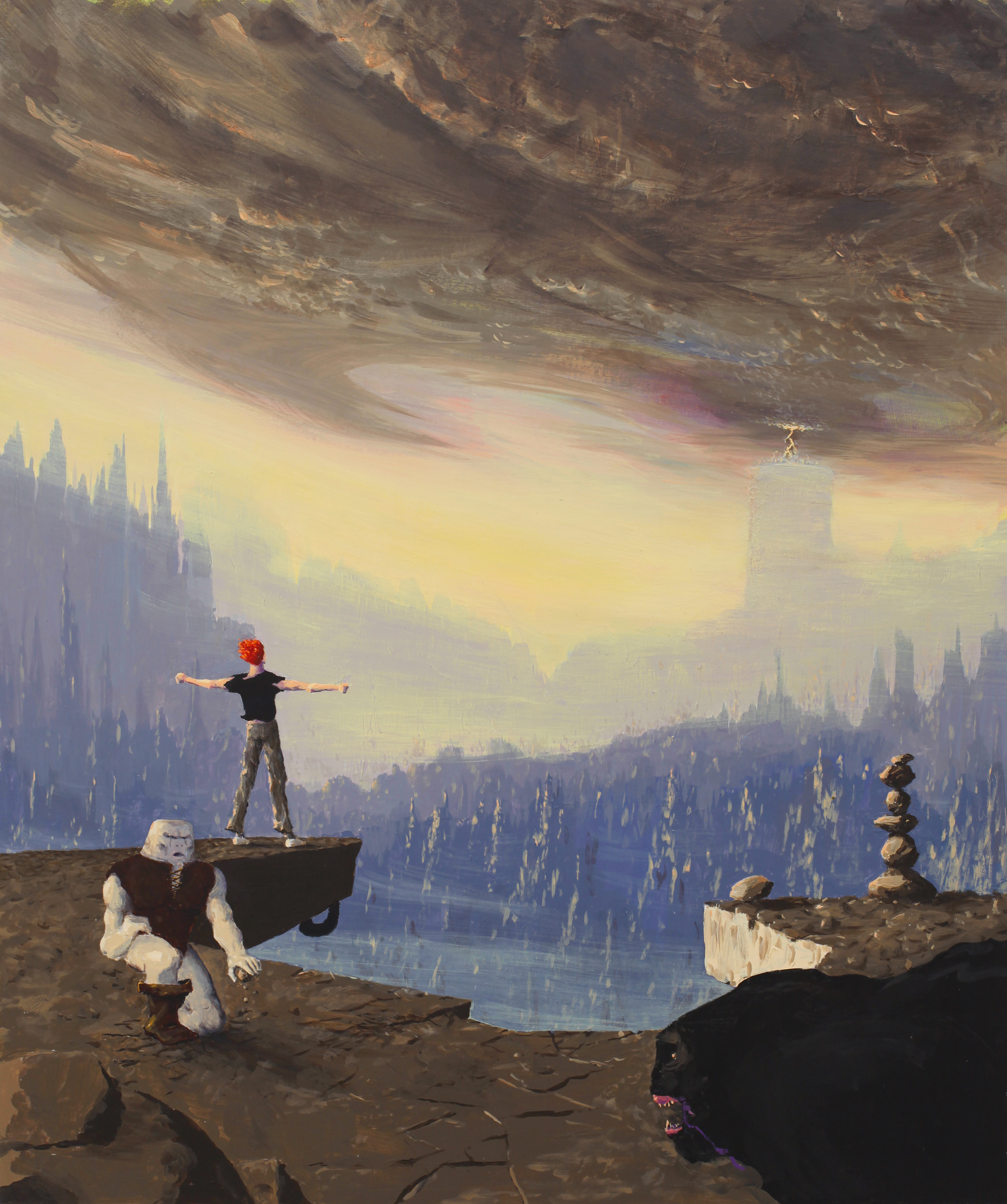
This isn't Your Favorte Cover Art, it's Best Cover Art. These are not necessarily the same. TL;DR below.
Something videogames don't seem to get away with - not that they try much - is good cover art. It's essentially the game's face, something to set it aside from other games at a first glance, yet most publishers seem content with pushing graphics to the max and having the protagonist either standing in the middle or walking/running towards the camera with an expression that is either defiant or downcast. You've seen this a million times.
THere's no Saul Bass of videogame cover art. Y'all know who Saul Bass was? He's probably the single most famous film poster artist, something he achieved via his amazing gift for synthesis: his posters give you a first impression of the story behind them that is both accurate and to the point, and he uses a bare minimum of elements, sticking to a simple 3 color palette, using shadows and silhouettes for characters and playing around with framing and angling. His style is so distinct that it's easily recognizable and mimicked, something Picasso or Hemingway could boast of just as well. Seriously, check out "Saul Bass style" on Google images.
TL;DR - Game cover art that succeeds in giving an accurate impression of the game by using a bare minimum of elements in a creative way?

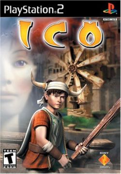
Isn't this a perfect representation of the game? Simple 4-5 primary color palette. The characters are minuscule and indistinct, and you can only tell they're 1) running, 2) holding hands, 3) one of them is holding something that could be either a stick or a sword. Compare their puny shadows with the vastness of the world surrounding them, which is composed of weird platform-based architecture serving some mistifying purpose (and you can tell you will have to brave it because of the ladder at the bottom right and the bridge on the upper left). And that's pretty much it. It's about two characters who must venture together and depend on each other to escape a strange world that is as immense as it is barren. You have character (two lonely kids), conflict (either they're lost or escaping the weird place), genre (adventure platformer) and themes (loneliness, camaraderie, melancholy).
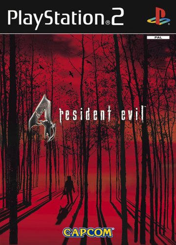
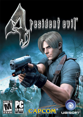
This reminds me of Bass's style: it sticks to 2 colors (black and a primary color) and simple shapes: trees and their shadows are mere lines, yet successfully convey the image of an opressive prison-like forest, with a small, lonely menacing figure standing in the middle. You would know it was a horror game without even having to look at the title. And you certainly know where it will be set as well. Here the cover is lying a bit - the setting goes from a rural forest area to a castle to a high-tech underground lab. But the "forest" is certainly the better part of the game, and it does give it a sense of dread and distinction you wouldn't get if you just showed Leon S. Kennedy fighting machine gun zombies on an oil rig.
Something videogames don't seem to get away with - not that they try much - is good cover art. It's essentially the game's face, something to set it aside from other games at a first glance, yet most publishers seem content with pushing graphics to the max and having the protagonist either standing in the middle or walking/running towards the camera with an expression that is either defiant or downcast. You've seen this a million times.
THere's no Saul Bass of videogame cover art. Y'all know who Saul Bass was? He's probably the single most famous film poster artist, something he achieved via his amazing gift for synthesis: his posters give you a first impression of the story behind them that is both accurate and to the point, and he uses a bare minimum of elements, sticking to a simple 3 color palette, using shadows and silhouettes for characters and playing around with framing and angling. His style is so distinct that it's easily recognizable and mimicked, something Picasso or Hemingway could boast of just as well. Seriously, check out "Saul Bass style" on Google images.
TL;DR - Game cover art that succeeds in giving an accurate impression of the game by using a bare minimum of elements in a creative way?
Isn't this a perfect representation of the game? Simple 4-5 primary color palette. The characters are minuscule and indistinct, and you can only tell they're 1) running, 2) holding hands, 3) one of them is holding something that could be either a stick or a sword. Compare their puny shadows with the vastness of the world surrounding them, which is composed of weird platform-based architecture serving some mistifying purpose (and you can tell you will have to brave it because of the ladder at the bottom right and the bridge on the upper left). And that's pretty much it. It's about two characters who must venture together and depend on each other to escape a strange world that is as immense as it is barren. You have character (two lonely kids), conflict (either they're lost or escaping the weird place), genre (adventure platformer) and themes (loneliness, camaraderie, melancholy).
This reminds me of Bass's style: it sticks to 2 colors (black and a primary color) and simple shapes: trees and their shadows are mere lines, yet successfully convey the image of an opressive prison-like forest, with a small, lonely menacing figure standing in the middle. You would know it was a horror game without even having to look at the title. And you certainly know where it will be set as well. Here the cover is lying a bit - the setting goes from a rural forest area to a castle to a high-tech underground lab. But the "forest" is certainly the better part of the game, and it does give it a sense of dread and distinction you wouldn't get if you just showed Leon S. Kennedy fighting machine gun zombies on an oil rig.


-1.jpg)