I know this is gonna be a pretty gosh-darn nitpicky subject, but I suppose a problem can't be dealt with unless we talk about it.
Assumedly we all know by now that America is pretty notorious for its truly terrible box art for games, for the most part. Thankfully, we outside the star-spangled borders are (mostly) lucky, in that most will get Europe's contributions to Box Art, sometimes Asia's, which are by comparison infinitely better designed.
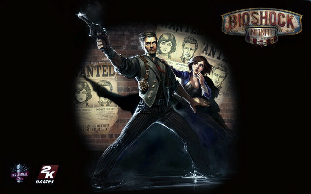
Anyways, Bioshock Infinite's box art has just been revealed, and...well...

Really, 2K/Irrational? Really? Of all the imagery from [URL="http://images.wikia.com/bioshock/images/a/ac/E32011Songbird1.png" (title,target)]something[/URL] as [URL="http://images1.wikia.nocookie.net/__cb20121022142659/bioshock/images/f/f6/Oct22-Screen03.jpg" (title,target)]vivid[/URL] as [URL="http://www.wouldyoukindly.com/wp-content/uploads/bsinfiniteangels.jpg" (title,target)]Columbia[/URL] that could've inspired something truly amazing to look at, you end up with...essentially nothing on a box. It looks like a Call of BattleHonour cover, with its one redeeming quality being that there's at least a clear blue sky. The previous Bioshock entries had wonderful box art, hinting at an incredible world in Rapture in the background, along with provocative imagery with the Big Daddy and Little Sister in the foreground.
This just looks like Booker's wondering why he's suddenly floating 10,000 feet in the air but trying to keep cool about it.
The only thing I like about it is the burning flag; it's hinting at something, I know that much, but I can't seem to care when I can't even see a hint of what that flag is attached to.
I really hope there's a European version of this that doesn't look like the Art Department was staffed entirely by Advertising drones.
Any thoughts on this?
EDIT: I'm not implying that this is swaying my decision on whether I'm getting the game or not, for I certainly am. I'm merely saying Bioshock's previous entries have both had incredibly well-made art for their covers, so to have such low...standards for Infinite seems incredibly jarring. They can and should have done better.
EDIT THE 2ND: So the full box art has now been released.

Corset-defying and most-important-part-of-the-game lady Elizabeth is relegated to the back cover. Oh hey, there's a picture of Columbia and a Handyman that probably should've been front and centre if the marketing department had put more than two brain cells into this.
Assumedly we all know by now that America is pretty notorious for its truly terrible box art for games, for the most part. Thankfully, we outside the star-spangled borders are (mostly) lucky, in that most will get Europe's contributions to Box Art, sometimes Asia's, which are by comparison infinitely better designed.
Anyways, Bioshock Infinite's box art has just been revealed, and...well...
Really, 2K/Irrational? Really? Of all the imagery from [URL="http://images.wikia.com/bioshock/images/a/ac/E32011Songbird1.png" (title,target)]something[/URL] as [URL="http://images1.wikia.nocookie.net/__cb20121022142659/bioshock/images/f/f6/Oct22-Screen03.jpg" (title,target)]vivid[/URL] as [URL="http://www.wouldyoukindly.com/wp-content/uploads/bsinfiniteangels.jpg" (title,target)]Columbia[/URL] that could've inspired something truly amazing to look at, you end up with...essentially nothing on a box. It looks like a Call of BattleHonour cover, with its one redeeming quality being that there's at least a clear blue sky. The previous Bioshock entries had wonderful box art, hinting at an incredible world in Rapture in the background, along with provocative imagery with the Big Daddy and Little Sister in the foreground.
This just looks like Booker's wondering why he's suddenly floating 10,000 feet in the air but trying to keep cool about it.
The only thing I like about it is the burning flag; it's hinting at something, I know that much, but I can't seem to care when I can't even see a hint of what that flag is attached to.
I really hope there's a European version of this that doesn't look like the Art Department was staffed entirely by Advertising drones.
Any thoughts on this?
EDIT: I'm not implying that this is swaying my decision on whether I'm getting the game or not, for I certainly am. I'm merely saying Bioshock's previous entries have both had incredibly well-made art for their covers, so to have such low...standards for Infinite seems incredibly jarring. They can and should have done better.
EDIT THE 2ND: So the full box art has now been released.
Corset-defying and most-important-part-of-the-game lady Elizabeth is relegated to the back cover. Oh hey, there's a picture of Columbia and a Handyman that probably should've been front and centre if the marketing department had put more than two brain cells into this.