Okie dokies, here I go...Smagmuck08 said:<spoiler=Super Mega Spoilers>
<spoiler=98 Bravo>http://img59.imageshack.us/img59/33/98bravothermal.jpg
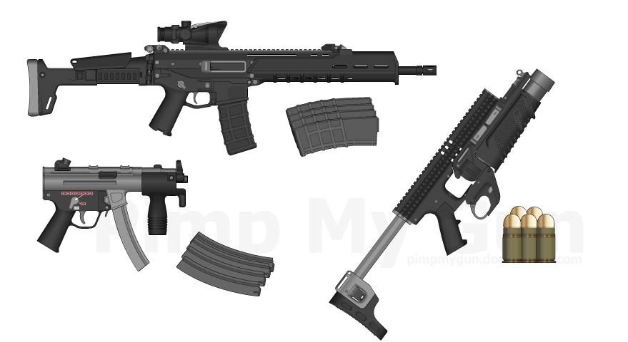
<spoiler=ACR>http://img59.imageshack.us/img59/6443/acrforereddot.jpg
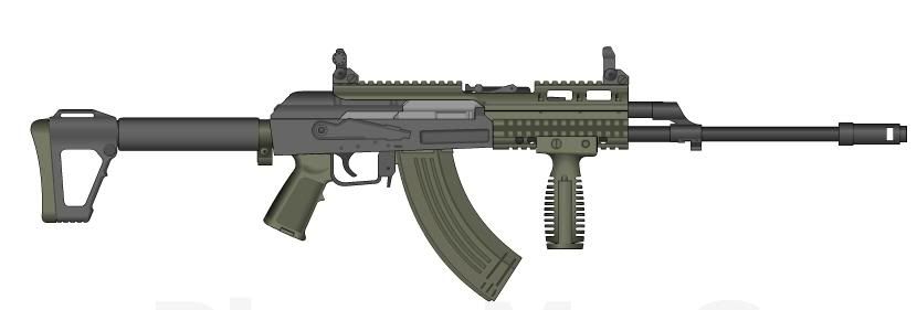
<spoiler=AK 47>http://img508.imageshack.us/img508/5728/ak47holofore.jpg
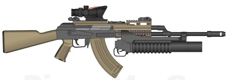
<spoiler=AK 74>http://img198.imageshack.us/img198/3875/ak74.jpg
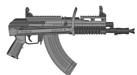
<spoiler=Ak 74U>http://img18.imageshack.us/img18/9937/ak74ufore.jpg
<spoiler=CQBR>http://img508.imageshack.us/img508/1082/cqbrfore.jpg
<spoiler=Draganov>http://img198.imageshack.us/img198/401/dragonov.jpg
<spoiler=HK 416>http://img63.imageshack.us/img63/3006/hk416scilencedfore.jpg
<spoiler=HK 417>http://img696.imageshack.us/img696/1580/hk417holom203.jpg
<spoiler=M4>http://img63.imageshack.us/img63/8306/m4reddotfore.jpg
<spoiler=M16>http://img63.imageshack.us/img63/4880/m16thermalm203.jpg
<spoiler=M200>http://img693.imageshack.us/img693/2338/m200scoped.jpg
<spoiler=Mk. 13 Standalone>http://img508.imageshack.us/img508/1859/mk13standaloneacoglaser.jpg
<spoiler=MP5>http://img198.imageshack.us/img198/3706/mp5reddot.jpg
<spoiler=SCAR-H>http://img194.imageshack.us/img194/1241/scarhreddotmk13.jpg
<spoiler=SCAR-L>http://img194.imageshack.us/img194/2502/scarlmk13holo.jpg
<spoiler=SR 25>http://img693.imageshack.us/img693/1391/sr25scopedfore.jpg
Please Critisize these creations...
98 Bravo - A bit generic, not much change. The pistol grip is slightly off, also.
ACR - The stock seems lacking, and the foregrip looks awkward, but otherwise it's good.
AKM - I do enjoy the AK holographic, but the foregrip is too far up. Try to bring it down. Good RIS positioning, though.
AK74 - Great stuff, good use of colours. I like it.
AK74u - The stock has not been moved all they way down, I'm pretty sure it's a U shape and can go all the way. Otherwise, good.
CQBR - The MOE stock is a little bit too far down, it should be centered on the buffer tube. I like how you've left space for attachments and customization.
Dragonov - The white colours are a good pick, although it make the stock look like it's pasted on rather than a part of the gun. Also, I don't like the little bits of white left on the hole in the handguard.
HK416 - Again, you've put the stock just a little bit too low, but I like the look of the barrel and suppressor.
HK417 - I like the solid-looking front with the grenade launcher, but the sparse back aesthetically unbalances it for me.
M4 - I'm not sure that the front iron sight should be there when using a red dot. I could be wrong, though.
M16 - Looks good, no technical errors.
M2000 - The pistol grip isn't really attached properly, and the scope is too far forward. However, the barrel looks great.
MK13 Standalone - Your ACOG is a bit too far back, but otherwise the design is good.
MP5 - I like the style of the handguard and stock, but the top rail is meant to be down a bit more until it's straddling the top of the gun.
SCAR-H - You've positioned the folded stock right, but the grenade launcher trigger is a bit iffy. Red dot needs to be higher too.
SCAR-L - The addition of a holo sight is good, and the grenade launcher is a bit better.
SR25 - The handgrip is a bit too short to be useful, but the rest of the rile is well made.


