The artist in thee
- Thread starter Labyrinth
- Start date
Recommended Videos
I did the colors like that intentionally, to be honest. I didn't want there to be too much of a contrast between the colors because, in my experience, that makes the icons on top of it harder to read (it's meant to be a wallpaper, remember). As for the arms...yeah, no excuse there. I really ought to get better at those.Fightgarr said:Hey buddy, just a couple of things. The drawing still feels a bit unresolved, the good news is is it's simply a colour balance issue. The piece is too warm. If you can make that green colder or make the subtle blue hints more saturated it'll really help resolve it as a whole. The only other piece of advice I have today is to start looking at arm shape a little more. I've noticed you tend to draw arms fairly straight, but an arm tapers in and out slightly. Just that small tapering I feel would help bring more form to your characters. Other than that, really nice work with lighting. The piece has a very established mood, and the character has a lot of personality. Hope that helps.Zemalac said:snip
Glad you like it so much.Shapsters said:snip
On the other hand, I've found it near impossible to create a male Shepard that doesn't look really weird. The facial creation engine in that game is just sort of... awkward for creating men. I've been admiring your drawings for a little while now, I haven't really gotten a chance to say anything yet. You have a lot of style and a very good sense of suggesting form. Hope you keep making us these things.LiquidGrape said:
I don't know, I managed to polish up a pretty decent maleshep.Fightgarr said:On the other hand, I've found it near impossible to create a male Shepard that doesn't look really weird. The facial creation engine in that game is just sort of... awkward for creating men. I've been admiring your drawings for a little while now, I haven't really gotten a chance to say anything yet. You have a lot of style and a very good sense of suggesting form. Hope you keep making us these things.LiquidGrape said:
- Though the hairstyles are all ghastly. Bald is really the only option.
And thank you so much for the kind words; in response I'd like to say that I really enjoyed your take on Demon Nago from Mononoke-hime.
Anywho,

Earthborn/Sole Survivor/Infiltrator/Paragon.
Enjoys anthropological discourse, sniper rifles and ladies of an azure disposition.
Just a note, looking at your style has reminded me of the Surrealist James Gleeson. Look him up some time, he has some fantastically creepy stuff. My favourite is The Citadel. You'll probably spot why when you find it.Swollen Goat said:
4B is part of your standard set you can find it at any art supply store and even at most good stationary stores. The mid to high B pencils are very soft, so yes, they will create smoother transitions and will allow for a greater range of tone. The 4B is the real middle of the road for drawing. It's why I like it, it's hard enough to get some really nice crisp lines, but soft enough to shade smoothly. Try using a blender or your fingers (nature's blender) to get a gradient feel, it may not be what you're looking for in terms of aesthetic but it's always something to try out. As for background taking away from your piece, only if you overdo it, I'm not even talking about establishing a concrete place for the thing to be in, it could just be parts of the drawing have a light grayscale, suggestions of shape. Experiment is all I can say.Swollen Goat said:Snip
I don't have any drawings online since I mostly just do sketches that aren't good enough to scan. I do have some quick photo manipulations I can post though. These are also all things I got off of tutorials so if anyone's interested I can link those. I would also like to note that I am not a photographer by any stretch of the imagination so the pictures I used are ones that I took out of a moving car and I just thought they looked neat.
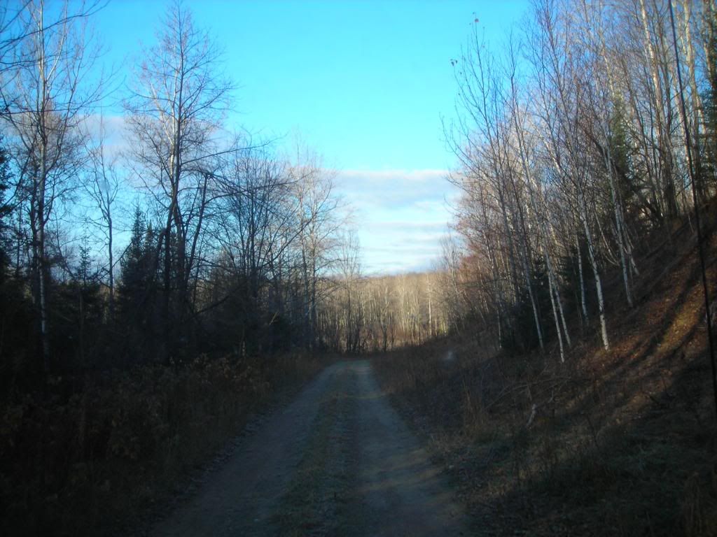
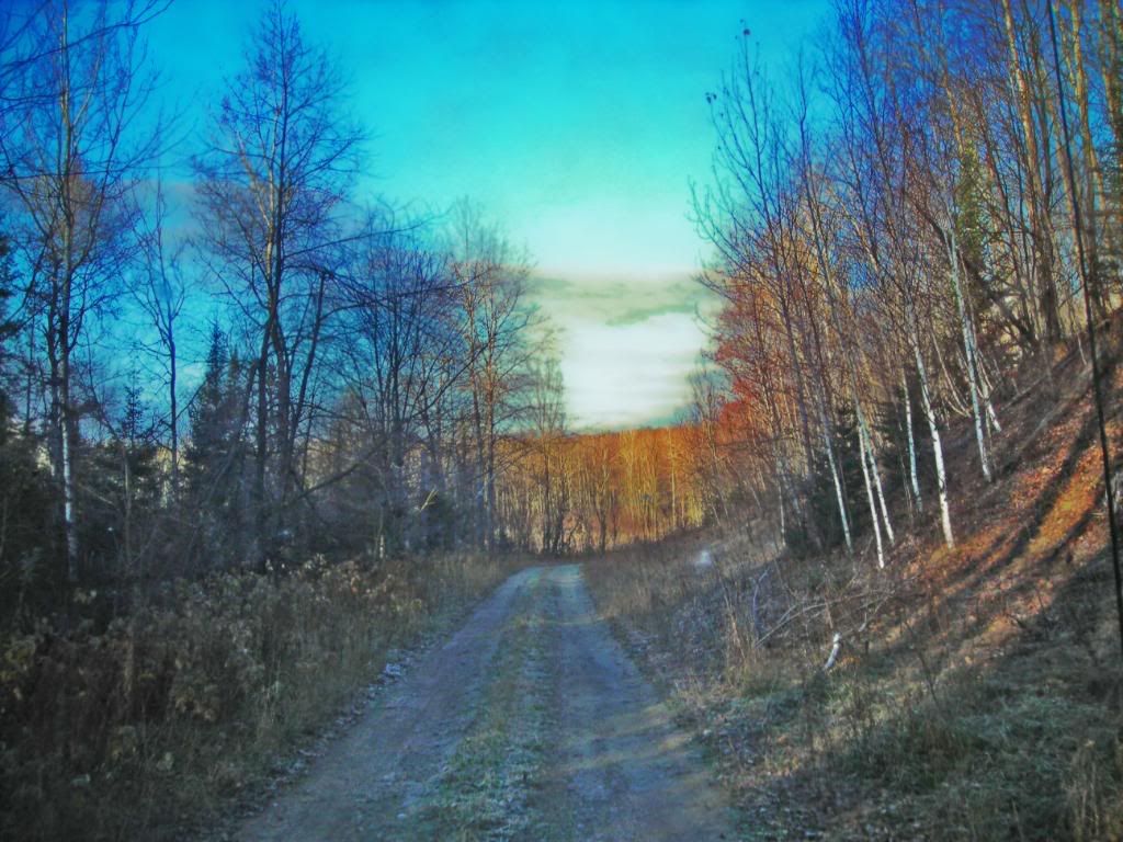
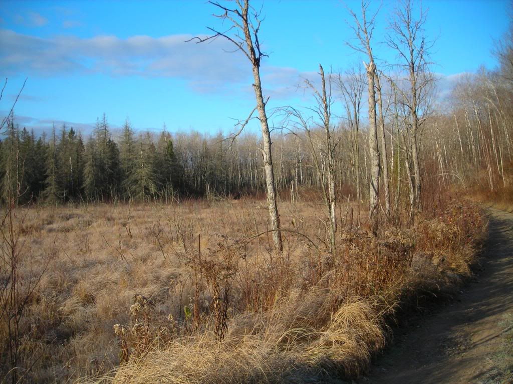
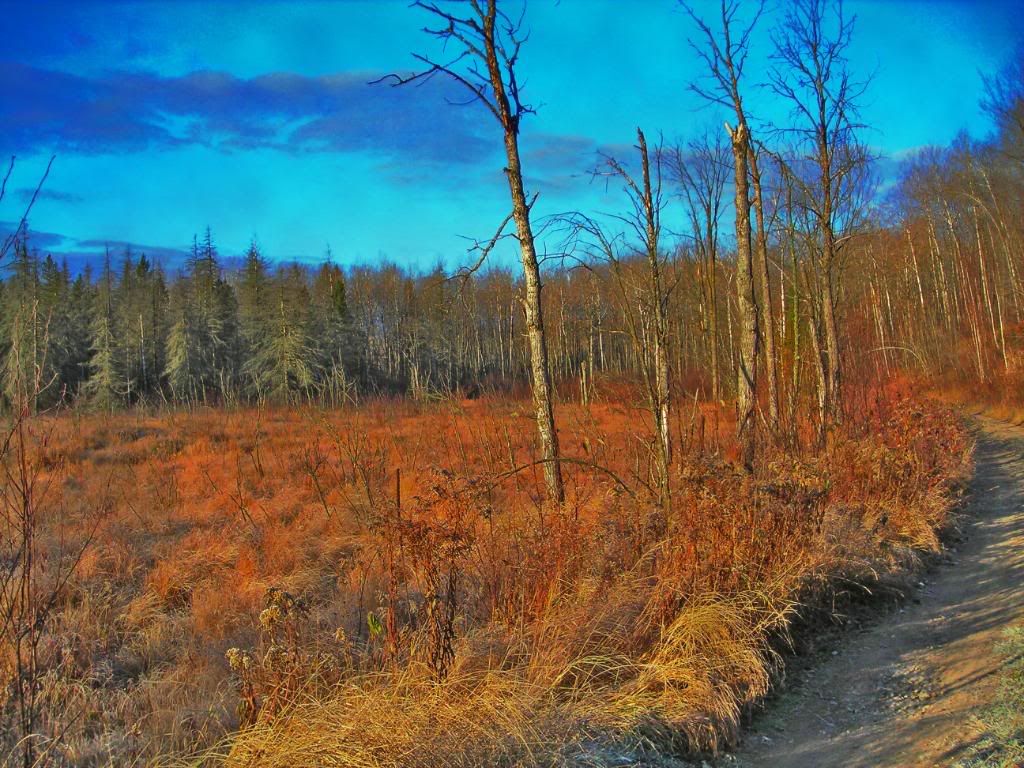

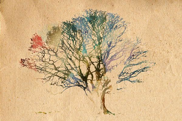 I have to dig through my old stuff to find some of my better work to post.


Oh, I laughed. Hard. For several minutes. Fantastic idea and great execution.LiquidGrape said:
Perfect.LiquidGrape said:
There's nothing else to be said about this.
It's just perfect.
Labyrinth said:Oh, I laughed. Hard. For several minutes. Fantastic idea and great execution.LiquidGrape said:
D'aww. You're both too kind.Tootmania said:Perfect.LiquidGrape said:
There's nothing else to be said about this.
It's just perfect.
I feel obliged to celebrate with more Mass Effect innuendo and intellectuals caught in the torrent of online idiocy.


