[HEADING=1]
The new Pokemon look horrid. Yeah, there are a few good ones here and there in each passing generation, but generally the quality of design has been very poor. It's almost getting embarrasing, with millions of fans willing to buy the game you'd think they would put real care into designing the little critter. With the nex starters released, it's best to not get your hopes up that Nintendo will improve the alarming trend of not giving enough of a shit about the aesthetics.
It's kind of strange, because it shouldn't be that hard to design them. I've tried to set up a few simple rules that ensure that they look interesting, visually pleasing and most importantly: believable. Now remember, these are just some personal suggestions and Nintendo can go do what they please and go churn out a rock with a nose on it for all I care...oh wait.
[HEADING=2]
8) They need a puntastic name
[HEADING=2]With these rules down, let's examine some pokemon and see how well they do. [/HEADING]

Pikachu, the mascot of Pokemon. Very simple , effective design. It's a rat, and even though it lacks any natural connection to electricity, the sharp ragged lines of the tail show the element. It has a strong sillouette, the yellow/black/brown colour scheme works nicely. It looks cute and agile, representing its abilities nicely. The tail seem to be a sort of reception for thunder. Apart from the lacking connection of rats/thunder and the retarded evolution to Raichu, it does very nicely.
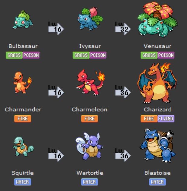
The original starters. They are all awesomely designed. Bulbasaur is a toad, thus immeadiatly draws connections with forests and poison. He has a petal placed on his back which alludes to his element and attacks. He grows stronger, more threatening and looks big like a tank character. The animalsitic connection is there, visually the blue/green colours work well. The flower develops through evolutions, making it a weapon used for solar beam and further strenghtening his function.
Squirtle is a turtoise, thus draws connections with water. It's cute and has a shell, which show the defensive prowess. The evolutions look fitting, the later water cannons are slightly overdone but show it's function of shooting water. The colour scheme works well,is unified through evolutions and indicates the element.
Charmander is a lizard type creature which immeadiatly draws connection with Fire salamanders, lizards and the dragon lore. It evolves into a mighty dragon, which looks threatening and agile. Good warm colours. Cute at the beginning and progressevily more dominant. It has a flame on its tail, which yet again, show the function and element.
Look at the features of all three: Cute, wide open eyes in the beginning which turn to evil, scowling eyes. Similar shapes and forms. Perfect, simple, easy to understand. Those are some memorable starters.

The new Black/White starters. Boy oh boy...where do I start?
The grass starter seems to be some kind of lizard. The colour scheme works resonably well, but seems to be a little to uneven with the unharmonious green/yellow. It has a sort of leaf shape on the tail which indicates the element. It has a very strange eye and some sort of collar. It only marginally represents a real animal, anatomy with feet and leg size looks rather silly. The lizard connection would work as a grass element, but it looks to little like a real animal to be effective. It seems to have no features with which to shoot its attacks apart from the mouth.
The fire starter is a fire pig. Yeah...It looks cute, but has a rather strange and happy mouth which looks uncharacteristic of the series, almost like the happy Yatzhee face. The connection between fire and pig are virtually non-existant. It has a spiral tail, which shows that it's a pig but does nothing for function or to establish it's abilities. The orange, black, yellow scheme might work, but the way it's applied looks uneven and downright strange to me. It's not a pattern, it's not fur and it seems like a type of cloak. It has rabbit ears, because it's a mix of a rabbit and pig? Not simple enough. Confusing.
The Water starter. It seems to be some sort of seal, although again the connection isn't very obvious. The colour scheme might work, but the applied colours look horrendous with the uneven white head, blue body. It looks like a snowball/ snowman. The nose is unfitting and breaks the colour scheme. It looks depressed and breaks the usually happy starter mood, also makes it look less cute. The feet and tail indicate the element, but don't go well with the stocky body. It holds a shell, which is probably it's unique interesting feature and might be awesome for a potential evolution/ weapon.
Now look at their joined features: They all have different eyes. Their moods are pronounced and seem strange by giving Pokemon overly human emotions. Their leg and arm shapes are vastly different and don't look unified at all. They all have different mouths. To be honest they hardly have any similar features.
In conclusion: They look like absolute shit. I can't even imagine what the next evolutions will look like, but I pray for their disfigured souls.
Anyway, this was a lot of text and I hope someone might read a bit.
As for my question:
[HEADING=2]What do you think? What makes a good pokemon design? Do you like the new starters? Any favorite/ hated designs?[/HEADING]
The Pokemon Design Guide
[/HEADING]The new Pokemon look horrid. Yeah, there are a few good ones here and there in each passing generation, but generally the quality of design has been very poor. It's almost getting embarrasing, with millions of fans willing to buy the game you'd think they would put real care into designing the little critter. With the nex starters released, it's best to not get your hopes up that Nintendo will improve the alarming trend of not giving enough of a shit about the aesthetics.
It's kind of strange, because it shouldn't be that hard to design them. I've tried to set up a few simple rules that ensure that they look interesting, visually pleasing and most importantly: believable. Now remember, these are just some personal suggestions and Nintendo can go do what they please and go churn out a rock with a nose on it for all I care...oh wait.
[HEADING=2]
Rules:
[/HEADING][HEADING=2]
Pokemon is, and should always be a kid's game. That isn't to say that it can't be enjoyed by older gamers, but if you can't excite kids with the design then you've failed your mission statement. The creator himself said that he was inspired by his days of catching bugs as a kid, and really most kids love either animals, adventure and collecting shit.
It's important for the monsters to be relatable to real animals. Not only can you already sort of know what they do, but you'll also find it easier imagining their movements, attitude's and attacks. There are millions of animals for reference here, so after 6 generations there's still plenty left. Certain animals will work better with certain elements. Obviously birds will be used as inspiration as flying pokemon, fish as water pokemon etc etc.
It gets confusing however once you start to mix uncommon types. A fire-piglet. Why? Where's the connection to fire? How does it produce fire? A similar problem exists with Pikachu. A rat that shootsshurikens and lightning. Why?
If a kid takes a look at the thing and doesn't immeadiatly click as to what it is and how it works, the design isn't very succesful.
In order for the beasts to be interesting and believable to kids, they should be grounded in reality.
[/HEADING]Pokemon is, and should always be a kid's game. That isn't to say that it can't be enjoyed by older gamers, but if you can't excite kids with the design then you've failed your mission statement. The creator himself said that he was inspired by his days of catching bugs as a kid, and really most kids love either animals, adventure and collecting shit.
It's important for the monsters to be relatable to real animals. Not only can you already sort of know what they do, but you'll also find it easier imagining their movements, attitude's and attacks. There are millions of animals for reference here, so after 6 generations there's still plenty left. Certain animals will work better with certain elements. Obviously birds will be used as inspiration as flying pokemon, fish as water pokemon etc etc.
It gets confusing however once you start to mix uncommon types. A fire-piglet. Why? Where's the connection to fire? How does it produce fire? A similar problem exists with Pikachu. A rat that shoots
If a kid takes a look at the thing and doesn't immeadiatly click as to what it is and how it works, the design isn't very succesful.
[img height 300, width=200]http://www.geekologie.com/2009/11/23/pikachu-mask.jpg[/img]
Pikachu in reality
Pikachu in reality
[HEADING=2]
This is the most essential one and doesn't need to much explaining. Pokemon should represent their strengths through their appearance. A high HP PM should look big, fat and like a tank. A quick one should look nimble. Certain animalistic traits can be used to strengthen such a connection of function. Shells/ spikes as a visual short-cut for a protective critter, large teeth for a violent beast, wings for flight etc etc.

How not to: Design/ function of Nosepass? To snort a lot of coke?
Form after function.
[/HEADING]This is the most essential one and doesn't need to much explaining. Pokemon should represent their strengths through their appearance. A high HP PM should look big, fat and like a tank. A quick one should look nimble. Certain animalistic traits can be used to strengthen such a connection of function. Shells/ spikes as a visual short-cut for a protective critter, large teeth for a violent beast, wings for flight etc etc.
How not to: Design/ function of Nosepass? To snort a lot of coke?
[HEADING=2]
They work best when they have a simple colour scheme. Nintendo has been doing a good job with this so far. DIfferent colour obviously indicate different elements, and shouldn't be mixed up too much. Warm colours for fire, cold colours for water etc etc. It's also crucial to not mix colours up too much in between evolution to maintain consistency.

Luckily Girafarig wasn't wearing any pants
A simple/ 3 colour design scheme that relates to their element.
[/HEADING]They work best when they have a simple colour scheme. Nintendo has been doing a good job with this so far. DIfferent colour obviously indicate different elements, and shouldn't be mixed up too much. Warm colours for fire, cold colours for water etc etc. It's also crucial to not mix colours up too much in between evolution to maintain consistency.
Luckily Girafarig wasn't wearing any pants
[HEADING=2]
This is important for a believable world and immersion. Pokemon should share a similar look, simple really. The physical features, height and colours have to match their surroundings and work together.
A lot of pokemon share features like black, small eyes, round body types, short and stumpy legs. Small pokemon look cute and cuddly with wide-open eyes, large pokemon have a scowl with semi-closed eyes.

Plea....please kill me.
Pokemon should share similar design themes throughout the generation
[/HEADING]This is important for a believable world and immersion. Pokemon should share a similar look, simple really. The physical features, height and colours have to match their surroundings and work together.
A lot of pokemon share features like black, small eyes, round body types, short and stumpy legs. Small pokemon look cute and cuddly with wide-open eyes, large pokemon have a scowl with semi-closed eyes.
Plea....please kill me.
[HEADING=2]
If the critter evolves, it should be natural. It gets bigger, more threatining if it gains health/ strength. If it gains mystical powers, it should look more supernatural and obscure. If it gains another element, it should be visually represented somehow.
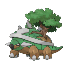
That's not a tree, that's a growing tumor
The evolution of the pokemon should be within resonable measure and show natural, visual progression
[/HEADING]If the critter evolves, it should be natural. It gets bigger, more threatining if it gains health/ strength. If it gains mystical powers, it should look more supernatural and obscure. If it gains another element, it should be visually represented somehow.
That's not a tree, that's a growing tumor
[HEADING=2]
A lot of Pokemon can learn a number of attacks although they don't seem to be equipped for them. That makes it hard to swallow how they could perform them, and decreases believability. It's okay to assume that most attacks are performed as a sort of mega blast from their mouth, but this idea can only take you so far. Bulbasaur uses his whips to whip stuff, Blastoise has a huge cannon with which he blasts stuff. Nosepass snorts, Lovedisc...loves? It makes for more unique and relatale pokemon if they have some sort of unique method to trigger their weapons and under no circumstances should a Pokemon be able to learn moves that it couldn't perform. For that matter, how can water types fight while you're searching in tall grass? Whatever.
What happens when you teach Explode to the wrong Pokemon
Pokemon should be physically equipped to perform their attacks.
[/HEADING]A lot of Pokemon can learn a number of attacks although they don't seem to be equipped for them. That makes it hard to swallow how they could perform them, and decreases believability. It's okay to assume that most attacks are performed as a sort of mega blast from their mouth, but this idea can only take you so far. Bulbasaur uses his whips to whip stuff, Blastoise has a huge cannon with which he blasts stuff. Nosepass snorts, Lovedisc...loves? It makes for more unique and relatale pokemon if they have some sort of unique method to trigger their weapons and under no circumstances should a Pokemon be able to learn moves that it couldn't perform. For that matter, how can water types fight while you're searching in tall grass? Whatever.
What happens when you teach Explode to the wrong Pokemon
[HEADING=2]
A lot of new Pokemon share the "more is more" design philosophy, especially the legendary ones. They have spikes, shapes and all these miscellanous shit attached to them. Why? It doesn't make them look better, if anything it just dilutes their look. Nintendo are the unquestionable champions of having simple, gorgeous design, they should stick to it more. This is a kid's series, it should be simple and effective.
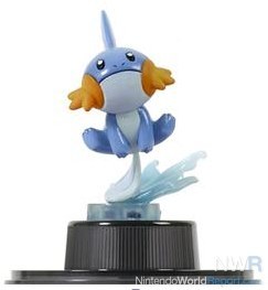
Mudkip enjoying a simple douche
The simpler, the better.
[/HEADING]A lot of new Pokemon share the "more is more" design philosophy, especially the legendary ones. They have spikes, shapes and all these miscellanous shit attached to them. Why? It doesn't make them look better, if anything it just dilutes their look. Nintendo are the unquestionable champions of having simple, gorgeous design, they should stick to it more. This is a kid's series, it should be simple and effective.
Mudkip enjoying a simple douche
[HEADING=2]With these rules down, let's examine some pokemon and see how well they do. [/HEADING]
Pikachu, the mascot of Pokemon. Very simple , effective design. It's a rat, and even though it lacks any natural connection to electricity, the sharp ragged lines of the tail show the element. It has a strong sillouette, the yellow/black/brown colour scheme works nicely. It looks cute and agile, representing its abilities nicely. The tail seem to be a sort of reception for thunder. Apart from the lacking connection of rats/thunder and the retarded evolution to Raichu, it does very nicely.
[HEADING=3]Final Grade =[HEADING=1] B+[/HEADING][/HEADING]
The original starters. They are all awesomely designed. Bulbasaur is a toad, thus immeadiatly draws connections with forests and poison. He has a petal placed on his back which alludes to his element and attacks. He grows stronger, more threatening and looks big like a tank character. The animalsitic connection is there, visually the blue/green colours work well. The flower develops through evolutions, making it a weapon used for solar beam and further strenghtening his function.
Squirtle is a turtoise, thus draws connections with water. It's cute and has a shell, which show the defensive prowess. The evolutions look fitting, the later water cannons are slightly overdone but show it's function of shooting water. The colour scheme works well,is unified through evolutions and indicates the element.
Charmander is a lizard type creature which immeadiatly draws connection with Fire salamanders, lizards and the dragon lore. It evolves into a mighty dragon, which looks threatening and agile. Good warm colours. Cute at the beginning and progressevily more dominant. It has a flame on its tail, which yet again, show the function and element.
Look at the features of all three: Cute, wide open eyes in the beginning which turn to evil, scowling eyes. Similar shapes and forms. Perfect, simple, easy to understand. Those are some memorable starters.
[HEADING=3]Final Grade =[HEADING=1] A+[/HEADING][/HEADING]
The new Black/White starters. Boy oh boy...where do I start?
The grass starter seems to be some kind of lizard. The colour scheme works resonably well, but seems to be a little to uneven with the unharmonious green/yellow. It has a sort of leaf shape on the tail which indicates the element. It has a very strange eye and some sort of collar. It only marginally represents a real animal, anatomy with feet and leg size looks rather silly. The lizard connection would work as a grass element, but it looks to little like a real animal to be effective. It seems to have no features with which to shoot its attacks apart from the mouth.
The fire starter is a fire pig. Yeah...It looks cute, but has a rather strange and happy mouth which looks uncharacteristic of the series, almost like the happy Yatzhee face. The connection between fire and pig are virtually non-existant. It has a spiral tail, which shows that it's a pig but does nothing for function or to establish it's abilities. The orange, black, yellow scheme might work, but the way it's applied looks uneven and downright strange to me. It's not a pattern, it's not fur and it seems like a type of cloak. It has rabbit ears, because it's a mix of a rabbit and pig? Not simple enough. Confusing.
The Water starter. It seems to be some sort of seal, although again the connection isn't very obvious. The colour scheme might work, but the applied colours look horrendous with the uneven white head, blue body. It looks like a snowball/ snowman. The nose is unfitting and breaks the colour scheme. It looks depressed and breaks the usually happy starter mood, also makes it look less cute. The feet and tail indicate the element, but don't go well with the stocky body. It holds a shell, which is probably it's unique interesting feature and might be awesome for a potential evolution/ weapon.
Now look at their joined features: They all have different eyes. Their moods are pronounced and seem strange by giving Pokemon overly human emotions. Their leg and arm shapes are vastly different and don't look unified at all. They all have different mouths. To be honest they hardly have any similar features.
In conclusion: They look like absolute shit. I can't even imagine what the next evolutions will look like, but I pray for their disfigured souls.
[HEADING=3]Final Grade =[HEADING=1] D-[/HEADING][/HEADING]
Anyway, this was a lot of text and I hope someone might read a bit.
As for my question:
[HEADING=2]What do you think? What makes a good pokemon design? Do you like the new starters? Any favorite/ hated designs?[/HEADING]