I think I'll second that. They did an excellent job making the menu thematic (aka spooky +foggy light) to the game itself.Vareoth said:I will most certainly agree with the first Halo game and MGS4 having great menus.
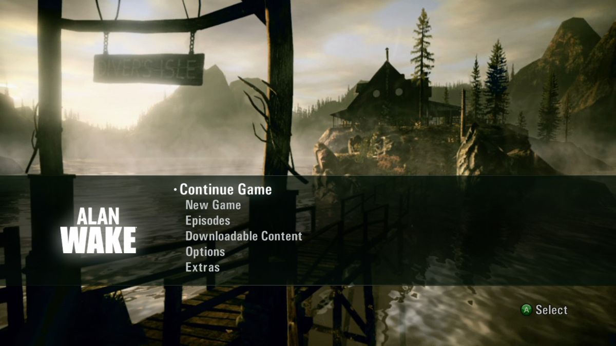
But I think I might have to go for Alan Wake.
I like that screen and the music a lot, but it causes a pretty massive dissonance (to me at least) between the menu and gameplay.solemnwar said:I kind of like Dragon Age: Origin's main menu. IDK why.

There's just something about it I like.
The games rather shitty graphics don't match up to it, and we never get to see that scene in game, what is the significance of the swords? Where is that? Ostigar?
So in my mind it kinda sticks out like "we imagined something so much better, but then we had to cut it due to time or technical constraints".
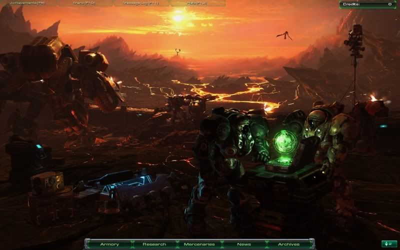
Another game I'd nominate is Starcraft 2. Not for the "main" main menu, but the campaign menu that changed as you went through the story. The place between missions where you can interact with characters and such. It's brilliantly done and I love it.