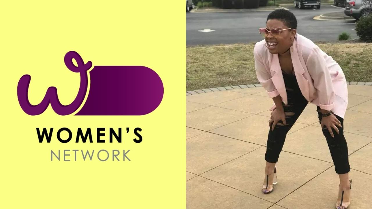
Looking at other logos of Australian 'networks', it sort of fits within the design language of other logos and it explains the weird tube on the right side. They're all cylinders? Tubes? Whatever that shape is called.
Federal Govt Makes A Women's Network, Gives It A Dick And Balls For A Logo
Penises don't reflect gender but we sure as hell doubt the Federal Government thought that when they approved this.www.pedestrian.tv

Having said that, I personally would have kept the W within the tube shape, because although it sort of fits within the design language of the other logos, it also doesn't and looks off when lining them up.
Something like this for example;

Although the shape of the W is still a little bit sketch and could be seen as a woman's buttocks or breasts if one is feeling randy enough.


