
Bioshock Infinite: The latest victim of the Stupid-American-Box-Art Virus.
- Thread starter Sepko
- Start date
Recommended Videos
It's pretty horrible and for me personally, it's a major turnoff.
I bought the first Bioshock not really knowing what I got myself into. It just looked and sounded like something pretty new, and interesting enough to want and grope at and play around with. I found it to be one of the best experiences since, say, Halflife 2. Shooty-shooty stuff, a story worth mentioning, some twists, some unexpected moments, a bunch of so-so ending, but the ride was very well worth the price of admission. The box cover you ask? If I remember correctly, 'twas just some rendering of a Big Daddy of sorts? Mysterious enough for the uninitiated, a welcome memory-inducing trigger for the battle-hardened, spliced-up players. Because this first one was such a darn pleasing ride, I pre-ordered the second one in the nifty butterfly box edition. Super ultra nice sweet box, but the game was rather... OK, with a sprinkle of 'meh' added. It felt more like BioShock 1.5, or a mod of sorts. Female, swift, death-from-above enemies to contrast the lumbering, charging, very earthbound Big Daddies? OK. Replace the male mortal enemy with a female one, with a thick accent? Uhm... not quite that original, is it.
Now with BioShock 3, everything pretty much pissed me off already. I never asked for timed-release info on all enemy types. That was total bollocks. Now, before even got released, I'm pretty much bored and annoyed beyond saturation, and the cover reminds me not of my adventures unda da sea, since it looks just like anything out of the Uncharted series, or any other random action-y game with pew pew shooty guns and stuff. It's also the first Bioshock where I am allowed (i.e. forced) to have a look at my player character hero type of sorts, even before we got properly introduced. It's lazy, it's wrong and I'll hold back to see if all that fancy new stuff isn't, in fact, some of that frothy Molyneux foam that will actually pretty much kill the franchise dead, dead, dead.
^this
Seriously, people will complain about anything these days, who looks at the box art longer than 5 seconds anyways? I can forgive a game for having bad box art if it's fun to play. If this game was just a generic COD clone, THEN I'd be upset.
Seriously, people will complain about anything these days, who looks at the box art longer than 5 seconds anyways? I can forgive a game for having bad box art if it's fun to play. If this game was just a generic COD clone, THEN I'd be upset.
I buy phyisical copies, and I still am finding it hard to care. Yes, it doesn't look very original...but I'm only going to be staring at the front for about fifteen minutes over the course of my life...Somonah said:i'm trying really really hard to care about boxart, but digital distribution is keeping me from caring. Damn it i wanna live in the past. Now im off to complain about itunes not stocking cassettes.
Reminds me of a picture I once saw, depicting several videogame protagonists walking forward (ripped straight from their respective boxart) in the exact same position, while some other guy was looking at them asking "Hey, where are you guys going? Can I come?"
http://greleases.com/bg_bilder/heavenly-sword-ps3-boxart.jpg
Would you believe me if I told you that I honestly didn't notice that until you pointed it out?Nomanslander said:Yeah this is a coming a pet peeve of mine. But at least it's not as offensive as the Heavy Rain box art came to be. =/
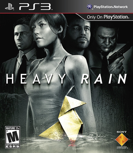
Don't you just love how a supporting character in the game is bought up front just so we wouldn't miss her lovely jugs while trying to read title of the game which is superimposed over them?
Now that was just shameless.
Top-left corner. What's this guy's deal?sextus the crazy said:At least it isn't a cornucopia of floating heads.
http://greleases.com/bg_bilder/heavenly-sword-ps3-boxart.jpg
What is exactly "Stupid" about it?
Sure it's common to feature the protagonist on the cover, but that doesn't make it bad. It's a decent pose and outfit, fits the setting.
- It's got a burning American flag in the background, and a blimp. How many other game covers have that?
- Actually this time the explosion is coming from behind the camera, and the sparks are flying towards the protagonist. Contrast that with the explosion usually being behind the protagonist.
I rather like it.
At first glance it's utterly generic. A close look shows some of the themes (a burning US flag) and the setting (the blimp). But both are heavily overshadowed by the protagonist and the blimp is practically indistinguishable from the blue background.
But at least it isn't 'oops I spilled some orange paint on me' that is the newer Battlefield boxart.'
But at least it isn't 'oops I spilled some orange paint on me' that is the newer Battlefield boxart.'
Now that is an eye-catcher and will certainly draw eyes in for a second look.White_Lama said:Why not one of these instead?
Then again, hopefully with being European, I won't have to look at that cover.

I'm going to guess that he's creaming himself after seeing the protagonist.Lugbzurg said:Top-left corner. What's this guy's deal?sextus the crazy said:At least it isn't a cornucopia of floating heads.
http://greleases.com/bg_bilder/heavenly-sword-ps3-boxart.jpg
The format (I think that's the word I'm after) of the box itself do look like the limited edition of the original Bioshock with it's rusty metallic look, so it might be a special edition cover.chimpzy said:Oh my, that first one does look mightily spiffy. I wonder if there's a high res version of that image on the cover available. I'd be tempted to just make my own.White_Lama said:Why not one of these instead?
Then again, hopefully with being European, I won't have to look at that cover.
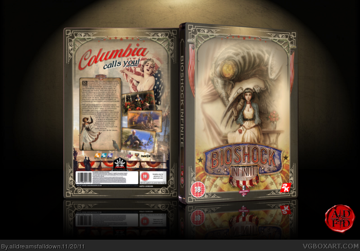

Or it's just some random cover a fan made which is far superior to the one posted by the OP.
And it's so darn prettyEd130 said:Now that is an eye-catcher and will certainly draw eyes in for a second look.White_Lama said:Why not one of these instead?
Then again, hopefully with being European, I won't have to look at that cover.
its hilarious..
its so unapologetically generic it could almost be a parody
mabye you could not buy for you know...a REAL reason, like DRM or online or some practice you don't agree with
why do peopel have to be so fucking petty?
its so unapologetically generic it could almost be a parody
*sigh*upgrayedd said:Def wont buy now.
mabye you could not buy for you know...a REAL reason, like DRM or online or some practice you don't agree with
why do peopel have to be so fucking petty?
except when you get someone who says they arent going to buy it or its off putting even though its a game they know about and weather or not they'll buy itNonomori said:Nobody is saying that the game is bad.
as I said..peopel can be so stupidly petty its infuriating
To be fair, before the widespread use of the internet, where nowadays you can get all the info you want on a game easily, box art was important, as it was one of the main ways to grab your attention. But yeah, nowadays, it's a bit redundant.Xdeser2 said:.......Who cares?
Does any sane gamer really buy a game based on its boxart?
Anyway, my opinion on the box art is that it's not good, but just meh.
I think a lot of people on here are taking the box art at face value. I mean, it is box art, so you should do that but lets not forget what this is. This is Bioshock. It is not CoD, Battlefield, or any other franchise that is cranked out once a year. It is under the lead of Ken Levine, the man who said that he wouldn't put multiplayer in a game unless he felt it fit perfectly into a spot in the game, and that forcing multiplayer in games (EA style) can ruin a game.
This is the man who in Bioshock crafted a plot with a twist that not only called out modern FPS games for being linear corridor to corridor boring experiences but called YOU the player out for being lead through them like mindless drone. You people really should not be underestimating Ken Levine.
As for the cover, I think its great for lots of reasons.
1)It is the exact opposite in style from Bioshock, where the main character is never really seen and instead the big bad's (Big Daddys) where smack in the middle of the cover making them the iconic "bioshock image". Here we have Booker, the main character looking like a classic American Badass...I'll come back to this later.
2)I think it shows enough to get people interested while not showing too much. I don't expect to see the whole of Columbia on the box art and in fact I'd be disappointed if I did. It shows the sky and part of a zeppelin. Not too bad.
3)The burning and torn up American flag. From what I've come to understand this game is going to have some harsh criticisms of what I think will be American customs/culture and ideology around the time of it taking place. I read where the leader of the founders, Zachary Hale Comstock, is called "The hero of the battle of wounded knee". If you don't know what that is wiki it. How anyone would want to be called a hero coming out of that I will never know. It might possibly even have criticism of today's America. As an American myself, I can't wait to see what it might be. I love hearing dissenting opinions and cultural criticisms.
4)Booker, the man on the cover. The picture looks perfect to me. Booker was a former Pinkerton agent and if you know what they were (the precursors to what would eventually become the secret service) then you know they were a bunch of guys you did not want to mess with. Also, the Nathan Drake look is definitely there, but do you know who was Nathan Drake before there was a Nathan Drake? John Wayne. I'm willing to bet there might be a criticism of the "Strong John Wayne/CLint Eastwood-esque American hero" type of character in the game, and indeed one of the whole concept of American machismo and gun-in-hand badassery that makes the bible belt masturbate.
Besides, I'd take this and whatever is x100 cheesier than some half naked JRPG teenage girls/boys box art. Seriously some of you guys kill me..
Captcha: Easy as cake
No not so easy it seems.
It honestly could've been better with all of the interesting things that Irrational has shown us so far, but I don't really feel like it subtracts anything from what is sure to be an awesome game.
Maybe I'm just not the type of person to be bothered by box art.
Maybe I'm just not the type of person to be bothered by box art.
I don't know about you but I wouldn't think my neighbor was a complete degenerate because of his welcome mat as compared to a game's box art. Is this really a bad thing?
Whole lot of people really want to let you know how much they don't care up in here.
Anyway, it's bland, but not terrible. At least there's none of that poorly-lit-scowl nonsense going on.
Anyway, it's bland, but not terrible. At least there's none of that poorly-lit-scowl nonsense going on.
Thats... fuckin' terrible box-art. How do you fuck that up? Put the banner up top, some skyline in the background, and the new Bigbird Daddy in the foreground. Done! Copy and paste my friends. Copy and paste.
EDIT - After some minor research I realized that apparently, American box-art needs to be action-oriented. Nothing subtle allowed. Go look at some classic SNES or Genesis covers. It's gotten worse.
EDIT - After some minor research I realized that apparently, American box-art needs to be action-oriented. Nothing subtle allowed. Go look at some classic SNES or Genesis covers. It's gotten worse.
I always thought the paragraph on the back of the box is supposed to tell you what it's about. The front is supposed to make you pick it up and say "Holy shit! This looks fucking cool! I'm gonna read the back of the box to find out what it is!!!"sneakypenguin said:I like it, just from a glance you can tell its an action FPS, set in a fantasy world, with political overtones. Seems to tell the story of the game pretty well. You could go with a more enigmatic cover but I doubt it would portray the game at a glance for the uninitiated which I assume box art is mainly for.