Industry Elites Added As Judges for Webcomic Contest

Satoshii

New member
Feb 7, 2010
47
0
0
titankore said:
Well good night and good luck to everyone.

Woot 100 posts, to celebrate here is a pic I did last week.
DariusPoyer said:
@titancore, i believe the head is supposed to be somehow attached the the body. it's a little freaky actually.
I'm not trying to bash your image (so please don't take offense), but the first thing I though of when I saw the picture was E.T. in a human/furry cross. http://i.telegraph.co.uk/telegraph/multimedia/archive/01474/et_1474485i.jpg The neck is too far to the right, and to it connects like it's coming out from the back of the head, not underneath it. With cartoons, the positioning of the head/neck is a little different from real life (in RL the neck tends to be thicker, that just looks weird in most comics), so best bet is to scower the web for good cartoon examples of the same pose and learn from the anatomy in those pics.

Also just wondering, is the body supposed to look that, well, 'toned'? Little bit muscley for a female if you ask me (unless of course she's going for the gold in weightlifting).
 

Phillip C

New member
Sep 28, 2009
34
0
0
@Titancore: I liked the colors going on in that picture actually, lots of respect for using a traditional medium! Anatomy is screwy though, grab yourself some Andrew Loomis pages online and hit the books! Just keep drawin' and you'll be unstoppable!


Regardless of who wins this, I really hope everybody here sticks around and gives support to the winner(s) as they can only go as far as you'll let them! Support your fellow artists, and keep in touch with one another!
 

Satoshii

New member
Feb 7, 2010
47
0
0
OK, i'm probably going to furry hell for this, but I felt I should try and show you where you're going wrong. I redrew the picture side by side so you can see the changes i've made. Excuse the crappy drawing, photoshop is running like a slug for some reason and i've just gourged myself on doughnuts and icecream which isn't helping, haha.

I've probably got it all wrong so if you guys wanna chip in, be my guest.


OK, so here's what I changed:

1) I made the head a little bigger and the body a little smaller. I tried to inject a little more cuteness into the character as she was looking a little rough looking (i.e. like she was gonna use you as a punching bag, lol). This is only a preference mind, not everyone wants their characters too look like eternal preteens, but I think it worked well.

2) I added a little more volume to the hair. One of the most noticible things at first glance, I wanted the hair to say "look at me!". That being said, I screwed it up a little, ha. Also I made it a little more wavy to add some character to it.

3) Reworked the face a little. I kept the basic shape which looks cute, but I moved the features closer together. They were spaced out a little too far for my liking. I also curved the eyes because the lack of eyebrows made her look angry, and did an anime esque wink for added 'kawaii'.

4) The original figures pose is arched kind of like she has a bad lower back. Shift the head over the neck, move the right (her left) shoulder down, and push the waist forward a little. She's not that dynamic, just enough to give it a natural look.

5) I'm not a big furry fan, but I think the tails look kinda cute, but exaggerate them a little. I made mine bigger, and more dynamic, coming from the back into the front.

6) Do something with the hands. Like I said last time, you need to add a bit of flavor to the arms. Don't have them both holding onto the bag straps on every character. Don't have them at the side all the time. Arms and hands are incredible tools to give life or meaning to your characters. A lot of body language is expressed with the hands, so use them!

7) I took off the muscle mass and replaced with with an a-typical anime body. Cliche, but it works. Lower the breasts to stop them from looking like pecs.

8) Add life to the clothes too. The little details count. Add some shading here, some details there. Give the shirt a little art design, even a strip (which i've used here to accentuate the body lines). And if you're gonna go for the open midriff, make sure it's worth it. Too little and it just looks like her clothes don't fit.


OK, so tell me what you think, if you have any questions, and tell me if i'm talking out of my arse, lol.

All the best.
 

Fuzzy_Pickles

New member
Feb 21, 2010
8
0
0
Satoshii said:
OK, i'm probably going to furry hell for this, but I felt I should try and show you where you're going wrong. I redrew the picture side by side so you can see the changes i've made. Excuse the crappy drawing, photoshop is running like a slug for some reason and i've just gourged myself on doughnuts and icecream which isn't helping, haha.

I've probably got it all wrong so if you guys wanna chip in, be my guest.


OK, so here's what I changed:

1) I made the head a little bigger and the body a little smaller. I tried to inject a little more cuteness into the character as she was looking a little rough looking (i.e. like she was gonna use you as a punching bag, lol). This is only a preference mind, not everyone wants their characters too look like eternal preteens, but I think it worked well.

2) I added a little more volume to the hair. One of the most noticible things at first glance, I wanted the hair to say "look at me!". That being said, I screwed it up a little, ha. Also I made it a little more wavy to add some character to it.

3) Reworked the face a little. I kept the basic shape which looks cute, but I moved the features closer together. They were spaced out a little too far for my liking. I also curved the eyes because the lack of eyebrows made her look angry, and did an anime esque wink for added 'kawaii'.

4) The original figures pose is arched kind of like she has a bad lower back. Shift the head over the neck, move the right (her left) shoulder down, and push the waist forward a little. She's not that dynamic, just enough to give it a natural look.

5) I'm not a big furry fan, but I think the tails look kinda cute, but exaggerate them a little. I made mine bigger, and more dynamic, coming from the back into the front.

6) Do something with the hands. Like I said last time, you need to add a bit of flavor to the arms. Don't have them both holding onto the bag straps on every character. Don't have them at the side all the time. Arms and hands are incredible tools to give life or meaning to your characters. A lot of body language is expressed with the hands, so use them!

7) I took off the muscle mass and replaced with with an a-typical anime body. Cliche, but it works. Lower the breasts to stop them from looking like pecs.

8) Add life to the clothes too. The little details count. Add some shading here, some details there. Give the shirt a little art design, even a strip (which i've used here to accentuate the body lines). And if you're gonna go for the open midriff, make sure it's worth it. Too little and it just looks like her clothes don't fit.


OK, so tell me what you think, if you have any questions, and tell me if i'm talking out of my arse, lol.

All the best.
Listen titankore... ^ Fuck all that ^. Here's what I would change:

1. Ditch the overused shojo look for something less CLAMP and more Samurai Pizza Cats.

2. Make the boy dog/fox (whatever) look more cartoonish so people won't think you got some weird fetish for animals with male human proportions. (female is pushing it)

3. Have them talk on cell phones without using their ears.

4. Update the clothes on the girl a little and put cartoon bones on all her accessories cause that's what dog people would wear.

5. Technically, you can't see belly buttons because the fur blocks it. (ask a vet)

6. Don't draw furries because you'll only bring shame to your already disappointed parents. :)

If you have any questions, look it up on yahoo answers.


...Yeah, I remembered the boy dog/fox/wolf/lamp had a thing for literary classics,
cause you shoved the character backstory down our throats on multiple occasions.
 

shefyg

New member
Feb 21, 2010
8
0
0
aeroz said:
shefyg said:
There are 10 types of people, those who understand binary code, and those who don't.
actually reminds me of one of my engineering classes. We were given instructions on how to opperate this machine and told to record the corrosponding lights as on or off. I quickly noticed they were going in binary, and thus did the entire assignement without using it. They asked me how I knew binary and I told them how I decoded the pattern when I was little for the fun of it. Their stares then made me realize

Holy crap, in a class of engineering students, I'M THE NERD
Actually it sounded more like - they are the noobs. But it is a funny story.

Now about those 10 webcomic writers that walk into a bar.. They sure got drunk after asking for 100 bottles of beer on happy hour
 

Phillip C

New member
Sep 28, 2009
34
0
0
Fuzzy_Pickles said:
Listen titankore... ^ Fuck all that ^. Here's what I would change:

1. Ditch the overused shojo look for something less CLAMP and more Samurai Pizza Cats.

2. Make the boy dog/fox (whatever) look more cartoonish so people won't think you got some weird fetish for animals with male human proportions. (female is pushing it)

3. Have them talk on cell phones without using their ears.

4. Update the clothes on the girl a little and put cartoon bones on all her accessories cause that's what dog people would wear.

5. Technically, you can't see belly buttons because the fur blocks it. (ask a vet)

6. Don't draw furries because you'll only bring shame to your already disappointed parents. :)

If you have any questions, look it up on yahoo answers.
I will say that this is some pretty good advice for ya, but I do feel like there is a bit too much personal preferences in there. ;3 However, I'm going to say that you should strive to find your own style, Samurai Pizza Cats is fine and dandy, but you should take on many different source materials when it comes to developing a style, and remember: There's nothing wrong with drawing anthropomorphic characters, when fetish is introduced however, it crosses the line into furry. My guidelines are as follows:


1. Get to know the basics before you even THINK about style! Dead serious here, learn perspective, get some life drawings down, study the works of Andrew Loomis, and get some color theory under yer belt! If you can't get any of this, search google for some reference pictures, there's a ton of material out there for you to use!

2. Don't just stick to one source for inspiration when it comes to your cartooning skills! TMNT, Swat Kats, Pirates of Dark Water, Voltron, Robotech, Spongebob, you name it! I've got some friends who have developed their own kickass styles, but you can most certainly bet that they had some artistic influence at some point in their lives. Take a look here http://thisissupertron.com my pal Sheldon here was inspired by old school video game art and whatnot!

3. Draw every day! Seriously, keep yer skills sharp, it doesn't matter what you draw either, just do it!

4. Don't limit your imagination! Draw a car that sneezes fire, draw your pets, just don't stick to one subject for too long or you'll never improve!

5. Don't give up.


That's all I can say dude. But seriously, get some basics down, they'll help you muchly!
 

shefyg

New member
Feb 21, 2010
8
0
0
Steagony said:
shefyg said:
Steagony said:
shefyg said:
I have a birth day this week. On Thursday I would be 0x21 years old.
Winning could be a nice present :-D (just kidding - couldn't help myself)
0x21? I don't understand ]:

Anyway, happy upcoming birthday.
10x

0x21 is 33 in Hex

It is the same kind of joke of:

There are 10 types of people, those who understand binary code, and those who don't.
OH DON'T YOU PATRONIZE ME
I didn't, just telling a joke.
A joke is the only thing that when others don't understand it, it is embarrassing for you.
 

emiliogomez

New member
Feb 24, 2010
3
0
0
So, can I get on with my life and develop my idea independently in my own website? Beats waiting for an answer.
 

Steagony

New member
Nov 20, 2009
117
0
0
Phillip has some sound advice, though Andrew Loomis sucks for beginners, methinks. Bridgman all the way. He exaggerates muscles and forms in such a way that it's easy to understand where all the 'parts' go, and his books have a fun way of explaining mass and volume.

I didn't, just telling a joke.
A joke is the only thing that when others don't understand it, it is embarrassing for you.
Actually, I was joking as well.
 

Coelasquid

New member
Feb 16, 2010
47
0
0
Fuzzy_Pickles said:
Satoshii said:
OK, i'm probably going to furry hell for this, but I felt I should try and show you where you're going wrong. I redrew the picture side by side so you can see the changes i've made. Excuse the crappy drawing, photoshop is running like a slug for some reason and i've just gourged myself on doughnuts and icecream which isn't helping, haha.

I've probably got it all wrong so if you guys wanna chip in, be my guest.


OK, so here's what I changed:

1) I made the head a little bigger and the body a little smaller. I tried to inject a little more cuteness into the character as she was looking a little rough looking (i.e. like she was gonna use you as a punching bag, lol). This is only a preference mind, not everyone wants their characters too look like eternal preteens, but I think it worked well.

2) I added a little more volume to the hair. One of the most noticible things at first glance, I wanted the hair to say "look at me!". That being said, I screwed it up a little, ha. Also I made it a little more wavy to add some character to it.

3) Reworked the face a little. I kept the basic shape which looks cute, but I moved the features closer together. They were spaced out a little too far for my liking. I also curved the eyes because the lack of eyebrows made her look angry, and did an anime esque wink for added 'kawaii'.

4) The original figures pose is arched kind of like she has a bad lower back. Shift the head over the neck, move the right (her left) shoulder down, and push the waist forward a little. She's not that dynamic, just enough to give it a natural look.

5) I'm not a big furry fan, but I think the tails look kinda cute, but exaggerate them a little. I made mine bigger, and more dynamic, coming from the back into the front.

6) Do something with the hands. Like I said last time, you need to add a bit of flavor to the arms. Don't have them both holding onto the bag straps on every character. Don't have them at the side all the time. Arms and hands are incredible tools to give life or meaning to your characters. A lot of body language is expressed with the hands, so use them!

7) I took off the muscle mass and replaced with with an a-typical anime body. Cliche, but it works. Lower the breasts to stop them from looking like pecs.

8) Add life to the clothes too. The little details count. Add some shading here, some details there. Give the shirt a little art design, even a strip (which i've used here to accentuate the body lines). And if you're gonna go for the open midriff, make sure it's worth it. Too little and it just looks like her clothes don't fit.


OK, so tell me what you think, if you have any questions, and tell me if i'm talking out of my arse, lol.

All the best.
Listen titankore... ^ Fuck all that ^. Here's what I would change:

1. Ditch the overused shojo look for something less CLAMP and more Samurai Pizza Cats.

2. Make the boy dog/fox (whatever) look more cartoonish so people won't think you got some weird fetish for animals with male human proportions. (female is pushing it)

3. Have them talk on cell phones without using their ears.

4. Update the clothes on the girl a little and put cartoon bones on all her accessories cause that's what dog people would wear.

5. Technically, you can't see belly buttons because the fur blocks it. (ask a vet)

6. Don't draw furries because you'll only bring shame to your already disappointed parents. :)

If you have any questions, look it up on yahoo answers.


...Yeah, I remembered the boy dog/fox/wolf/lamp had a thing for literary classics,
cause you shoved the character backstory down our throats on multiple occasions.
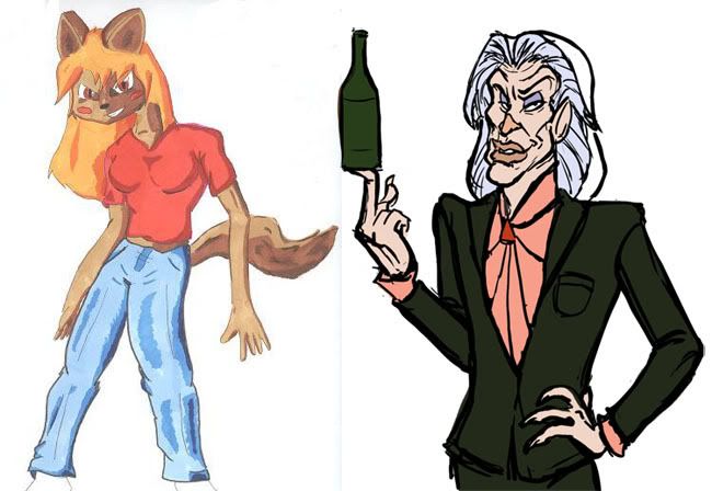
Okay, now forget all the advice these guys just gave you, 'cause I'm here to show you how to draw the perfect anthro character


1) Girls? phft, who cares about them. Girls are for gays. Toss those boobs and let's get down to business

2) Let's add some intrigue to that face, I want to see that this is a man who has lived many years and experienced every substance the world has to offer. This is also the superhero origin of how he's pickled himself and for all intensive purposes become immortal. At least that seems to be how it worked for Iggy Pop.

3) Really, the more you can make him look like the science!baby of Mick Jagger and David Bowie the better.

4) Probably want to add some lipstick, eyeshadow and a carefully coiffed glam-rock mullet, after all, people want to see that this is a man-rat who cares about his appearance.

5) Give him a snazzy suit. Remember, the bigger your... cravat... thing... is, the more people will respect you. Salmon pink and forest green seem as good a colour scheme as any, they ain't never did nobody no harm.

6) Everybody likes the guy who shows up to the party with beer.

7) Now you're probably going to want to make an animated feature about this guy, seeing how he rocks so much face and all. I suggest talking to Nelvana about that, they're pretty easy going people, I'll bet they won't even ask for the script to be finished by the time production starts.

8) Also, get Lou Reed to do his musical number.
 

LACKT

New member
Feb 17, 2010
99
0
0
Furries were an excuse to not draw people who can't draw them right,then it turned weird...
Just study the basics/structure,I can see your love for the subject on how natural it looks.


titankore

New member
Nov 10, 2009
378
0
0
LACKT said:
Furries were an excuse to not draw people who can't draw them right,then it turned weird...
Just study the basics/structure,I can see your love for the subject on how natural it looks.
Actually that is the reason I started drawing like this was for the contest. I really suck at drawing regular people so I figured something made up would be easier, so I remembered the show Swatkats from when I was a kid and started drawing. I really had no idea at the time about furrys and stuff because I normally don't spend so much time on the internet.
 

boybokeh

New member
Feb 27, 2010
58
0
0
Look, there's nothing wrong with furries. You stick to what you're doing. But keep in mind that there are a lot furmeisters yiffing the yiff out of their furries these days. How passe. If you want to move your art out of 2004 and start developing your own friggin' ism, I ask you to consider a rethink of your chosen genre. A Frank Milleresque exploration of the subject matter, if you will.

Nothing wrong with boobs and a bit of tone. BUT, instead of a furry, how about a furry... hunter! Yeah dawg amirite or what? ikr. I rarely see furry hunters get hated on. Here is a quick sketch I've done to illustrate the concept. I've kept pretty close to the original design and even sampled most of the colours from the original palette.

[http://img202.imageshack.us/i/redoingitwrong.jpg/]
 

toadking07

New member
Sep 10, 2009
266
0
0
titankore said:
LACKT said:
Furries were an excuse to not draw people who can't draw them right,then it turned weird...
Just study the basics/structure,I can see your love for the subject on how natural it looks.
Actually that is the reason I started drawing like this was for the contest. I really suck at drawing regular people so I figured something made up would be easier, so I remembered the show Swatkats from when I was a kid and started drawing. I really had no idea at the time about furrys and stuff because I normally don't spend so much time on the internet.
LOL poor titankore walked in here hoping to get some artist advice, and walked right in the middle of internet furry hatred!

There is some good advice from your fellow artists to be found here, so do pay attention to what they say. Other the other hand, I'd say ignore the "don't do furries" remarks, cause they seem to only think about sexual fetishes when they see something with ears. They seem to be forgetting all the games and tv shows, (Sonic, Starfox, Swat kats, Looney Tunes) that have anthropomorphic animals as characters.