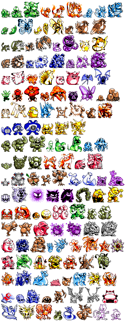
I'm guessing this discussion has been going on for a while now, but I would like to point out that there are far more iconic characters from times where graphics were primitive than from more recent periods.Buretsu said:They're effective, because they had to be to not be blobs, and they're iconic, because they came first.Nazulu said:Same designer or not, it's irrelevant. Made simpler for Game Boy, irrelevant. Thanks for the info but it's not what I'm talking about.Buretsu said:See, it's still the same guy doing the Pokemon Designs. It's not some new designer who's come in and messed up, it's the same designer, making designs that are more complicated and involved because now we have the graphics to handle them.Nazulu said:Go suck a lemon.Buretsu said:So it's not nostalgia, it was just better when the designs were simpler and lazier to fit with the crappy handheld graphics of the day. Gotcha.
Some of the really simple pokemon might of have been from laziness, I don't know. I wasn't speaking about them specifically though.
Take Mario. What's the meaning behind his classic look? It's all to compensate for the graphical limitations of the original arcade games. He's wearing a red shirt and blue overalls to make his clothes stand out against each other and the background. He's wearing a hat, so his hair doesn't have to be animated. He has white gloves to make his hands stand out more. He has a large nose and moustache to avoid having to draw any other facial features.
Older Pokemon designs were simplier because the Game Boy had crappy resolution, and if they were more detailed, you wouldn't be able to see anything other than a chaotic blob.
I'll repeat, some of these simple design are just really really effective. My original post is to point out that if you can't see why they are iconic then it's useless. Both sides can't understand each other and the fighting should stop.
And the reasons are well understood to most graphic designers. Severe hardware limitations naturally impose a design constraint that actually remains true no matter how good your graphics get.
The most memorable characters tend to be the ones with a very strong, unique, and easy to identify design.
And most of the time, this comes from simplicity, not complexity.
Character designers who concern themselves with creating 'memorable' or 'iconic' characters often point to the silhouette test.
Basically, if you reduce a character to just it's outline, without any other details, it should still quite obvious who it is.
(Try it with Mario and sonic for instance, for some of the best examples. But it works reasonably well for Samus, Link, Master Chief... Crash Bandicoot. Bart Simpson. Etc. - As a contrast, try a character from a typical shooter such as call of duty. Can you tell one soldier apart from any other just from their silhouette? I doubt it.)
Complex and detailed does not make things better when it comes to memorable design. In fact, given too much freedom, it is much easier to design something that simply won't be remembered at all.
Memorable designs work well no matter how complex or simple you make them.
Compare mario from the first Super Mario, to the 3d model used in Mario Galaxy.
Look carefully and you'll note that the 3d model includes such tiny details as the fabric pattern of his denim overalls, buttons, fabric seams and so on.
The 8 bit sprite has none of these details. Yet you'd recognise either quite easily as being mario, even just from their outline alone.
Just to be clear, while complexity and detail isn't a bad thing, a good, memorable character design is one which remains recognisably unique for as long as possible, no matter how much you simplify it.
Details are good, but the design shouldn't need them to be recognisable.
If your design is still easy to recognise with no detail to it whatsoever, then people will probably remember it.
If it looks just like 60,000 other things, unless you draw in all the tiny little details that set it apart from those other designs... People probably won't remember it for very long.

")


.jpg)