Redesigned Box Art Images Approach Games Differently

Saetha

New member
Jan 19, 2014
824
0
0
Does anyone else think these look kinda terrible? Because I think they look kinda terrible.

Or, rather, they look like something I'd expect to find in a museum, not on the cover of a book or video game. I don't know, maybe I'm uncultured swine, but it looks bad to me. It doesn't look like it's trying to capture the game so much as look vague and mysterious and stand as it's own work - which would be cool... if these were paintings in an exhibit. As covers for a product, they should be more representational. The article itself even points out that game covers often eschew representional art in favor of market-tested recognition - I feel like these covers go too far in the other direction, and eschew representational art in favor of seeming deep and mysterious.
 

Shocksplicer

New member
Apr 10, 2011
891
0
0
Kind of hate these. Some are kind of pretty, like the Far Cry and Destiny ones, but others, like the Infamous ones, are just plain hideous.

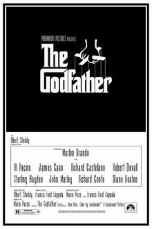
Worst, though, is the fact that, despite the stated intention being capturing the atmosphere of the games, they utterly fail to do so in almost every instance. The only ones that are somewhat successful are Watch Dogs (which steals its aesthetic from The Godfather) and GTA5 (which uses essentially the same aesthetic used in the actual covers for the GTA series.)

Overall, very unimpressed.
 

Arnoxthe1

Elite Member
Dec 25, 2010
3,391
2
43
Some of them are kinda cool but others are just boring and too artsy or confusing. And no, I'm not just saying that because they don't have a Generic Video Game Protagonist plastered all over the front.

The box art isn't supposed to be some sort of work of art that belongs in a museum. They're supposed to catch the eye of the consumer and convince them to just give the game a look. That is their purpose. Ken Levine gave a good talk on this a little while ago on Gamespot, talking about the original System Shock box art and etc.
 

Kameburger

Turtle king
Apr 7, 2012
574
0
0
Yeah I kinda wish box art was a bit more collectible these day. I mean some games have some cool box art but it's kind of rare. A lot of the time you get a kinda DVD cover that looks like its advertising the game to you even though you just bought it. And I kinda get that from a shelf standpoint at a store, but I would kinda like a collectors edition from time to time. [edit] When I say collectors edition I kinda mean something that would look good on my shelf, not some ridiculous over bloated pre-order bonus BS. Just wanted to clarify in case someone from game stop was reading and decided to take that as approval of their particular brand of parasitic self promotion.
 

Olas

Hello!
Dec 24, 2011
3,226
0
0
Eiv said:
Olas said:

Cool . . . . . . . . . . . .


_____________________________________________________________________________________________________
But why is so much of the text sideways? It looks like the typographer didn't know what direction the box is supposed to be held.
I believe it may be for the spine. Out of context, it does look misplaced though.
I am a stupid stupid idiot. Somehow it didn't occur to me that these were the front spine and back all in one. Thank you for pointing out the blatantly obvious to me.

It still doesn't explain Watchdogs though.
 

josemlopes

New member
Jun 9, 2008
3,950
0
0
They are all kind of terrible, most of them are simply vague and lack composition, then the art itself isnt all that good either.

Sure, I would like some real covers to be a bit more artistic but it certainly isnt with these ones.
 

thanatos388

New member
Apr 24, 2012
211
0
0
Nice idea but all these look the same. And the games they represent are wildly different. So in that way I see them as a failure to do what they are supposed to,capture the essence of the game. It's like Bioshock Infinite's alternative cover all over again.
 

Shamanic Rhythm

New member
Dec 6, 2009
1,653
0
0
Arkham City: Because Tits or GTFO.

The Destiny and Watch Dogs box art are trying waaaay too hard. The Far Cry ones are just a kind of lazy attempt impressionism that doesn't add anything. Overall I most liked the one for Tomb Raider.
 

Dragonlayer

Aka Corporal Yakob
Dec 5, 2013
971
0
0
In all honesty, I thought these were pretty naff: I know they were deliberately trying to create a less marketable artwork, but I wouldn't have been able to recognise at least half of these without prior knowledge. Ironically, an attempt to move away from generic marketing techniques has created some generic jungle terrain pictures in the case of Far Cry 4 and Destiny is just too....abstract? Meaningless? Contextless? I'm not sure what word to use, but it strikes me as a big empty mess of nothing. I also love that they chose to draw Arkham City's cover as someone grappling giant boobed Catwoman's thigh, in this age of constant sexism outrages.
 

Dragonlayer

Aka Corporal Yakob
Dec 5, 2013
971
0
0
Scorpid said:
Moar like Polish Box Art!... Because the poles tend to make their movie posters very minimalistic and trippy... whatever. They've all got Merits except the Arkham City one. It looks like batman is in his batcave masturbating with a Cat Woman sex doll. The others for the most part need work but I like the direction they're going in. I for one am tired soldier(s) walking/running from a battle/explosion with lasagna spilled down his side.
The Destiny one did remind me of Cracked's various articles on terrifying Polish cover art and movie posters - all it needs is for some surreal guerrillas having sex inside the moon with a van Gogh style face spying on them.
 

The_Blue_Rider

New member
Sep 4, 2009
2,190
0
0
these are alright I guess? As people have said they all look like theyre in the same style even though the games in them are all pretty different. The Arkham City one almost looks like its putting Catwoman in a very compromising position, and I could barely figure out that the inFamous box arts were for inFamous, I had to search the image because the colour of text chosen blended in with the background. Im all for more interesting box arts, but you still need to clearly tell me what goddamn game I'm looking at. Also doesnt seem like theres any room on the back for any info about the game. That part is normally pretty important in getting people to buy your game
 

Mister K

This is our story.
Apr 25, 2011
1,703
0
0
These covers look... bland. Especially Infamous ones. It is as if someone gave crayons to a 6 years old and said: "Draw something. Whatever you want."
I am all for covers that look better and more original than what we have now, but that doesn't mean I should settle with low quality. Remember Bioshock: Infinite alternate cover? Or EU and JP covers for Ico? Those are neat. These ones? Well, I wouldn't pay money for them, that is for sure.
 

The Real Sandman

New member
Oct 12, 2009
727
0
0
"Better Box Art believes video game box art should be as creative as games."
*Looks at Watch_Dogs box art*

Really now...


There is a very fine line between minimalist, and just plain boring and lazy.
 

deathbydeath

New member
Jun 28, 2010
1,363
0
0
Shocksplicer said:
Kind of hate these. Some are kind of pretty, like the Far Cry and Destiny ones, but others, like the Infamous ones, are just plain hideous.

Worst, though, is the fact that, despite the stated intention being capturing the atmosphere of the games, they utterly fail to do so in almost every instance. The only ones that are somewhat successful are Watch Dogs (which steals its aesthetic from The Godfather) and GTA5 (which uses essentially the same aesthetic used in the actual covers for the GTA series.)

Overall, very unimpressed.
QFT.

That being said, you don't have to go all post-modern minimalist to convey the "themes" and "atmosphere" of a work. Look at the promotional/cover art for the Battlestar Galactica remake:
It establishes the major players and their relationships with each other based on who is at the table and where they are at the table while the layout of the scene intentionally evokes Leonardo da Vinci's The Last Supper, which echoes the theme of religion persistent throughout the series.

See, you don't have to be all vague and abstract to tell people what the hell they're buying. It might make your art 58% less artistic integrity and therefore you won't be able to hang it in a museum and impress people with your arts, but at least it will be informative!
 

martyrdrebel27

New member
Feb 16, 2009
1,320
0
0
The Watchdogs art is truly inspired. It just encapsulates the game in one piece of minimalist perfection. I love it. The infamous sketch is glaringly mediocre though.
 

BakaSmurf

Elite Member
Dec 25, 2008
1,323
0
41
I don't like a single one of these, and I sure as hell wouldn't want any of them in place of the official box art we have already. There's nothing I can say that hasn't already been said in this thread in regards to the quality of the pieces (even as stand-alone art I find them all rather lacking though, honestly) so I'll withhold my thoughts on the matter as is.

Really though, I've seen free replacement box art that looks magnitudes better then what these guys want us to pay for...
 

Casual Shinji

Should've gone before we left.
Legacy
Jul 18, 2009
20,162
4,929
118
No offense to the artists that drew these, but they all look pretty terrible. I like pencil as much as the next guy, but there's a limit; I can hardly tell what is even going on with the inFAMOUS covers. The only one that comes close to being decent is the GTA5 one, and it still wouldn't make a good cover.

Sorry, but I'd rather have the marketing inspired covers.
 

LazyAza

New member
May 28, 2008
716
0
0
Detiny one really should have just been a guy shooting a cave spitting out glowing orbs but super detailed and artsy.
 

Vault101

I'm in your mind fuzz
Sep 26, 2010
18,863
15
43
ummm....

did some rule34 end up in the Arkham one?...like....wut?

EDIT: I like the tomb raider one