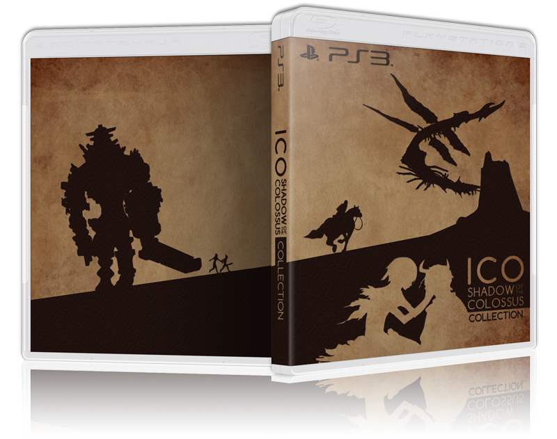
The idea has potential, but this first attempt is a swing and a miss. I'd have to question the design knowledge and artistic credentials of the artists because on the whole they're muddy, poorly composed, and fail to catch the eye. They look like average paperback novel artwork, and I suspect the thinking behind them was a rather snobbish notion that a minimalist aesthetic is more "mature" than an exciting, busy cover.
The Arkham Asylum one was good, the Watch Dogs cover would last all of two seconds before the lawyers ate it up like piranhas, and the GTA V one is an anaemic replacement for Rockstar's very strong established house style. "Better Box Art"? If so say so, fellas...


