This imediately reminded me of Shinkawa's fantastic Metal Gear box art. And the generic screen grab copy paste crap we have been getting since the PS3 era.
Redesigned Box Art Images Approach Games Differently
- Thread starter roseofbattle
- Start date
I like the Destiny one as a piece of art but a vid game cover? nah. The Watchdogs cover nailed it, nice and minimal whilst looking good and conveying the theme of the game. The rest of the covers are mediocre at best and some are downright poor.
martyrdrebel27 said:The Watchdogs art is truly inspired. It just encapsulates the game in one piece of minimalist perfection.
Shame it's just a rip-off of the Godfather logo. :/Rot_At_The_Root said:The Watchdogs cover nailed it, nice and minimal whilst looking good and conveying the theme of the game.

OK. So maybe "a reference to" or "a parody of" would be kinder.
OT: Sad to say I'm not impressed by any of them. Quite lazy, uninspired artwork. Seems like just another group of not-brilliant artists trying to make a bit of cash by marketing their work towards a subculture known for having money to spend. (Gamers do love their collectors editions.) Good on them for being enterprising, I guess.
with exception of Far Cry 2 i think those are terrible. mostly aimless themes with nothing going on, empty spaces, looks messy and without direction. would not back. im not art buff but this is clearly not for me
also this.
also this.
you can put so much in a single picture, why put even less than official cover. most of the covers present here hardly even shows anything. heck, even z grade movie box art is more telling.deathbydeath said:It establishes the major players and their relationships with each other based on who is at the table and where they are at the table while the layout of the scene intentionally evokes Leonardo da Vinci's The Last Supper, which echoes the theme of religion persistent throughout the series.
Except Shinkawa's art looked good on the cover of the MGS games. I don't think these would at all, there seems to be no effort made into making them into actual covers instead of some decent fan art with a tiny out of place title in a terrible font. Again, no offense to the artists but these aren't good at all.vagabondwillsmile said:This imediately reminded me of Shinkawa's fantastic Metal Gear box art. And the generic screen grab copy paste crap we have been getting since the PS3 era.
These covers all look extremely try hard. Most of these completely fail to capture the tone or content of the game. They communicate nothing about the game or, even worse, communicate the wrong things about the game. The images are cool as fan art, but as box art for the various games they fail hard.
Spoils it slightly that it's a rip-off of the Godfather logo.chikusho said:Holy shit, that Watch Dogs one was brilliant. Visual imagery that perfectly sums up the entire premise behind that game. Cudos!

It's like they didn't have any original ideas...
- Apr 1, 2009
- 15,014
- 3,880
- 118
- Gender
- Whatever, just wash your hands.
I think a better one for watch dogs would have been just the main character facing away from the camera and holding up his phone in one hand as he stares down a city street and all the street lights are green and the path is clear for him while on the side streets all have cars backed up at them.
The Watchdogs one is cool. The Arkham City one is nice art but has no actual Batman on it so it's awful compared to the actual game over. GTA one is good and so is Tomb Raider. Most of the others, especially Destiny, are awful.
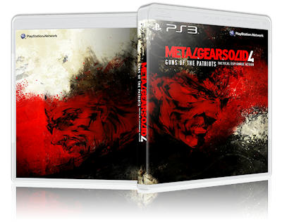
MGS has always had cool box art:

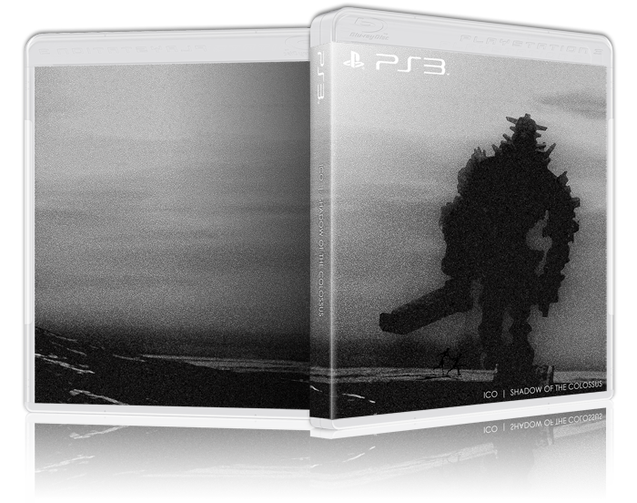
Also found this on the NEOGAF thread someone posted. Jesus this is how you do box art:
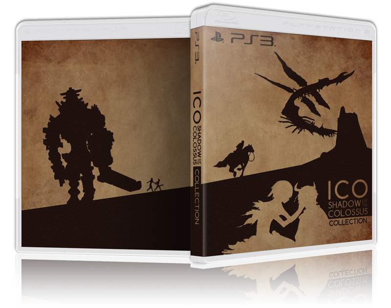
If you wanna really sum up a game - this is it:
MGS has always had cool box art:

Also found this on the NEOGAF thread someone posted. Jesus this is how you do box art:


If you wanna really sum up a game - this is it:

I am not a fan of the infamous ones. They are too vague and unevocative. Neither of them makes me think about the game...

So... they really nailed the look of the comics:Sigmund Av Volsung said:...Aside from the Batman one. I get that it's supposed to look like the comics, but the enlargement of Selina Kyle's bust is really unnecessary. Not to mention that she saves Batman in the game, and not the other way around as the pose suggests >.>

So it's just dissonant with the actual story then.hermes200 said:I am not a fan of the infamous ones. They are too vague and unevocative. Neither of them makes me think about the game...
So... they really nailed the look of the comics:Sigmund Av Volsung said:...Aside from the Batman one. I get that it's supposed to look like the comics, but the enlargement of Selina Kyle's bust is really unnecessary. Not to mention that she saves Batman in the game, and not the other way around as the pose suggests >.>
I still don't like it, but the Batman/Rocksteady games have never had good box cover artwork to begin with.
Of course. I am not saying its good, just that is as bad as the current portrait of the characters in the comics.Sigmund Av Volsung said:So it's just dissonant with the actual story then.hermes200 said:I am not a fan of the infamous ones. They are too vague and unevocative. Neither of them makes me think about the game...
So... they really nailed the look of the comics:Sigmund Av Volsung said:...Aside from the Batman one. I get that it's supposed to look like the comics, but the enlargement of Selina Kyle's bust is really unnecessary. Not to mention that she saves Batman in the game, and not the other way around as the pose suggests >.>
I still don't like it, but the Batman/Rocksteady games have never had good box cover artwork to begin with.
I agree with the Rocksteady problem with the covers, but Origins is not really a lot better, so I tend to blame Warner for them.
I agree. Warner have trouble getting past the "it's cool cause he's angry" thing that was started by them misinterpreting why people liked The Dark Knight.hermes200 said:Of course. I am not saying its good, just that is as bad as the current portrait of the characters in the comics.Sigmund Av Volsung said:So it's just dissonant with the actual story then.hermes200 said:I am not a fan of the infamous ones. They are too vague and unevocative. Neither of them makes me think about the game...
So... they really nailed the look of the comics:Sigmund Av Volsung said:...Aside from the Batman one. I get that it's supposed to look like the comics, but the enlargement of Selina Kyle's bust is really unnecessary. Not to mention that she saves Batman in the game, and not the other way around as the pose suggests >.>
I still don't like it, but the Batman/Rocksteady games have never had good box cover artwork to begin with.
I agree with the Rocksteady problem with the covers, but Origins is not really a lot better, so I tend to blame Warner for them.
Then again, we could have Square Enix Batman D:
So, what you're saying is... that you don't get it?MetalMagpie said:Spoils it slightly that it's a rip-off of the Godfather logo.chikusho said:Holy shit, that Watch Dogs one was brilliant. Visual imagery that perfectly sums up the entire premise behind that game. Cudos!

It's like they didn't have any original ideas...
Sure, there's a similar outline of the hand and cross, but the marionette as a symbol for control is universal. It might even work if you consider that the person who holds the strings on the cover image to be corrupt, a syndicate leader or something or other.
Either way, it's different enough for it not to be a rip-off in the slightest. The Marionette hand on the front cover has its strings dispersed over a city, and the brilliance comes from the single marionette hand controlling those strings from a phone. Which is the entire purpose of the story: A totalitarian state uses technology to control the city, and Aidan uses that same system to fight it. Simply brilliant.
Yah, I'm not really crazy about these either. I think it goes too far in the other direction. Whereas the old style MGS covers, for example, were a perfect blend of sell-the-game and do-it-with-class-and-style, these are a little too chin stroking.ToastiestZombie said:Except Shinkawa's art looked good on the cover of the MGS games. I don't think these would at all, there seems to be no effort made into making them into actual covers instead of some decent fan art with a tiny out of place title in a terrible font. Again, no offense to the artists but these aren't good at all.vagabondwillsmile said:This imediately reminded me of Shinkawa's fantastic Metal Gear box art. And the generic screen grab copy paste crap we have been getting since the PS3 era.
I think one of my personal problems with these is the canvas size. Even though the conceit of this exercise is to create a box art void of marketing considerations, the canvas size should still be constrained to the portion that is intended to face the audience. In fact the artists are acknowledging this division in the box by including the title where the spine would be for display.
That said, the ones I think work best are those for Batman, GTA5, Watchdogs. I say that because, even though they are "free" of marketing considerations, they are unmistakably indicative of the games they represent. The Far Cry, Infamaous, Tomb Raider, and Destiny illustrations, by contrast, could be indicative of any number of games.
It's not just that it's also a hand holding marionette strings. It's that it's in exactly the same style. The only difference is that the fingers are distributed slightly differently and the strings point at a city rather than at a title.chikusho said:So, what you're saying is... that you don't get it?MetalMagpie said:Spoils it slightly that it's a rip-off of the Godfather logo.chikusho said:Holy shit, that Watch Dogs one was brilliant. Visual imagery that perfectly sums up the entire premise behind that game. Cudos!

It's like they didn't have any original ideas...
Sure, there's a similar outline of the hand and cross, but the marionette as a symbol for control is universal. It might even work if you consider that the person who holds the strings on the cover image to be corrupt, a syndicate leader or something or other.
Either way, it's different enough for it not to be a rip-off in the slightest. The Marionette hand on the front cover has its strings dispersed over a city, and the brilliance comes from the single marionette hand controlling those strings from a phone. Which is the entire purpose of the story: A totalitarian state uses technology to control the city, and Aidan uses that same system to fight it. Simply brilliant.
If they wanted to use the same idea as the Godfather used, they could at least have drawn it in their own style.
The thing is though that it's the idea that is unique. He had a brilliant idea of his own, and chose to draw recognizeable imagery to illustrate it. And that's where new things come from, you take something, combine it withe something new or put in adifferent contextMetalMagpie said:It's not just that it's also a hand holding marionette strings. It's that it's in exactly the same style. The only difference is that the fingers are distributed slightly differently and the strings point at a city rather than at a title.chikusho said:So, what you're saying is... that you don't get it?MetalMagpie said:Spoils it slightly that it's a rip-off of the Godfather logo.chikusho said:Holy shit, that Watch Dogs one was brilliant. Visual imagery that perfectly sums up the entire premise behind that game. Cudos!

It's like they didn't have any original ideas...
Sure, there's a similar outline of the hand and cross, but the marionette as a symbol for control is universal. It might even work if you consider that the person who holds the strings on the cover image to be corrupt, a syndicate leader or something or other.
Either way, it's different enough for it not to be a rip-off in the slightest. The Marionette hand on the front cover has its strings dispersed over a city, and the brilliance comes from the single marionette hand controlling those strings from a phone. Which is the entire purpose of the story: A totalitarian state uses technology to control the city, and Aidan uses that same system to fight it. Simply brilliant.
If they wanted to use the same idea as the Godfather used, they could at least have drawn it in their own style.
