American Box Art Sucks

RabbidKuriboh

New member
Sep 19, 2010
376
0
0
the best case for this point(even though yahtzee won't apreciate this) is the final fantasy series

in europe and japan the box art simply consists of a blank white background with the amano illustration and the title in the center whereas the us versions generally end up showing disjointed pictures of all the main characters

the eu and jpn versions work better as the stark white case catches your eye against all the brown on the shelves and the strange illustration piques your interest

as for why? americans TEND to be a lot more heavy handed in....well everything! be they box arts,comedy or even love interests in games
 

mjc0961

YOU'RE a pie chart.
Nov 30, 2009
3,847
0
0
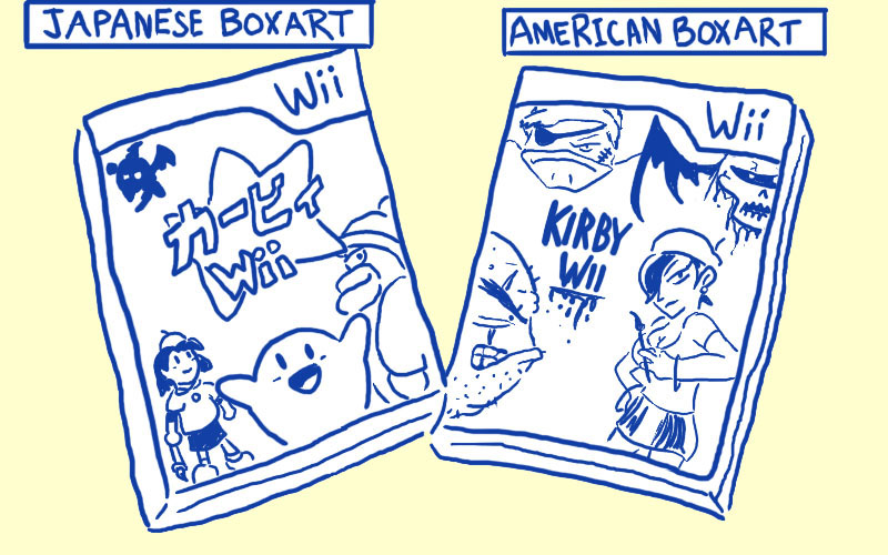
Yup. We sure get some weird boxart over here in the States. I also submit for this discussion, Kirby:


http://www.brawlinthefamily.com/?p=288

Last one is a joke obviously, but really, why did they keep making Kirby angry on our box art?
 

Russian_Assassin

New member
Apr 24, 2008
1,849
0
0
LadyRhian said:
Because America is all about identifying with the main character- becoming the main character, so that's what we want to see on our box art. Admittedly, not always, but mostly. And we can't identify with a character (or characters) if we don't know what they look like.
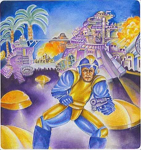
I'm sorry, fellow escapee, but I could never identify with a main character that looks like this abomination over here:

[small]
What the fuck is this?​
[/small]

And the punchline? MEGAMAN DOESN'T EVEN LOOK LIKE THAT!
 

BlueInkAlchemist

Ridiculously Awesome
Jun 4, 2008
2,231
0
0
Do you all just genuinely have the aesthetic sense of a kipper, or is this part of that big "defiance of authority" thing you guys have going that makes you equate "stubborn pig ignorance" with "down homey wisdom"?
There's a third option. American marketing executives think the purchasing public are a bunch of idiotic tasteless morons and commission their hard-working slave-trade designers to cobble something together to meet some form of aesthetic that's guaranteed to sell. Forget if it has anything to do with what's being sold, as long as it sells.

It's the same thing that happens to web design, as the Oatmeal accurately describes [http://theoatmeal.com/comics/design_hell].
 
Apr 28, 2008
14,634
0
0
LadyRhian said:
Because America is all about identifying with the main character- becoming the main character, so that's what we want to see on our box art. Admittedly, not always, but mostly. And we can't identify with a character (or characters) if we don't know what they look like.
I was going to say something like this. Only I was going to say thats what marketers/people who handle the importing think.

I personally think its bullshit, and would love to change it. The reason I didn't buy ICO at first was because of the insanely awful box-art.

Then I bought Shadow of the Colossus, because of its box-art, and upon learning the same people made ICO, I set out to buy it.

EDIT: Also, what he said:

BlueInkAlchemist said:
Do you all just genuinely have the aesthetic sense of a kipper, or is this part of that big "defiance of authority" thing you guys have going that makes you equate "stubborn pig ignorance" with "down homey wisdom"?
There's a third option. American marketing executives think the purchasing public are a bunch of idiotic tasteless morons and commission their hard-working slave-trade designers to cobble something together to meet some form of aesthetic that's guaranteed to sell. Forget if it has anything to do with what's being sold, as long as it sells.

It's the same thing that happens to web design, as the Oatmeal accurately describes [http://theoatmeal.com/comics/design_hell].
 

10BIT

New member
Sep 14, 2008
349
0
0
Here [http://www.gamesradar.com/f/why-japanese-box-art-is-better/a-20080729123833874037] is a nice comparison between American and Japanese box art.

I love how Kirby has to be angry in America.
 

Dave Brohman

New member
Apr 7, 2010
7
0
0
What I find more perplexing is the assumption that the North American market somehow requires different, and invariably shittier, cover art. The very notion of needing to localize covers art is implicitly insulting.
 

Vimbert

New member
Aug 15, 2009
512
0
0
I just try not to think about it, but every game I get that includes the original box art somewhere always makes me think "God damn it, localization team." Trust me, Yahtzee, it annoys the hell out of a lot of Americans too.

For those who want to see more examples of things ruined in this manner, I direct you to (where else?) TVTropes. http://tvtropes.org/pmwiki/pmwiki.php/Main/AmericanKirbyIsHardcore
 

Mr Companion

New member
Jul 27, 2009
1,534
0
0
Future wars one made me laugh, the Amarican one looks like 2 soldiers are trying to hold off an octopus while a happy doggy tries to get in on the actions too.

Edit: Oh and the soldiers have fire plooming out from their arseholes
 

Solo-Wing

Wanna have a bad time?
Dec 15, 2010
3,642
0
0
Well I'm Canadian and we don't really don't like to be bunched with the americans. But unfortunately we are when it comes to games. We get all the american versions. I kinda wish we would get the Pal version of games. I would have loved to have the pal version of Final Fantasy X.
 

Raithnor

New member
Jul 26, 2009
224
0
0
Short version:

This sort of thing is done by people who have no sense of subtly or had it beaten out of them. They know they have at best 30 seconds to make the game stand out on the shelf. So they create the busiest mess imaginable so the average passerby has to stop and make sense of it.

A good chunk of the American history of marketing relied on being as obtrusive and obnoxious as humanly possible and this is just the latest iteration of it.
 

Jazoni89

New member
Dec 24, 2008
3,059
0
0
Russian_Assassin said:
LadyRhian said:
Because America is all about identifying with the main character- becoming the main character, so that's what we want to see on our box art. Admittedly, not always, but mostly. And we can't identify with a character (or characters) if we don't know what they look like.
I'm sorry, fellow escapee, but I could never identify with a main character that looks like this abomination over here:

[small]
What the fuck is this?​
[/small]

And the punchline? MEGAMAN DOESN'T EVEN LOOK LIKE THAT!
holy shit, i've seen some bad american box art in my time, but that takes the cake.

Im glad us brits get mostly awesome covers, and awesome cases as well (see Dreamcast, those of which came in nice blue jewel cases, unlike the US ones that came in music cd like cases).
 

teh_Canape

New member
May 18, 2010
2,665
0
0
idk, but for some reason, I can't get over the brilliance of this cover


it's just, genius

like Spoony said: "it's like, how much more black could it be?
and the answer is none

nonemoreblack"
 

Kimarous

New member
Sep 23, 2009
2,011
0
0
I don't really give a crap about how cover art looks, but somebody answer me this... WHY DO PEOPLE HATE FLOATING HEADS SO MUCH? Seriously! Every time I see any kind of cover with a disembodied head of any kind, people ***** about it, even if it looks perfectly fine! Why?

Actually, speaking of how covers look, I wanted to get Yahtzee's "Mogworld" book for Christmas (family tradition dictates we never buy ourselves gifts), but my mother refused to get it because she thought the cover art was too hideous to even consider. It's a funny ol' world, isn't it?
 

hermes

New member
Mar 2, 2009
3,865
0
0
Because Marketing in America is not about something that looks artsy, but something that looks sellable... Which means it has to be as generic, dumb and familiar as possible. And nothing is more generic and overdone as the faces collague in a poster (half a face looking at the camera is another, more recent example).
 

Falseprophet

New member
Jan 13, 2009
1,381
0
0
Clearly it's because of Microsoft's position in the gaming industry, and we know what they think of minimalism:


Let's hope Apple puts out a console next generation.
 

ace_of_something

New member
Sep 19, 2008
5,995
0
0
I think you're confusing Americans with marketing executives who are not only unamerican but also tend to not be human.

(present company excepted)