Urgh, I cannot stand CLAMP's designs. They look like Gumby's relatives coated in anime paint. I like stuff like Lupin III or some of the 90s designs. I like the sketchy characters and fancy backgrounds more than the modern stuff. It just seems so flat, and in the case of Kyon, fucking alien.Casual Shinji said:I like anime with a soft, warm and down to Earth design.


Unfortunately, the latter is all anime seems to be as of late.

Anime visual styles you can't stand
- Thread starter Lilani
- Start date
Recommended Videos
Yeah, it's mainly anime that is so overly shiny and overly designed it looks like the characters are made out of licorice and marzipan.Soviet Heavy said:Urgh, I cannot stand CLAMP's designs. They look like Gumby's relatives coated in anime paint. I like stuff like Lupin III or some of the 90s designs. I like the sketchy characters and fancy backgrounds more than the modern stuff. It just seems so flat, and in the case of Kyon, fucking alien.Casual Shinji said:I like anime with a soft, warm and down to Earth design.
*image snip*
Unfortunately, the latter is all anime seems to be as of late.
Character design shouldn't call way too much attention to itself. Which is why I always loved Ghibli's designs.
I'm just gonna say bad ones and be done with it. Now I know what you're thinking, "how can style be objectively bad?" and know that I agree with you. I honestly can't think of an anime where I was turned off by the art style rather than the terrible quality of animation or art. For this reason I dislike a whole lot of older stuff simply because it isn't up to date with modern animation and artistic quality, though the designs themselves still hold up.
Or the Voldemort nose slits. Hold on, Voldemort doesn't get picked up by spellcheck?Mortai Gravesend said:OMG that looks so freaky .__.TehCookie said:As a huge fan of anime there are only a few styles that I cannot stand to watch. Though the one I hate the most is this:

For a less extreme example see Clannad.
The mouths and the eyes... It's like it was drawn by an alien who only vaguely know what a human looks like.
Very very faint ones on the red specimen.Mortai Gravesend said:Do they even get nose slits? I guess they might have them between their eyes somewhere...Soviet Heavy said:Or the Voldemort nose slits. Hold on, Voldemort doesn't get picked up by spellcheck?Mortai Gravesend said:OMG that looks so freaky .__.TehCookie said:As a huge fan of anime there are only a few styles that I cannot stand to watch. Though the one I hate the most is this:
For a less extreme example see Clannad.
The mouths and the eyes... It's like it was drawn by an alien who only vaguely know what a human looks like.
My spell check does get Voldemort. Hmm.
Anime styles like DN Angel and most of the moe crap usually pisses me off.
Clannad is an exception though, I fucking love Clannad.
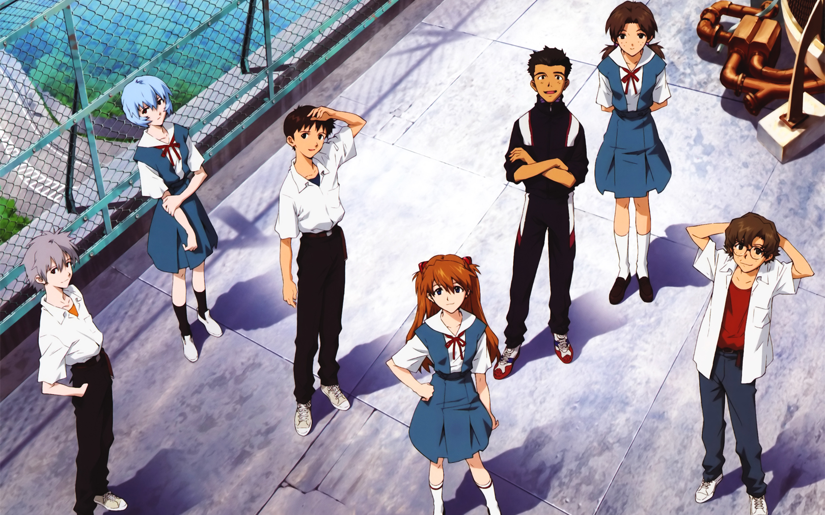
I love Evangelion, Ergo Proxy and 5 Centimeters Per Second's art styles if I have to give examples of the sort of style I like. There are others though.
Clannad is an exception though, I fucking love Clannad.
I love Evangelion, Ergo Proxy and 5 Centimeters Per Second's art styles if I have to give examples of the sort of style I like. There are others though.
Visual styles I can't stand? I'm impartial to most drawing styles. I can get lost into anything if the story is good enough.
But there's something I can't stand. Fucking pervs animating these things. High School of the Dead would be a good zombie anime if EVERY SHOT DIDN'T HAVE TO FOCUS ON CROTCH OR CLEAVAGE. I was sucked into the promises of lifelong friendship and betrayal seconds later after one of them got bit. And now I literally have to peek over these 'high school' girls' breasts to actually see the damn drama.
Fuck it, Japan. We know you're repressed. Just stop drawing pictures of women that don't exist in nature, actually go meet a live female, get all that frustration out and live normal lives. It's starting to effect your... everything!
captcha: Watch Out. Now it's threatening me. CAPTCHA, ONE DAY WE SHALL MEET ON THE FIELD OF BATTLE!
I really don't like it when their chins look so freaking sharp it can be used as a weapon. Also I don't li-
 no.
no.
TehCookie said:
Uncanny. Canyon. This goes beyond the valley.TehCookie said:As a huge fan of anime there are only a few styles that I cannot stand to watch. Though the one I hate the most is this:
For a less extreme example see Clannad.
This.TehCookie said:As a huge fan of anime there are only a few styles that I cannot stand to watch. Though the one I hate the most is this:
For a less extreme example see Clannad.
Sure I'm open minded to different animation styles that is however the animation style is off putting, mainly the ones where they got their eye proportion is so large that it cover most of the face if not all of it!
However in saying so the anime Saber Marionette J was sometimes like that so I guess that is my borderline (so the style was werid but I still like watching that anime).
I really wish you spoilered that... have you seen what you've done to this thread?!?!TehCookie said:snip
Seriously, my eyes are bleeding...(!)
Does that count as anime? I thought that was just ye olde animation? Or does all animation come under anime now?Lilani said:The Secret of Kells.
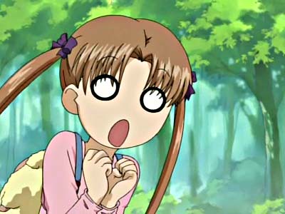
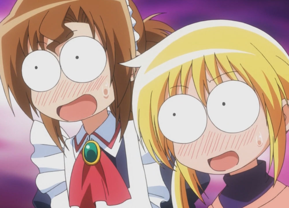
OP: I don't know too much about different styles. I do hate these kinds of expressions though:

This is going to sound insensitive but they actually look retarded. As in, they look like something went seriously wrong soon after conception.TehCookie said:Snip
Are those even eyes? Is this even real?TehCookie said:As a huge fan of anime there are only a few styles that I cannot stand to watch. Though the one I hate the most is this:
For a less extreme example see Clannad.
Mother of god, that's horrifying.
So so much this. First anime series I ever watched was Stand Alone Complex, and this kind of shit wasn't in it, well except for the Tachicoma skits at the end.Colour-Scientist said:OP: I don't know too much about different styles. I do hate these kinds of expressions though:
Now, as a massive massive perv, I don't mind lots of cleavage shots (though schoolgirl upskirt shots gets a little embarrassing after a while) or Gainaxing, but as soon as these frigging 'cartoony' expressions start getting thrown left right and centre, it really takes me out of it.
Those that don't fit, those who lack it, and those who use generics. Topic not important enough to scour the webs in search of images though there are some specifics I dislike: DB/z/gt, cutesy, dark (cheap in every way possible,) more but I lost interest.
Wallflower and Ouran included? Refreshed my memory, wallflower: very inconsistent, the simplistic parts I like; ouran wasn't overdone, good.
Yes, those, and those marvel tie-ins, and 3d (both regular and cell shaded.)
Troublesome Lagomorph said:Typical shoujo and anything by KEY. That's about it, really.
Yes, those, and those marvel tie-ins, and 3d (both regular and cell shaded.)
I'm really picky, but one anime that comes straight to mind (besides Dragonball Z) is Revolutionary Girl Utena.

Ugh, I just can't stand how pointy their features are. Another one is Vampire Knight or any other anime with ridiculously massive eyes.
Ugh, I just can't stand how pointy their features are. Another one is Vampire Knight or any other anime with ridiculously massive eyes.
Yeah I really don't like those anime facial expressions, especially when the anime is suppose to be serious. Nothing wrong with cracking a few jokes, but don't do it in such a looney toonesque wayColour-Scientist said:Does that count as anime? I thought that was just ye olde animation? Or does all animation come under anime now?Lilani said:The Secret of Kells.
OP: I don't know too much about different styles. I do hate these kinds of expressions though:
Honestly, other than shows that go seriously off-model (like tehcookie's post; Kyoani did a much better job with Kanon's art when they got around to it), I only find a couple off-putting. Mostly...well, One Piece. I willingly concede that the story is great, but the artwork took some serious getting-used-to; I just didn't like Eichiro Oda's character stylization. Same for Shaman King, which looks similar.
Other than that, I can go for almost anything. That's just the only type that seems like a "trend" (i.e. more than just one artist's distinct style).
Other than that, I can go for almost anything. That's just the only type that seems like a "trend" (i.e. more than just one artist's distinct style).