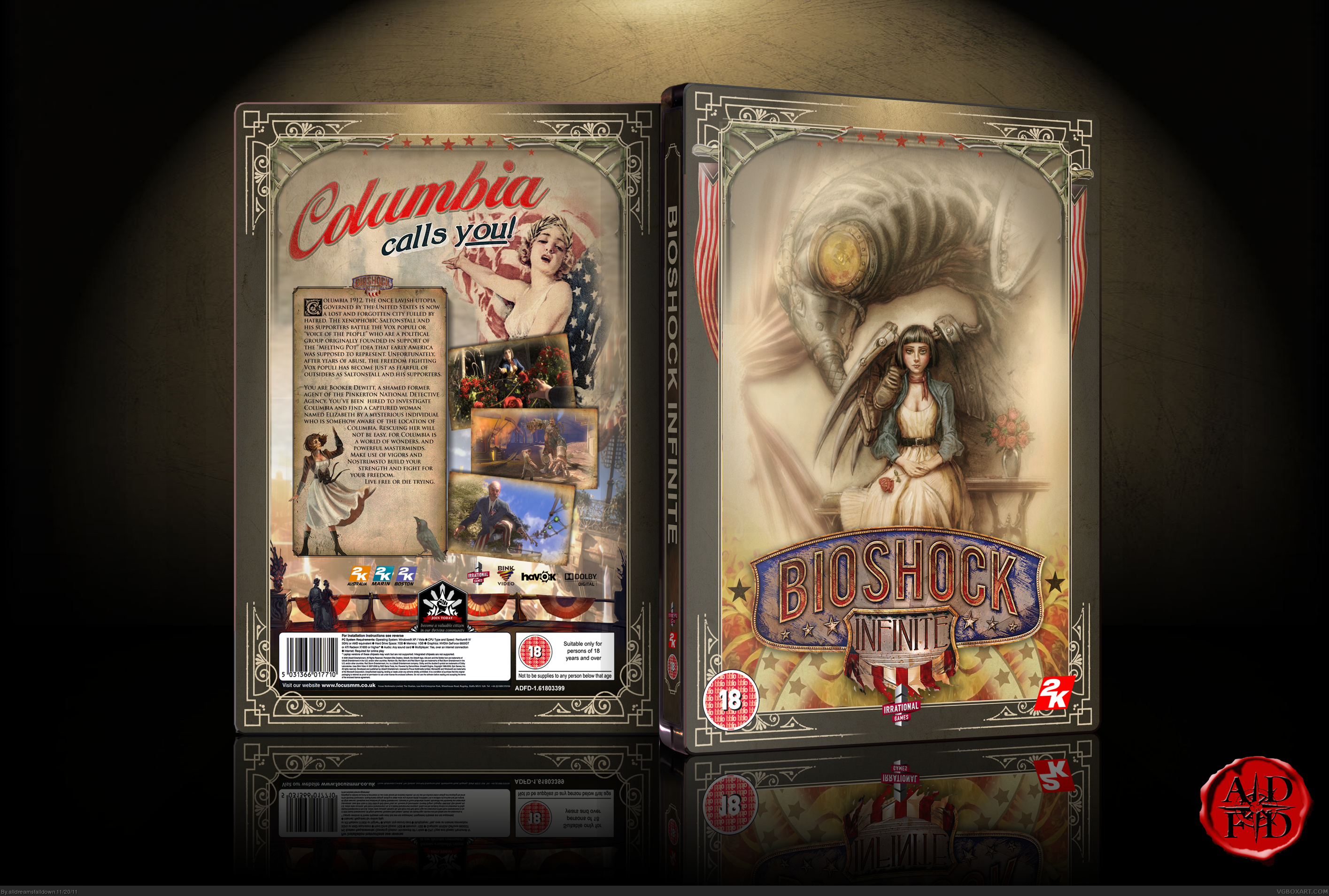
Bioshock Infinite: The latest victim of the Stupid-American-Box-Art Virus.
- Thread starter Sepko
- Start date
Man... they SO should have used this! That's awesome.Zhukov said:Personally, I would have hoped for something along these lines:
http://2.bp.blogspot.com/-C6YwccBwAgs/Tfz8F0XwoRI/AAAAAAAAACE/w9jWEXBAaNI/s1600/635px-Elizabeth_and_Him_art.jpg
good post. best post.Soviet Heavy said:No no no, Jarl Balgruuf has swagSmashLovesTitanQuest said:Fucking terrible, even though you gotta admit the guy has swag.
Hmm it's not 'bad' box art as such, it just doesn't really suit the game. Like earlier posts have said, I would've gone for something with an early 20th century poster vibe.
Alright, fine! I'll lower my standards then, if being happy about the box art is that important. I shalt never again consider discussing something on a discussing forum, on my word as a gentleman.
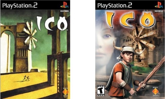
The nose wins it for most ridiculous box picture. HahahahahDJjaffacake said:It's not that bad. Bit bland, but it's got nothing on Heavy Rain or Ico.
American box art

European box art

Japanese box art


What's wrong with that? Main character on the front, supporting character on the back, setting is displayed in the background, genre is made pretty obvious because he's holding a friggin' gun. So in a single glance you know what the game is about in a nutshell. It's a video game box, not a fucking Monet painting.
As far as the Bioshock cover goes, what I don't like is the fact that Nathan Drake was standing in the very same pose, only had his back to us instead (first Uncharted), but even worse than that, it sells the impression that Bioshock is a full shooter game with unstoppable action, something that is not true (or wasn't with the first two games)... In other words, cliché and totally out of tune.
But people who are complaining about American cover art... Go to Cracked.com and look for the worst movie posters or something, hehehe THAT is another level of bad...
But people who are complaining about American cover art... Go to Cracked.com and look for the worst movie posters or something, hehehe THAT is another level of bad...
I'm not sure that REALLY is the box art as it isn't branded to any particular platform and there is a huge "PRE ORDER NOW" on the back.
But if it is pretty much how it will be... It's marketing, marketers know how to do their jobs.
The thing is they know what will sell for that particular market.
And it doesn't look like cheap box art, it looks professionally done and shows it's a high standard game (not like Ico box art).
Remember, what is the box art SUPPOSED to do? It's supposed to catch people's eye, and then convince them to pick it up and consider it for their tastes in games. I think this does that.
As a PC gamer, box art hasn't mattered anything to me for years as of course Steam games don't have box-art.
How do you know it isn't?MammothBlade said:The thing is, it's NOT just about the main character's gun rampage throughout a beautiful game environment. It should be a picture of the city itself or something, not some square-jawed cowboy. Something about it irks me.jetriot said:If you really look at this box art and think about it you will find it matches the themes perfectly. This is a series that is about this kind of man, the hero of the Gilded Age. It is like they mixed Teddy Roosevelt, Carnegie and John Galt and this is what we are left with. Am I really the only one that sees how perfectly this box art fits with this series?
Look at the subtext. It is screaming at you.
It is a First Person SHOOTER. The trailers focus a heck of a lot on the combat.
Sorry, but the city premise itself... it's a little goofy when you sum it up in just one frame. A flying city like Columbia is something you have to live in to accept, not just have "huh, flying city, probably a JRPG".
Captcha: Believe Me
Is it just me or does the box art say Fuse and have nothing at all to do with Bioshock Infinite? I don't see the Irrational games logo...what's going on in this thread?
Edit: Ah I see, I was on the wrong page. There's nothing wrong with that box art. I don't really see the problem here. What? Were you expecting the box art to fuck your eyeballs? I mean as a community we should try not reinforce the stereo-type that all gamers are a bunch of whiny nerds, who don't have anything better to talk about on their on gaming website.
Edit: Ah I see, I was on the wrong page. There's nothing wrong with that box art. I don't really see the problem here. What? Were you expecting the box art to fuck your eyeballs? I mean as a community we should try not reinforce the stereo-type that all gamers are a bunch of whiny nerds, who don't have anything better to talk about on their on gaming website.
So...
Either people are REALLY, REALLY trying to complain about every single detail EVER as some say, or I am very easy to please...
Can someone tell me why it is bad at all?... I think its standard. Not impressive, but hey not every single cover is going to be impresive right...
Actually maybe it is because I dont give a shit about covers usually, that may be it.
This is a First person shooter.
The cover shows a guy with a gun.
Seems appropiate enough to me.
...
Yeah that proves it. People complain about EVERYTHING for no reason. Other than the fact than for some reason it dosnt fully shows the characters face full for some odd reason, I see nothing wrong at all with this.
I cant see anything wrong in ANY of the covers in this thread so far... Maybe I am just thar blind? (save for the amnesia one, that was funny!).
Also:
This. Whats up with that. I am guessing its 80 rewards earnt by the whole 2 bioshock games? (And even then 80 is a shitload for just 2 games).
I wonder how many rewards do long runner high quality games such as COD and Mario have?
Either people are REALLY, REALLY trying to complain about every single detail EVER as some say, or I am very easy to please...
Can someone tell me why it is bad at all?... I think its standard. Not impressive, but hey not every single cover is going to be impresive right...
Actually maybe it is because I dont give a shit about covers usually, that may be it.
Rainforce said:Wait, wasn't this game not just about a guy with a shotgun?
then again, most boxart doesn't show much more, but at least it's normally more...cryptic/symbolic/whatever.
Not just some guy with a gun.
EDIT: also, damn, that blimp barely made it onto the cover, at least it's first half
This is a First person shooter.
The cover shows a guy with a gun.
Seems appropiate enough to me.
Rocklobster99 said:Still not as bad as Fuse.

It's the kind of cover one would use as a parody.
...
Yeah that proves it. People complain about EVERYTHING for no reason. Other than the fact than for some reason it dosnt fully shows the characters face full for some odd reason, I see nothing wrong at all with this.
I cant see anything wrong in ANY of the covers in this thread so far... Maybe I am just thar blind? (save for the amnesia one, that was funny!).
Also:
Wintermute said:The thing isn't even out yet and it's already won 80 awards?
This. Whats up with that. I am guessing its 80 rewards earnt by the whole 2 bioshock games? (And even then 80 is a shitload for just 2 games).
I wonder how many rewards do long runner high quality games such as COD and Mario have?

