General Gaming News.
- Thread starter BrawlMan
- Start date
I swear every time I hear something about vtuber one of my hair turn grey and I have to yell at a cloud.
Vtubers to appear in the next Death Stranding game?
Don't see why you should get upset over it. I am not hardcore into the Vtuber scene, but most of the ones I've watched are good people, look out for each other, and aren't gargantuan assholes.I swear every time I hear something about vtuber one of my hair turn grey and I have to yell at a cloud.
Oh not upset, but definetly realizing that this is the "thing the new generation does that I really don't understand".Don't see why you should get upset over it. I am not hardcore into the Vtuber scene, but most of the ones I've watched are good people, look out for each other, and aren't gargantuan assholes.
They're not that much different from Hatsune Miku nor The Gorillaz. I am more so referring to the latter. Think of them like that, minus the music and singing.Oh not upset, but definetly realizing that this is the "thing the new generation does that I really don't understand".
Circa.....2016 I'ma say there started to be a big push for streamers to have facecams, for whatever reason.Oh not upset, but definetly realizing that this is the "thing the new generation does that I really don't understand".
For any of various reasons, streamers don't want to show face (self confidence, anxiety, disabilities, privacy, whatnot)
Some wear masks (like the big minecraft guy whatever his name was), others figured out your could hook up face tracking technology to animate avatars (this is nothing new, my webcam could do this with like a puppy avatar in 2008), which have become generally more advanced.
Now to get a good custom one that is properly rigged and fully emotive, you both need a)a fairly expensive cam b)a supercomputer lol for the extra processing (if you're gaming, you effectively need a whole second pc for the streaming), c) if you want a really good custom one, 1-2000 dolllars to hurl at an artist that can actually make proper ones (though you can get down to 500ush for some of the lesser quality one that have minimal animation rigging)
(I have 0 for 3, and at least 2 of the reasons not to show my face, so I remain a disembodied voice on streams lol)
It just seem weird to want to see the person but at the same time not want to see the person. Like there's plenty of streamer who do show themselves, so if someone want to see a live person they can just pick one of those streamer. But if someone doesn't want to see the streamer, there's also plenty who stream without showing themselves. The vtuber just seems like a weird in between, you kinda see them but not really. That and the fact that the majority are cute anime girl but you know most of those must be dude.
Reddit - Dive into anything
Im not even gonna say it anymore.
Ah yes, companies should totally put excessive production value and overdesign in the thing that people mash the button to skip past >_>Reddit - Dive into anything
reddit.com
Im not even gonna say it anymore.
No, most of them are women. There are plenty of male Vtubers that exists, but not as popular as the ladies. And even if some of them are guys behind the female digital avatars, I don't care. So long as they act as good, decent, and reasonable people not causing trouble, nor intentionally hurting others, I don't see the big deal.That and the fact that the majority are cute anime girl but you know most of those must be dude.

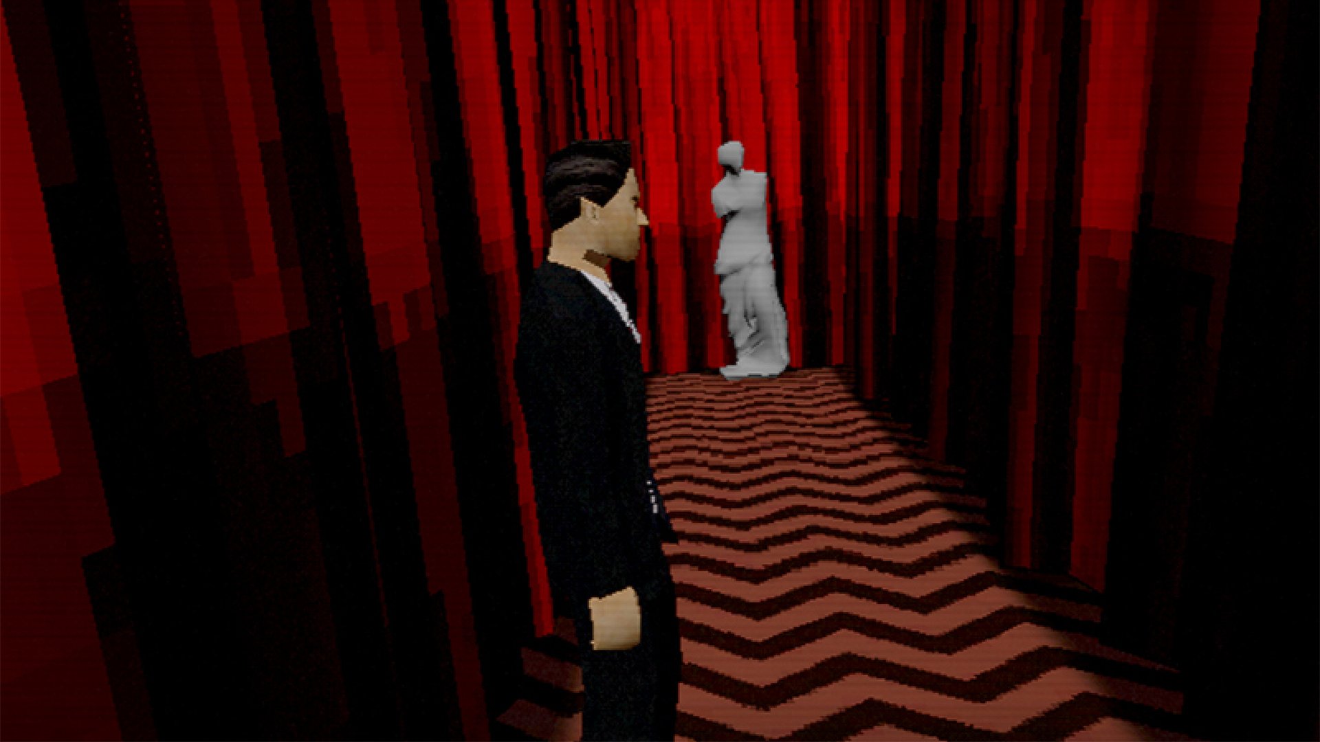
A demo for a fan-made PS1-style Twin Peaks game is available on PC | VGC
Twin Peaks: Into the Night is inspired by David Lynch’s cult series…

'90s internet animation Killer Bean is getting a video game, and it looks like procedural Just Cause
Classic internet animation Killer Bean is getting a video game, and it's an open world roguelike sandbox shooter that looks like a procedural Just Cause.
Last edited:
Reddit - Dive into anything
reddit.com
Im not even gonna say it anymore.
I'm curious what that guy would even consider a "good" start screen.Ah yes, companies should totally put excessive production value and overdesign in the thing that people mash the button to skip past >_>
It kinda looks like a membership card to a club of some sort.Reddit - Dive into anything
reddit.com
A lot of people in that thread have brought up the Elden Ring screen in comparison:Reddit - Dive into anything
reddit.com
Im not even gonna say it anymore.

I don't see how you can get much more minimalistic in comparison, and nobody's accusing that game of being shoddily made or rushed.
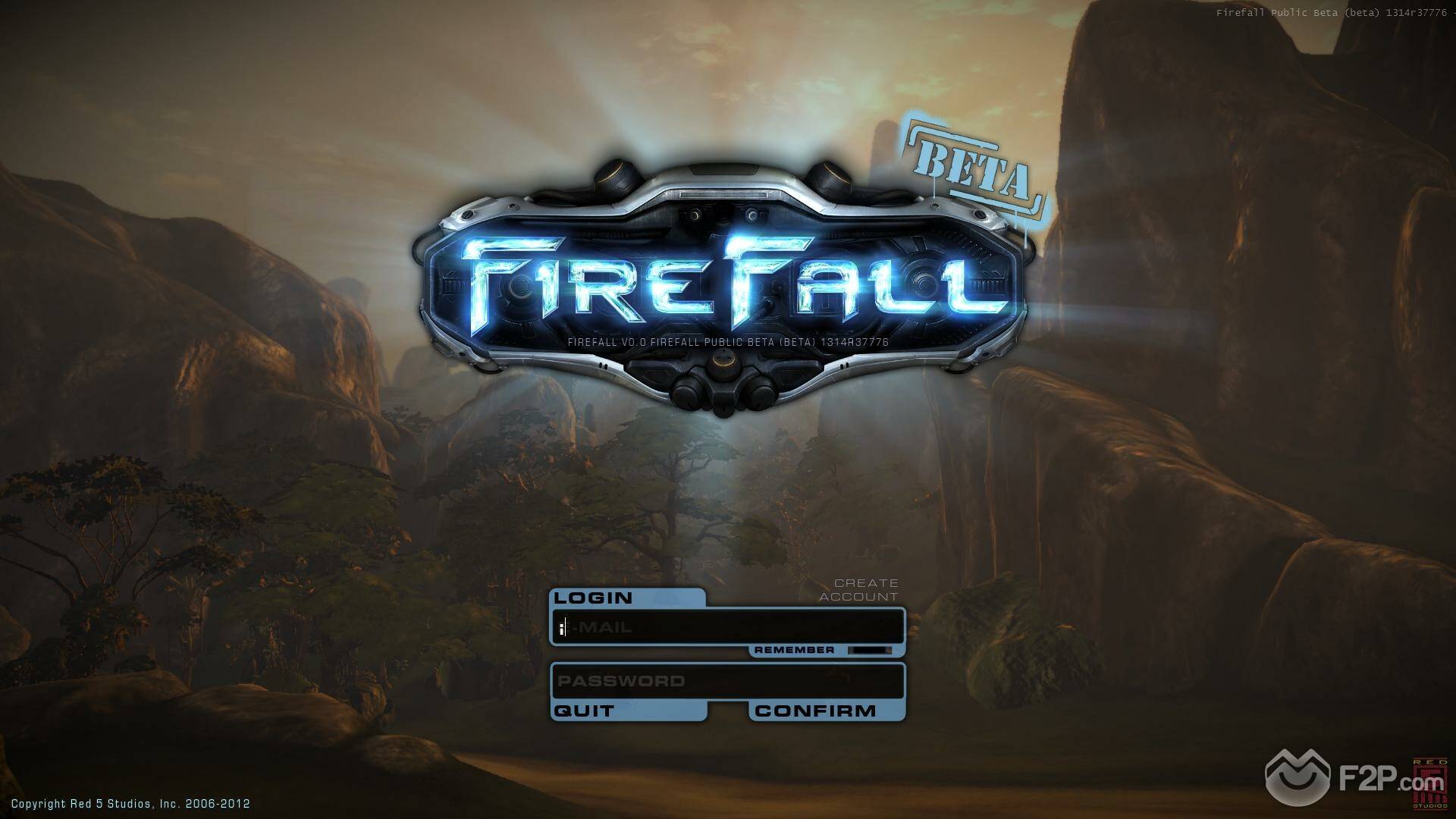
On the other hand, Firefall, the game Kern founded a studio to make:

I mean, it's not terrible, but let's remember that Firefall suffered greatly from design drift- Kern was desperate to make it an e-Sport, but never could figure out how- and he was ousted from his own company for his behavior, and Firefall and its studio eventually failed. (And I'm not even bringing up the Firefall bus....)
I'm not at all stating anything about Starfield's potential quality. I'm just saying that he's in an extraordinary fragile glass house and he's throwing boulders.
The bus looks like shit! Haaa!.....hahahahaha!A lot of people in that thread have brought up the Elden Ring screen in comparison:

I don't see how you can get much more minimalistic in comparison, and nobody's accusing that game of being shoddily made or rushed.
On the other hand, Firefall, the game Kern founded a studio to make:

I mean, it's not terrible, but let's remember that Firefall suffered greatly from design drift- Kern was desperate to make it an e-Sport, but never could figure out how- and he was ousted from his own company for his behavior, and Firefall and its studio eventually failed. (And I'm not even bringing up the Firefall bus....)
I'm not at all stating anything about Starfield's potential quality. I'm just saying that he's in an extraordinary fragile glass house and he's throwing boulders.
What the fuck was he thinking?
Ahh yes, the do or die importance of a main menu screen.Reddit - Dive into anything
reddit.com
Im not even gonna say it anymore.
As much as I don’t have high hopes with this game, sometimes the simple designs are the best choices. It actually reminds me of Alien Isolation, and something about simple 8-bit themed menu made the game even more scarier. I mean when you say “sci-fi”, what sort of aesthetic do you think of? Fancy ornately vibrant colors decors, or something you see on a computer screen?
If you are gonna trash the game, at least come up with legit complaints and problems in the game, which Starfield is already showing tons of signs of
God of War consistantly had really good start screens.I'm curious what that guy would even consider a "good" start screen.
The Witcher 3
Shadow of the Tomb Raider
WoW's log in screens
Baldur's Gate 3
A good start screen imo has characters from the game on it, or has some sort of interactivity that leads directly into the game. Almost like the start screen is a pause of the game, and when you hit new game everything animates and you're thrown right into it. But other than that, a start screen featuring characters, or move backdrops are the best.
Starfield could have just put a ship flying through space, or something that just captivates the player for the game they're about the play.
Start screens aren't super important, but good ones really stand out.
Dude, they're just funny muppets, no need to overthink this.It just seem weird to want to see the person but at the same time not want to see the person. Like there's plenty of streamer who do show themselves, so if someone want to see a live person they can just pick one of those streamer. But if someone doesn't want to see the streamer, there's also plenty who stream without showing themselves. The vtuber just seems like a weird in between, you kinda see them but not really. That and the fact that the majority are cute anime girl but you know most of those must be dude.
I mean, the general idea of the Starfield one is fine.
The goofy "news/announcement" box that is typically a live service game thing in the corner kind of wrecks it.
The menu, which seems to be going for a particular retro scifi look with the pixels clashes with the actual logo and backgrund gradient being in the higher res though.
The goofy "news/announcement" box that is typically a live service game thing in the corner kind of wrecks it.
The menu, which seems to be going for a particular retro scifi look with the pixels clashes with the actual logo and backgrund gradient being in the higher res though.
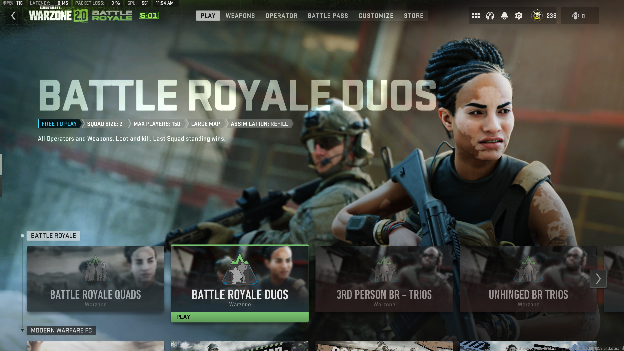
Looks ok to me. Pretty minimalist, yeah, but that's fine. Looks a bit like Mass Effect's main menu. I would actually strip it down even more. Lose the Bethesda logo. And that 'welcome to starfield' thing in the top right, which at least isn't trying to sell something (tho I suspect that's its ultimate purpose). Reduce the options to just Load Game, New Game, Settings and Quit Game. Only ones you need. I'd take it over something like this fucking mess any time.Reddit - Dive into anything
reddit.com
Im not even gonna say it anymore.

Last edited:
