I completely agree ! I hate americans box art. I was at a video club last weekend and i was looking at the games and i thought to myself: Man, they all look the same ! IT IS NOT APPEALING TO THE EYE ! PAY A FUCKING ARTIST TO THE BOX ART ! If you want video games to be recognized as an art form well, a beautiful hand-painted box art is a point in it's favor not against it.
American Box Art Sucks
- Thread starter Yahtzee Croshaw
- Start date
I think that's just Fox News. Why do the English hate the French?Yahtzee Croshaw said:Why does America hate French videogame developers?
....
Okay, why do you Still hate the French?
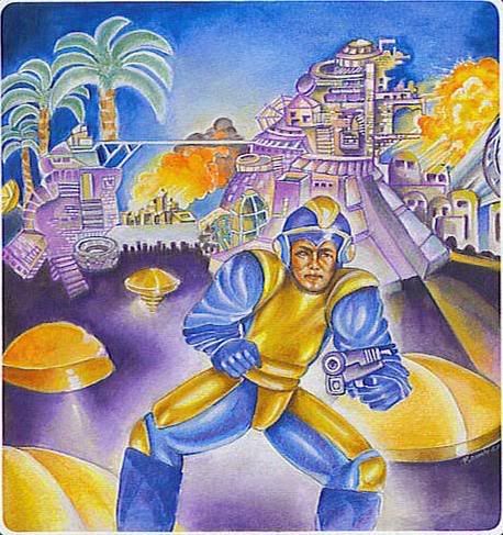
I think the reasons that the US gets such horrible cover-art is because the person who wants to play the game doesn't care what's on the cover. For example: I really liked Mega Man.
The marketing dept designs the cover for the mom in the store buying it for their kid. So they try and design the cover to catch the eye, rape it, then leave it for dead. The idea is for it to be like an overwrought romance novel cover that shows a lot of what they can pass as being in the game. So the mom can say "oh this will be good. Johnny likes aliens, guns, AND tits."
The more they can fit on that image, the more likely some uninformed parent will see it and buy it.
No offense but the escapist kind of does the same thing with the front page of this site.
::Laughs.:: He looks like he's in the midst of a desperate potty emergency.Russian_Assassin said:I'm sorry, fellow escapee, but I could never identify with a main character that looks like this abomination over here:LadyRhian said:Because America is all about identifying with the main character- becoming the main character, so that's what we want to see on our box art. Admittedly, not always, but mostly. And we can't identify with a character (or characters) if we don't know what they look like.
[small] What the fuck is this?[/small]
And the punchline? MEGAMAN DOESN'T EVEN LOOK LIKE THAT!
It's because the people who do American boxart don't know shit. Hollywood does floating heads because they spent a ludicrous amount of money buying Harrison Ford's head, because they know that movie-goers will spend a ludicrous amount of money to buy tickets to see Harrison Ford's head. Games do not have actors. Our floating head fetish makes no sense.
A game like Bayonetta that sells on the strong character design and sex appeal of its lead, sure, put her on the cover. But there had better be some goddamn tits, because no one is buying her hairstyle. RE4's cover, we started out with a decent shot of filthy, crazed villagers, that's what the game is about, that's great, and then we stick Leon's stupid face on top of it; ugly, I think you ruined it, but a pretty boy and a gun could help, so I see where you're coming from. But for Ico... Jesus, it's the most meaningless thing I've ever seen. No idea what the game is about, but I'm playing as A KID WITH HORNS, FUCKING AMAZING. And there's a GIRL'S HEAD involved somehow, holy shit. I weep for the money spent on this shitty box.
A game like Bayonetta that sells on the strong character design and sex appeal of its lead, sure, put her on the cover. But there had better be some goddamn tits, because no one is buying her hairstyle. RE4's cover, we started out with a decent shot of filthy, crazed villagers, that's what the game is about, that's great, and then we stick Leon's stupid face on top of it; ugly, I think you ruined it, but a pretty boy and a gun could help, so I see where you're coming from. But for Ico... Jesus, it's the most meaningless thing I've ever seen. No idea what the game is about, but I'm playing as A KID WITH HORNS, FUCKING AMAZING. And there's a GIRL'S HEAD involved somehow, holy shit. I weep for the money spent on this shitty box.
I dunno. Maybe it is because I am American but when comparing all the non-america covers to the American ones, I have the distinct feeling almost every time that I'd be more likely to pick up and look over the American cover than the others. I agree the others tend to have a better artistic sense but marketing isn't about art, it's about grabbing the eye enough to get you to look at the back, like Yahtzee listed. Actually the majority of the American box art covers meet the first two criteria if not the third (viewable from a distance).
I think this is also a plausible theory.LadyRhian said:Because America is all about identifying with the main character- becoming the main character, so that's what we want to see on our box art. Admittedly, not always, but mostly. And we can't identify with a character (or characters) if we don't know what they look like.
I haven't seen it yet but I've been wanting to for a LONG time, too bad no video stores seem to have it.The Real Sandman said:Who knows really.
I don't have any particularly notable games to mention, but I do have my own personal gripe.
The Secret of NIMH
Fucking. Amazing. Film.
It was a family flick filled with all the adventure and fantasy animated films about talking woodland critters were required to have as rule of thumb, but it still managed be pretty damn dark, serious, fairly intellectually driven and out right beautifully artistic. It was a family movie that defied conventions and was actually about stuff.
OT: Many have said that box art covers doesn't really matter since it's the game itself that counts.
A good, memorable box art can make a good impression in the marketing campaign. Something that draws your attention when put on billboards or websites and makes people that don't keep up with gaming news know that the game exists and what it's about. And it's a real advantage in marketing if you have some unique imagery when competing with hundreds of other products for the consumers attention.
box art is an interesting and funny subject. way back when i was but a lad, i bought flashback, despite the weird box art that actually had nothing to do with the game. luckily for me, the game was good. and then just a few years ago, i came across Ico after getting my PS3 (never had a PS2) and panned it because of the horrible box art. of course now i know that the game is great and i should have purchased it, but the box art was so horrible, so off-putting that i missed out on the game. now i have to wait for the HD bundle i guess.
i really wish that we up here in canada didn't have to suffer with the US box art. i'd much rather have the european or japanese box art in most cases anyway.
i really wish that we up here in canada didn't have to suffer with the US box art. i'd much rather have the european or japanese box art in most cases anyway.
Maybe, maybe not. We all get the same box art though.Otto42 said:Europe also has everybody pretty much *hating* each other's guts. There's virtually no crossover. Or are you seriously suggesting that Germans all watch the same shows that the British people do?Danzaivar said:Europe has twice as many people and a dozen times as many languages, and completely different cultures every few hundred miles too. Don't try selling that varied culture crap.
The thing is, while the US is indeed a wide varied set of cultures, just as Europe is, very few people are trying to sell something to the whole of Europe at once. They localize, and tailor content to each audience. That's not the case here, because apparently we just can't be bothered or something, so everything ends up having to appeal to the lowest common denominator.
It's not that you can't find intellectually stimulating and satisfying material in the US, it's just that from the outside looking in, you'd have to see through the 20 layers of stupid nonsensical BS to get anywhere near it. And this is the case in the reverse too, obviously. There's a lot of crap coming out of the BBC these days, and while the Brits obviously know what is good there, you have to admit that there's a lot of bad as well.
Oh and you guys all hate each other too. Be it politics, or north/south, or east/west. Whatever.
As an American, I will respond for my people by saying: If we don't have a picture of titties with lots of color and flashy filters we wont buy it....why? Because our attention span is so minuscule unless its ungodly flashy and screaming "OH GOD PLEASE LOOK AT ME!" then we can't notice it because we are too busy buying other, flashier things.
I am from England and i can't stand american box art.
Other examples of this are Final Fantasy. The EU and JP box art id just a white case with the logo on it, rather than the mess americans have.
And the worst one i have seen is pretty recent and i know Yahtzee will hate it.
Amnesia.
http://img98.imageshack.us/img98/9024/boxartj.jpg
Guess what one belongs to who.
It's all apart of the hate-cycle. See, ever since becoming a world power, we've decided that holding a grudge for all those wars in the second half of the 18th century (plus we decided to protest your naval shenanigans by going to war with Canada in 1812, which ended about as well as you could expect for a war run by people who accidentally invaded the wrong country) was too petty for our new international Superman image. Instead, we decided to take out all of our hatred on France, because France hates you British people already. The more we pick on France, the more France takes it out on you.
EDIT: More seriously, there are plenty of American gamers (possibly even a majority of the market) who only like games that allow them to live out their juvenile male power fantasies. However, only a vanishingly small amount of that demographic is going to show up on the Escapist, so you're preaching to the choir.
EDIT: More seriously, there are plenty of American gamers (possibly even a majority of the market) who only like games that allow them to live out their juvenile male power fantasies. However, only a vanishingly small amount of that demographic is going to show up on the Escapist, so you're preaching to the choir.
I don't know, the first one definitely conveys the feeling of being alone in an alien and threatening environment, that feeling that something can pop out from any corner at any time. The problem with the American box art in my opinion is that it's far too literal. The PAL version, if it were text, says to me "lost in the dangerous, unknown woods" which sums up the game quite nicely in some ways. The American box art says "look your this guy with a laser sight and you get to shoot these assholes behind him look how many their are but you're a tough guy".Mcface said:American box art is just more descriptive of the game.MacNille said:You should have brought up resident evil 4 boxart.
here is the pal version:It's very stylise and a litte scary too.
Now here is the american:
So generic. Nothing about this cover is good. It's so damn bland.
So if you are browsing the store, you see both of these game cases, knowing nothing about the game, you are more likely to get a better idea of what the game is from it.
It's not a creepy dark game where you are in a empty desolate place like the top cover suggests, you are in a village packed with zombies carrying chainsaws, like the bottom.
Also when are American marketing teams going to realize that just because a character model is perfectly suitable for gameplay, it doesn't make it good box art? Are they afraid that people will mistake a game with a beautiful painting on the cover for a game about painting? "oh no, I'm not picking up this game. I want a game with polygons".
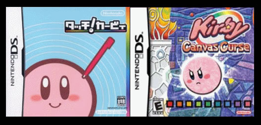
http://tvtropes.org/pmwiki/pmwiki.php/Main/AmericanKirbyIsHardcore

http://www.infendo.com/america-makes-kirby-pissed-off-japan-makes-him-smile/

There are better examples but I feel lazy.
The same goes for all (most?) other kirby games, check em out if you want.

http://www.infendo.com/america-makes-kirby-pissed-off-japan-makes-him-smile/

There are better examples but I feel lazy.
The same goes for all (most?) other kirby games, check em out if you want.
That monster on the cover looks like it has a beak for a mouth.Dannyjw said:I am from England and i can't stand american box art.
Other examples of this are Final Fantasy. The EU and JP box art id just a white case with the logo on it, rather than the mess americans have.
And the worst one i have seen is pretty recent and i know Yahtzee will hate it.
Amnesia.
http://img98.imageshack.us/img98/9024/boxartj.jpg
Guess what one belongs to who.
So we can have a console that costs $999 and games that cost $99 just because of the special "you will pay way more than this is worth" stamp [http://www.maclife.com/files/u57/apple-logo1.jpg] on them? No thanks. I'll take bad box art over overpaying out the ass any day. Plus it's stupid to try and blame Microsoft anyway; North America has been getting shitty boxart before even Sony got into the game market.Falseprophet said:Let's hope Apple puts out a console next generation.
For America, out box art problem comes from to issues:Yahtzee Croshaw said:Snip
1. Hollywood always puts a picture of the actor on the film poster if they are even slightly bankable. If somebody is the slightest fan of the actor, they hope to attract them based on the actor. Putting the director on the poster makes little sense since you never see them, and trying to sell a movie with the story is a joke hollywood would laugh for hours at. Paying somebody like Drew Struzan (who did the perfect posters for E.T., Star Wars, and the Indiana Jones movies) who could show both the characters and give a feel for the story was considered to expensive with the invention of photoshop. It is a trend we've had since their has been famous actors and it is one that were stuck with, which has infected American video game box art design, so no box art isn't complete without the characters of the game.
2. American audiences want stuff that looks hardcore: The target American audience for both Hollywood and the video game industry is 15-30 year old men. Box art is often made to look hardcore so the person buying it doesn't feel bad about the fact they are buying a "game."


