American Box Art Sucks

taltamir

New member
Mar 16, 2005
65
0
0
Pugiron said:
So you blame American consumers for art choices made by a few foreign game companies when they import things here? Thats like blaming Australians for "choosing" to have Paul hogan be their national spokesman for 20 years, or the British for "picking" the ugliest royal family in history.
its even worse than that. since its foreign companies exporting games to the USA, the blames lies on their prejudices.

American game box covers suck compared to those in other countries because the marketing execs of foreign countries believe Americans to be dumber then people of their own country. As a result they provide a "dumbed down" version for the "stupid Americans". This in no way indicates that Americans are actually stupid.
 

Lionsfan

I miss my old avatar
Jan 29, 2010
2,842
0
0
Hell I don't know why it sucks, I didn't even know that it sucked. But looking at some of these examples I do wonder why the American Version usually sucks more
 

cthulhumythos

New member
Aug 28, 2009
637
0
0
we have bad artists?

i dunno. i just buy games that appeal to me. boxart is about eye-catching, but i know what i'm getting before i enter the store. hooray internet.
 

JUMBO PALACE

Elite Member
Legacy
Jun 17, 2009
3,552
7
43
Country
USA
10BIT said:
Here [http://www.gamesradar.com/f/why-japanese-box-art-is-better/a-20080729123833874037] is a nice comparison between American and Japanese box art.

I love how Kirby has to be angry in America.
I clicked on the link to see Kirby and I couldn't help but laugh.
 

qeinar

New member
Jul 14, 2009
562
0
0
Kimarous said:
I don't really give a crap about how cover art looks, but somebody answer me this... WHY DO PEOPLE HATE FLOATING HEADS SO MUCH? Seriously! Every time I see any kind of cover with a disembodied head of any kind, people ***** about it, even if it looks perfectly fine! Why?

Actually, speaking of how covers look, I wanted to get Yahtzee's "Mogworld" book for Christmas (family tradition dictates we never buy ourselves gifts), but my mother refused to get it because she thought the cover art was too hideous to even consider. It's a funny ol' world, isn't it?
well i kinda guess your mom is not the target audience this book was aimed at? also did no one tell your mom not to judge a book by the cover? ^^
 

qeinar

New member
Jul 14, 2009
562
0
0
Falseprophet said:
teh_Canape said:
idk, but for some reason, I can't get over the brilliance of this cover


it's just, genius

like Spoony said: "it's like, how much more black could it be?
and the answer is none

nonemoreblack"
It worked for AC/DC, Metallica, and Spinal Tap, so why not?

But to be fair, by that point the Ultima was such an established brand you probably could have written "Ultima VII" in crayon on a piece of tissue paper and people would have bought it.
to me this cover just says: we got a great game, we don't need to get all fancy with our box art.
 

qeinar

New member
Jul 14, 2009
562
0
0
DarkShadow144 said:
oh wow, ive never seen the other versions of Heavy Rain box art. He's right, the japanese version is so much better then the american version, even the version in europe looks better, what the hell happened?
it's kinda funny because it's like they saw the european version and tought: "that looks pretty good.. we'll keep the origami part in, and then add more shit.
 

Eclectic Dreck

New member
Sep 3, 2008
6,662
0
0
I think an interesting thing to point out is that just because the covers were designed (presumably) to appeal to Americans, it is not always successful. Heavy Rain in particular was terrible art by American video game <a href=http://www.destructoid.com/us-heavy-rain-box-art-is-pretty-rubbish-160252.phtml>journalists. In many of the examples given by Yahtzee, one can find pages of people complaining that the American art is rubbish. The problem is that many of these games are quite good in spite of the box art and are thus purchased which I can only assume is the driving reason behind the classic trend of bad American box art. If the game sold well with terrible art, then, by some bizarre marketing logic, the art must have worked!
 

Aptspire

New member
Mar 13, 2008
2,064
0
0
It's funny (or rather, sad) that it often extends to books and movies as well. well, not so much the art as the titles are getting more and more butchered :/
 

qeinar

New member
Jul 14, 2009
562
0
0
imnotparanoid said:
LadyRhian said:
Dannyjw said:
I am from England and i can't stand american box art.

Other examples of this are Final Fantasy. The EU and JP box art id just a white case with the logo on it, rather than the mess americans have.

And the worst one i have seen is pretty recent and i know Yahtzee will hate it.

Amnesia.
http://img98.imageshack.us/img98/9024/boxartj.jpg

Guess what one belongs to who.
That monster on the cover looks like it has a beak for a mouth. :p
Oh lord no, no NO!
How could they do that!
ahahaha oh my god that is funny.. xD the normal one looks pretty badass though. :D
 

drisky

New member
Mar 16, 2009
1,605
0
0
I think a lot of people have a a bit of misconnection about whats going on. The designers don't usually have the final say on what goes out the client or in this case the regional publishers do. As a graphic design student a lot of people in the industry keep telling me that you have to develop tricks to convince the clients that what they want is wrong, after all your the professional. But a lot of times in america business men want the creative control even when they don't necessarily know what there doing. And in the end many of those people are afraid to take risks so they usually chose the one that is safe and delivers the message the best, rather than the one that stands out artistically.

In conclusion, stop blaming American artists, they don't have much say in the matter.
 

Aldan9

New member
Sep 5, 2009
89
0
0
I wish Yahtzee would stop with the Uncanny Valley references already. It's getting old.
 

googleback

New member
Apr 15, 2009
516
0
0
I honestly have no idea why it STILL happens... Big companies realised a few years ago that the American market isn't as dumb as they expected all those years... its hilarious to look back on these ridiculous boxarts, its like looking back at the stone age isn't it?
 

Trasken

New member
Mar 30, 2010
120
0
0
I'll answer your question with another question:
Should it really surprise us that the box art in countries that have existed for so long and have such a rich artistic history and culture (japan and europe) is much much better than that of a relatively young country that is mostly known worldwide (albeit in an axeggerated fashion) as shit blowupers and self declared world police? (i'll let you figure this one out)

It's like having a 9 year old child with ADD trying to compete with a 60 year old graduate in literary history in a poetry competition
 

gyroscopeboy

New member
Nov 27, 2010
601
0
0
10BIT said:
Here [http://www.gamesradar.com/f/why-japanese-box-art-is-better/a-20080729123833874037] is a nice comparison between American and Japanese box art.

I love how Kirby has to be angry in America.
The funny thing is, a lot of the comments say how much they prefer the US art...maybe they bring it upon themselves?
 

NickCaligo42

New member
Oct 7, 2007
1,371
0
0
Nobody I've talked to actually likes the American version of the box art we get, under any circumstance. Any time they're made aware of other box art, there's an immediate outcry about how much our box art sucks in comparison. I have no idea why we keep getting the worst box art ever, but rest assured we aren't asking for it.
 

robinkom

New member
Jan 8, 2009
655
0
0
All of the good American box art was used for DOS, C64, and Amiga games! Just look at the AD&D Gold Box covers. Also, I happen to like the American Flashback cover, I have it for DOS and Genesis. Also used to have Another World on Amiga way back.

Personally, I don't like box art where too much Photoshop and graphic art were used. I like to see handmade paintings. Best example: Atari 2600 games. The games were complete shit visually, you HAD to sell it on the box art.

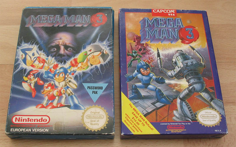
Also, here's another good example relating to Yahtzee's article:

I still like the American box for being stylized except Mega's face makes him look like a Keebler elf. The European box, however, has all of the robots in their Anime-style appearances and perhaps the most foreboding and dark shot of Dr. Wily's face ever. It's almost scary.

Even better... Capcom does it on purpose now as retro humor. But still, it was done by hand and it's a rather nice piece.