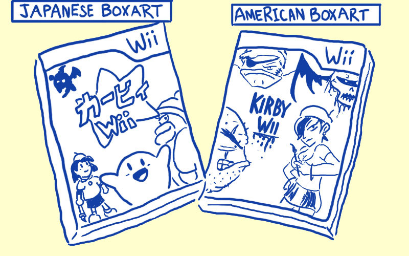
American Box Art Sucks

HeroKing89

New member
Nov 9, 2009
45
0
0
Danzaivar said:
Same reason why Silent Hill loses all of what made it special when it goes to US developers.

Americans SUCK at symbolism. Or subtlety.

What they did to the ICO cover is just criminal. It's like sticking a fucking fake nose/moustache disguise on the mona lisa or something.

/endtarbrushinganentirecountry
Ugh... ok first of. Climax Studios, is a British Developer. So 2 out of the 3 new Silent Hill games were not American Developed. Secondly, while Homecoming (the American developed one) lacked slightly in the subtly department it was still highly symbolic, all of it's monsters still represented something. I could go on all day about this...

But anyway, I agree with the Ico box art, the American one is a travesty but eh... I never played Ico although I'd like too. Hard to find cheap nowadays.
 

Roofstone

New member
May 13, 2010
1,641
0
0
I think I just fell in love with whoever made the japanese heavy rain box art.. Anyone know where to send my wedding proposal and deed to all my belongings?

I jest...

Seriously though, that box art is awesome. <3
 

Archtype

New member
Apr 25, 2010
32
0
0
SilentHunter7 said:
It's a trade off. You Aussies get good box art. We Yankees get games before they become irrelevant.
Rofl amen to that. Ok sure I'll readily agree that some of the box art is definitely lacking. However, I don't even remember the last time I really noticed the box art on a game or even really cared.

Other countries continue to regard us with as a stereotype of an unpredictable and crazy group of people. Who at any given moment might become bored with trying to negotiate with insane people and just pull out a .45 and blow them away. And personally... I like it that way... ;D

Also, Yahtzee my friend, I believe you are a bit racist.
 

ANImaniac89

New member
Apr 21, 2009
954
0
0
I agree whole heartedly with you Yahtzee, as an American gamer I hate the overwhelmingly bland look that most game's box art get in it US release.

I think I realized this first when I bought Batman: Arkham Asylum and I found myself thinking, My God, I own hundreds of Batman comics and trades and 90% have infinitely better cover's. But with this $60 new game I get Batman standing on a cliff looking somewhat confused.
 

Arawn.Chernobog

New member
Nov 17, 2009
815
0
0
Because Americans like frowning protagonists with moody expressions showing off their physical appeal (or just a female character filling out the latter) and any form of artistic expression in the box-art superior to "Generic Hollywood-esque Poster" is hated and assumed as "pretentious".

Bottom line, you have to make something that appeals to a violence-loving, beer-consuming and escape-reality-and-pretend-to-be-the-main-character-fighting-off-monsters-and-actually-touching-a-woman-desiring community... that unfortunately isn't just found in the states but it's probably more glorified by mainstream media there then anywhere else. Hopefully the minority will fight against it... or just apathetically say "Meh" and shrug.
 

Casual Shinji

Should've gone before we left.
Legacy
Jul 18, 2009
20,161
4,926
118
mjc0961 said:
Yup. We sure get some weird boxart over here in the States. I also submit for this discussion, Kirby:


http://www.brawlinthefamily.com/?p=288

Last one is a joke obviously, but really, why did they keep making Kirby angry on our box art?
That's a good one. It reminds of those Dreamworks Animation covers. The whole "Yeah, we're up to no good" face.

American marketing just doesn't like to take any real risks. When Four Weddings and a Funeral was being distrubuted in America, they apparently wanted to change the title because they thought it would be too long and confusing for the American audience. Marketing really needs to stop treating Americans like they're the frikkin' princess on the pea.

That Ico cover was the first thing that sprang to my mind when I saw the title of the article... God, the horror!
 

Otto42

New member
Feb 8, 2011
3
0
0
Yahtzee, you egomaniacal madman... What have you got against tits?

I mean, yes, good design, and yes, layout and drama and angst and soul-enhancing artwork can really spice up the presentation of a game and make the player feel a lot more happy about it overall, sure.

But also, TITS.

Also, F the French.
 

etocadet

New member
Jun 21, 2010
7
0
0
As soon as I read Delphine software I thought "Yahtzee is this another flashback plug" amazingly I was right but more amazingly I missed the picture art until I finished the article, i must be the reincarnation of Tasman a joke probably only the australians will get or geography enthusiasts, definately not americans then. you know what Americans are like, they haven't just butchered box art, they've butchered tv shows, games and movies to make more sales, their film trailers are the worst, most of them misrepresent a film entirely giving out the wrong impression, and while this makes the most money it doesn't do the content any favours, they fail to realise if they market their show to the right crowd then that crowd will spread it amongst themselves via word of mouth and they'll make a nice some of money and their game will be praised, instead they market it to everyone and the amount of negative reviews vastly outweighs the good but what does it matter they made a mint, case in point assissins creed 1, tried to please too many instead it pissed them off. A good game that hasn't made a lot but has had praise would be amnesia the dark descent, which developer would you rather be, rich but hated, or not rich but loved.
 

Kumomaru

New member
May 21, 2008
158
0
0
Danzaivar said:
JuryNelson said:
The thing about America is that it is fucking huge.

When they brought over the Office, they had to change quite a bit about it before it would be palatable?not to An American Audience, but to an incredibly massive and varied one. Lowest Common Denominator doesn't mean that we're a pack of idiots, it means that we're a nation that's so loosely connected, there's very little that we can all legitimately enjoy.

Design by Committee happens so often here because we usually Enjoy by Committee, too.

That's changing, it should be noted. Inception, Mad Men, Even Kanye West. The vision of a single auteur seen through from beginning to end is coming out more quality, and getting the critical recognition and commercial success we hope for it.

As for why we hate the French, it's partly that we're jealous of their cheap wine and delicious bread, and partly because they take every chance they can to just up and quit working, and that looks too much like laziness to be ignored.
Europe has twice as many people and a dozen times as many languages, and completely different cultures every few hundred miles too. Don't try selling that varied culture crap. :p
We have a state where the culture changes every few STREETS.

And while Europe's culture changes, it's not one country. It's a continent. It's a different ball game
 

Otto42

New member
Feb 8, 2011
3
0
0
Danzaivar said:
Europe has twice as many people and a dozen times as many languages, and completely different cultures every few hundred miles too. Don't try selling that varied culture crap. :p
Europe also has everybody pretty much *hating* each other's guts. There's virtually no crossover. Or are you seriously suggesting that Germans all watch the same shows that the British people do?

The thing is, while the US is indeed a wide varied set of cultures, just as Europe is, very few people are trying to sell something to the whole of Europe at once. They localize, and tailor content to each audience. That's not the case here, because apparently we just can't be bothered or something, so everything ends up having to appeal to the lowest common denominator.

It's not that you can't find intellectually stimulating and satisfying material in the US, it's just that from the outside looking in, you'd have to see through the 20 layers of stupid nonsensical BS to get anywhere near it. And this is the case in the reverse too, obviously. There's a lot of crap coming out of the BBC these days, and while the Brits obviously know what is good there, you have to admit that there's a lot of bad as well.
 

superline51

New member
Nov 18, 2009
179
0
0
Yes, the reason we buy games is because the box art, that sits on a shelf and only gets looked at when getting the game out, is pretty.

The moral of the story: who gives a crap. Dead Space 2 could have had a literal steaming pile of shit on the front cover and I still would have bought the game immediately.
 

MasterChief892039

New member
Jun 28, 2010
631
0
0
While I generally agree with this article, I hope everyone realizes that a) consumers have no say in what the box art for their games look like and b) many of these could be considered a matter of opinion. Obviously no one can argue that the Megaman cover sucked balls, but personally for the last example Yahtzee gave, I preferred the second "Out of This World" box art -the "old pulp sci-fi" American version- to the blandly coloured, hand-painted original... just look at that blocky ape man in the lower left hand corner. Looks awful.
 

Bloodstain

New member
Jun 20, 2009
1,625
0
0
Americans want their covers to look thrilling and gun-fighting-y in order for them to appeal to the mass audience.
The thing is: Because all covers try to pull that off, they all look all the more boring and generic. They all look the same.

That's why simple and question-raising covers (one might call them artsy) are - even though it may seem paradoxical - stand out and thus attract more attention.

It's the same with book covers (at least here in Germany). They all try to look shocking and mysterious, most of them are in black and red. So simple, white covers attract more attention (at least more of mine).
 

Farlander

New member
Oct 31, 2010
11
0
0
Which reminds me. Russian releases usually use European covers. But sometimes there's shit shittier than American shit (although, not all American covers are bad). Like this one.


AWhite107

New member
Jul 29, 2010
10
0
0
As an American I can honestly say, minus the fact that the only country I ever find myself hating because they got the game before me is Japan, we screw with games way too much. From changing titles for the American version, to changing images etc. I dont know why we have to try to be so unique.
 

Kegluneq

New member
Aug 3, 2010
14
0
0
To everyone arguing that minimalist box art doesn't tell you what the game is like: DVD cases have two sides. The back of Ico has screenshots and writing telling you what the game is about, as does just about any other game, regardless of the art on the front. But anyway, the box art for Ico (and the art design in general) is amazing and the cover is one of my favourite for any form of media.

To add another example that hasn't been brought up yet: The Metal Gear Solid 4 cover. The US versions of previous titles in the series weren't too bad and there's only one real difference between the two, but it's an important one. By not going for the handrawn look, the US version goes against the theme of the series art beforehand and thus fails.

Edit: Wow, Farlander, that's even worse than the Rats of NIMH one. Speaking of which, is Watership Down a cuddly cute film about bunnies [http://www.dvdcorral.com/viewmovie.php?id=15486] or the awesome yet horrifying product of a broken mind [http://pics.livejournal.com/escapecomplex/pic/0004qfxy]?