American Box Art Sucks

Telekinesis

New member
Apr 26, 2008
104
0
0
From TVTropes' "American Kirby Is Hardcore" trope:
Ico's original cover◊ did a good job of capturing the overall feel of the game - quiet, isolated, beautiful, and above all artistic. The American cover◊ takes all of that away and gives it the look of an uninspired throwaway game, while making Ico himself look gritty, aggressive and as being straight from the Uncanny Valley - something he most definitely is not.
Is it just me or did Yahtzee totally rip off that paragraph?
 

Mstrswrd

Always playing Touhou. Always.
Mar 2, 2008
1,724
0
0
Unfortunately, I think the people who make box art are stuck in the past (about 30 years ago, to be precise... and they're also failed movie poster designers, not game box-art designers). I often don't keep the box art a game comes with anymore; I printed out the Japanese box-art for MGS4, the PAL box-art for ICO, and a few other games I've done the same thing for (the names escape me right now). On the otherhand, on the rare occasion that we get good box-art, it's usually not because we did it well, so much as because the other box-arts just failed harder. I can only think of a few legitimately good American box-art's, and those are almost all from games made here in the U.S., like God of War and GoW II, thought GoW III's box-art was awful.
 

darkman80723

New member
Jul 1, 2009
176
0
0
And the box art matters in games when we have shitty game design, terrible voice acting, repetitive stories and worst of all broken game play why?
 

CitySquirrel

New member
Jun 1, 2010
539
0
0
I don't think anyone else has posted this but an article on cracked.com [http://en.wikipedia.org/wiki/Drew_Struzan/] today but if his work making movie posters has been so prolific here then it makes sense that his style would be so integrated into our way of thinking about promotional art. Just look at the samples of his work in the cracked article... the floating heads and collages seem to be, if not his doing, at least popularized by him.
 

Burck

New member
Aug 9, 2009
308
0
0
1) American Individualism. This aspect of our culture puts emphasis on individuals over the collective and insists that individuals make the most impact on the world, when really, the relationship between people and their common goals (fantasies, desires) matter.

2) American Marketing Departments.
 

Dfskelleton

New member
Apr 6, 2010
2,851
0
0
Russian_Assassin said:
LadyRhian said:
Because America is all about identifying with the main character- becoming the main character, so that's what we want to see on our box art. Admittedly, not always, but mostly. And we can't identify with a character (or characters) if we don't know what they look like.
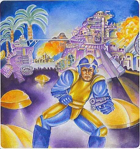
I'm sorry, fellow escapee, but I could never identify with a main character that looks like this abomination over here:

[small]
What the fuck is this?​
[/small]

And the punchline? MEGAMAN DOESN'T EVEN LOOK LIKE THAT!
AAAGH! KILL IT WITH FIRE! KILL IT WITH FIRE!
OT: These days I didn't notice that it happened too much. I guess I've never really cared (or played Mega Man). Although I do agree that some of these look much better in Japan and UK. Whatever, I guess just more proof on what lazy stupid lame boring uncreative fat insensitive undereducated insuperior people us Americans are.
 

xyrafhoan

New member
Jan 11, 2010
472
0
0
I hate boxarts with 3D renders of the main characters plunked on top. This was especially bad in ICO's era but even now, many of the realistic 3D renders are so uncanny valley that it just creeps me out. MGS4, with a closeup of old Snake's face, is especially bad. For this reason, even though I typically anticipate purchases ahead of time, a good cover for a game I'm on the fence about will usually prompt a buy. And usually, those games will have hand-drawn covers, which tend to have much better design elements because they had to hire an actual artist and not just grab a random intern/committee-influenced "designer" to compile a collage in Photoshop.

And for those who don't care about what's on the box, remember: Your parents and family probably aren't nearly as educated about games, and WILL judge a game by the boxart. They aren't targeting you. They're targeting your naive parents and/or grandparents.

http://www.escapistmagazine.com/articles/view/columns/first-personmarketer/8525-First-Person-Marketer-So-You-Got-a-Bad-Game-for-Christmas

This is an excellent supplement article for this column.
 

Frotality

New member
Oct 25, 2010
982
0
0
typical american video game boxart is designed after typical american movie posters, and i think the logic behind those are "shove every characters face on the poster and hopefully people will identify with at least one of them".

secondly, our boxart is NOT meant to convey what the game is about... it is all floaty heads as you said, and it is meant solely to get someone to buy it, with no mind to what the hell its actually about. look at the whole add campaign for dragon age, heavy metal action scenes for a damn RPG, and what does it say about our box art that superimposed witches over a field of swords inside a dragon shaped blood splatter is probably one of the most minimalist boxart designs for recent games? also take the famously atrocious ME2 boxart; not a week after it was shown, forum goers posted their own vastly superior photoshopped boxart pleading for bioware to use that instead, but nope, they had to have as generic a boxart as possible, as apparently no one seems to catch on that doing that makes your game just blend in with all the other floaty head boxarts in the video store.
 

F-I-D-O

I miss my avatar
Feb 18, 2010
1,095
0
0
Pugiron said:
So you blame American consumers for art choices made by a few foreign game companies when they import things here? Thats like blaming Australians for "choosing" to have Paul hogan be their national spokesman for 20 years, or the British for "picking" the ugliest royal family in history.
Let us not forget, Sega developed Shadow the Hedgehog because they thought that was what American's wanted.
Consumers don't always have a say, we're just expected to like some things. That being said, some American box art is much better than other countries.
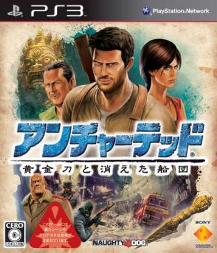
Speaking of featuring a bunch of people on the cover: (Original first, then American)


I think the American there was sometimes better.
Yeah, we get some crappy box art. So do other countries. We also get some box art that is much better. Specifically, Valkyria, or improving Drake's stupid face on the Japanese UC2.
 

beema

New member
Aug 19, 2009
944
0
0
It's true, most American box art sucks a fat one.

I think it's because the marketing people who develop these things are under the impression that all Americans are big spazzy, attention-deficit-having, neanderthals who couldn't possibly appreciate anything remotely artistic or stylized. We need the cover crammed with 5 million different things to look at or we will get bored. We can't just have some artsy fartsy landscape, or simple logo art or something! That's for pansies!

I'd love to see some more examples of this. I'm not sure why I like pissing myself off...

Dannyjw said:
And the worst one i have seen is pretty recent and i know Yahtzee will hate it.

Amnesia.
http://img98.imageshack.us/img98/9024/boxartj.jpg

Guess what one belongs to who.
holy frekaing god! is that real!?
I didn't even know Amnesia had a retail box, I thought it was download only. that's atrocious
 

Dfskelleton

New member
Apr 6, 2010
2,851
0
0
imnotparanoid said:
LadyRhian said:
Dannyjw said:
I am from England and i can't stand american box art.

Other examples of this are Final Fantasy. The EU and JP box art id just a white case with the logo on it, rather than the mess americans have.

And the worst one i have seen is pretty recent and i know Yahtzee will hate it.

Amnesia.
http://img98.imageshack.us/img98/9024/boxartj.jpg

Guess what one belongs to who.
That monster on the cover looks like it has a beak for a mouth. :p
Oh lord no, no NO!
How could they do that!
Wait... Amnesia has cover art? Well, I can't view the popup. The internet is being an idiot when I try to open it.
EDIT: Nevermind, it works now. WTF? That HAS to be fake. Amnesia is only sold on steam and on Frictional's website. It isn't sold in retail, therefore can have no cover art. It looks like it was made on Deviantart or something.
 

mikespoff

New member
Oct 29, 2009
758
0
0
Hadn't realised the scale of this problem before, but the contrast in those examples is pretty damn stark...
 

captainwalrus

New member
Jul 25, 2008
291
0
0
If it's any consolation, PAL box art for SNES games were terri-bad, while the US covers were, for the most part, okay.

Art Lesson #1: Giant, obstrusive borders make for bad box art [http://timewarpgamer.com/features/box_art_disparity_snes.html]
 

Lord Kloo

New member
Jun 7, 2010
719
0
0
Akalabeth said:
Lord Kloo said:
Cover Art is usually irrelevant to buying games as if its on the big display board in shops then its big and you heard about it, if not then you only get to see the side of the box so art is pointless..
Eh? What stores do you go to? Every store I've been to shows the cover not the spine. Some stores like EB Games sometimes have one shelf per console that has only spines showing, but the new releases and so forth are the covers not the spines.
Oh I generally shop in game, gamestation, (uk stores) and the new big releases, or just new things usually have their own sections, but most 'left over' games have only spines showing unless arranging with the first cover towards the corridor, then no-one gets a spine...

I'm sure it's different elsewhere, but I suppose I was making a generalisation based on my experience of medium-sized uk cities..
 

AmzRigh

What's the frequency, Wishbone?
Dec 9, 2010
39
0
0
There's one title I really have to bring as another example of what American marketing does with box art. But, due to how obscure the game is, I'm going to approach this a little differently...

The game is Chulip -- a game that can only be described as a "kissing RPG." In the game, you and your father have just moved to a new town. You don't know anybody, and you have to start your life anew. But almost immediately, you meet the girl of your dreams. You want to kiss her, but you're not good enough yet, so you have to go and get better at it...by kissing everyone you possibly can. It was odd, for sure.

I'll start with the cover art it got here in the US:


Now, granted, it does somewhat convey what the game is about. You're trying to kiss everyone. But...they sure don't make it look good. I mean, would you buy that if you didn't know what it was?

In Japan, however, the cover art they got was incredibly different:

[spoiler][img src=http://upload.wikimedia.org/wikipedia/en/6/6e/Coverchulip.jpg]

It may not convey the action of the game, but it sure communicates the aloneness the protagonist feels at the outset, as well as illustrating the setting.[/spoiler]

Now, same title notwithstanding, if you saw two games on a shelf, one with the American cover and one with the Japanese...which would you be more interested in?
 

ReiverCorrupter

New member
Jun 4, 2010
629
0
0
The real answer is that America is more consumerist. We expect our products to convey information about the game that we can use to buy it. Collages give you several aspects together, while the minimalist or abstract approach might look better, it doesn't tell you much about gameplay. The main idea behind the American style is to cram in as much information as possible. Let the consumer see the hero and the villain, etc.
 

Andy of Comix Inc

New member
Apr 2, 2010
2,234
0
0
This is one of those things my brain knew about but I somehow never noticed. Now that you've pointed it out, goddamn. Wow. That some bad boxart.