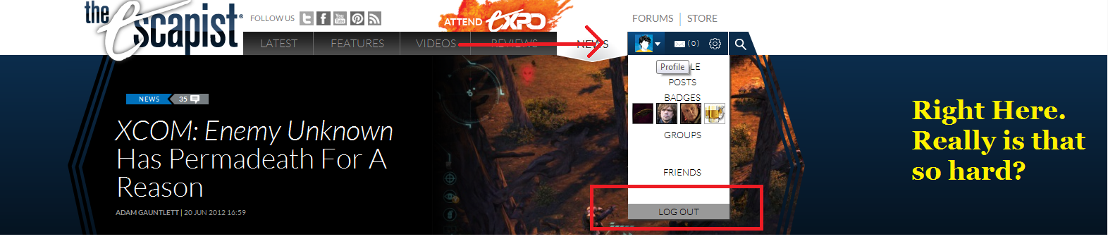
You think that's bad, I can't even log out anymore due to this redesign.Wenseph said:I think it's pretty shit. You removed functionality for form. The last one was better.
- I could see my groups.
- I could see my friends online.
- I could see the last two threads I posted in and if they were updated.
- I didn't have to click anything to see the headlines of the latest news. I barely went to the news section before, but when it just scrolled down I could see if there were news of interest.
All this without going anywhere. Now it's just shiny.

Check out The Escapist's Updated Layout!
- Thread starter The Escapist Staff
- Start date
Recommended Videos
I didn't bother scrolling through 6 pages of comments, so forgive me if this has been mentioned, but ever since the update the website freezes for me every once in a while on the front page. While I can still interact with my computer and browser in a normal way, I can't click anything on the page, I have to close it and open a new tab and go to the site again.
Internet Explroer 9.
Internet Explroer 9.
Eh it's not bad, but a little awkward. Requires just a little to much scrolling to be perfectly comfortable, no matter where I'm on the page, something I'd want to look at is always part way off screen by 1-3 mouse wheel clicks, which is just short enough to be hard to hit, but long enough to be annoying.
That took me maybe 5 seconds to find? Comeon, there's a few things that could be improved, but you're just not trying.
Casual Shinji said:You think that's bad, I can't even log out anymore due to this redesign.Wenseph said:I think it's pretty shit. You removed functionality for form. The last one was better.
- I could see my groups.
- I could see my friends online.
- I could see the last two threads I posted in and if they were updated.
- I didn't have to click anything to see the headlines of the latest news. I barely went to the news section before, but when it just scrolled down I could see if there were news of interest.
All this without going anywhere. Now it's just shiny.
That took me maybe 5 seconds to find? Comeon, there's a few things that could be improved, but you're just not trying.
They should be in the right hand column on each page, about halfway down.game-lover said:It looks nice, it does.
Is the front of the home page, the only area where you can see the latest forum posts? Because if not, I could probably use a hand finding the other link to them...
Except it doesn't scroll out for me. When I hover my cursor over my avatar nothing happens. See how it becomes rather difficult to log out when the "LOG OUT" option doesn't scroll down.halfeclipse said:
That took me maybe 5 seconds to find? Comeon, there's a few things that could be improved, but you're just not trying.
yalp, you see, what you got there is a case of the Adblocks. That there bar shouldn't be gray, but then again there should also be an ad there.kyosai7 said:
Do you mean this "latest threads" forum box or something else?ultrachicken said:My concern is that the "latest threads" page is no longer linked to on the homepage, and when I do go to it, I get a bunch of code instead of the usual layout.

We don't employ pop ups and we'd appreciate you not using adblock very much.ultrachicken said:I've never seen a pop-up on this site, and I haven't seen any ads before videos in a while. Though maybe I'm mistaken.kyosai7 said:Ahh okay, thanks! I wonder how I would go about enabling banner ads to support the site, while keeping ads before videos, and pop ups blocked...ultrachicken said:That's because you're using adblock. The grey block is where the ads go. Though, strangely, they never fill it up, so you always get this ugly white-on-gray nonsense at the top of the page.kyosai7 said:So, on the main page, I have a giant gray block on the top of the site, before the actual Escapist site starts, and I have to scroll down to really see the page. Anyone else have this problem? I'm in Windows 7 64 bit using Chrome.
EDIT: This is what I mean.
My concern is that the "latest threads" page is no longer linked to on the homepage, and when I do go to it, I get a bunch of code instead of the usual layout.
Our featured articles will appear periodically in our header's features panel. Earlier this week "Taking The Shepard's Path" was displayed there. "Bears are Jerks" was published today. They'll be cycled out as new features are published, but you can continue to access them in our homepage's features river or on their dedicated page.snave said:Whatever happened to the feature articles? They used to be the main thrust of this site, 4 or 5 per week, and are now relegated to being hidden knee-deep in menus. Something other such sites never had. A quick glance shows we're lucky to get one per month these days.
I find it a shame. An article can be read on a bus or train or whilst on a coffee break, a video generally cannot.


Where are you seeing white? There shouldn't be very much.Nazulu said:Still too much white, looks incomplete, and I don't like the layout of the drop down menu under my avatar. Maybe put lines underneath each part so it's more clear.
To the right of article title's there should be a little "Aa" symbol. Hover over it for a drop down menu. It allows you to adjust the panel color, font and size.Zachary Amaranth said:Is there a way to darken the main panel?

The schedule should also link to the most recent episode in each series. Newest videos can be seen on the videos tab of the new header, here:Zydrate said:Eh. Still trying to figure out where the new stuff scrolls around. I'm missing out on videos and such the day they come out.
The "schedule" is a nice touch though. Now I can stop guessing when videos are posted

There shouldn't be any white space above the header, unless you're referring to our "motto of the moment", which is a publisher's club feature.gyroscopeboy said:Looks great, however there is a buttload of white space above the header...means instant scrolling to read content.
Also..any chance of a responsive implementation? The escapist has always been a ***** to read on a phone.
An example of it being done right [http://www.smashingmagazine.com/]
You may also accidentally be employing an adblocker, in which case we suggest you turn it off or 'whitelist' The Escapist.
apparently, I already have it as dark as it'll go. Damn.Nasrin said:To the right of article title's there should be a little "Aa" symbol. Hover over it for a drop down menu. It allows you to adjust the panel color, font and size.Zachary Amaranth said:Is there a way to darken the main panel?
Ah well, thanks!
i find it more confusing. the previous one was much better and easier to get around. where is the drop down menu for the video section? was so much simpler to just move your mouse over it and click on the section you want like "trailers".
now its a mess. dont like it.
now its a mess. dont like it.
If I may offer one thing: That top bit scrolls a bit too fast. The time it takes for me to read the header, see the picture, my interest to be piqued, and then to finally click on it... Well, let's just say I've gone to the next article accidentally because it scrolled as soon as I clicked.Nasrin said:The schedule should also link to the most recent episode in each series. Newest videos can be seen on the videos tab of the new header, here:Zydrate said:Eh. Still trying to figure out where the new stuff scrolls around. I'm missing out on videos and such the day they come out.
The "schedule" is a nice touch though. Now I can stop guessing when videos are posted
Just an idea. Add an extra second or two (Or whatever
)