
Check out The Escapist's Updated Layout!
- Thread starter The Escapist Staff
- Start date
Recommended Videos
Much nicer than the last change, but still a bit busy overall.
I definitely appreciate the drop menus being, um, dropped. Those things were annoying.
I definitely appreciate the drop menus being, um, dropped. Those things were annoying.
That's because you're using adblock. The grey block is where the ads go. Though, strangely, they never fill it up, so you always get this ugly white-on-gray nonsense at the top of the page.kyosai7 said:So, on the main page, I have a giant gray block on the top of the site, before the actual Escapist site starts, and I have to scroll down to really see the page. Anyone else have this problem? I'm in Windows 7 64 bit using Chrome.
EDIT: This is what I mean.
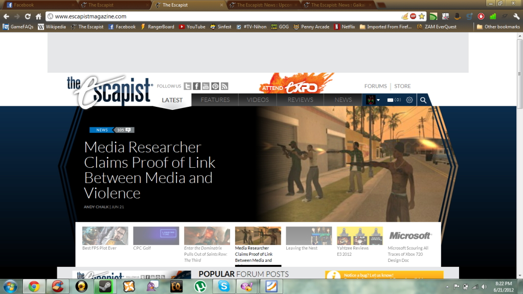
My concern is that the "latest threads" page is no longer linked to on the homepage, and when I do go to it, I get a bunch of code instead of the usual layout.
Ahh okay, thanks! I wonder how I would go about enabling banner ads to support the site, while keeping ads before videos, and pop ups blocked...ultrachicken said:That's because you're using adblock. The grey block is where the ads go. Though, strangely, they never fill it up, so you always get this ugly white-on-gray nonsense at the top of the page.kyosai7 said:So, on the main page, I have a giant gray block on the top of the site, before the actual Escapist site starts, and I have to scroll down to really see the page. Anyone else have this problem? I'm in Windows 7 64 bit using Chrome.
EDIT: This is what I mean.
My concern is that the "latest threads" page is no longer linked to on the homepage, and when I do go to it, I get a bunch of code instead of the usual layout.
I've never seen a pop-up on this site, and I haven't seen any ads before videos in a while. Though maybe I'm mistaken.kyosai7 said:Ahh okay, thanks! I wonder how I would go about enabling banner ads to support the site, while keeping ads before videos, and pop ups blocked...ultrachicken said:That's because you're using adblock. The grey block is where the ads go. Though, strangely, they never fill it up, so you always get this ugly white-on-gray nonsense at the top of the page.kyosai7 said:So, on the main page, I have a giant gray block on the top of the site, before the actual Escapist site starts, and I have to scroll down to really see the page. Anyone else have this problem? I'm in Windows 7 64 bit using Chrome.
EDIT: This is what I mean.
My concern is that the "latest threads" page is no longer linked to on the homepage, and when I do go to it, I get a bunch of code instead of the usual layout.
Whatever happened to the feature articles? They used to be the main thrust of this site, 4 or 5 per week, and are now relegated to being hidden knee-deep in menus. Something other such sites never had. A quick glance shows we're lucky to get one per month these days.
I find it a shame. An article can be read on a bus or train or whilst on a coffee break, a video generally cannot.
I find it a shame. An article can be read on a bus or train or whilst on a coffee break, a video generally cannot.
Wow, Nice to hear people postive about the new layout. It does look nice though, kudos to the designer!
Why do you people keep working backwards. Your 08 design was perfect. Every design since has varied from tolerable, to bad, with the best once since then being the second redesign with all the features in a neat little line on the lower-right.
And you keep changing it as soon as we get used to dealing with it.
I notice that among all the redesigns the site is still slow.
Maybe stop putting your money into site design, and put some into faster servers?
Captcha: change yourself
No, I won't change myself, why meddle with perfection?
And you keep changing it as soon as we get used to dealing with it.
I notice that among all the redesigns the site is still slow.
Maybe stop putting your money into site design, and put some into faster servers?
Captcha: change yourself
No, I won't change myself, why meddle with perfection?
Looks great, however there is a buttload of white space above the header...means instant scrolling to read content.
Also..any chance of a responsive implementation? The escapist has always been a ***** to read on a phone.
An example of it being done right [http://www.smashingmagazine.com/]
Also..any chance of a responsive implementation? The escapist has always been a ***** to read on a phone.
An example of it being done right [http://www.smashingmagazine.com/]
I like most of the redesign. Two things I'd like to ask, though...
1. My message box has had all the notifications shrunk in size (like it's a smaller font, though the rest of the page in unchanged), making it hard to tell which messages are new. This is without me changing any settings. Is this normal?
2. One of my biggest complaints with the old redesign was the brightness of the sidebars. We were allowed to change that, and now we have more options. Is there a way to darken the main panel? My eyes are very sensitive and I hate staring at white or whitish screens if I can avoid it. I looked at the options and saw nothing like that, but it'd be awesome.
God, I finally became acclimated to the last layout overhaul and they go and change it again.
Pick a design and stick with it. No more of these overhaul shenanigans.
More importantly: Where the hell did the Required Reading tab go? That feed was awesome.
Pick a design and stick with it. No more of these overhaul shenanigans.
More importantly: Where the hell did the Required Reading tab go? That feed was awesome.
It is. Thank you, I love it.Nasrin said:Are you familiar with our RSS feed?Stefan Rogen said:Could you please make a text only version of the page, linking to the content? Those of us, who actually can read don`t need that fancy pictures. And I am actually dead serious about this.
You can also get to it with this link.
Is that the kind of thing you're looking for?
Goddammit! Stop it!
Seriously, I've taken a major hiatus from the site since the LAST redesign and I don't feel at home anymore. I just recently got used to the (old) new layout, and even came to like a few of the features. I started crawling back to the forums with a semblance of the frequency I once did even though I didn't recognize many of the faces around these parts anymore, and now I get smacked in the face with MORE weirdness.
Honestly, guys and girls, I don't HATE change, but are you going to be popping these surprises on me again in the near future? Can I please just have a heads up now? That would be just fucking lovely.
I think it's pretty shit. You removed functionality for form. The last one was better.
- I could see my groups.
- I could see my friends online.
- I could see the last two threads I posted in and if they were updated.
- I didn't have to click anything to see the headlines of the latest news. I barely went to the news section before, but when it just scrolled down I could see if there were news of interest.
All this without going anywhere. Now it's just shiny.
BartyMae said:Hover over your name at the top right of the screen - logout is on the bottom, (assuming that's what you mean). Otherwise, I have no idea what you could mean. Invisible mode?Darth_Payn said:Something's missing from the top of the page: where's the profile logout button?
quote]
Only my profile avatar is visible and there's no hover drop-down menu. Am I using the wrong browser? It's IE9 on Windows 7.
Only my profile avatar is visible, and there's no drop-down menu. Am I using the wrong browser? I use IE9 on windows 7.BartyMae said:Hover over your name at the top right of the screen - logout is on the bottom, (assuming that's what you mean). Otherwise, I have no idea what you could mean. Invisible mode?Darth_Payn said:Something's missing from the top of the page: where's the profile logout button?
And please forget my last comment; I had some trouble editing a quote.
I like the new design it's just I find it to be really slow. Anyone else having this issue? Is it just me & my house mates?