Sorry, I should have been more specific. I was referring to how on the previous version of the site, my latest two posts on the forums would appear along with the threads' post counts on the top right hand corner of the main page.Nasrin said:Are you sure?Lord Krunk said:It'll take a bit of getting used to, but I don't mind it.
My only major qualm is that the 'recent forum posts' on the main page are gone now. I liked being able to easily see if there were updates on certain RPs I frequent.


Check out The Escapist's Updated Layout!
- Thread starter The Escapist Staff
- Start date
Recommended Videos
Previously, under the "Forums" dropbox, there were links to pages that displayed "Latest Threads" and "Hot Threads." Just my preferred way of browsing the forums when I'm bored.Nasrin said:Do you mean this "latest threads" forum box or something else?ultrachicken said:My concern is that the "latest threads" page is no longer linked to on the homepage, and when I do go to it, I get a bunch of code instead of the usual layout.

My complaint regarding code appearing rather than a typical page can be disregarded as me accidentally clicking an RSS link without realizing it.
EDIT: Double quote? That's a new one.
...Can you guys like, just give us more of a heads up? Or at least ask us if we're okay with the current format?
Much like the layout before the last, I got used to the most recent one and now you just 'had' to change it again. I know it may piss you guys off to see a meaningless 'I don't like change' post like this but if I don't vent 'somewhere' I'm going to just have some pent up rage. I 'really' wish this would stop happening.
So essentially, it's gonna take some getting used to. I like everything below the big header box, it works for the most part.
But for now, I'm just going to be a little butthurt for a bit and I don't really care if anyone is offended by it.
We posted this article about the layout being updated a week ago and it has been hosted on our homepage every day since. We're sorry that you don't feel it was enough warning, but we did sincerely try to make people aware beforehand.Kyogissun said:...Can you guys like, just give us more of a heads up? Or at least ask us if we're okay with the current format?
update your browser, or allow java script.Casual Shinji said:Except it doesn't scroll out for me. When I hover my cursor over my avatar nothing happens. See how it becomes rather difficult to log out when the "LOG OUT" option doesn't scroll down.halfeclipse said: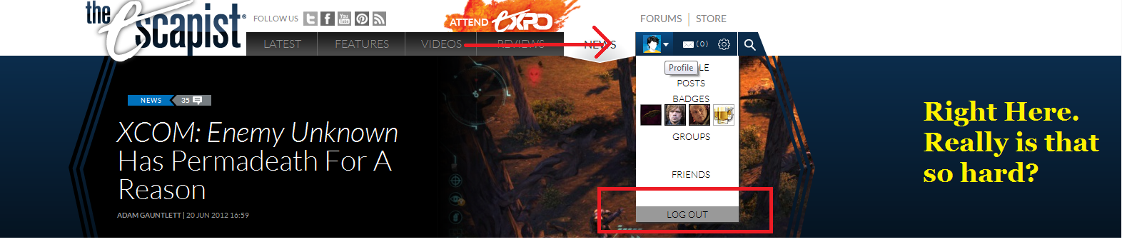
That took me maybe 5 seconds to find? Comeon, there's a few things that could be improved, but you're just not trying.
I already contacted the Escapist, and the problem's been solved.halfeclipse said:update your browser, or allow java script.Casual Shinji said:Except it doesn't scroll out for me. When I hover my cursor over my avatar nothing happens. See how it becomes rather difficult to log out when the "LOG OUT" option doesn't scroll down.halfeclipse said:
That took me maybe 5 seconds to find? Comeon, there's a few things that could be improved, but you're just not trying.
Apparently it was the Compatability View screwing things up, but I got it turned off now.
Not sure if I've posted here since I got the update (not a pub club member), but what the hell:
I like it. It solves pretty much all my problems with the old redesign: The annoying drop-down menus, the scrolly-things my mouse would get stuck on as I scrolled....And actually, that's about it. But there's also about a million improvements. I like how the "Popular Forum Posts" thing is closer, pretty much all the content is WAY more easily accessible....You guys should be proud. This is a really good redesign.
I suppose if I had one complaint, it would everything black or really, REALLY dark blue. It looks pretty depressing. Other then that, though, everything looks and works GREAT. I really can't stress that enough.
There's heaps you mean. The whole top menu and where all the conversations are. Can we please just have an option for other colours? It gives me a headache after a while.Nasrin said:Where are you seeing white? There shouldn't be very much.Nazulu said:Still too much white, looks incomplete, and I don't like the layout of the drop down menu under my avatar. Maybe put lines underneath each part so it's more clear.
I'm pretty okay with the new design so far. Some stuff will take getting use to.
Two things I noticed that are either unfinished bits or glitches:
1. The setting in my browsing options 'don't let headline, video panel, etc rotate automatically' doesn't work. Front page stuff is rotatey as all get out.
2. I'm using the up-to-date version of Firefox. Escapist's new layout now gives me this lovely horizontal scroll bar. The page is too big for my screen now. It goes all the way over to 'Reply Quot' and cuts off at the e in quote. 'Topic Inde'. It doesn't effect reading posts, as those appear to fit my page perfectly. It's just the outer table border size?
The top menu? You mean our "motto of the moment"?Nazulu said:There's heaps you mean. The whole top menu and where all the conversations are. Can we please just have an option for other colours? It gives me a headache after a while.Nasrin said:Where are you seeing white? There shouldn't be very much.Nazulu said:Still too much white, looks incomplete, and I don't like the layout of the drop down menu under my avatar. Maybe put lines underneath each part so it's more clear.
I'm having a bit of trouble understanding exactly what you mean and a screenshot would greatly assist me in assessing your concerns.
These are both minor concerns, but the little things add up so:
It seems to take a lot of clicks to get to the video galleries. If I want to pull up an old Zero Punctuation or see what Moviebob had to say about a film that came out a while ago it takes like two or three pages just to get to the gallery.
Also, I miss having the links to your last two forum posts right on the front page. That was useful when there was a topic I was especially interested in.
Again, these are really just minor inconveniences, but interface 101: the fewer clicks the better.
Having lived with this for a week now, let me just say: I hate - expletive deletedly hate - the mouse-over effect for the new top interface. I cannot even navigate to the site before it's changing things around on me and it's nearly impossible for me to get it to go - and stick - where I want it to.
The fact that you don't have your articles and features in the "latest" bit annoys me as well. I'd just gotten used to using the old new site, and now I have to get used to a new new site. It's like you're actively trying to keep me from browsing your site.
The fact that you don't have your articles and features in the "latest" bit annoys me as well. I'd just gotten used to using the old new site, and now I have to get used to a new new site. It's like you're actively trying to keep me from browsing your site.