Oh sweet jesus, I thought that picture was from a 1950's sci-fi book, not a MegaMan cover.CantFaketheFunk said:and while I've certainly seen worse [http://upload.wikimedia.org/wikipedia/en/e/ea/MegamanBox.jpg] in my gaming career, it's... kinda underwhelming.
Mass Effect 2 Box Art Fails to Impress
- Thread starter John Funk
- Start date
Ooooo... Pretty.lukemdizzle said:This is just a good marketing tool to get people to buy the collectors edition

*walks closer with bambi eyes, and money in hand*
[small]Why yes, I am a sucker for those.[/small]
It looks like one of those old Power Rangers posters when they pose, but it looks really realistic roughly though. (<---Alliteration LOL) I've never played Mass Effect before though.
Apologies if this was written somewhere in the middle of the thread.
If you're shopping around for a new game to buy, what do you look at? While there are people who read the back of every. single. game, most people look at just the TITLE and the ART before deciding to look deeper. So yes, both the title and the art are important.
Granted, they get some leeway as it's the second installment in the franchise (that is, they can ride the franchise's coattails somewhat), poor box art works against attracting new people to the series.
Come on people, try to step outside of your own experiences once in a while.
That's sad.lukemdizzle said:This is just a good marketing tool to get people to buy the collectors edition

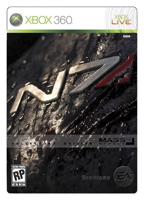
Holy balls, that's awesome. Yeah, fuck it. I'm getting collectors edition for the box art alone.Geamo said:That's...fairly boring. And generic.
To be fair, it looks more like a cut-and-paste job rather than a flowing piece of art.
EDIT:
This man speaks the truth. Collectors edition boxart (if that is the final one) looks great.lukemdizzle said:This is just a good marketing tool to get people to buy the collectors edition

DAMN YOU BIOWARE!
Can't say it agree, I thought it was supposed to be capturing the feel of a rather cheesy but good 80's sci-fi action flick; the villains face looming behind the main characters of the game ,the ships on either side. But to each their own.but it at least communicated the idea of "this is an incredibly deep and complex space opera
Yes, but I'm trying to hold onto as much money as possible.HG131 said:It's only $69.99 USD.dancinginfernal said:Holy balls, that's awesome. Yeah, fuck it. I'm getting collectors edition for the box art alone.Geamo said:That's...fairly boring. And generic.
To be fair, it looks more like a cut-and-paste job rather than a flowing piece of art.
EDIT:
This man speaks the truth. Collectors edition boxart (if that is the final one) looks great.lukemdizzle said:This is just a good marketing tool to get people to buy the collectors edition

DAMN YOU BIOWARE!
Exactly, its got a weird sort of off-ness to it. It might be the way it reminds me of Star Wars.Echer123 said:Something's off with it. I can't put my finger on it, but it might be the colors. It looks more like a screenshot then box art for a game.
I'm trying to wrap my head around any logical progression from Mass Effect's box art to this, and I'm drawing a blank. At least the original box art conveys something sweeping and massive about the game, whereas this just makes you think Generic Hero, Hot Woman, and Silly Lemonhead Sidekick (lol forever).
I'm not gonna lie, I'm going through ME now, and I'm not immersed or anything. Maybe it's because I'm a big baby who likes to get acquainted with games before they slap me around in the middle of space. Or maybe I just need to spend more than five hours with it.
I'm not gonna lie, I'm going through ME now, and I'm not immersed or anything. Maybe it's because I'm a big baby who likes to get acquainted with games before they slap me around in the middle of space. Or maybe I just need to spend more than five hours with it.
To me it seems like one of those 'Design a Magazine Cover' that they do in ONM, GamesTM and such. They just, you know, shopped it onto a video-game box.
Speaking of shopped: does Shepard's head seem at an odd angle to the rest of his body to you?
Speaking of shopped: does Shepard's head seem at an odd angle to the rest of his body to you?
I can't really explain why, but yeah... I hate it.
Is it actually some kinda sick joke? Photoshop?
Is it actually some kinda sick joke? Photoshop?
