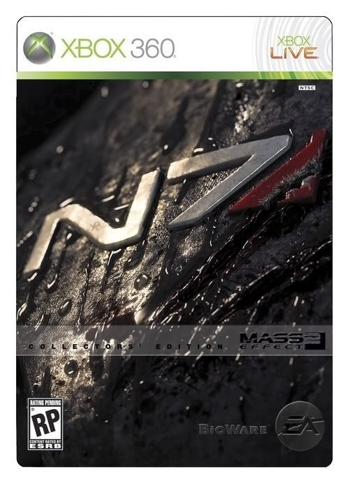
I don't know. I kind of like the art. At least Shep actually looks like Shep, whereas the box art from the first game had him looking...constipated. But seriously, the game looks amazing. If you've watched any of the trailers or reveals for it, you should see that by now. Is box art really going to make you more or less likely to buy a game? Especially a big tentpole title like ME2 which everyone knows about and most people are anticipating?
Mass Effect 2 Box Art Fails to Impress
- Thread starter John Funk
- Start date
I think everyone here knows what must be done...
BOYCOTT!!! It's a guarantee!
In all seriousness, while I really like great cover art, mediocre covers don't bother me. Nothing could really stop me from buying the game, especially not something as petty as lame art. The collector's edition looks friggin' sweet, though.
BOYCOTT!!! It's a guarantee!
In all seriousness, while I really like great cover art, mediocre covers don't bother me. Nothing could really stop me from buying the game, especially not something as petty as lame art. The collector's edition looks friggin' sweet, though.
For a game that damn near revolutionized the space-RPG genre, this is just sad. I'm still excited for the game becasue I know what it is, but will any newcomers be attracted to this? no.
At least it looks different. It's not a shit-brown, baby-puke-green, gunmetal-grey or black-on-darker-black that's all the rage in game art these days. Not the best they could have done, but kudos for at least branching into a try at lighting the game shelves a bit.
Holy crap thats badass,lukemdizzle said:This is just a good marketing tool to get people to buy the collectors edition

Maybe just make the box some sort of heavily stylized shot of the Normandy in space with Shepard floating nearby looking outward at a nearby planet. Normandy can be wrecked or not, doesn't necessarily matter. I mean they've already done a lot of teaser and trailer stuff dealing with the Normandy in a state of severe damage if not outright destruction so...yeah.scifidownbeat said:I'd like to incorporate the Normandy into the box art, but I wouldn't know how....
Has box art ever made anyone avoid a game they would have otherwise purchased?
The closest that came for me was the original Worms. I had only had a taste of a demo, and the god-awful box art was almost enough to make me hang on to my prescious allowance money. I'm sure glad I did buy it though.
If I get Mass Effect 2 it will be through digital distribution anyhow, so it won't really be an issue.
XD
Good lord, this box art is awful. That's like they photoshopped a few images of the characters into some of their concept art. It doesn't match their first cover in any respect. The lighting doesn't even look real. Cripes, I've seen STUDENTS AT MY SCHOOL make better box art than that.
Good lord, this box art is awful. That's like they photoshopped a few images of the characters into some of their concept art. It doesn't match their first cover in any respect. The lighting doesn't even look real. Cripes, I've seen STUDENTS AT MY SCHOOL make better box art than that.
Wow. That really does look bad. Not as in bad artwork, but bad presentation. Something they whipped up in half an hour for a third tier Direct-to-DVD movie bad.
Looks uncomfortably similar to those dime-a-dozen Erotica novels you see swarming the shelves at the local grocery store.
Eh...Anybody else see it...?
The awkwardly close-up and detailed faces as well as their vague expressions of determination and confidence?
Not to mention the ubiquitous "raven-haired beauty" with the high cheekbones and that ridiculous mane of lush hair flowing out behind her like it was defying gravity.
I don't know, I'm just a bit sickened by it.
The second game was supposed to have a darker mood and now they vomit out this aesthetic abomination.
That's what I thought.Moonmover said:If I wasn't already familiar with the franchise, I would look at the collector's edition box-art and think the game was called "N7."
The girl does kind of look like Remy Hadley.
I disliked the first one so I probably won't play the second one.
I think the colours are too warm, when dealing with space I think you should use a more colder pallet of colours as well space is (as far as I'm aware) cold. It also needs to feel more quite or subtle. The first games box art was nice and subtle with nice cold colours which made it feel spacey, this with the background and the warm pallet makes it look like a Mad Max game.
