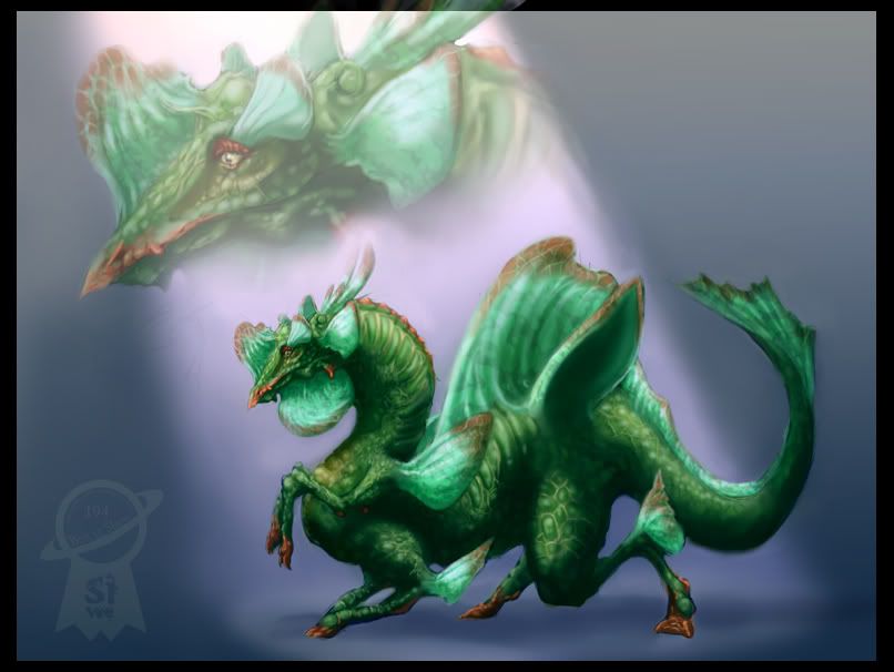
Anyway, not sure if this can be called 'art' as it's the computer doing all the hard stuff, however as I suck with both pencil and brush I'll take all the help I can get.
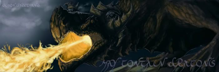
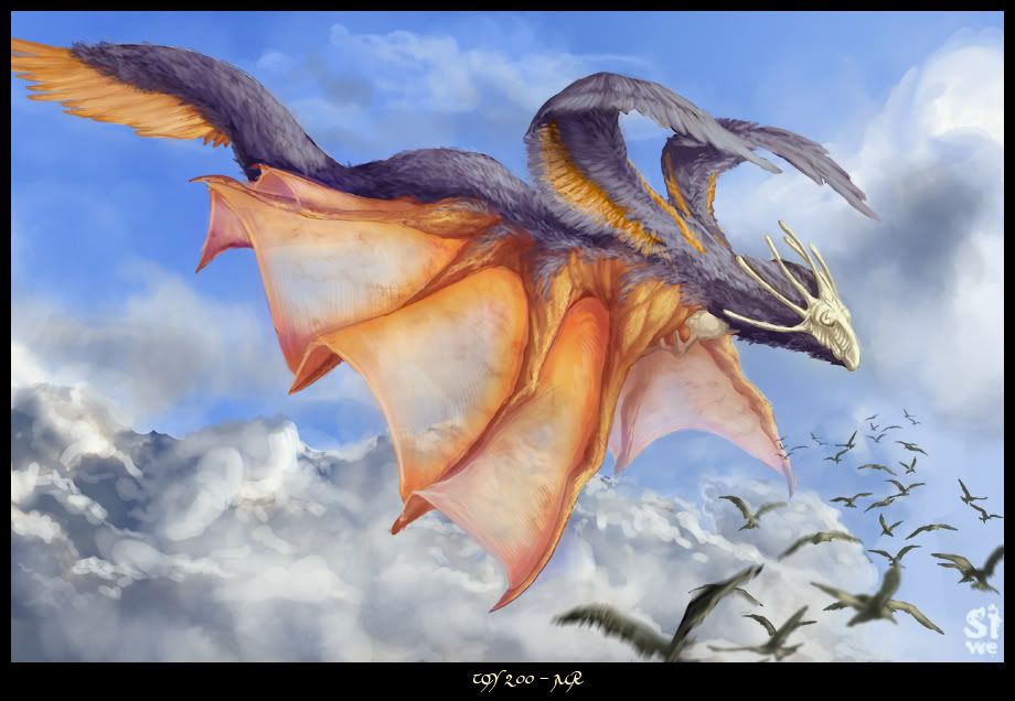
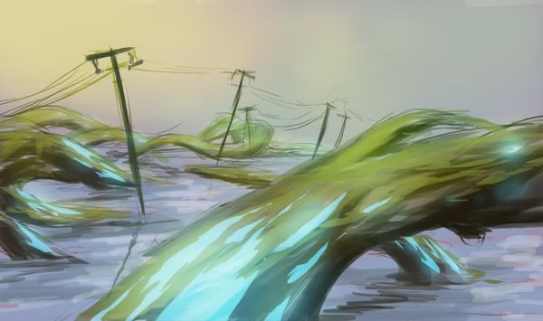
This was created for a scene which I might get around to finishing one day if I can stop being distracted (curse you Just Cause 2!).
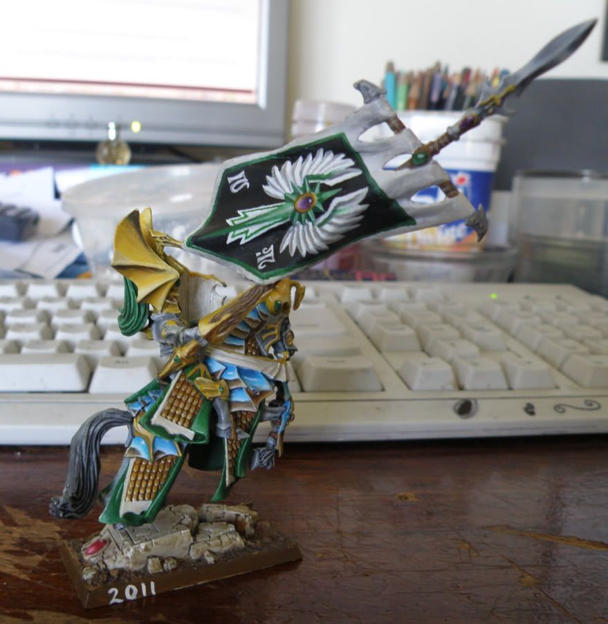
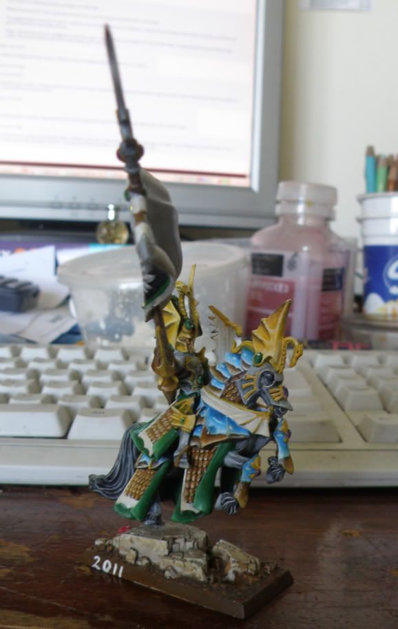
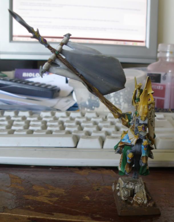
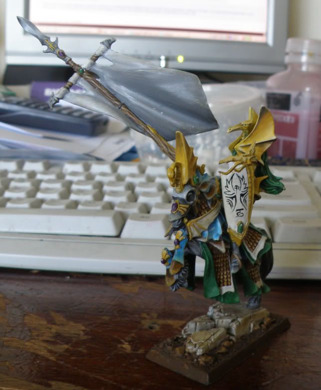
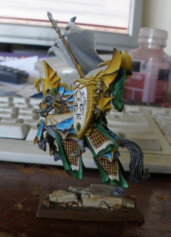
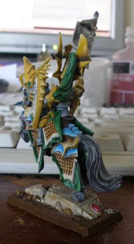
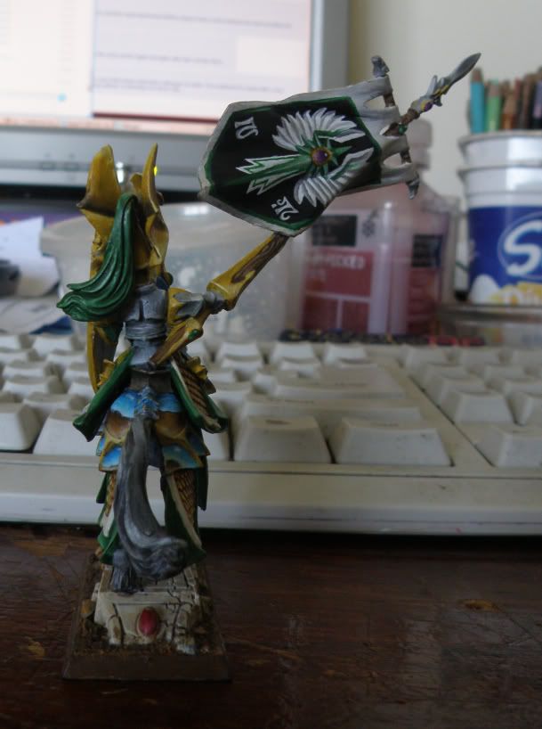
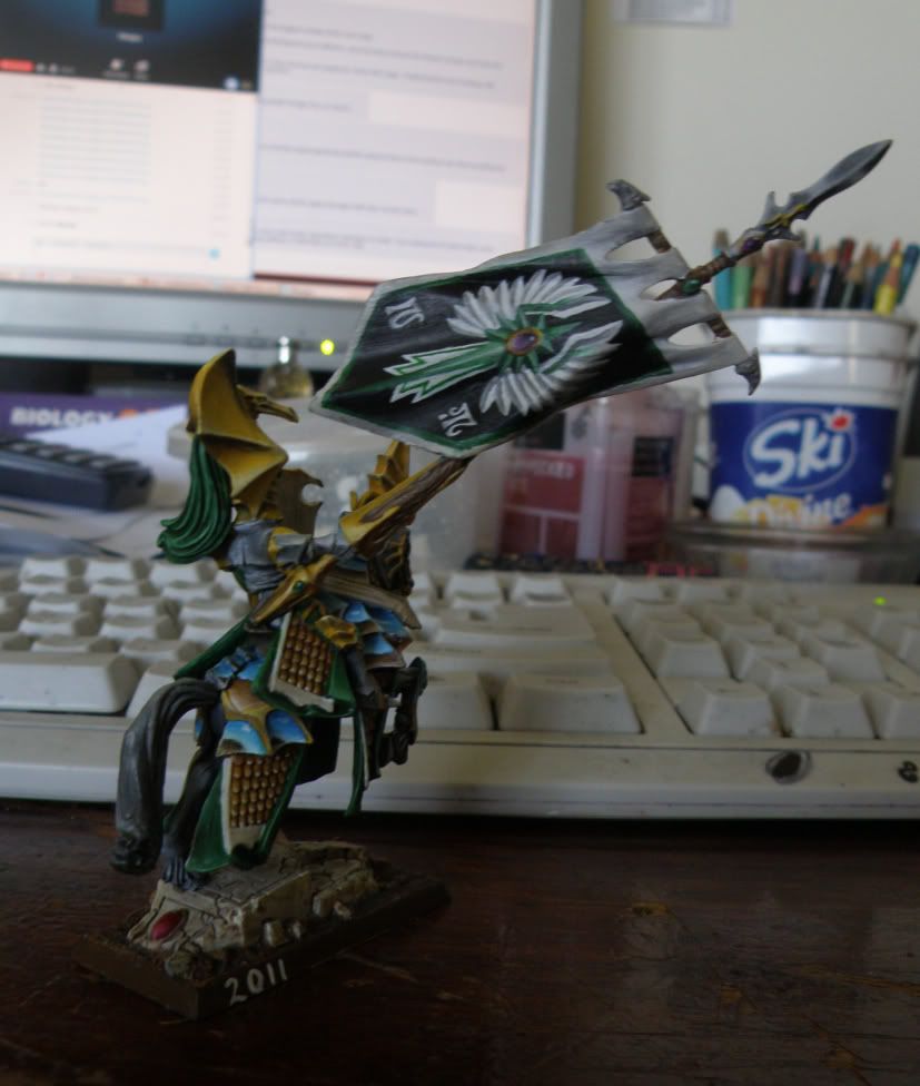
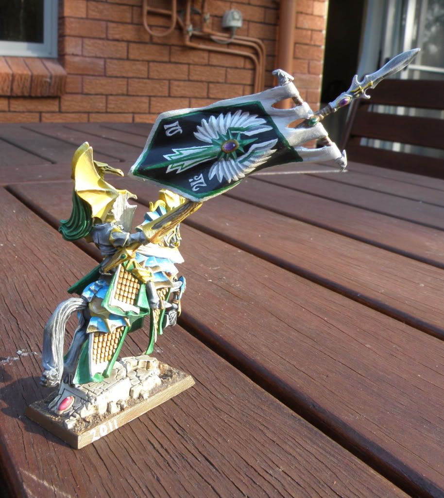
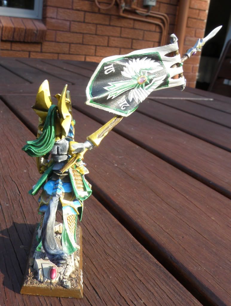
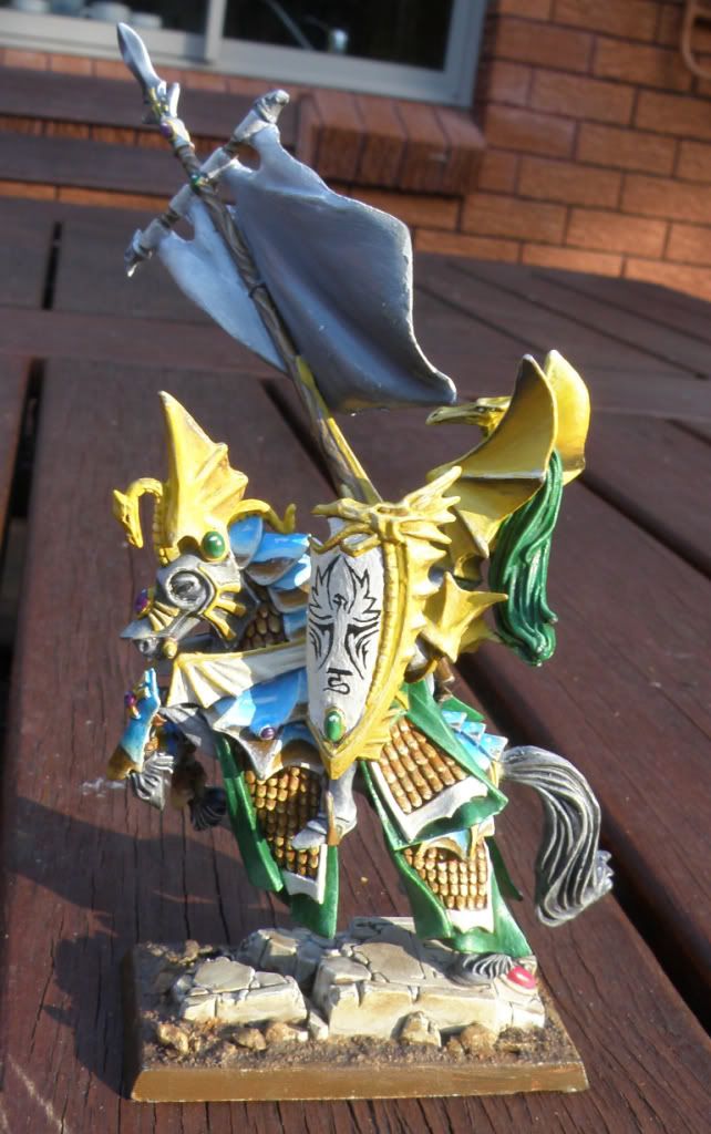
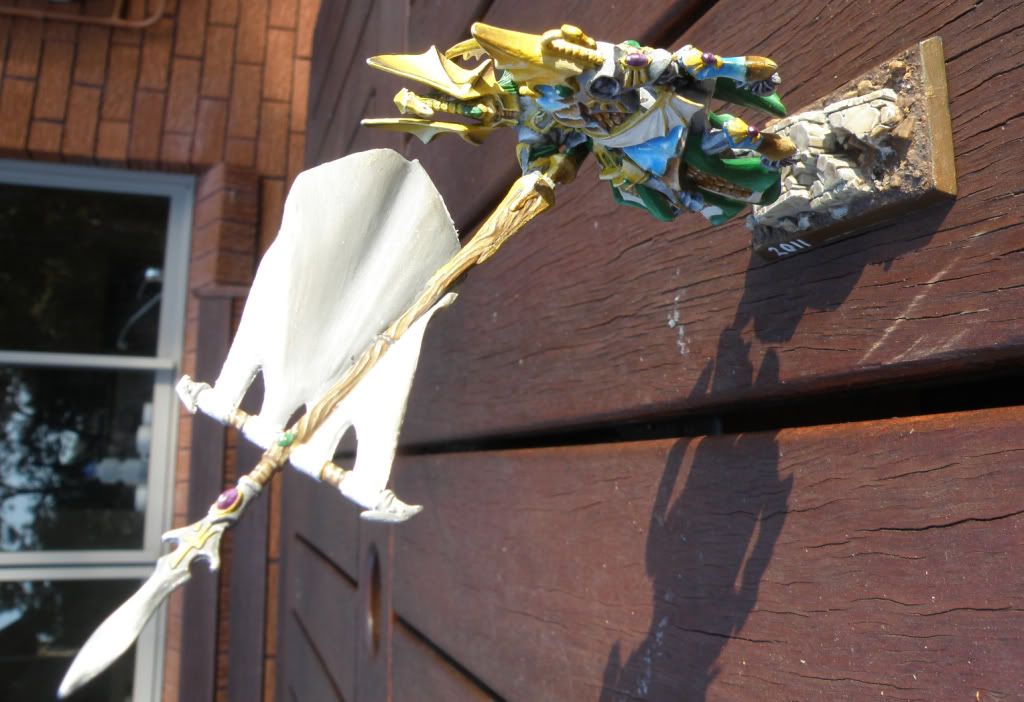
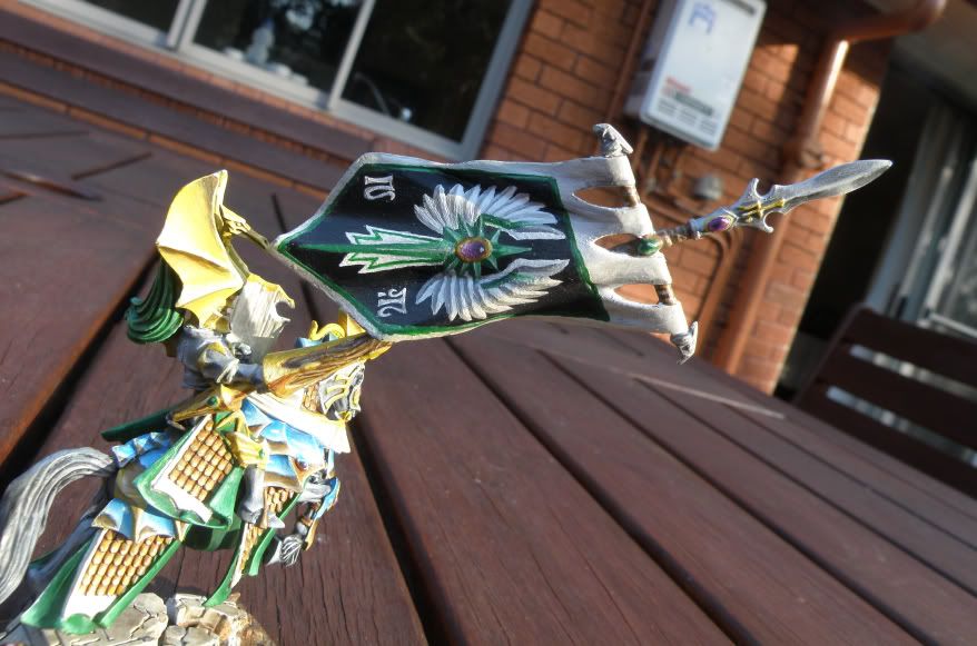
TADAAAAAAA!!! WOOO! YEAH!!!...*cough*. Heh, well it's not really that great but at least you can tell what it's meant to be if you know what the praetorian banners look like
I reread the comic Girl Genius recently, and (as I usually do after reading it) I set out on a steampunk creative bender afterward. From that came this. Initially it was supposed to be me, but as usual I can't draw my own damn hair, so it looks like someone completely different.
[vimeo=19167988]
Just finished up modelling a Cerberus for my anatomy master.
More 3D stuff, some portraits [http://artbyruben.blogspot.com/2010/11/beautiful-people.html] and ZBrush sketches [http://artbyruben.blogspot.com/2010/11/heads-up.html] at my blog [http://artbyruben.blogspot.com]. Done tons of other stuff but you know, can't be arsed to start coding my personal website for it.
Also took a shot at game modding recently, more specifically Angelina Jolie's signature weapon from the movie Wanted for Fallout: New Vegas [http://www.newvegasnexus.com/downloads/file.php?id=38407].
I reread the comic Girl Genius recently, and (as I usually do after reading it) I set out on a steampunk creative bender afterward. From that came this. Initially it was supposed to be me, but as usual I can't draw my own damn hair, so it looks like someone completely different.
Hey Zemalac, it's been a while since I commented on one of your pieces. With a piece like this my advice would be to warm up the highlights and cool down the shadows a lot. See how on his face the shadows are red? Try cooling down the hue. Your highlights right now are going towards white, but he's being lit by fire, thus your brightest highlight would be light orange and so all colours would be going towards that. Try messing around with "soft light" layers and giving the shadows and highlights some slightly different hues like that. You can also mess around a bit with colour balance, but for something like this you'll need to be more precise. Another technique that would look pretty ballin' in this situation would be to employ rim lighting. Basically it's just an extreme highlight that we only see the edge of because the rest of the highlight is on the back of something/someone. It replaces your dark outline with something that is basically your most extreme highlight for that surface. Take a look at some reference for backlighting and you'll see what I mean.
Other than that it's a cool image. I like the textures on the jacket a lot.
Here's a couple of random doodles from me, all for different weekly activities on ConceptArt.org...
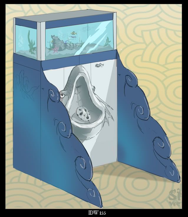
Alternative urinal design for a public aquarium, industrial design of the week:
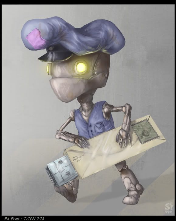
The intergalactic postman, for character of the week:
Hey Zemalac, it's been a while since I commented on one of your pieces. With a piece like this my advice would be to warm up the highlights and cool down the shadows a lot. See how on his face the shadows are red? Try cooling down the hue. Your highlights right now are going towards white, but he's being lit by fire, thus your brightest highlight would be light orange and so all colours would be going towards that. Try messing around with "soft light" layers and giving the shadows and highlights some slightly different hues like that. You can also mess around a bit with colour balance, but for something like this you'll need to be more precise. Another technique that would look pretty ballin' in this situation would be to employ rim lighting. Basically it's just an extreme highlight that we only see the edge of because the rest of the highlight is on the back of something/someone. It replaces your dark outline with something that is basically your most extreme highlight for that surface. Take a look at some reference for backlighting and you'll see what I mean.
Other than that it's a cool image. I like the textures on the jacket a lot.
Here's a couple of random doodles from me, all for different weekly activities on ConceptArt.org...
Alternative urinal design for a public aquarium, industrial design of the week:
The intergalactic postman, for character of the week:
Hey, good to hear from you again. I'll definitely take your advice about the highlights and shadows--looking at this again, it sort of looks like the character is standing in front of a backdrop instead of actually being in the scene, if that makes sense. Some better highlighting and shadows would fix that, I think.
Your work is, as always, magnificent. I especially love the robotic mailman, though I'll admit that when I first saw his hat I thought he was wearing a patched sock on his head.
EDIT:
Asuka Soryu said:
http://asukalangleysoryu.deviantart.com/
Most of my pics are done in MS Paint, like the one above.
So we're just postin pictures of stuff we've drawn then?
I hope that works...
Anyway, yes it is rather big but I don't know how to make it smaller or put the spoiler thing on it. Anyway, my scanner sucks at picking up colors so... Yeah....
Hey Zemalac, it's been a while since I commented on one of your pieces. With a piece like this my advice would be to warm up the highlights and cool down the shadows a lot. See how on his face the shadows are red? Try cooling down the hue. Your highlights right now are going towards white, but he's being lit by fire, thus your brightest highlight would be light orange and so all colours would be going towards that. Try messing around with "soft light" layers and giving the shadows and highlights some slightly different hues like that. You can also mess around a bit with colour balance, but for something like this you'll need to be more precise. Another technique that would look pretty ballin' in this situation would be to employ rim lighting. Basically it's just an extreme highlight that we only see the edge of because the rest of the highlight is on the back of something/someone. It replaces your dark outline with something that is basically your most extreme highlight for that surface. Take a look at some reference for backlighting and you'll see what I mean.
Other than that it's a cool image. I like the textures on the jacket a lot.
Here's a couple of random doodles from me, all for different weekly activities on ConceptArt.org...
Alternative urinal design for a public aquarium, industrial design of the week:
The intergalactic postman, for character of the week:
Hey, good to hear from you again. I'll definitely take your advice about the highlights and shadows--looking at this again, it sort of looks like the character is standing in front of a backdrop instead of actually being in the scene, if that makes sense. Some better highlighting and shadows would fix that, I think.
Your work is, as always, magnificent. I especially love the robotic mailman, though I'll admit that when I first saw his hat I thought he was wearing a patched sock on his head.
EDIT:
Asuka Soryu said:
http://asukalangleysoryu.deviantart.com/
Most of my pics are done in MS Paint, like the one above.
This site uses cookies to help personalise content, tailor your experience and to keep you logged in if you register.
By continuing to use this site, you are consenting to our use of cookies.

 *ENVY* I wish I knew how!...