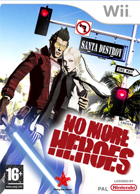
American Box Art Sucks

moosek

New member
Nov 5, 2009
261
0
0
Box art is probably a product of the game's marketing, and marketing teams for videogames often want to use something flashy and eye-catching rather than something subtle or dignified.

Most box art in general really sucks. I'm trying to think of some good covers in my collection and the one that stands out the most in terms of uniqueness is Borderlands. Burnout Paradise is also a fairly decent example.
 

zombie711

New member
Aug 17, 2009
1,505
0
0
MacNille said:
You should have brought up resident evil 4 boxart.

here is the pal version:
It's very stylise and a litte scary too.

Now here is the american:


So generic. Nothing about this cover is good. It's so damn bland.
The pal version is super misleading. It makes you think your in a dark world of fear and danger, were your survivel is questioned at every move, when in actuality its not scary, Your just mowing down People who apperently are not zombies in one of the most praised games ever, so the American box art shows you what you get, rather than pretend to be something else like the pal box art does.
 

zombie711

New member
Aug 17, 2009
1,505
0
0
Before I forget

American which is Awsome


Pal version which is boring, bland and lacks any real art
 

mechanixis

New member
Oct 16, 2009
1,136
0
0
Robborboy said:
mechanixis said:
Robborboy said:
AgentNein said:
Mcface said:
MacNille said:
You should have brought up resident evil 4 boxart.

here is the pal version:
It's very stylise and a litte scary too.

Now here is the american:


So generic. Nothing about this cover is good. It's so damn bland.
American box art is just more descriptive of the game.
So if you are browsing the store, you see both of these game cases, knowing nothing about the game, you are more likely to get a better idea of what the game is from it.

It's not a creepy dark game where you are in a empty desolate place like the top cover suggests, you are in a village packed with zombies carrying chainsaws, like the bottom.
I don't know, the first one definitely conveys the feeling of being alone in an alien and threatening environment, that feeling that something can pop out from any corner at any time.
Completely correct. It conveys something that does not exist at all in the action shooter that is RE4 whereas the American box art shows what it is. An action game

Atmos Duality said:
Must be a really slow week if we're sitting around bitching about box art from the DOS era.
True that.

Akalabeth said:
Lord Kloo said:
Cover Art is usually irrelevant to buying games as if its on the big display board in shops then its big and you heard about it, if not then you only get to see the side of the box so art is pointless..
Eh? What stores do you go to? Every store I've been to shows the cover not the spine. Some stores like EB Games sometimes have one shelf per console that has only spines showing, but the new releases and so forth are the covers not the spines.
Any Gamestop/EB I go to has such a large amount of games that they stock them so that only the spine is visible.

Frotality said:
typical american video game boxart is designed after typical american movie posters, and i think the logic behind those are "shove every characters face on the poster and hopefully people will identify with at least one of them".

secondly, our boxart is NOT meant to convey what the game is about... it is all floaty heads as you said, and it is meant solely to get someone to buy it, with no mind to what the hell its actually about. look at the whole add campaign for dragon age, heavy metal action scenes for a damn RPG, and what does it say about our box art that superimposed witches over a field of swords inside a dragon shaped blood splatter is probably one of the most minimalist boxart designs for recent games? also take the famously atrocious ME2 boxart; not a week after it was shown, forum goers posted their own vastly superior photoshopped boxart pleading for bioware to use that instead, but nope, they had to have as generic a boxart as possible, as apparently no one seems to catch on that doing that makes your game just blend in with all the other floaty head boxarts in the video store.
There is a problem with what you just said. All American boxart DOES tell what the game is about.

Take Enslaved for example. The bottom of the box is covered in red flowers. Red, denoting conflict, strife. But also being represented in such fragile form as a flower. This shows softness, possibly romance. Move up a bit more and on the left side you see ruined buildings. Something wrong has happened. Moving up more, the sky. It is a lightly cloudy blue. This represents that something nice still exists in this broken world.

Now to the characters. There are six total. First you have Monkey. And aggressive look on face, what looks to be metal boxing gloves, and a headband with an ominous red glow. From this alone you can tell he is a fighter, more of a no-nonsense kind of guy. Ready to take something down when the time comes.

With Trip you see a lightly clothed woman, running close behind Monkey with a concerned, piercing look aimed towards Monkey.

And behind them you see a large mechanical beast. It appears to be chasing Monkey and Trip. With Monkey's fierce attitude this shows that there are things bigger than he. Things even he will tackle "cautiously". And that Trip is looking towards him for protection.

The birds and "dragon fly" lend their own part to what the cover-art story is, but I won't bother with it. At this point you either see that you are wrong, or too pig-headed to admit it.
But you see, you would never have been able to put that together without playing the game first, and that makes it all irrelevant. Observe.


Here we see the cover art for Bioshock 2. It features a man in a pressurized metal suit, alluding to the game's extraterrestrial setting; the dark background likewise represents the dark void of space. The rugged, dirty filter on the image and the suit's massive drill-arm suggest the main gameplay mechanic: mining asteroids. However, there is another figure on the boxart, the little girl. Her pale skin and otherworldly glowing eyes make it clear that she is paranormal in nature, possibly a ghost. She is perched on the protagonist's back, out of his sight, and holds the tubing of his life-support system in her hand, threatening to tug it out. She is obviously the game's antagonist. The cracked glass represents the shattering of the Fourth Wall, as the characters of the game frequently speak directly to the player.

See how that works? It's easy to project all sorts of wild interpretations onto images. All that American covers are trying to convey is that the protagonist is LARGE and POWERFUL and INCLINED TOWARDS VIOLENCE. Almost every American boxart you can find features at least two of the following: 1) a scowling male figure, 2) a sexualized female figure, and 3) a sizable weapon.
Except, you know, you read into it wrong.
You see a diving suit, water, and fish, yet you extrapolate a setting in space? That is just silly. You can't just pull random things out your ass. You have to use a bit of *le gasp* LOGIC when interpreting a cover. Something you clearly did not do here.
Logic? This is browsing the videogame aisle, not a highschool literature class. If you didn't have prior knowledge of Bioshock's content, then my interpretation would be just as good as yours. Really, you can't argue that that looks any more like a real diving suit than it does like a fictional spacesuit, and those fish are little more than blurry dark shapes. And when I see a huge industrial drill am I supposed to somehow NOT assume it's a piece of mining equipment? Your idea of 'logic' in these interpretations is pretty arbitrary.
 

Eiv

New member
Oct 17, 2008
376
0
0
Yahtzee is Trolling :) love it.Go Go Defensive Rangers :)

Have to say, glad you yanks never noticed. You win the internet :)
 

Keivz

New member
Dec 4, 2008
51
0
0
Agreed. Another example where the american version trumps the eastern version (http://www.hardcoregaming101.net/draslefamily/draslefamily.htm):

http://www.hardcoregaming101.net/draslefamily/draslefamily.jpg

vs.

http://www.hardcoregaming101.net/draslefamily/legacyofthewizard.jpg
 

Biscotti187

New member
Aug 12, 2009
65
0
0
1) Why do you bring America as a discussion point so often in critique to modern-day habits? Sure you make german jokes (Wolfenstein) or english food but then when you bring up America its so centered on the population (Americans why do hate the french (the language hurts my ears) or in "For my non-American viewers who know that the world doesn't consist of one country riding on top of a sea of Mexican immigrants." Makes you seem more obsessed with Americans than your American viewers (and have you listened to the news services in Germany? They really have little idea whats going on in the world) Besides Americans are the ones who are the victims in the runs of this bad box art
2) as for the bad box art two ideas:
a) they may be targeted more to their urban consumer base where after staring at countless seas of advertisements faces and people are the only ones that offer meaningful contact and notice and only then if you stick them right the middle less they fade back with all the other commuters
b) or they may just be making an extra effort to avoid pissing of those mothers who have an annoying tendency to start advocacy groups ... dont know if they do or dont in Europe or Japan
 

Poisoned Al

New member
Feb 16, 2008
109
0
0
Humm, people have touched on this before, but I think Americans don't seem to "get" quality. Quality to them is "make it bigger" or "add more of it." Others will take one thing and refine it, making it better and (gasp) maybe smaller and more efficient. But that's for sissy pinkos! We make something shit bigger, so it's a bigger pile of shit! And if you don't buy our huge pile of shit and like it, the terrorists win!

American cars are a prime example of this. "Hey, this car isn't very good. I know! Lets slap in a huge engine so it'll be going even faster when it careens off the road due the chassis being made out of old ladders, and the transmission lifted from Fred Flintstone's car!"
 

dbmountain

New member
Feb 24, 2010
344
0
0
It all really depends on what games you are looking at. Some games have better North American box art while others of better box art in different areas. Someone could post an equivalent article that says "European Box Art Sucks" with equal success. People just love hating on Americans
 

RJ Dalton

New member
Aug 13, 2009
2,285
0
0
You know, I never thought about it until now, but you're right. American box art does suck. I guess it never got to me because I never bought a game based on the box art. I only buy games if I get a recommendation from someone I trust.
 

boholikeu

New member
Aug 18, 2008
959
0
0
"I've got a question for my American readers. It's a simple one. Why do you hate things that look good?"

We don't hate things that look good. I'm sure most Americans here prefer the international box covers.

The problem is the suits deciding which box cover to use. They hate things that look good. And they are idiots.
 

InnerRebellion

New member
Mar 6, 2010
2,059
0
0
LadyRhian said:
Because America is all about identifying with the main character- becoming the main character, so that's what we want to see on our box art. Admittedly, not always, but mostly. And we can't identify with a character (or characters) if we don't know what they look like.
I think you might be on to something here.

Also, as a side note. I've come to realise; I much prefer these articles of Yahtzee's over Zero Punction.
 

Nitrozzy7

New member
Feb 15, 2010
160
0
0
It's because America was founded by hopeless romanticists that didn't account for all those greedy aliens that flooded the place in pursuit of their dreams. Whatever dreams a greedy alien might have...
I guess all those monsters, lasers and round things that always go together, must remind them their lives back in Pluto or Mars...
Damn those Aliens!
French should have think twice about close encounters of the third kind...
 

BluesHadal

New member
Feb 10, 2011
16
0
0
Wow, basically anything anyone outside of America said about Americans is such bullshit. Even some things some americans said. There were some plausible reasons given outside of the bullshiters.

what we(the audience) can tell is that there is a trend to show characters. The problem is that due to that, the cover for foreign game covers is deemed unusable. The second problem is that the American marketing doesn't want to spend or waste a whole lot of time and money on cover art. That leads to bad art.

But honestly the cover art to FF10 is great for the U.S. It's ridiculous to think it isn't, Its better than the Japanese. Though 12's is obviously better than the cheap one for the U.S.
 

ObsessiveSketch

Senior Member
Nov 6, 2009
574
0
21
I'm actually much more familiar with the foreign box art of both Heavy Rain and ICO (perhaps because those are the images shown here on the escapist). After looking through all the examples, I'm ashamed to admit that my country has completely murdered game box art. It seems like they try to make the cover a mini-trailer for the game(look, here's you and these are the baddies you'll be fighting, oh whee, doesn't this look like fun!). Meanwhile, the original box art is actually phenomenal. If more games kept their covers like that, we would probably be much further along the "Games are art" road.
 

TheECP

New member
Nov 1, 2007
81
0
0
jackpipsam said:
because the US cannot understand a silly thing such as story.

good thing us Aussies tend to have euro boxs
"No, I'm not an elitist bastard."

I do agree the US box art is worse, but it's just a product of high paid marketing departments who actually know how to make money off of people. They have no interest in having any sort of artistic value, just whatever will catch the interest of your typical shopper.
 

ckam

Make America Great For Who?
Oct 8, 2008
1,618
0
0
American Kirby is Hardcore [http://tvtropes.org/pmwiki/pmwiki.php/Main/AmericanKirbyIsHardcore], duh. Personally, I'm against the change of the ICO cover. It and the others look fucking ugly.
 

ManInRed

New member
May 16, 2010
240
0
0
I think the biggest example of poor American box art preventing me from buying a game would be Silent Hill: Homecoming. Had the game kept the original Japanese box art of Pyramid Head showing off he'd be making a cameo, I might have bought the game before I knew anything else about the game. Instead, I got the American box art, a boring family portrait, which along with the title Homecoming made me feel this game had nothing to do with Silent Hill anymore. Heck, even the European box art had one of the classic nurses, giving me some hope it could contain some of the magic of the series still.