Mass Effect 2 Box Art Fails to Impress

Frenger

New member
May 31, 2009
325
0
0
Generic is way to kind, this box is horrible, dreadfull... no, it's shit. Compared to ALL their previous ones, which had movie poster vibes to them, this one looks really cheap :/

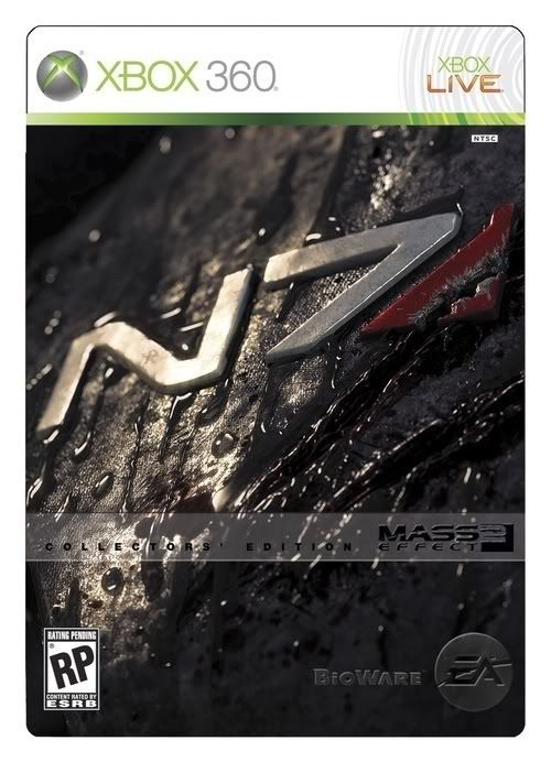
The Collectors box looks shit too. It looks like a racing game, Forza, or similar. No go.

Edit: I will buy it in a heartbeat, but I wouldn't mind having at least a decent box. I'm the kind of guy who make my own slips for DVD's if the boxart isn't good enough. I'm looking at you, Cowboy Bebop: The Movie! Photoshop sunflares are so 1995...
 

j0z

New member
Apr 23, 2009
1,762
0
0
lukemdizzle said:
This is just a good marketing tool to get people to buy the collectors edition

awesome box art. ^^

Yeah, that box art is terrible, I really liked ME1's box art, but this doesn't do justice to what will certainly be an awesome game.
 

Rock 'n' Soul

New member
Nov 15, 2009
357
0
0
Nah, I think you pretty much nailed it by saying "underwhelming". I don't know why the guy in charge of the artwork thought this was a good idea. It kind of looks like the cover of a really cheesy low budged B film and if you weren't familiar with the title I think you would find yourself saying..."There's a "2"?!!!" But yeah, it doesn't sell me.
 

jad4400

New member
Jun 12, 2008
1,688
0
0
Meh, the box art is okay, but I don't really care so long as the game underneith is just as epic as the first game.
 

Rock 'n' Soul

New member
Nov 15, 2009
357
0
0
PapaJupe said:
Wow....people will whine about anything.
And I thought that was just an internet rumor.
I don't think anyone is going to lose sleep over it, but when you pay $60 for a game, I think it's fair to ask for a little bit of decoration.
 

squid5580

Elite Member
Feb 20, 2008
5,106
0
41
That is just horrible. And why did they put Sheppard on the cover. He looks nothing like the Sheppard I played through ME 1 with. For starters wrong gender.

Lemonface lol
 

lacktheknack

Je suis joined jewels.
Jan 19, 2009
19,316
0
0
Wow... Sounds like Yahtzee all over again.

The box art IS, after all, undeniably the least important part of a game.
 

G1eet

New member
Mar 25, 2009
2,090
0
0
Xzi said:
That is pretty bad. I'd take a shot of just some CGI scenery over that. As a matter of fact, I Google imaged Mass Effect 2, and here's what I got: http://elder-geek.com/wp-content/uploads/GavinGreene/2009/10/masseffect2_desktop_06_640x480.jpg

and

http://www.justpushstart.com/wp-content/uploads/2009/10/masseffect2.jpg

Either of which would have made much better box art.
That second one just looks like a recycled Eden Prime.
 

number2301

New member
Apr 27, 2008
836
0
0
Agreed with most of the above, it's rubbish. Does box art matter? Yes. I must have looked at Just Cause a dozen times before buying it because it had cheesy box art. When I finally did buy it on recommendation it was a great game and had I not had that recommendation I would never have experienced it.

HardRockSamurai said:
You know, the funny thing is that a simple "/sarcasm" would have prevented all this.
I really don't think we need to reduce ourselves to the lowest common denominator do we? Besides, flagging sarcasm like that completely misses the point of sarcasm in the first place.
 

Susan Arendt

Nerd Queen
Jan 9, 2007
7,222
0
0
Ok, I can't say much at the moment, but what I will say,with absolute certainty, is that you're not going to give a damn what's on the cover.

Trust me.

Also, I am totally telling the BioWare folks about the "girl from House" thing tomorrow, because that's hilarious.
 

The Random One

New member
May 29, 2008
3,310
0
0
They should have taken some pointers from Something Awful [http://www.somethingawful.com/d/photoshop-phriday/classy-games4.php].
 

HardRockSamurai

New member
May 28, 2008
3,122
0
0
number2301 said:
HardRockSamurai said:
You know, the funny thing is that a simple "/sarcasm" would have prevented all this.
I really don't think we need to reduce ourselves to the lowest common denominator do we? Besides, flagging sarcasm like that completely misses the point of sarcasm in the first place.
Well duh. That's what made it funny.
 

FoolKiller

New member
Feb 8, 2008
2,409
0
0
Well I will be getting the collectors edition so i don't care but I think that its pretty ugly. Especially when you consider the fact that Shepard doesn't necessarily look like that as you can customise it. I think they should have stuck with the theme of the first game's art.
 

jboking

New member
Oct 10, 2008
2,694
0
0
lukemdizzle said:
This is just a good marketing tool to get people to buy the collectors edition

Sir, I believe you are correct. As that box art is amazing and the box art at the top is...well terrible.
 

RebelRising

New member
Jan 5, 2008
2,230
0
0
Man, why is Bioware so adverse to the awesome style they had for the first game's boxart? They had something really epic and symmetrical going there. Not that it matters, as I will be purchasing the Collector's Edition anyways.

On the whole, I feel this cover [http://i34.tinypic.com/zwgvtz.jpg] speaks better to the spirit of the sequel.