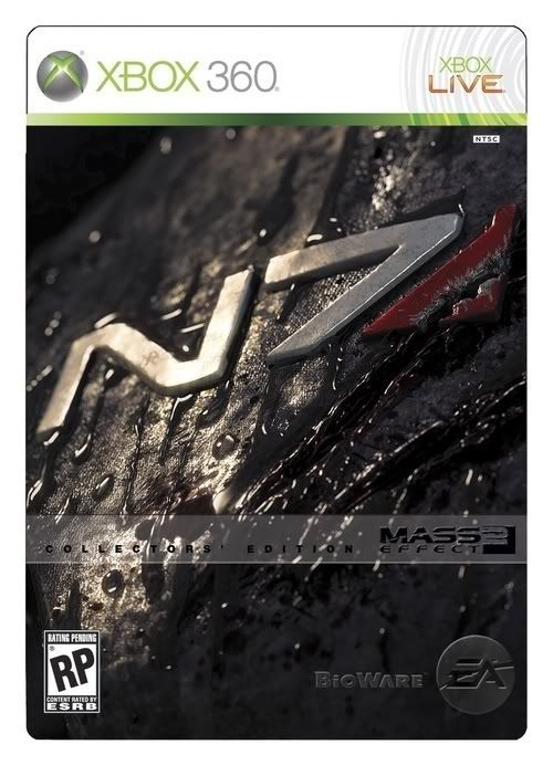
Mass Effect 2 Box Art Fails to Impress

Thaius

New member
Mar 5, 2008
3,862
0
0
"The first game's box art wasn't a Leonardo da Vinci masterpiece, but it at least communicated the idea of "this is an incredibly deep and complex space opera," rather than looking like "this is a sci-fi shooter just like every other sci-fi shooter..."

This. Exactly. As much as the new art looks kind of cool, it also looks like every other generic sci-fi action title out there. The old one communicated a mix of awesomeness and depth, quite fitting for the game.

Well at least I now have the extra little push of motivation to buy the Collector's Edition. Beautiful tin case, you shall be mine soon... ^_^
 

Chris^^

New member
Mar 11, 2009
770
0
0
its 'ooh bright lights and sci-fi with angry bland looking characters!'
welcome to the generic generation guys
 

Orange Monkey

New member
Mar 16, 2009
604
0
0
Well all the hype i've seen for this game so far has indicated that they've been focusing more on the violence. After all you've got an Assasin, Hyper Aggresive Krogan and a Psycothic Biotic ***** on your team, and you can shove people out of windows during conversations.

So the box art, isn't all that surprising really.
 

Doc Theta Sigma

New member
Jan 5, 2009
1,451
0
0
... The fuck Bioware? The Collector's Edition box art is gorgeous and for the standard edition you give us this? Well. Luckily I'm a massive Bioware fanboy and was getting the CE to begin with.
 

Phase_9

New member
Oct 18, 2008
436
0
0
Shamus Young said:
Ooooh! A game about space marines! We don't get nearly enough of these!

Will it have multiplayer deathmatch?
Come on. Mass Effect was a great game with an engaging story.
 
Aug 25, 2009
4,611
0
0
The Collector's Edition looks so much better.

They could be trying to entice people with almost false marketing. They know that people who bought Mass Effect 1 are likely to buy Mass Effect 2, so they have to widen their pool, and what better way to do that than mislead people into thinking they're buying a Halo/GoW style game? It won't matter to them if people buy it and never oplay it because they will still have all that lovely money, and anyone who buys it for the misleading boxart and likes it is more likely to purchase ME1 and then ME3.

It could be an extremely clever marketing strategy, rather than a generic one.
 

Kandon Arc

New member
Mar 10, 2009
115
0
0
The worst for me is Shepard. He just looks indescribably stupid. Luckily I don't have to describe it though, as it is self evident.
 

Caligulove

New member
Sep 25, 2008
3,029
0
0
What I have liked about BioWare is that their cover-art for their games seem more like movie posters most of the time to really make you think about the awe and the scope of what might be in this game.

With KotOR, it looked like any other poster for a Star Wars film that you would have seen before (same goes for KotOR 2, though that was Obsidian) Mass Effect as well- showing off this kind of space opera epic to make you wonder about what is going on.

But the rare thing out this is that its a rare BioWare sequel- which there are few of. Fewer (if any?) that are direct sequels to the previous.
So I understand the lackluster art on display here. I certainly dont care about box art as a fan of the first one- I'll play it either way. While the generic approach while appeal to newer fans as well
 

Korten12

Now I want ma...!
Aug 26, 2009
10,766
0
0
hm... dont really like the box art. I was thinking something like sheperd standing their and then a bunch of shadows of the most of important characters in the back munch together. 0.0 or something.
 

ma55ter_fett

New member
Oct 6, 2009
2,078
0
0
Can't wait to do the girl, oh wait this is bioware with it's unrealistic and unreveling sex scenes that always disapoint...
 

Rancid0ffspring

New member
Aug 23, 2009
703
0
0
Geamo said:
That's...fairly boring. And generic.

To be fair, it looks more like a cut-and-paste job rather than a flowing piece of art.

EDIT:
lukemdizzle said:
This is just a good marketing tool to get people to buy the collectors edition

This man speaks the truth. Collectors edition boxart (if that is the final one) looks great.
I rarely buy collectors editions because I don't want to fork out extra money for additional bits that I don't care about... this however looks very sexy & I may well pay the extra for it.

Also box art never factors into my decision to buy a game. They could give me the game in a blank box with the words Mass Effect 2 handwritten & I'd still buy it
 

Andy Chalk

One Flag, One Fleet, One Cat
Nov 12, 2002
45,698
1
0
I'm thoroughly unimpressed. The original box art wasn't great by any stretch but this is several steps down. Completely falls flat. Fortunately, I already have the CE preordered. Now that's a good cover. (Assuming that image is, in fact, the CE box art.)

I don't expect the art will have much of an impact on sales, since it's a highly-anticipated sequel to an extremely popular game, but don't think for a second that bad box art doesn't have an impact. A lot of people blame the poor sales of Planescape: Torment, one of the finest RPGs of all time, on the hideously ugly box art.