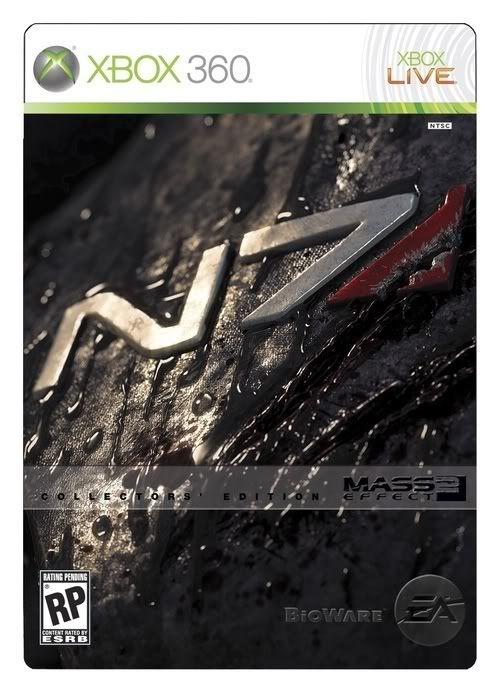
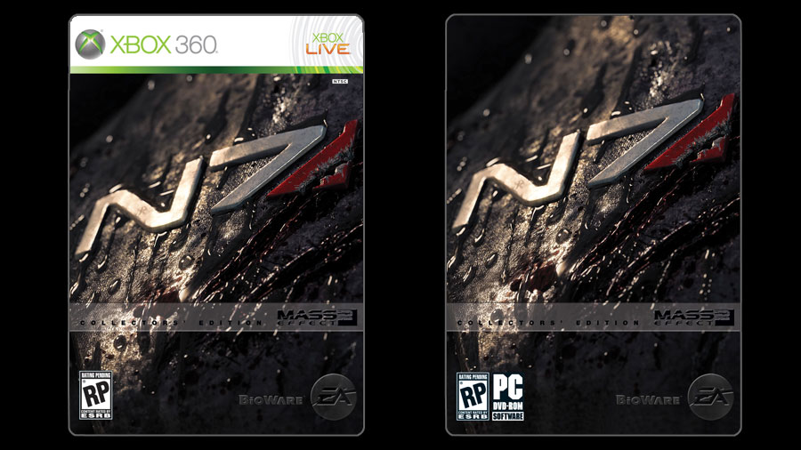
Mass Effect 2 Box Art Fails to Impress
- Thread starter John Funk
- Start date
And the most hilarious thing is, if you saw the boxart and menu screens for Halo 3, you'd think it was some sort of deep, meaningful epic, when its just a bunch of space marines hopping around spraying each other with hoses that shoot bullets instead of water.
And THIS just looks like a poster advertisement you see in the subway for a running shoe.lukemdizzle said:This is just a good marketing tool to get people to buy the collectors edition

That's not what people say about Mega Man.Hallow said:Would you dig through shit for a diamond?SendMeNoodz84 said:I'm just going to say this: Who gives a CRAP?
If the game is good, who actually cares about the package? Does this honestly deserve a whole thread devoted to it? Batman: Arkham Asylum's cover is just as generic as this one. Does it matter? No, the game is still great. It doesn't effect the game at all, so why don't you all just stop complaining?
It doesn't matter how good something is, advertising is supposed to make the product appealing to a mass audience. If it's ugly as sin, no one cares if it's a diamond.
Its not that bad.CantFaketheFunk said:Mass Effect 2 Box Art Fails to Impress

Mass Effect 2 is looking great so far. Its newly-revealed box art, on the other hand, isn't.
While rumors that BioWare agents have kidnapped a member of The Escapist's staff and spirited them away to their well-hidden battle fortress concealed deep within the frozen Canadian wilderness in order to force them (at gunpoint, no less) to play through a bit of Mass Effect 2 have yet to be corroborated, everything we've seen of the title is looking pretty damn ace so far - the game seems to be improving on the first installment in almost every way...
...Except where box art is concerned. The official box art went up seen worse [http://masseffect.bioware.com/media/screenshots] in my gaming career, it's... kinda underwhelming.
It isn't so much that the art itself is bad, as it is that it's incredibly generic. Ooh, a manly-looking brown-haired protagonist with a futuristic-looking machine gun, so edgy! The first game's box art wasn't a Leonardo da Vinci masterpiece [http://upload.wikimedia.org/wikipedia/en/d/d2/Mass_Effect_cover.PNG], but it at least communicated the idea of "this is an incredibly deep and complex space opera," rather than looking like "this is a sci-fi shooter just like every other sci-fi shooter, only your sidekicks are a guy with a lemon for a face and the girl from House," to borrow a description from our very own Malygris.
Nothing about this art appeals to me in the least. In fact, were I to see this on shelves having not heard of the game before, this art would make me less likely to buy it.
Is it just me? Am I making something out of nothing here, with sensibilities far more delicate than I'd have ever guessed? Or is this box art just that damn uninspired?
Permalink
Damn! That's beautiful.lukemdizzle said:This is just a good marketing tool to get people to buy the collectors edition

Mass Effect took place over a huge world and everything about it was large-scale. This box art looks small in scope in just about every way it could be. That's my opinion.CantFaketheFunk said:Is it just me? Am I making something out of nothing here, with sensibilities far more delicate than I'd have ever guessed? Or is this box art just that damn uninspired?
Don't particularly care what the cover art looks like, just as long as the game itself is good.
Christ, man, you people need to relax. No one here is boycotting the game just because of the box art -- in fact, read the comments closely and you'll find a number of people who have acknowledged that the box art sucks but are still incredibly excited for the game. But nevertheless, this box art is ass. Worth a news story and five pages of comments? Probably not, but ME2 will be amazing and I want that to be represented on the cover.Darkside360 said:Ever heard of "Don't judge a book by its cover" by chance?
Who cares about box art? Since when does box art make a game good or bad?
I've bought games with horrible box art yet the games were awesome. Again I've bought games with great box art and the game was shit.
I can't have fun with the box other than getting high off the new game smell.
While this may matter to some people, I'll be having fun with my copy of "THE GAME" rather than the box come January.


